
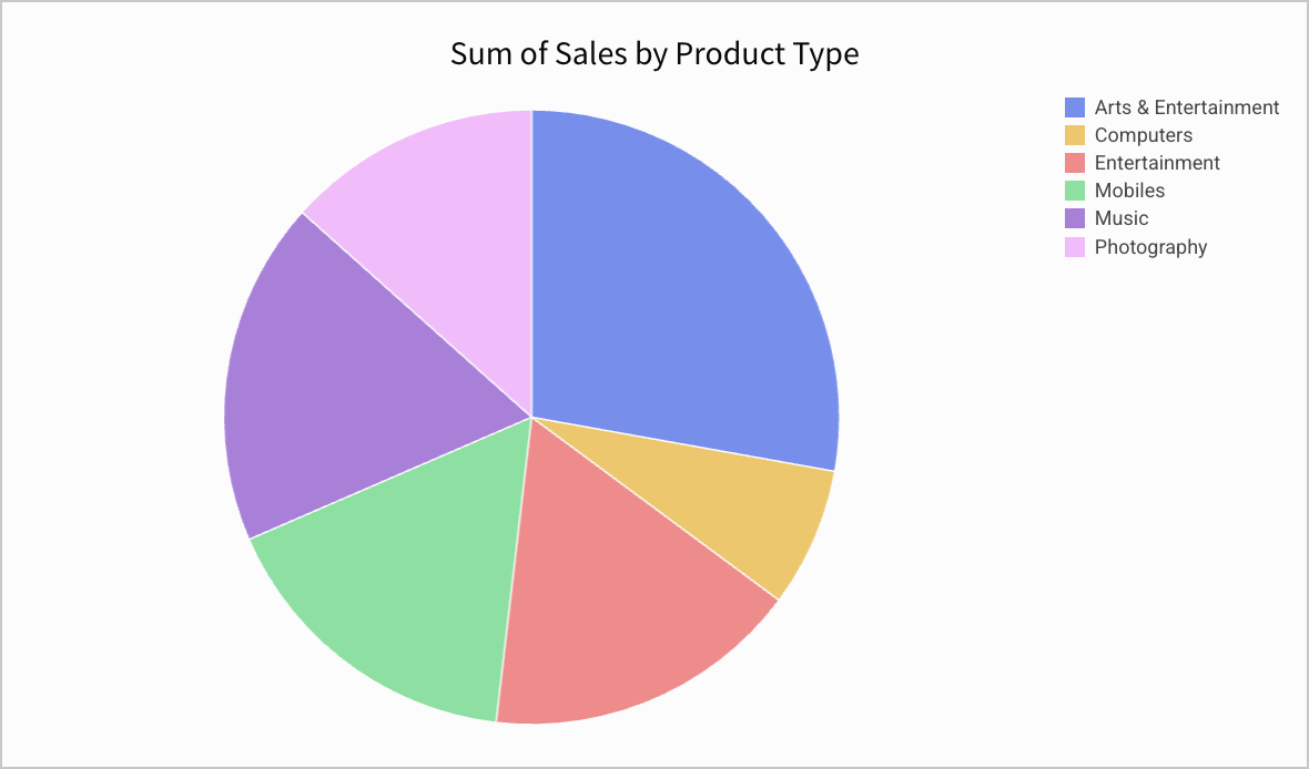
Pie and donut charts
Pie and donut charts are a good way to visualize data as a percentage of a total.
Requirements
- To create a data element, you must have Can Edit access to the individual workbook and be in Edit mode.
- Many exploratory actions are also supported when customizing a view, see Workbook modes.
Plot options
You can create pie and donut charts charts from the PAGE ELEMENTS section of your workbook's editor panel, or directly from an existing data element.
Required fields
- COLOR (1 column)
- VALUE (1+ columns) Columns added to the VALUE field are aggregated by default. Aggregation type (e.g. Sum vs Count) is dependent on the original column’s value type (e.g. text, number, date, etc). Example: A numeric column [Sales Amount] will create a new calculated column [Sum of Sales Amount].
Marks
- TOOLTIP: choose columns to show when hovering over points in the chart
- TRELLIS: select columns to serve as Trellis Rows or Columns, splitting the chart into separate charts
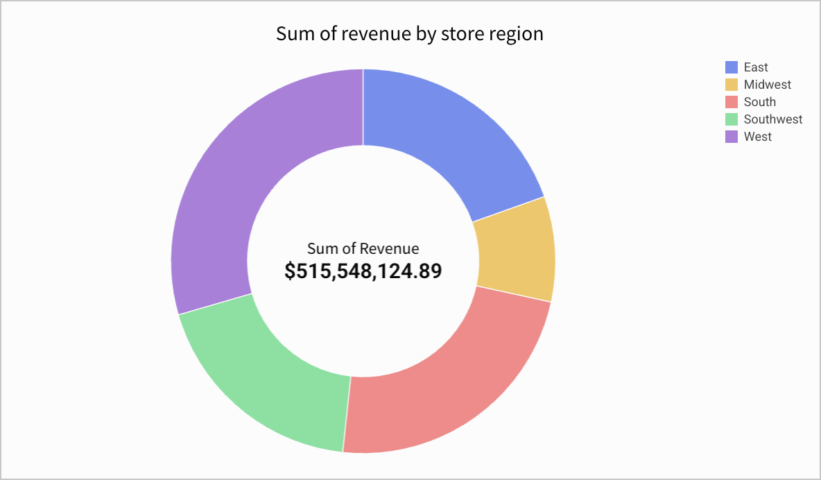
Donut hole value
If you're creating a donut chart, you can optionally add a KPI to the hole of the donut.
-
Select the element.
The editor panel opens to the Element properties section.
-
For Donut hole value, select the + to add a calculation.
-
Add a new column, select the row count, or choose a column to aggregate and display in the donut hole.
The aggregate value appears with the column name as a default label. You can format the value using the format options.
Format options
To start editing the format options for a chart:
Before you start: This action uses the editor panel. If you have not done so already, open the editor panel from either Explore or Edit mode.
- In the editor panel, select
 Element format.
 - Select a format option to view and edit its settings.
The following format categories are available for pie and donut charts:
- Background
- Title
- Legend
- Data labels
- Donut hole (only for donut charts)