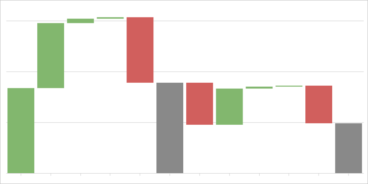
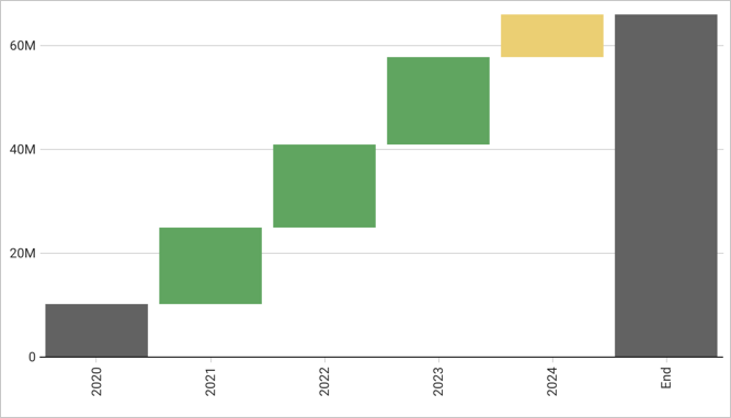
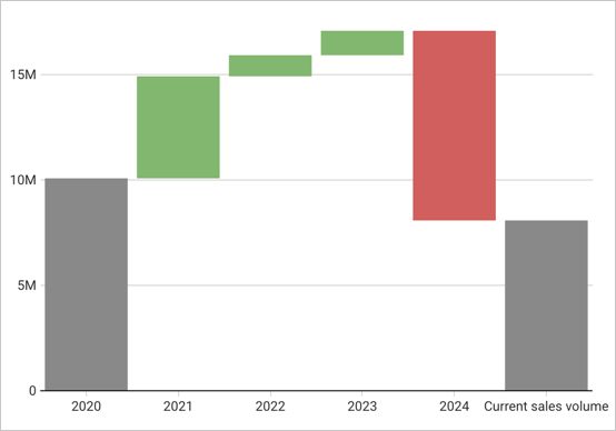
Build a waterfall chart
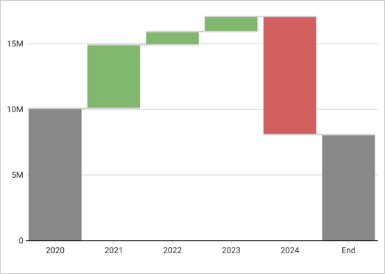
Waterfall charts are typically used to show changes in one or two categories of data over a period.
This document details basic waterfall chart requirements and introduces key properties and format options to help you enhance your workbook charts.

Example use cases:
- Accounting analytics: Measure the positive and negative contributions to an overall budget.
- Financial analytics: Track revenue and spend for a project, department, or an entire organization.
- Retail analytics: Track positive and negative foot traffic over time for a store or region.
- HR analytics: Measure employee retention rates as part of total employee headcount tracking.
User requirements
The ability to create waterfall charts and other charts requires the following:
- You must be assigned an account type with the Edit Workbook and/or Explore Workbook permission enabled.
- You must be the workbook owner or be granted Can explore or Can edit workbook permission.
If you’re granted Can explore access to the workbook, you can create and modify visualization properties and formatting in Explore mode, but you cannot publish your changes.
Basic waterfall chart requirements
To plot a waterfall chart, configure the following properties in the ![]() Element properties tab:
Element properties tab:
- Chart: Chart type displayed in the workbook
- X-axis: Source column that defines the x-axis (horizontal axis) categories or variable
- Y-axis: source column that defines the y-axis (vertical axis) categories or variable
In a waterfall chart, one axis typically represents ordinal or nominal categories (like stages, regions, departments) presented as vertical or horizontal bars. The other axis represents a variable that measures a value (like sales, leads, expenses) for each category and determines the height of the corresponding bar. The type of data affiliated with each axis depends on the chart orientation, which you can modify at any time.
At the core of every visualization is an underlying data table (derived from the data source) that supplies the information visualized by the chart. As you build your chart, Sigma automatically calculates and structures the data to map the element properties to source columns in the underlying data table. For information about how to view the underlying data while you configure the chart, see Maximize or minimize a data element.
Add a waterfall chart
Add a new chart element and designate it as a waterfall chart.
- Open a workbook in Explore or Edit mode and add a new chart element.
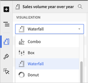
- In the Chart property, click the dropdown field and select Waterfall from the list.
You can also use this dropdown field to convert an existing chart to a different type. Sigma retains all property and format configurations shared by the initial and new type. Properties and formatting not shared by the new type are not retained.
Define the categories
Define the categories for the chart by configuring a source column to use. Because waterfall charts are best for showing change over time, select a date column:
-
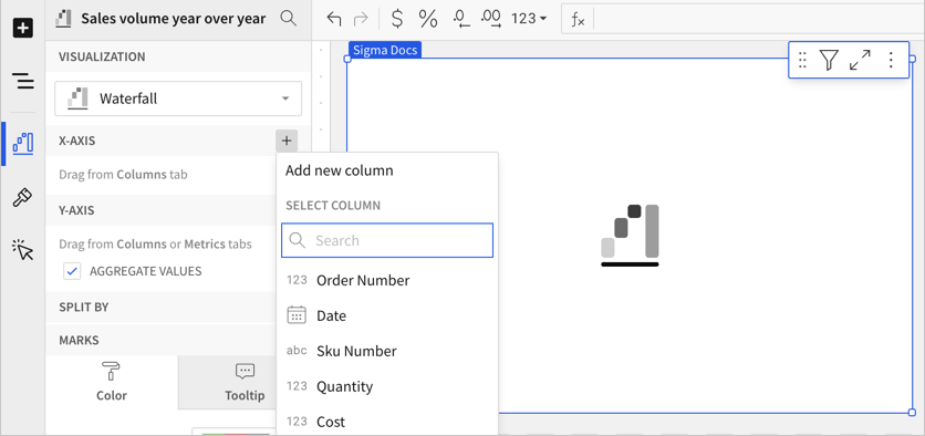
In the X-axis property, click
 Add column and select an option from the menu:
-
To generate categories based on distinct values in an existing column, search or scroll the Select column list and select the column name.
-
To generate categories based on a custom formula, select New column and enter the formula in the toolbar.
Select or replace an existing column by dragging and dropping a column name from the Columns list to the applicable axis property.
-
-
[optional] Adjust how the source column data is categorized and displayed in the chart:
-
Hover over the source column name, then click the caret (
 ) to open the column menu.
 -
Hover over any of the following items, then select option you want to use:
-
Truncate date - Categorize date values by the selected interval or unit of measure.
-
Transform - Convert the column to the selected data value type.
-
Format - Display axis and data labels in the selected format.
-
Availability of column menu items and corresponding options varies depending on the data type of the column. For example, Truncate date is only available for date values.
-
Define the variable
Define the chart variable, or what has changed over time, by configuring a source column. When you add a source column, Sigma automatically aggregates values associated with the same chart category.
-
In the Y-axis property, click
Add calculation and select an option from the menu:- To aggregate values of an existing column, search or scroll the Aggregate column list and select the column name.
- To calculate values based on a custom formula, select New column and enter the formula in the toolbar.
- To use a count the number of rows associated with each category, select Row count.
This visualization supports up to 25,000 data points. If the configurations result in a data set that exceeds this limit, the visualization displays the first 25,000 data points, and a warning message indicates that the chart is incomplete. To reduce the number of data points, aggregate the values or apply data filters to the visualization or source element.
You can also select an existing column by dragging and dropping a column name from the Columns list to the applicable axis property.
-
[optional] Adjust how the source column data is calculated and displayed in the chart:
-
Hover over the source column name, then click the caret (
) to open the column menu. -
Hover over any of the following items, then select the option you want to use:
-
Set aggregate - Calculate values based on the selected aggregation method.
-
Transform - Convert the column to the selected data value type.
-
Format - Display axis and data labels in the selected format.
-
To plot the source column data without aggregating values, clear the Aggregate values checkbox in the Y-axis property. If this results in an incomplete chart that exceeds the 25,000 data point limit, aggregate the values again or apply data filters to reduce the number of data points.
You can also use the toolbar to change the aggregation method (using the formula) and data label format.
-
-
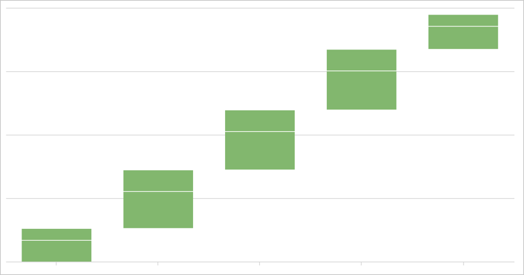
[optional] Repeat the previous steps to add additional y-axis source columns and create a stacked waterfall chart.
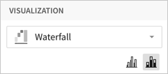
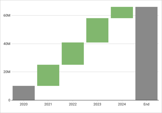
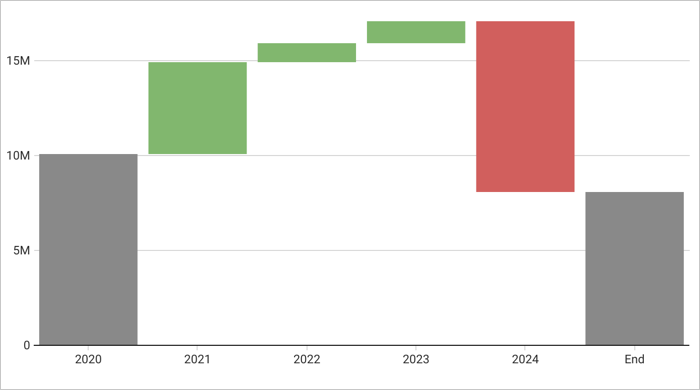
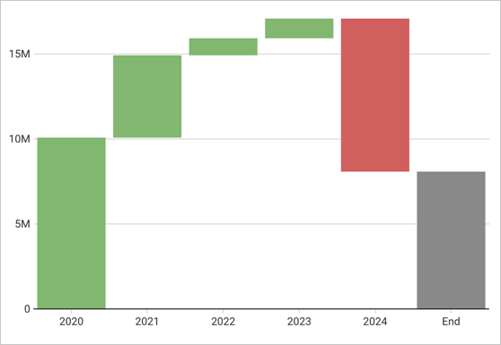
By default, a waterfall chart shows the sum of values over time. If you only have one y-axis source column, you can change the display formatting to show the difference in values across each period. See Customize waterfall shape.
Customize your waterfall chart
Sigma auto-generates source column names and chart titles to reflect the visualized data, but you can customize these fields as needed:
-
To rename a source column, double-click the column name in the X-axis or Y-axis property, then enter a new name. Changes are reflected in the default chart title.
-
To edit the chart title, double-click the title in the chart, then enter a new title.
Sigma auto-generates a default chart title. After you customize the title, the chart title no longer reflects changes to source columns and their names.
Advanced waterfall chart properties and formatting
Sigma features various properties and format options that give you the flexibility to build advanced waterfall charts, including stacked waterfall charts.
The following sections introduce configurations that can enhance your charts and help you deliver specific insights with meaningful and actionable information.
Change stacking
When you add multiple source columns, the values are stacked by default. You can change the chart formatting to remove the stacking.
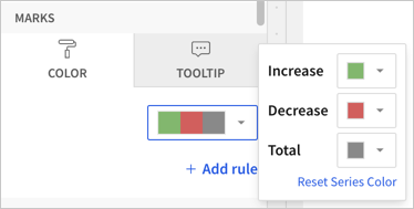
Configure mark colors
Configure waterfall mark colors in the ![]() Element properties > Marks > Color tab to differentiate data and highlight specific values.
Element properties > Marks > Color tab to differentiate data and highlight specific values.
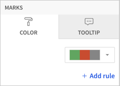
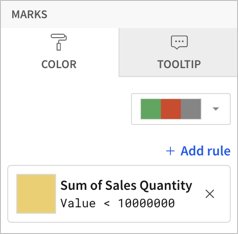
Add conditional formatting
In the ![]() Element properties > Marks > Color tab, you can configure formatting rules (+ Add rule) that determine waterfall mark colors according to value-based conditions, in addition to the increase and decrease colors used for the waterfall chart.
Element properties > Marks > Color tab, you can configure formatting rules (+ Add rule) that determine waterfall mark colors according to value-based conditions, in addition to the increase and decrease colors used for the waterfall chart.

Example:
When the conditions of multiple rules are met, Sigma applies the formatting rules in order of precedence, from top to bottom. Drag and drop rule blocks to reorder them as needed.
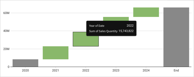
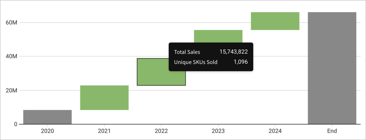
Customize tooltip fields and values
Customize chart mark tooltip fields in the ![]() Element properties > Marks > Tooltip tab to display the most relevant metrics and data attributes. For more information, see Customize chart mark tooltip fields.
Element properties > Marks > Tooltip tab to display the most relevant metrics and data attributes. For more information, see Customize chart mark tooltip fields.
For example, you can customize the default tooltip by removing the X-axis chart value from the tooltip and adding a new aggregate column, showing a distinct count of SKU numbers, in the Tooltip tab.
Customize waterfall shape
You can customize the shape of the waterfall. In ![]() Element format, select Waterfall shape and configure the available options.
Element format, select Waterfall shape and configure the available options.
Set the calculation to display
You can only choose the calculation to display for waterfall charts that display one source column (are not stacked).
Configure the start value
Choose from several options for the start value of your waterfall chart:
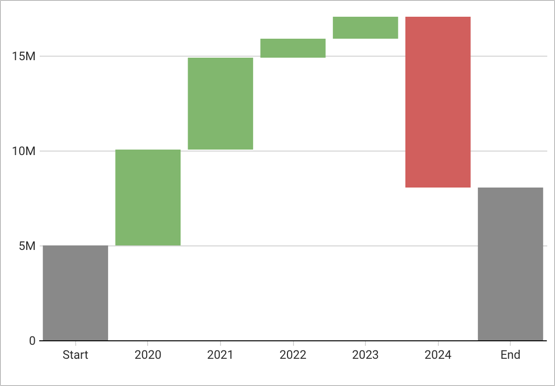
Configure the end value

Show connector lines
Select the Show connector line checkbox to show a line connecting the values on the waterfall chart. You can then select a Connector line color.