Sparkline
The Sparkline function creates sparkline charts from an array of JSON objects. If you want to create sparklines without JSON data, see SparklineAgg.
Syntax
Function arguments
Notes
- To create meaningful sparklines, add a grouping to your table. Groupings ensure multiple values are available for use in the sparkline. For more information on groupings, see Group columns in a table.
- Sparkline charts the values provided in the JSON column and returns variant data that renders as a sparkline chart in the table. You cannot copy from the chart canvas.
- To format the chart output of Sparkline (color, chart type, interpolation, etc), see Format sparklines in Create sparklines in a table.
Example
A table, PLUGS_ELECTRONICS_HANDS_ON_LAB_DATA, contains information on an electronic retailer’s sales, including columns such as:
- Product Name: Name of the electronic product sold.
- Month and Quantity Sold: JSON data formatted as
{x: [Date when an item was sold truncated to month], y: [Sum of quantity sold]}. For example:
The table is grouped by Product Name, so the Month and Quantity Sold reflects the sum of each product sold per month.
To see how the sales of each product have changed month to month, you can use Sparkline:
Your table may look something like:
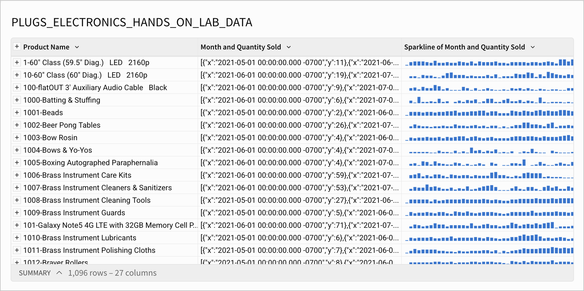
The sparklines here represent changes in the quantity of each product sold by month.
If you want to change the format (e.g. chart type, color, interpolation) of your sparklines, see Format sparklines in Create sparklines in a table.