Lesson six: Organization
Lesson six: Organization
Welcome to lesson six: Organization.
In the last lesson, we added interactivity to our workbook by configuring controls and actions. Using these elements, we defined how users could filter data in the workbook.
Now, we’ll organize our filters and charts according to some best practices of user experience and extensible design.
This lesson covers the following Sigma features:
- Modals
- Text elements
- Dynamic text
- Extensible design
- Chart formatting
A Note on Organization and Style
Up to now, we’ve improved our dashboard by adding functionality - new tables, charts, and controls. However, we’ve spent almost no time considering the appearance of our dashboard. As a result, it’s difficult to navigate.
Some design choices ultimately come down to personal preference: picking just the right shade of green, or choosing the perfect font for your brand. Those aren’t covered in this course.
Other design choices play important roles in making a clear, accessible user experience:
- Some color differences are harder for some users to see than others
- Placing elements in logical orders or groups can boost comprehension
- Larger details are noticed more immediately and perceived as more important
These are covered in this course. The next two lessons focus on making a clear user experience, and directing you towards features you can use for design and aesthetics along the way.
Managing global filters
Currently, we have five filters for our dashboard, at the bottom of the Arrival Delay vs Departure Delay page. They are functional, but there are a few key user experience problems we should consider:
- Space: As users request more filters and controls, our Arrival Delay vs Departure Delay page becomes longer and more cluttered
- Scope: These filters target our parent FLIGHTS table, meaning they impact all child elements on all pages, regardless of what page the filters themselves are on
- Legibility: When a user opens any page, how do they know what filters are being applied? Currently, they have to toggle to this specific page and look at the controls to see this
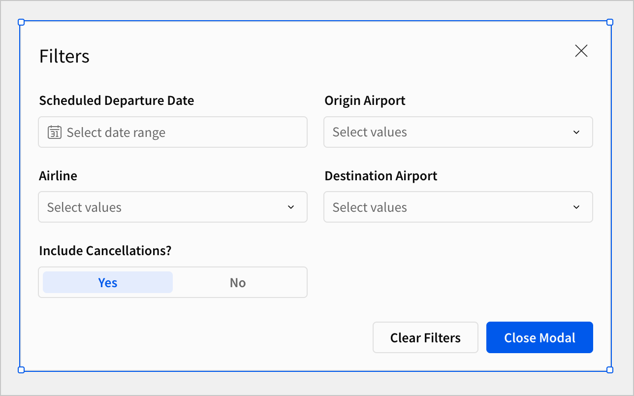
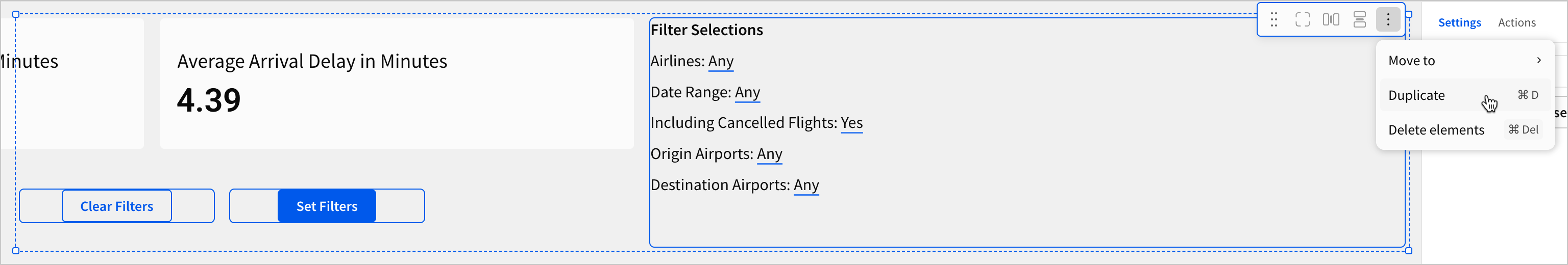
Let’s solve these problems by storing our filters in a modal, and displaying their settings on every page in a dynamic text element.
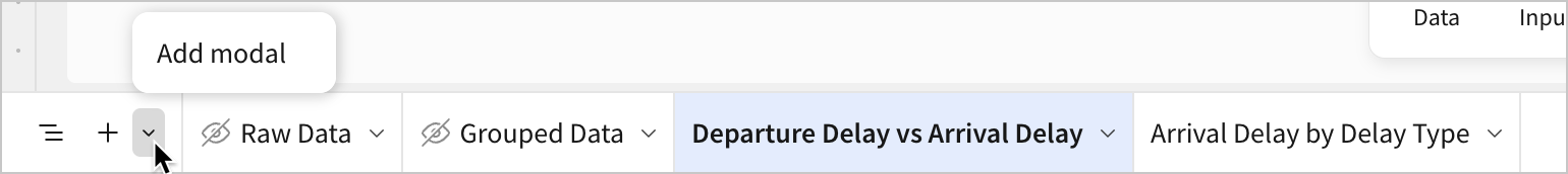
- At the bottom of the workbook, select
 More options > Add modal.
-
Return to the Arrival Delay vs Departure Delay page.
-
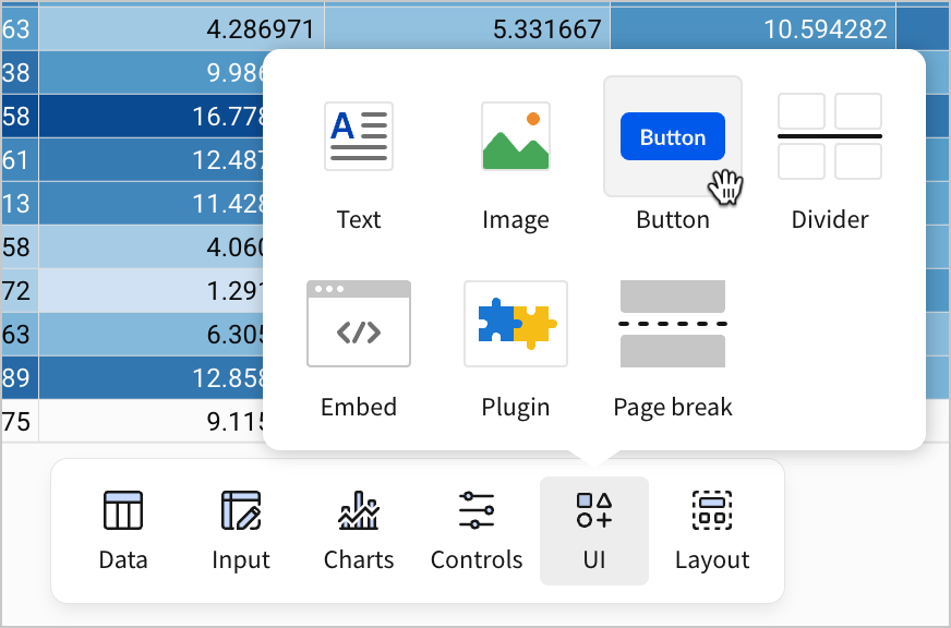
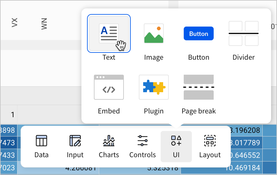
In the Add element bar, select UI > Button.
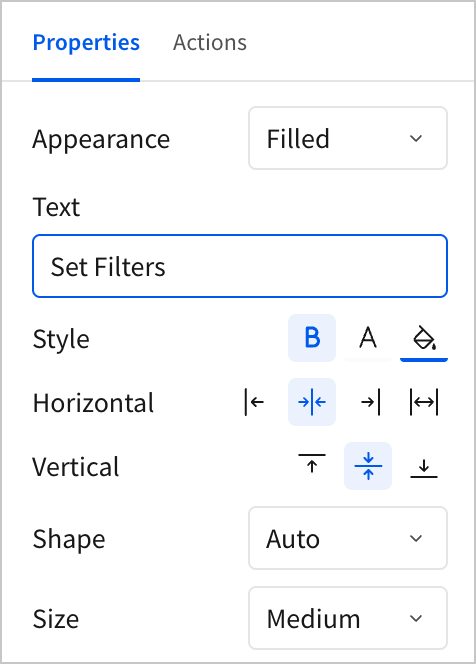
- In the editor panel, under Properties, change the Text attribute for the button to
Set Filters, and then pressenter(returnon Mac) on your keyboard.
-
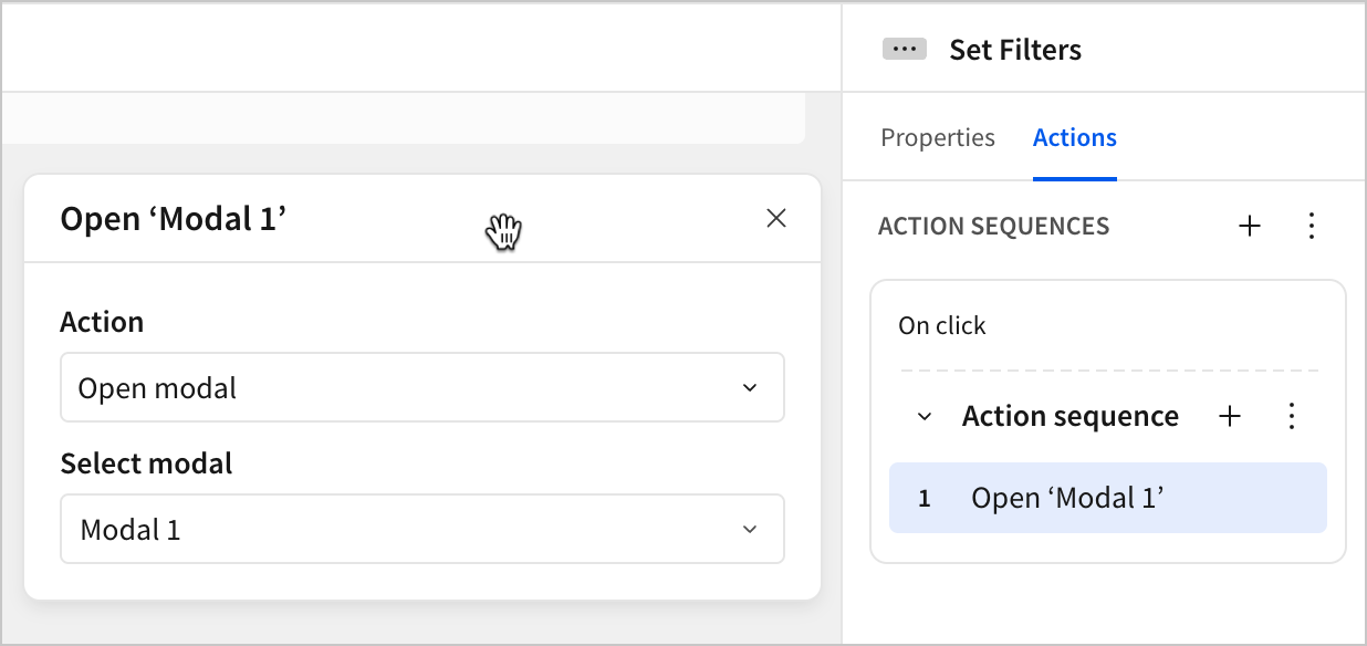
In the editor panel, select Actions.
-
Add a new action to the existing Action sequence.
-
For the Action type, select Open modal. Under Select modal, choose Modal 1.
- Click the new Set Filters button to see the modal open.
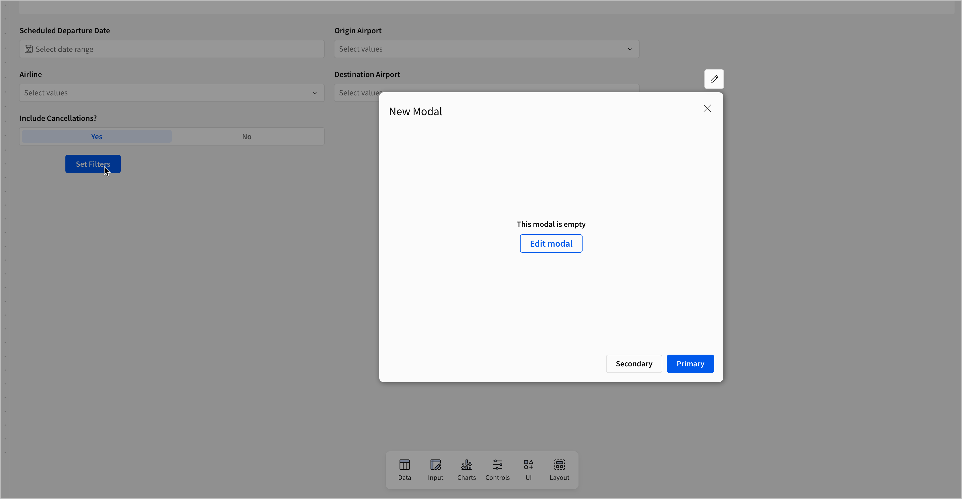
This is a modal in Sigma as an end-user might see it. When opened by an action, it obscures the current page, and provides an overlay with new content. Since modals are not part of the current page, we can open them anywhere in the workbook. This means they’re a great place to store globally applicable content, like filters or forms.
Can I reuse a modal?
Yes! Modals are distinct from any page in the workbook, and can be opened from any page. One modal can be opened by actions on several different pages.
For example, if you were to write a reminder about your organization’s data usage policies, and wanted users to be able to access it on every page, you could add an Our Policies button on each page that opens a modal with the explanation.
Users can’t directly navigate to modals in the published workbook like they would with a page. They don’t appear as an option at the bottom of the workbook. This means you have a high degree of control over when and how users access modals.
Let’s configure this modal for use with our filters.
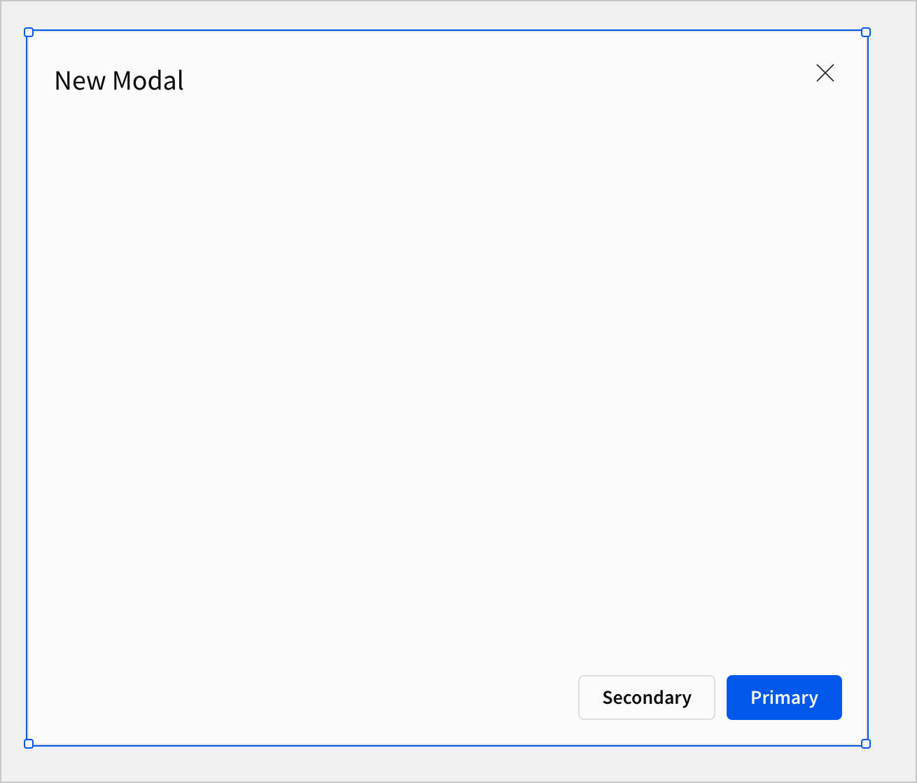
- If you still have the empty modal open, select Edit modal. Otherwise, click Modal 1 at the bottom of the workbook to begin editing the modal.
-
Double-click the current title - New Modal - and rename it to
Filters. -
Double-click the page title - Modal 1 - and rename it to
Filters. -
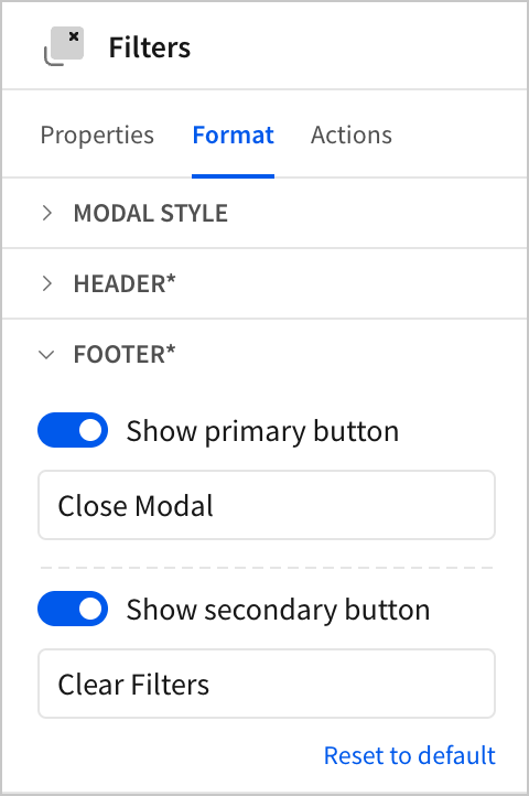
In the editor panel, select Format. Open the Footer section. Rename the Primary button to
Close Modaland the Secondary button toClear Filters.
-
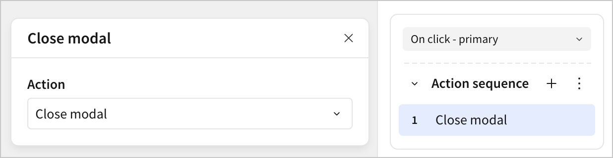
In the editor panel, select Actions.
-
For the Action sequence with an On click - primary trigger, add and configure a Close modal action.
-
For the Action sequence with an On click - secondary trigger, add a Clear control action.
-
Configure it to Apply to a Page / modal / popover, and select Filters.
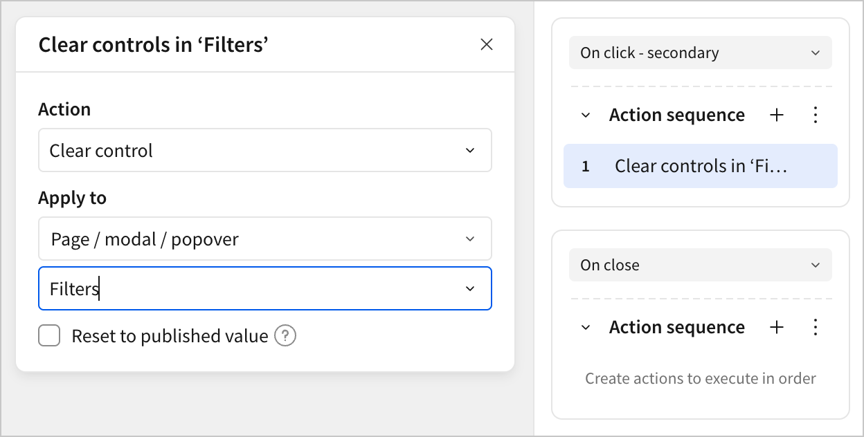
- Add a second action to the Action sequence with an On click - secondary trigger. Configure it as a Set control value action. Under Update control, select the Include Cancellations? control and set it to a static value of
Yes.
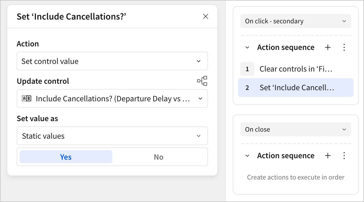
Why can’t we just clear a segmented control?
In the previous steps, we configured an action that clears the controls in the Filters modal, but then had to configure a separate action to reset the segmented Include Cancellations? control. Why is this?
This is because the segmented control is always set to one of its options. There’s no empty state. As a consequence, it’s not clear what clearing it should mean, and so clearing the control doesn’t change it.
However, in the context of our dashboard, we can decide that the “clear” state is the one that includes cancellations, and set a second action in the sequence to reset the control.
-
Navigate to the Arrival Delay vs Departure Delay page.
-
For each control, click
 More > Move to > Filters to move them to the modal.
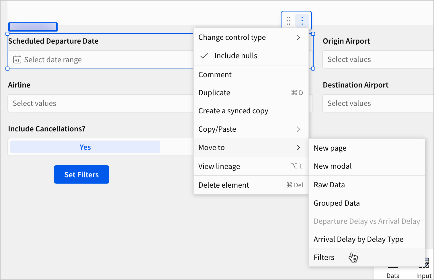
You can also click and drag your cursor or use ctrl+click (cmd+click on a Mac) to select multiple filters to move to the modal at once.
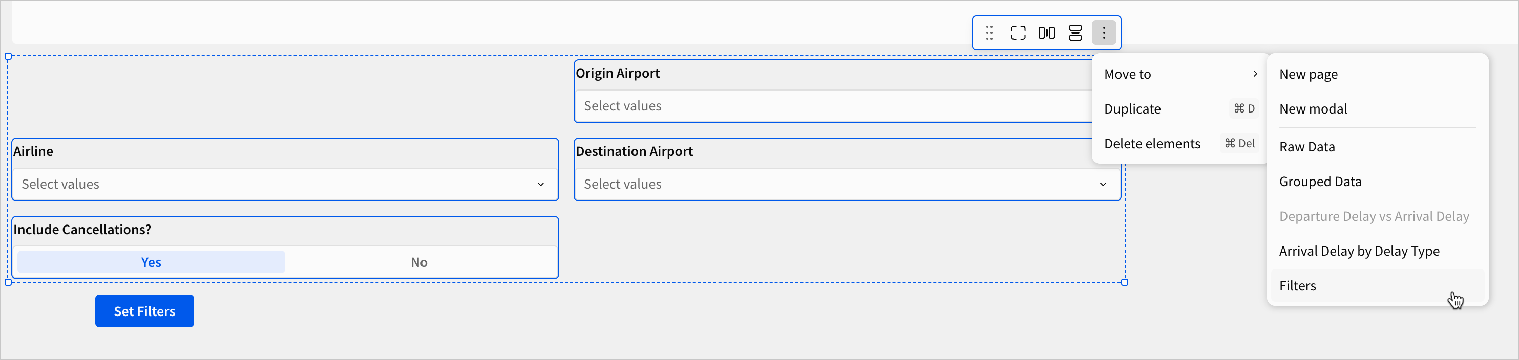
- When all five filters are in the modal, organize their size and position to your liking.
-
Navigate back to the Arrival Delay vs. Departure Delay page.
-
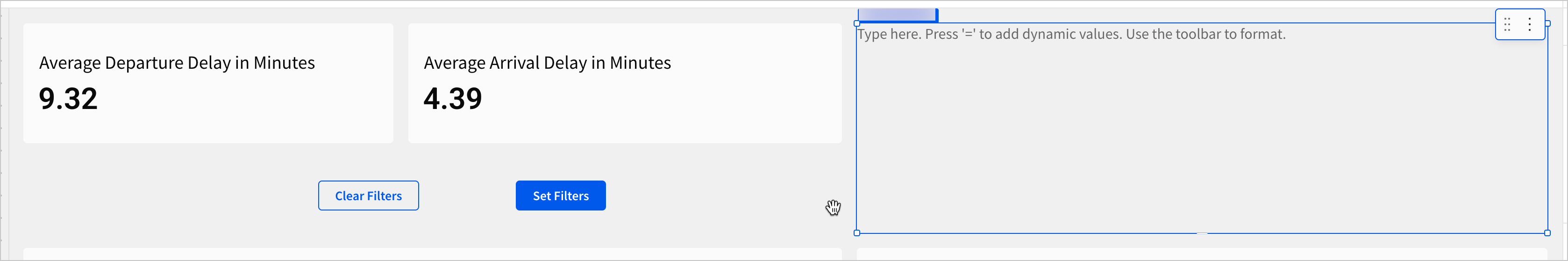
Move the Set Filters button element to the top of the page.
-
Right click the button, and select Duplicate.
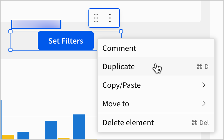
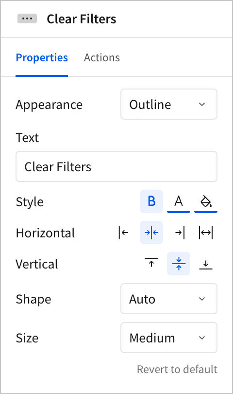
- Select the duplicate button. In the editor panel, under Properties, set its Appearance to Outline and its Text to Clear Filters.
- In the editor panel, select Actions, and configure the same action sequence you configured for the On click - secondary sequence in the modal.
Now, take some time to test the functionality of your new buttons and modal. Open the modal, set some filters. When you close the modal, the filter selections persist. You can clear them by using the Clear Filters button on the workbook page or back in the modal.
This is a strong start for a user experience, but we can make it even more intuitive and responsive. Recall that at the beginning of this section, we observed three problems about the existing layout of our filters: space, scope, and legibility.
We’ve solved the space problem by moving the filters into their own modal, giving us more space on the workbook page. We’ve even begun to solve the scope problem by storing our global filters outside of a specific workbook page. However, we still can’t access the modal from all workbook pages, and we certainly haven’t made the filter contents legible globally.
Let’s solve these problems by configuring a dynamic text element that displays control settings, and then copying our new on-canvas filter controls across all pages.
- To start, make some space at the top of your workbook page, like in the screenshot below.
- In the Add element bar, select UI > Text to add a text element to the workbook page.
- Bring the new text element to the blank space we created at the top of the page.
- Copy the following text into your text element:
-
Put your cursor in the blank spot after the word
Airlines:. -
Press
=on your keyboard to open the formula bar.
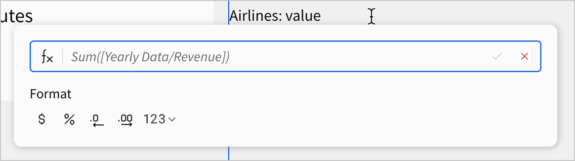
- Copy the following formula into the formula bar and press
Enter(returnon Mac) on your keyboard:
When you press Enter, the dynamic text populates.
This formula uses an If statement to check the number of items selected in the [control-airline] filter from our filters modal. If there are no items selected, the formula returns the text value Any. If there are items selected, it returns the items listed in [control-airline] as a text value. Now, we can see what values are set for the filter without having to look at the control itself. Even when the modal is closed, users can read this dynamic text to see what is selected.
Using our Control IDs from previous lessons
In previous lessons, whenever we made a control, we took time to set the Control ID field to a particular value. In previous lessons, the benefits of this may have been unclear, but they become indispensable when targeting several controls in formulas.
Consider now a workbook with dozens or even hundreds of control elements. Without a strong naming convention, identifying the right control for a formula can become laborious and time-consuming.
-
Let’s configure similar dynamic text for each of our controls, to display their contents dynamically in this text element.
-
Use the following formulas for the corresponding line in the text element:
Date Range:
Include Cancelled Flights:
Origin Airports:
Destination Airports:
- Click Clear Filters.
Your dynamic text appears like the screenshot below:
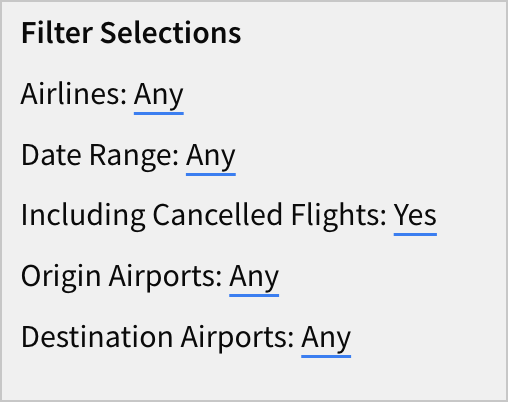
We can now read the contents of our Filters modal from this page without having to open the modal or read the controls themselves directly. Though these controls are relatively simple to interpret, if we were to build more complex controls, a dynamic text representation like this might be the best way to make the filters legible to users.
For now, let’s finish configuring our global filters by copying our buttons and dynamic text to our other dashboard page.
-
Using
ctrl+click(cmd+clickon Mac), select the text element, Clear Filters button, and Set Filters button. -
Select
More options > Duplicate.
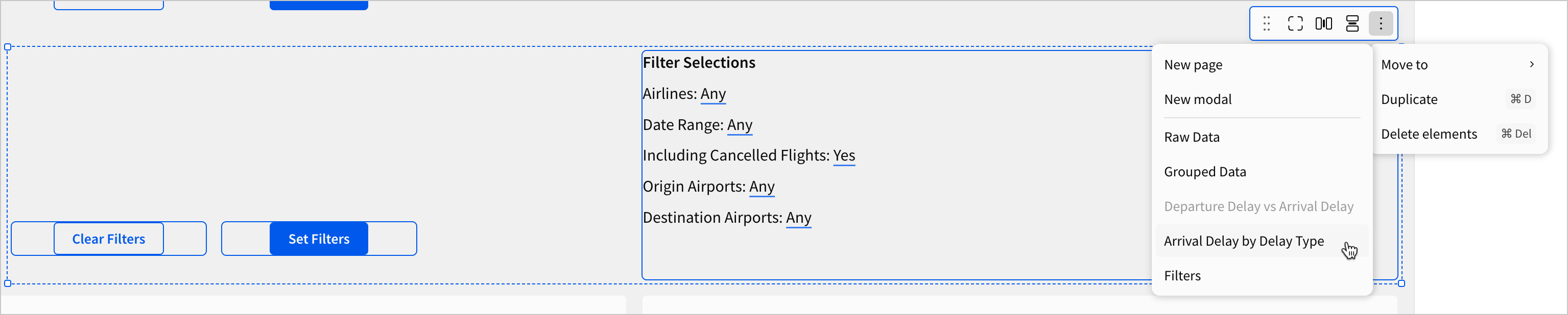
- Select the duplicates, and then More options > Move to > Arrival Delay by Delay Type.
Test the buttons and dynamic text on this page, and notice that they work identically to how they did on the page where we first created them. We have now solved the problems of space, scope, and legibility for our filter elements. They can be accessed from any page without cluttering the space, they impact all pages, and their current settings can be read on all pages.
How would we expand this design in the future?
Throughout this tutorial, we’ve focused on extensible design. Choices made as early as lesson two, like building off of one parent table, are paying off now.
If we wanted to add another control, we might create it from our parent FLIGHTS table, move it to our Filters modal, and then copy-paste a new dynamic text entry onto each page to display its contents.
If we wanted to add another workbook page, we might copy-paste the buttons and text element from our existing workbook pages onto the new page, instead of having to copy-paste every control and synchronize them across the pages.
- Click Publish save your work to the published version.
Chart settings and style
To round out our workbook, let’s add in a couple more charts to help us clearly organize information for a user, and provide some information they might want that isn’t currently available.
-
Navigate to the Arrival Delay vs Departure Delay page.
-
Select the pivot table Departure Delay by Month and Day of the Week. Click
More > Duplicate. -
Rename the duplicate element Arrival Delay by Month and Day of the Week.
-
In the editor panel, under Properties, replace the Value of Avg of Departure Delay with Avg of Arrival Delay.
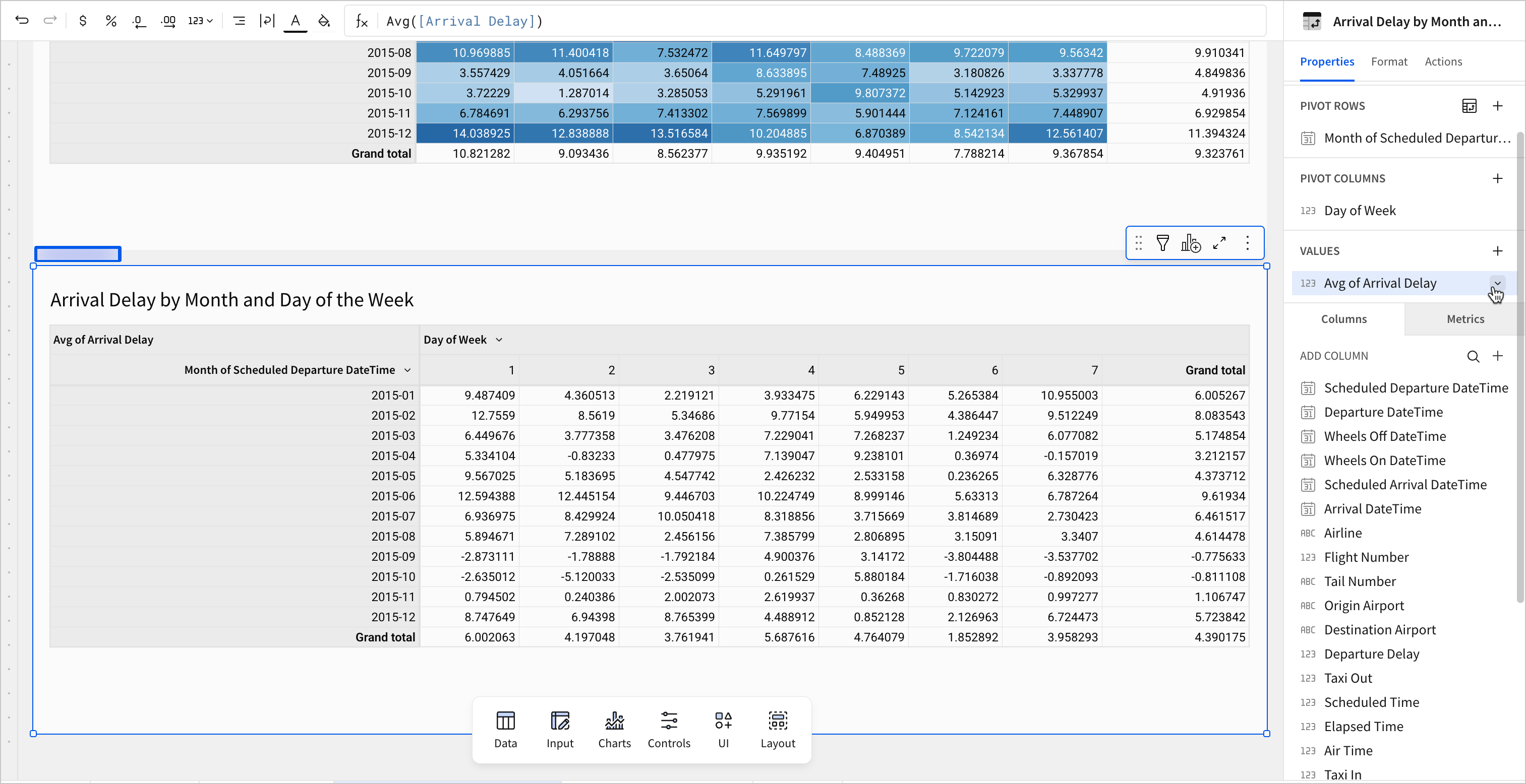
-
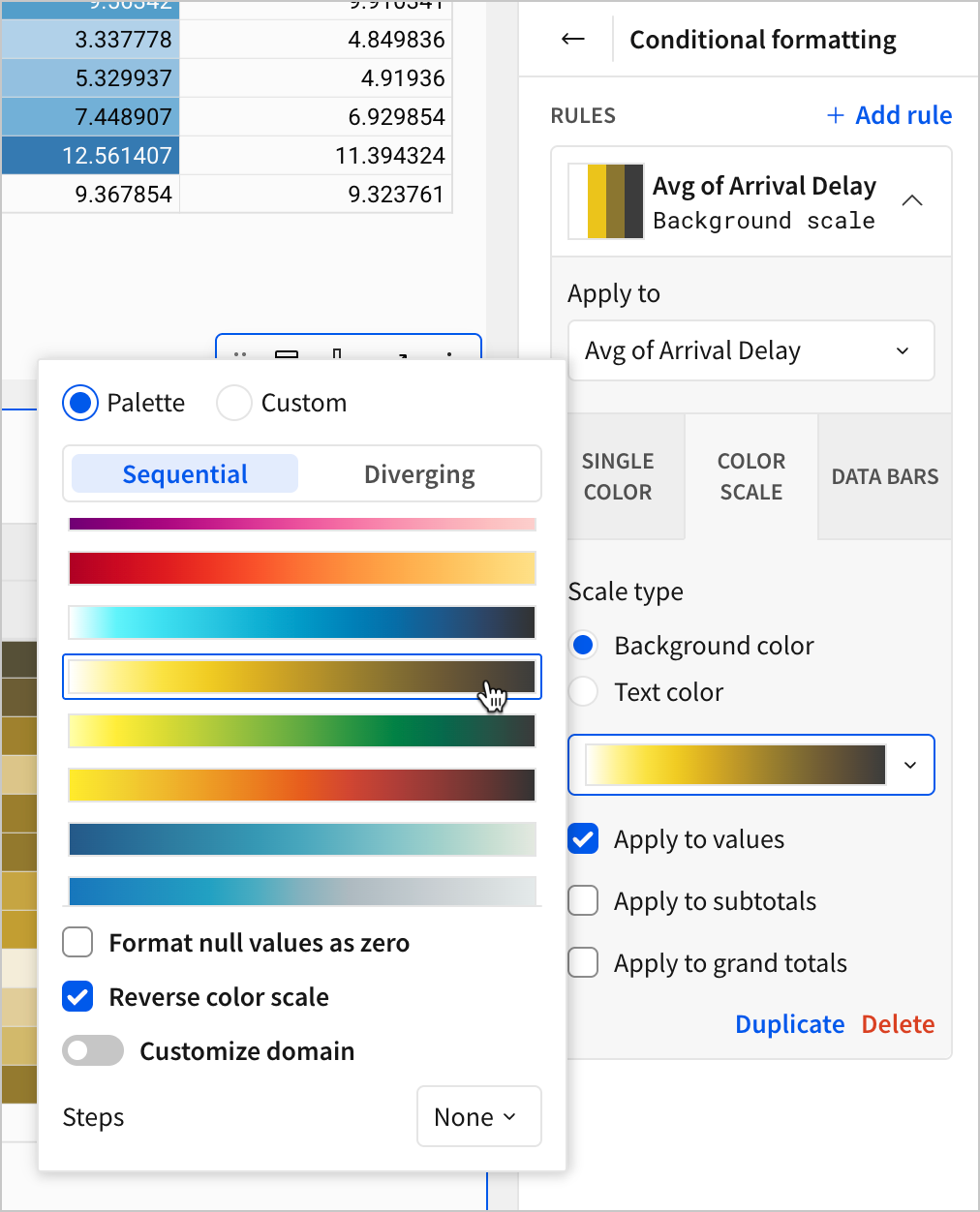
In the editor panel, select Format > Conditional formatting.
-
Click Color scale. Select this yellow gradient and select Reverse color scale.
-
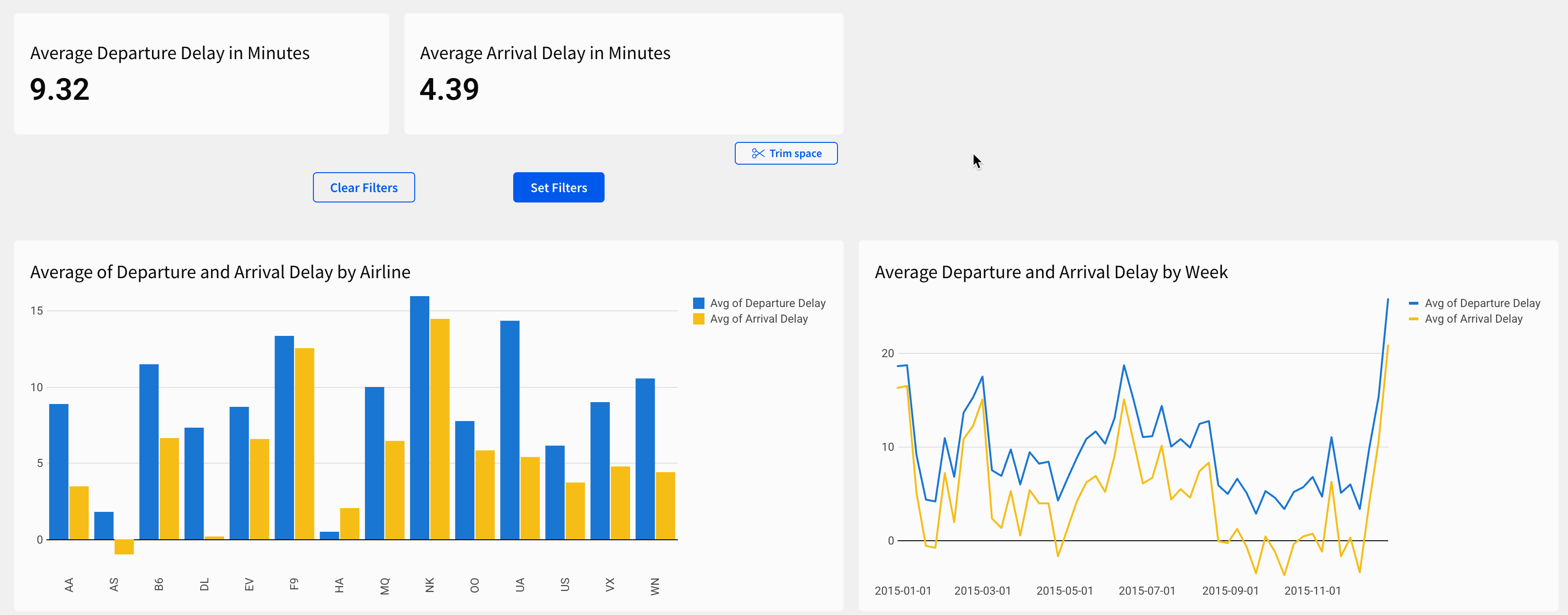
Move the new Arrival Delay by Month and Day of the Week pivot table side-by-side with the Departure Delay by Month and Day of the Week pivot table.
-
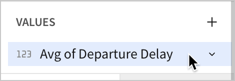
Now, select one of the pivot tables. In the editor panel, select the Avg of Departure Delay calculation under the Values section so that it’s highlighted.
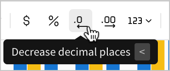
- In the top-left corner of the workbook, select Decrease decimal places from the toolbar.
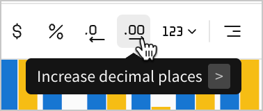
- Then, select Increase decimal places.
- Repeat these steps for the other input table. As a result, both show only one point after the decimal for each cell, reducing visual clutter by truncating the previously long series of numbers.
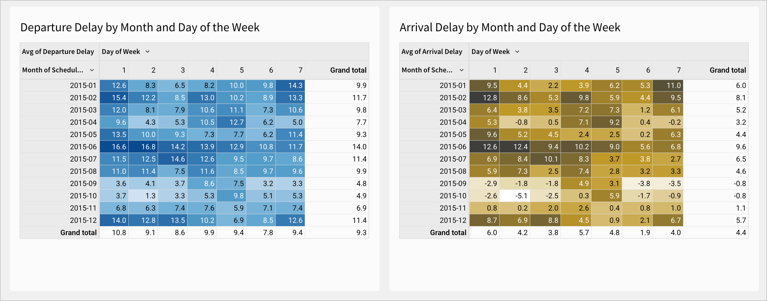
Let’s think through some of the practical reasons to make these design choices:
- Thematic Consistency: We already had both departure delay and arrival delay listed in our KPIs and both of our charts. If we provided the pivot table for only one of them, a user might naturally ask for the other.
- Visual Clarity: To help users read these tables as a pair, we configured them so that a darker color means a longer delay, regardless of delay type. This means that users can quickly scan both tables to see what times of year had the more or less delay.
- Color selection: We’ve used the same colors for departure delay (blue) and arrival delay (yellow) across the page. This helps them to scan across charts more quickly, and promotes extensibility.
- Necessary precision: By reducing each cell value to show only one digit after the decimal point, we removed unnecessary precision and visual clutter.
Let’s add one more chart to see other design choices in action.
-
Navigate to the Raw Data page.
-
Select the FLIGHTS - Delay Breakdown table and create a child chart element.
-
Select the new bar chart this creates. Select
More > Move to > Arrival Delay by Delay Type
- In the editor panel, configure the following settings for the new chart:
- Chart type - Line
- X-axis - Week of Scheduled Departure DateTime
- Y-axis - Sum of Late Aircraft Delay, Sum of Airline Delay, Sum of Air System Delay, Sum of Weather Delay, Sum of Security Delay
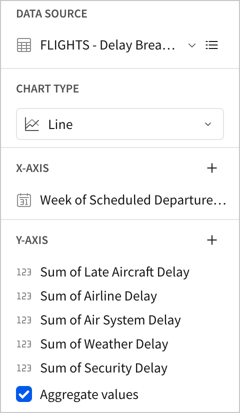
This creates a line chart with five lines, each of which charts the variation in one source of delay time over the course of the year.
- Rename the chart Arrival Delay by Delay Type.
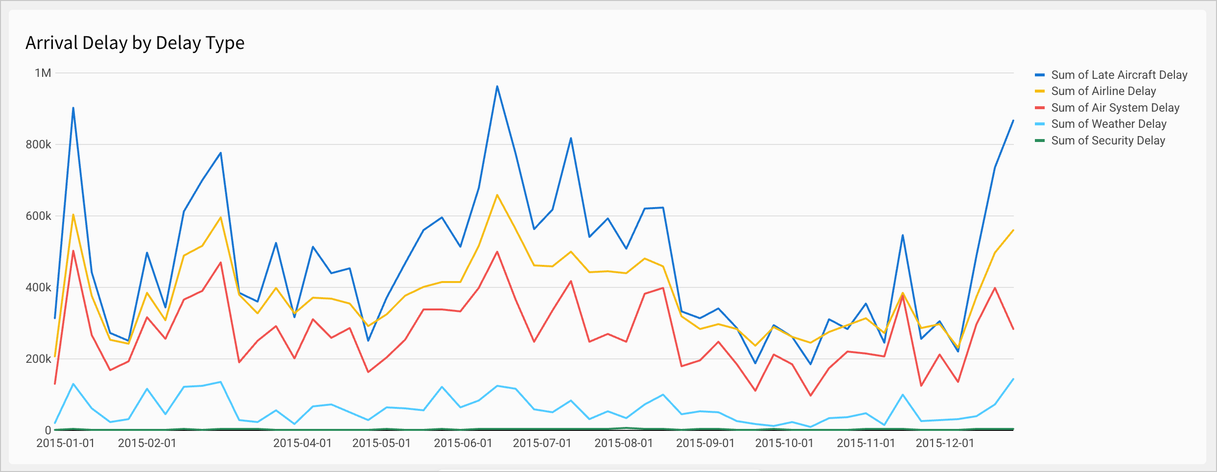
This provides a few design advantages when paired with our donut chart:
- Trends: Using a chart with a time-dimension on the x-axis like this allows us to see how each source of delay varied over the course of the year.
- Sums for each week: Since we used the sum of each delay type in our y-axis, we can hover over the line for any week in our chart to see all five delay type sums in a tooltip, which we didn’t previously have access to on this page.
A user on this page could now observe trends in both the totals and averages for delay times based on global filter settings.
- Click Publish to save your work to the published version.
Conclusion
At the end of lesson six, we’ve made some basic design choices that made our dashboard more organized and easier to expand in the future. We chose how to handle our global filter options, and filled in some gaps in our dashboard pages.
To do that, we learned about the following:
- Modals
- Text elements
- Dynamic text
- Extensible design
- Chart formatting