Lesson seven: Style
Lesson seven: Style
Welcome to lesson seven: Style.
In the last lesson, we organized our workbook around a clear user experience and a design that’s easy to maintain.
Now, let’s focus on the layout and style of our workbook by implementing layout elements, as well as workbook themes.
This lesson covers the following Sigma features:
- Image elements
- Container elements
- Layout elements
- Workbook settings
- Themes
- Account types and permissions
Layout
Let’s take a final pass through our workbook pages to polish the layout, and learn about a few more Sigma elements we can use to organize workbook contents.
-
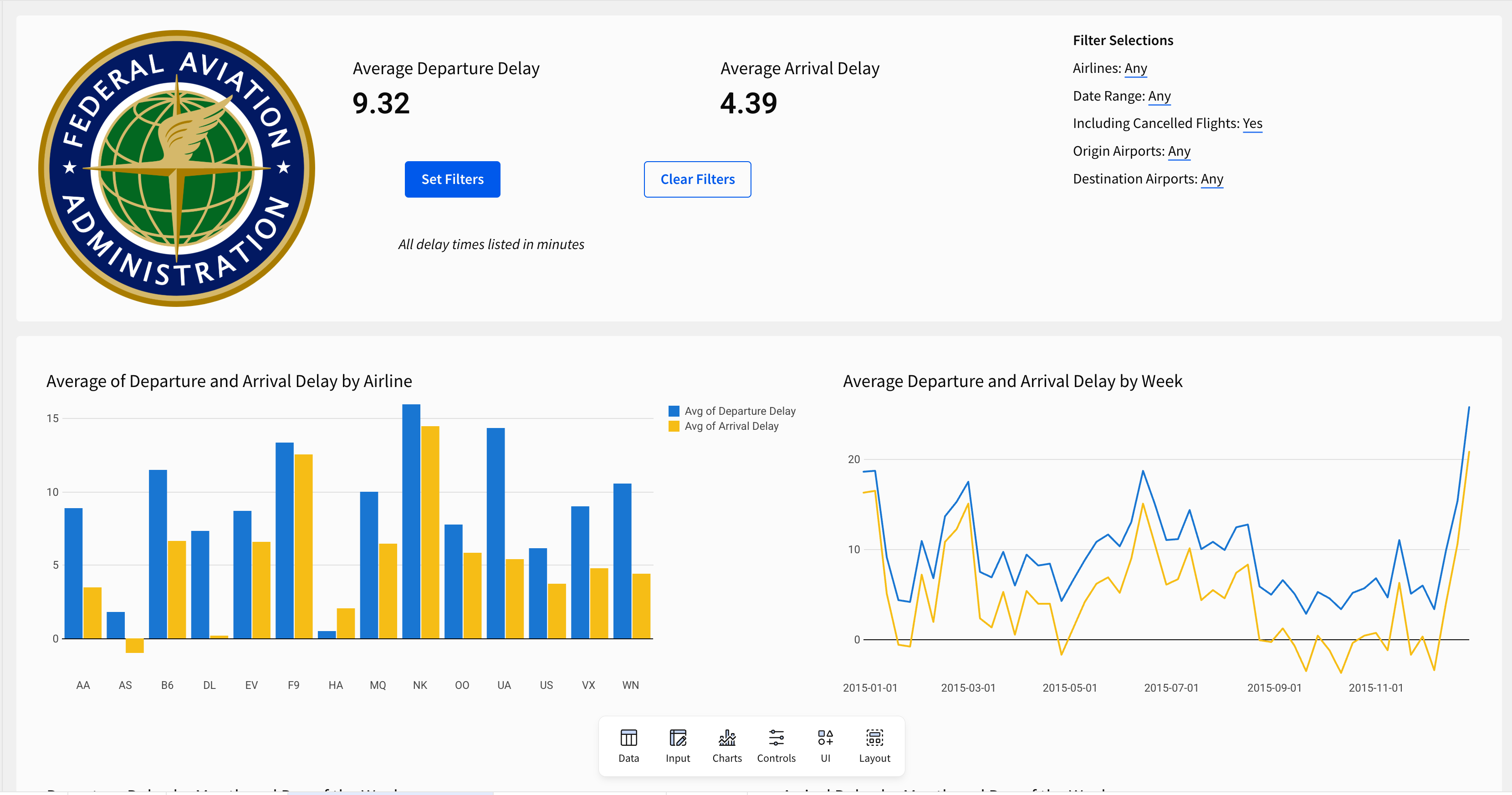
To start, navigate to the Departure Delay vs Arrival Delay page.
-
From the Add element bar, select UI > Image.
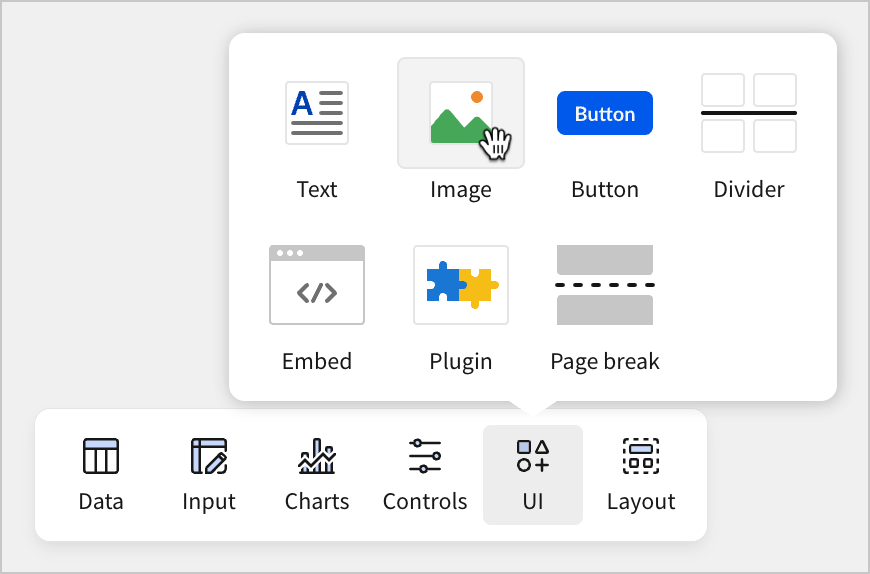
Image elements can be used to display an image file. You can download this symbol for the Federal Aviation Administration to test this out.
- Right-click this image and select Save Image As…
![]()
-
Give the file a name, and save it to a location of your choice.
-
Navigate back to your workbook page. Select Add Image on the image element, and select your image from the file browser.
-
The image element populates with the FAA icon.
-
Move the image element to the top of the page. Then, select the image element, the two KPI elements, two filter control buttons, and the text element that displays our filter values by using
shift+click,ctrl+click(cmd+clickon Mac), or click and drag. -
With all these elements selected, select
 Create container.
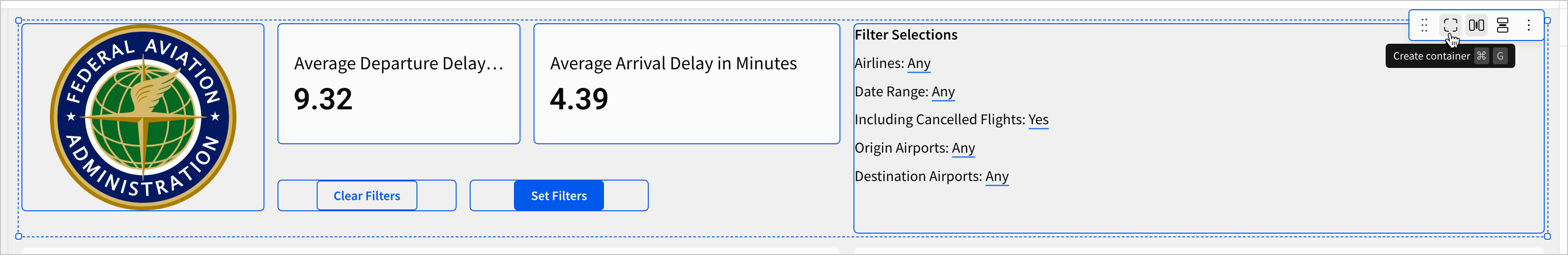
This creates a container element surrounding the selected elements.
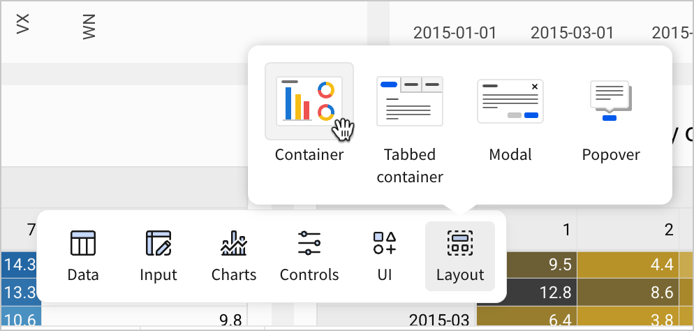
Containers are a layout element. In this case, we created a container by selecting multiple elements and using the Create container menu option. However, you can also create an empty container by selecting it from the Layout section of the Add element bar.
When should I use a layout element?
Each layout element has its own use case. Containers are useful for making clear groups of elements, or for styling multiple elements at once, but they aren’t always the best option. We saw in our last lesson that a modal was the obvious choice for content that needs to be globally accessible.
When selecting a layout element, consider the user experience.
Imagine a scenario where you’ve made a dashboard with a line chart showing daily sales over the course of the quarter. You get a request from management to add in lines for net profit and sales quantity. Instead of adding multiple lines representing different measures to the same chart, you might decide to use a tabbed container to show each of these different measures in separate charts viewed in the same place in the dashboard.
Consider why this might be the best option when it comes to using the available space most efficiently.
Containers offer two main advantages:
- Grouping: Because containers surround the selected elements, they make an obvious visual grouping that can be used to separate distinct groups of elements from one another. In this case, we’ve separated controls, images, and text from the various charts on our workbook page.
- Style: Containers offer style options for the spacing between elements, as well as background color and padding, which allows us to style multiple elements as a group, or to style our workbook page with multiple background colors.
- Select the remaining elements on the workbook page (bar chart, line chart, and two pivot tables) and create a container around them as well.
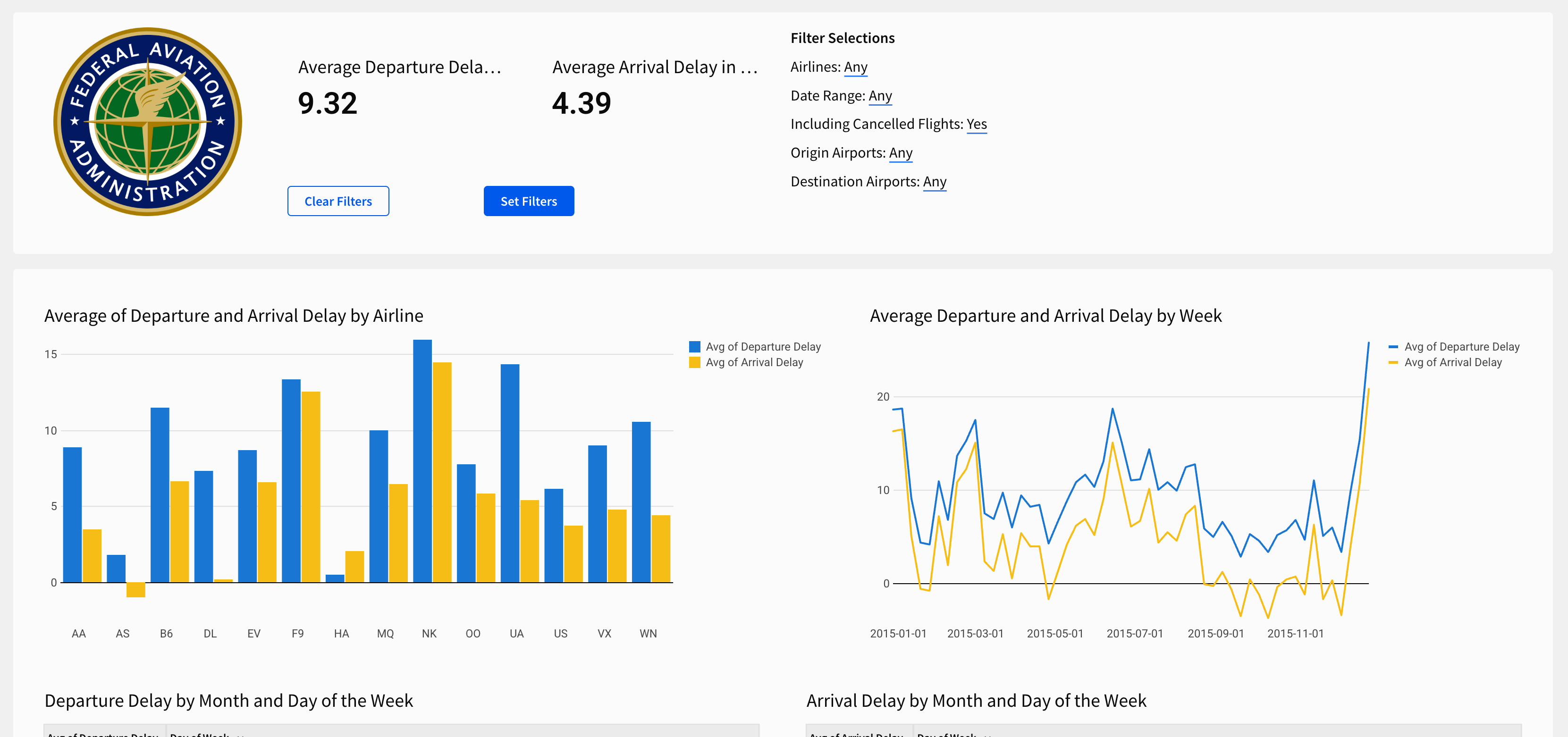
- To finish the layout and style of this page, implement the following small changes:
- Set the Size of the Set Filters and Clear Filters buttons to Large in the Properties panel
- Change the name of the KPI elements to Average Departure Delay and Average Arrival Delay, and add units (minutes) to each
- Create a new text element, and add it to the container with the image element. Enter the phrase
All delay times listed in minutes, and italicize it - Rework some of the spacing and arrangement in the top container to make it presentable
- Select the line chart Average Departure and Arrival Delay by Week. In the editor panel, select Format and open the Legend section. Turn the Show legend toggle off.
- Select the bar chart Average of Departure and Arrival Delay by Airline. In the editor panel, select Format and open the X-axis section. Change the orientation to 0 degrees.
The Departure Delay vs Arrival Delay page now looks like the screenshot below:
Now, let’s turn our attention to styling the Arrival Delay by Delay Type page.
-
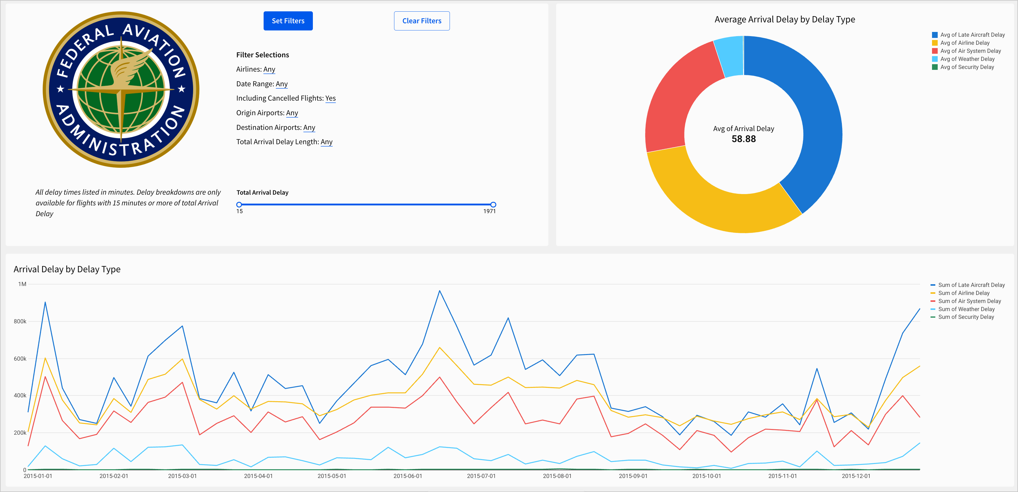
Navigate to Arrival Delay by Delay Type.
-
Add a copy of the image element with the FAA icon we added to the Departure Delay vs. Arrival Delay page.
-
Add a copy of the text element with the disclaimer
All delay times listed in minutes. -
Organize the page so that it roughly mirrors the Departure Delay vs. Arrival Delay page. In the example below, we opted to use a container in the top-left corner of the page to show buttons, text, the FAA logo, and the unique filter for this page. The donut chart is placed in the top-right corner, and the line chart runs horizontally along the length of the page below them.
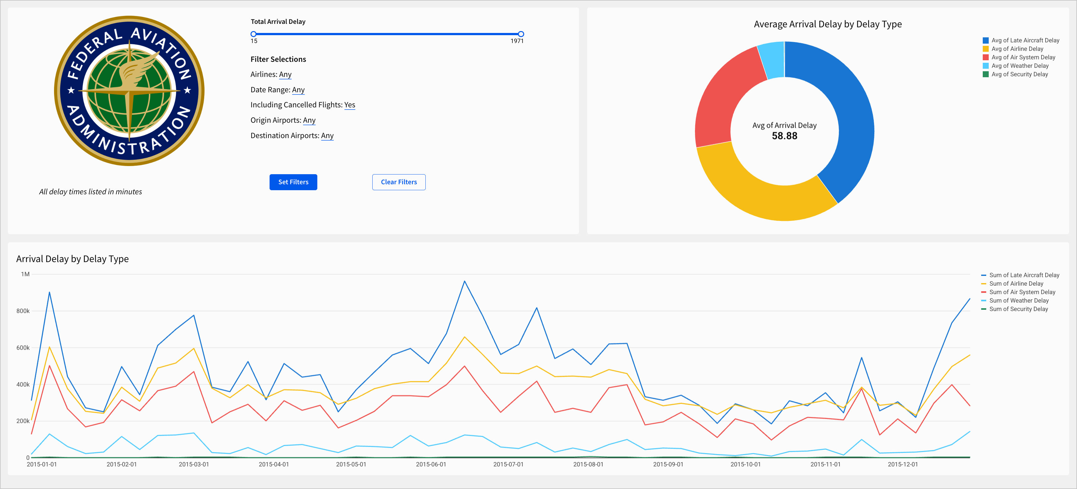
These placements compliment the shapes of these two charts, helping keep them legible. If we were to swap them, the line chart would appear squashed, and the donut chart would be far too large compared to the rest of the workbook contents.
- To finish the layout and style of this page, implement the following small changes:
- Set the Size of the Set Filters and Clear Filters buttons to Large in the properties panel.
- Update the
All delay times listed in minutestext to readAll delay times listed in minutes. Delay breakdowns are only available for flights with 15 minutes or more of total Arrival Delay - Rework some of the spacing and arrangement in the top container
- On the Clear Filters button for this page and in the Filters modal, add a Clear control action that clears the Total Arrival Delay range slider control.
- In the dynamic text element that displays Filter selections, add a line for
Total Arrival Delay Length:and press=on your keyboard to configure the following formula for it:If((([control-total-arrival-delay].min = 15) and ([control-total-arrival-delay].max = 1971)), "Any", (Text([control-total-arrival-delay].min) & " to " & Text([control-total-arrival-delay].max)))
How would I write this formula on my own?
We’ve provided some rather long formulas in this course to help simplify the building process. What resources are available to help write complicated formulas on our own?
In the documentation, you can refer to the function index to see available functions by type.
Alternatively, you can consult the formula assistant, an AI tool that can write or explain formulas.
In the case of this specific formula, consulting the documentation for the If function helps explain the structure.
The goal for this formula is to provide text that describes the current delay duration we’ve filtered to.
- In the first argument -
(([control-total-arrival-delay].min = 15) and ([control-total-arrival-delay].max = 1971))- we declare a condition to check if both the min and max values of the control are set to the extreme values. - In the second argument, we put the result to return if the first condition is met. In this case, since the flight duration hasn’t been filtered at all, we return the string
Any - In the third argument, we specify what to return if the condition in the first argument is not met. In this case, we return
(Text([control-total-arrival-delay].min) & " to " & Text([control-total-arrival-delay].max)))which reads the current minimum and maximum values from the control, converts them to text, and concatenates them with “ to “ in between them.
The Arrival Delay by Delay Type page now looks like the screenshot below:
Now both of our dashboard pages are standardized and organized.
- Click Publish to save your work to the Published version.
Workbook themes
In the last section, we reviewed style at the level of individual elements. We organized elements into containers, changed sizes, and added images. These small changes are important to the final product, but they’re not holistic in the same way as other design choices we could make. Let’s explore workbook themes to make universal style changes quickly.
-
Navigate to the Departure Delay vs Arrival Delay page.
-
Click on the background of the workbook page. Note that container element backgrounds are not the same as the background of the workbook. You can tell that you’ve clicked on the background when the editor panel shows options for the page, rather than any individual element.
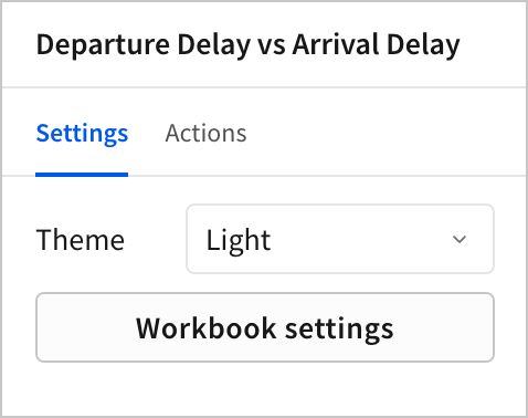
- Open the Theme dropdown menu and select Dark.
The workbook changes to Dark, a pre-configured workbook theme. The background turns black, text turns white, and other elements, like the Set Filter button, change to shades of blue that compliment the new black background.
- Open the Theme dropdown and select Light.
Themes are a powerful tool for styling one or more workbooks quickly. In the rest of this section, let’s configure a custom theme that we can apply to this workbook as well as other workbooks for our organization. In the future, we won’t have to configure the theme. We’ll be able to select it from the dropdown menu.
-
Click the Workbook settings button.
-
Open the Color section.
-
Open the Highlight color picker.
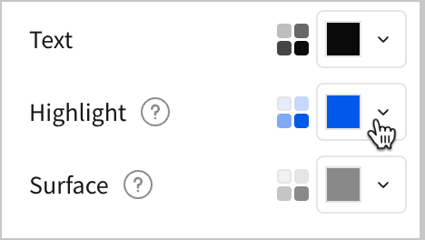
-
Select the dropper icon to Pick a color.
-
Using the color picker, hover over the green of the FAA logo, and click to select it as the Highlight color.

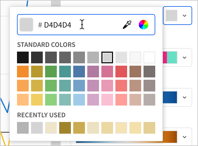
- Open the Canvas color picker. Click to edit the six-digit hex code for the canvas and enter
D4D4D4.
-
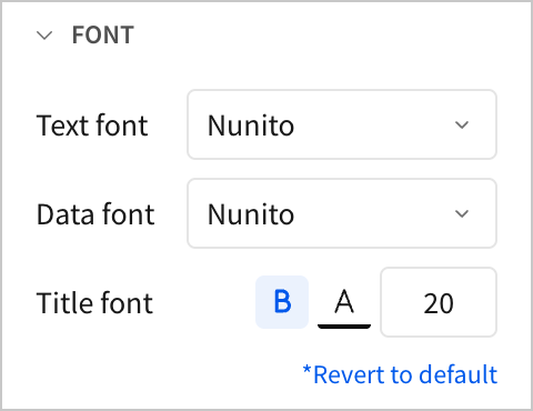
Close the Color section and open the Font section.
-
Set the Text font and Data font to Nunito. For Title font, select Bold.
-
Close the Font section and open the Layout style section.
-
Set Page width to Large and Spacing to Small.
-
Close the Layout style section and open the Table style section.
-
Set the following Table style settings:
- For Preset, select Presentation.
- For Cell spacing, select Medium.
- For Grid lines, select No grid.
- Under the Subheader tab, select Center align for both the Row header and Column header.
- Under the Cell tab, select Center align.
These changes demonstrate some of the ways we can style our workbook with themes. You might notice that some of our previous choices, like the colors in our charts, don’t compliment the theme well. In the future, we might want to apply a theme like this at the beginning of our workbook creation process. That way, we can make design choices about individual elements with our overall theme in mind. Let’s round out this lesson by learning how to save and reuse a theme in future workbooks.
To complete the next step, you must be assigned an account type with the Manage all workbook themes and fonts permissions enabled.
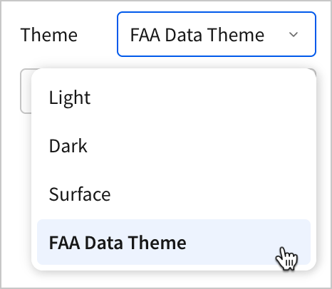
- In the Settings panel, open the Theme dropdown menu and select Save custom theme…
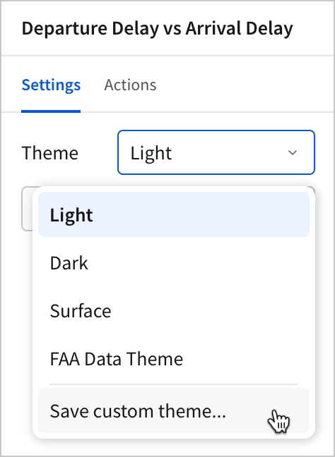
- In the menu, enter FAA Data Theme as the name for the theme. Then, click Save.
Do I have permission to do this?
You might not have the necessary permissions to save your current workbook settings as a theme available to all users in your organization. In this case, you can only access this feature if your account type has the Manage all workbook themes and fonts permission enabled.
Permissions in Sigma are based on account types. Each account type has several different permissions granted to it, which are controlled by admins. There are multiple default account types, but administrators can also select unique permissions to create custom account types.
Because custom account types offer so much flexibility, it might not always be obvious from your account type alone if you have permission to access a feature. You can always check the User requirements section of a feature in the documentation to identify the name of the permission your account type must have.
- Click Publish to save your work to the published version.
Conclusion
At the end of lesson seven, we’ve styled individual elements along with our dashboard as a whole. Our pages share a standard layout and theme.
To do that, we learned about the following:
- Image elements
- Container elements
- Layout elements
- Workbook settings
- Themes
- Account types and permissions