Intro to charts
Charts and visualizations are graphical data elements that add visual context to your analysis. They allow you to create, explore, and view your data in a more focused and digestible format.
By adding charts to a document, like a workbook or report, you can reveal patterns, trends, outliers, and correlations crucial to creating a compelling data narrative. Build each visualization to deliver specific data insights and answer important questions that help you make better business decisions.
This document introduces the types of charts Sigma offers and explains where to configure element properties and formatting.
Chart types
Effective charts are essential to telling meaningful data stories, but choosing the right type of chart can be a challenge. Consider the type of data you want to visualize, the questions you need to answer, and the users who will view and consume your analysis.
The following information can help you choose charts best suited for a clear and detailed narrative.
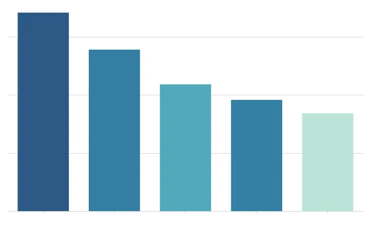 | Bar chartShow how values vary across categories or groups of data. Compare values against each other, in relation to a reference mark, or as proportions of a whole. See Build a bar chart. |
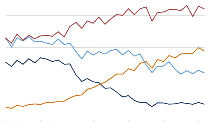 | Line chartShow how values of one or more metrics change over time. Spot trends and identify anomalies in your dataset. See Build a line chart. |
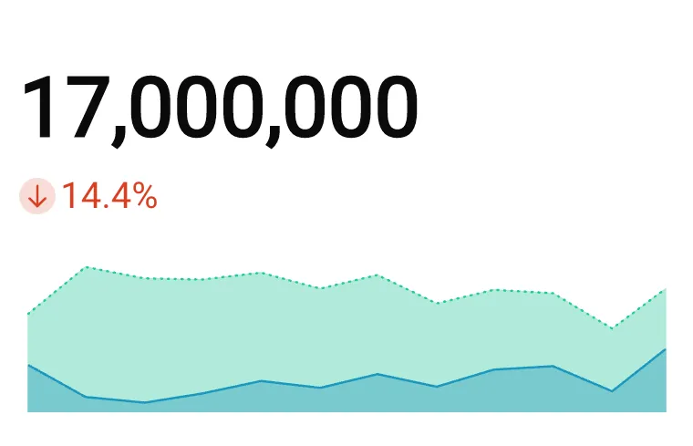 | KPI chartHighlight a single metric value to measure performance or progress toward a goal. Summarize the total value for a specific period, compare the value over time, or measure it against a benchmark or target. See Build a KPI chart. |
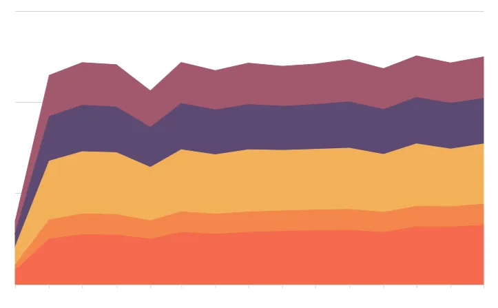 | Area chartIllustrate the magnitude or cumulative values of one or more metrics over time. Compare categories or groups of data, or evaluate the data composition or part-to-whole relationship. See Area charts. |
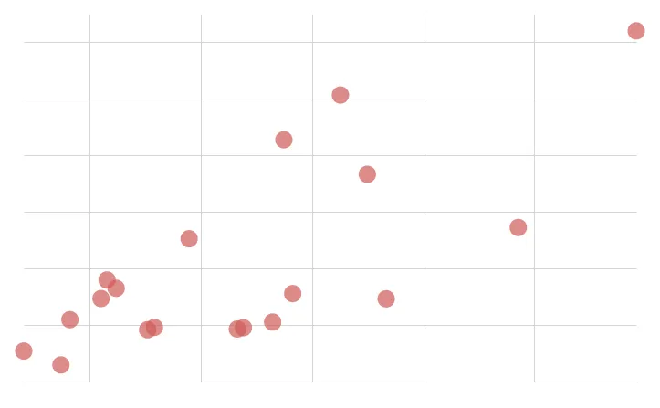 | Scatter plotDemonstrate the presence and strength of a correlation between metrics. Analyze patterns, understand distribution, and identify outliers in your dataset. See Build a scatter plot. |
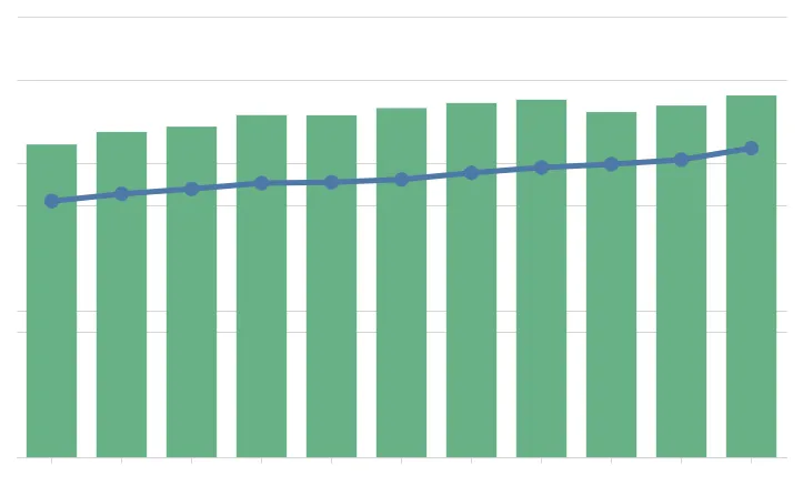 | Combo chartCombine bar, line, area, and/or point marks to compare multiple types of metrics. Evaluate the relationship to identify correlations and variations between the datasets. See Combo charts. |
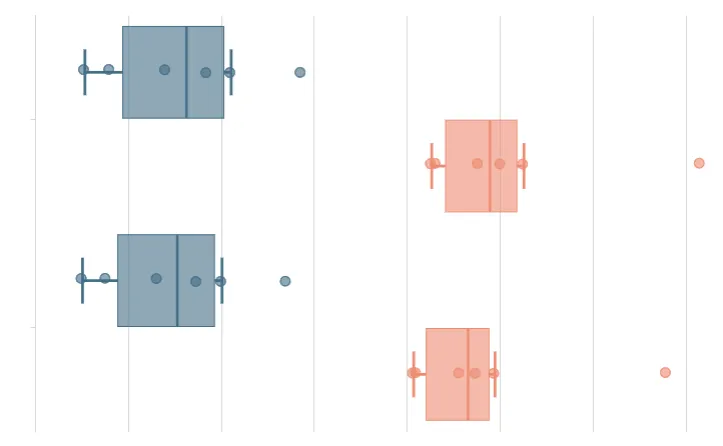 | Box chartShow the value distribution of one or more metrics. Mark the minimum, median, and maximum values, and identify outliers in your dataset. |
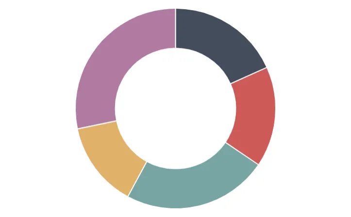 | Pie and donut chartsPortray values as proportions of a whole to convey the data distribution and part-to-whole relationship. See Pie and donut charts. |
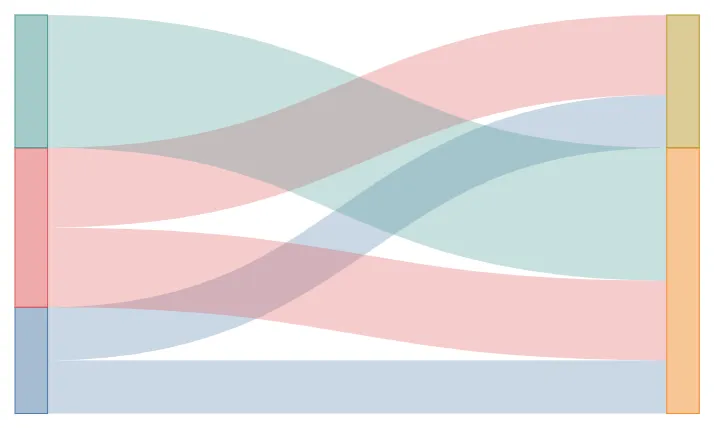 | Sankey diagramShow how data flows and changes throughout a process or system. Compare the movements and proportions of data across different paths to analyze distributions, workflow, networks, and more. |
 | Funnel chartMeasure values across sequential stages in a linear process. Gain insight into inputs across stages, identify bottlenecks and other issues, and assess the overall health of the process. See Build a funnel chart. |
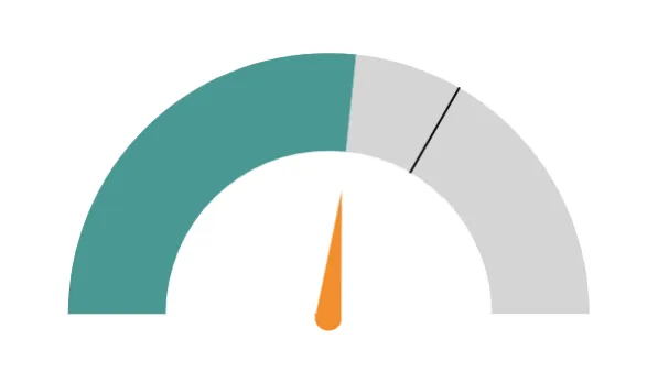 | Gauge chartMeasure a single-value metric against a radial scale. Evaluate growth, assess performance, and track progress toward a goal. See Build a gauge chart. |
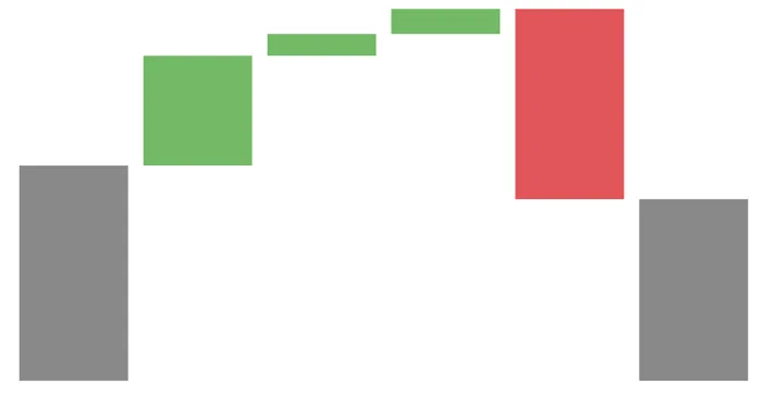 | Waterfall chartShow changes in one or two categories of data over a time period. |
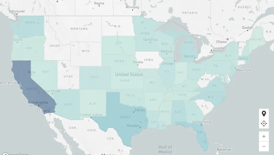 | Region mapIllustrate data distribution by region, including country, state, county, and city. Compare scale to identify variability and patterns across distinct geographical areas. See Maps. |
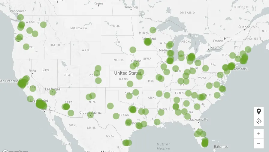 | Point mapIllustrate data distribution with precise positioning based on latitude and longitude coordinates. Reveal geospatial patterns and identify outliers in your dataset. See Maps. |
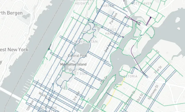 | Geography mapIllustrate geospatial objects on a map using geography (WKT) or variant (GeoJSON) data. Demonstrate data distribution, reveal patterns, illustrate spatial networks, or assess data variability across distinct geographical areas. |
Custom configurations
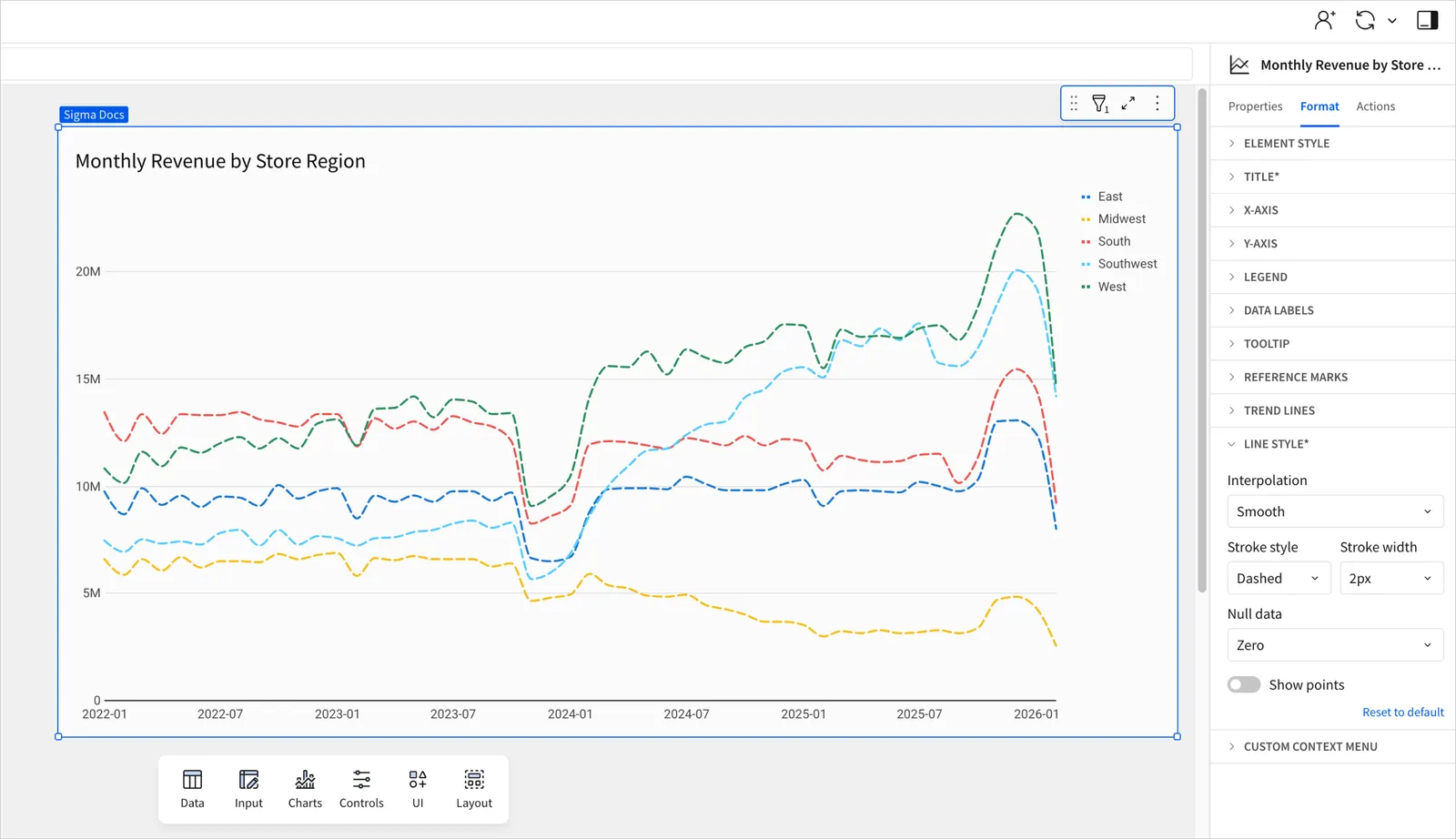
Charts feature various properties and formatting options that determine how your data is represented. With a wide range of customizable configurations, you can enhance your charts and ensure they present meaningful and actionable information. Options for customizing the configuration of a chart are located in the editor panel, under the Properties and Format tabs.
Properties
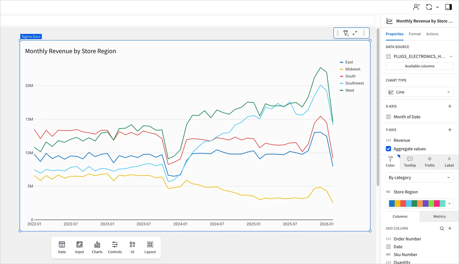
In the Properties tab of the editor panel, you can select a chart type and configure source columns to define chart properties, including axis categories, metrics, colors, trellising, and tooltips.
You can convert data value types, change the data aggregation or truncation, and customize chart markers and tooltips. Depending on the chart type selected, you may also have options to change the chart orientation, modify data stacking, and add trellis rows and columns.
Formatting
In the Format tab of the editor panel, you can customize the appearance of various components, including the chart’s title, size, and alignment. Depending on the chart type selected, you can also format the background, axes, legend, data labels, reference marks, trend lines, and more.