

Button elements
Add a button to create a one-click interaction in a workbook or application. You can customize the button display with text and icons, and configure it to trigger actions that kick off workflows, navigate to a specific destination, modify or refresh elements, export data, call APIs, and more.
Buttons are a UI element, allowing you to stylize workbooks and create seamless interactive experiences.
This document explains how to create and customize a button element. For information about actions and action sequences that can execute when the button is clicked, see Action effects.
User requirements
The ability to create and customize a button element requires the following:
- You must be assigned an account type with the Full explore or Create, edit, and publish workbooks permission enabled.
- You must be the workbook owner or be granted Can explore or Can edit access to the workbook.
Add a button element
Add a Button element to your workbook.
-
Open a draft, custom view, or saved view of a workbook.
-
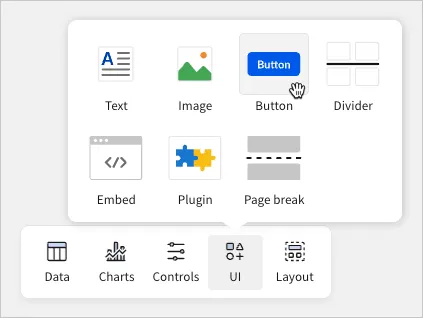
In the Add element bar, hover over UI and select Button.
Customize button properties
You can customize the element properties that define the button’s appearance, including the label, style, alignment, shape, and size.
In the editor panel, select the Properties tab, then configure the following settings for the button:
You can search for icons that fit your design needs. After selecting Change icon in the Properties tab, you can search for an icon by its name using the search bar. Additionally, you can search by category by selecting between All, Filled, Outlined, Toned, and Emoji.
Configure button actions
Configure actions and action sequences that execute when the button is clicked.
-
In the editor panel, select the Actions tab.
-
Configure actions and action sequences as needed. For information about specific action effects and how to configure them, see Action effects and the documentation linked in the table.