Explain charts with AI
The Explain this chart feature uses AI to instantly generate a description of any chart. Details can include key insights, observations, data distribution summaries, and other context that can enhance your understanding of visualized data and help drive informed decisions.
This document introduces AI-generated explanations for charts and explains how to access and utilize the feature.
The use of AI features is subject to the following disclaimer.
System and user requirements
The ability to explain a chart with AI requires the following:
- An AI provider must be configured for your organization. See Configure an AI provider.
- You must be assigned an account type with the Explain charts with AI permission enabled.
About AI-generated explanations
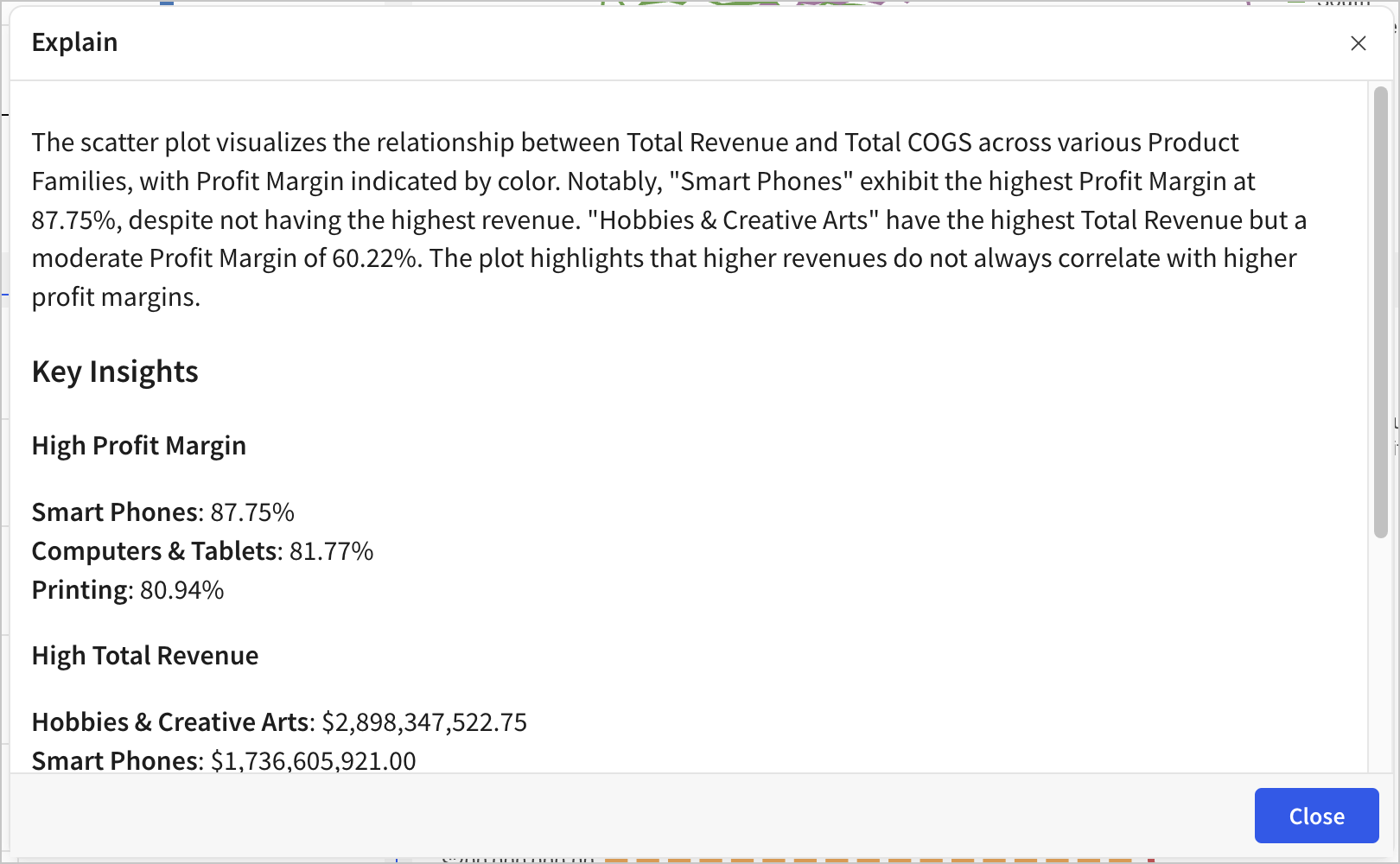
When you use the Explain this chart feature, Sigma captures a snapshot of the chart and passes this image, along with the chart’s underlying data, to your configured AI provider. The model then processes the information and analyzes the context to generate an explanation of the data visualized by the chart. Sigma presents this explanation and allows you to provide feedback about the results, which can be used to improve future responses.
Explain a chart
-
Open a workbook.
-
Hover over or select the chart that you want to explain.
-
In the element toolbar, click
 More to open the element menu, then select Explain this chart.
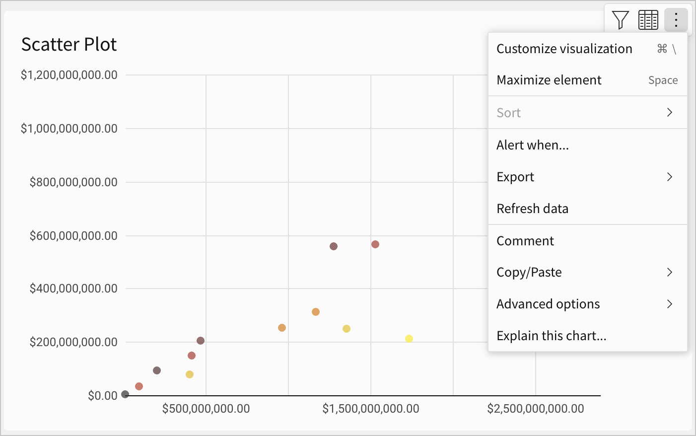
-
The Explain modal displays the explanation in real time, as it’s generated. Use or interact with the results as needed:
-
Click
 Copy text, then save or share the results (for example, paste it into a text element to supplement the chart).
 -
Click
 Helpful or
  Not helpful and submit additional details to help improve future responses.
-