
App tutorial: Build an employee feedback survey
In this tutorial, you'll learn the fundamentals and best practices needed to efficiently build a basic data collection app. The app includes a simple employee feedback form that collects and records the following information in an input table:
- Employee sentiment
- Net promoter score (NPS) rating
- Workplace preference
- Leadership feedback
- Date of form submission
As a basic data collection app, the resulting solution writes the user input back to your data platform, but it doesn't integrate source data or feature any analytics. Both, however, can be incorporated into the app to meet expanded objectives.
When you successfully complete this tutorial, you'll have a working app like the one embedded below. You can submit the form and see how the data is recorded in the Form submissions input table.
The input table is displayed below to demonstrate how form submissions are recorded. In a real-world implementation of this app, the input table would not be visible to form responders.
Required tasks
To build the employee survey app, you'll need to complete the following tasks in the order listed:
- Task 1: Create and save a workbook
- Task 2: Build an input table
- Task 3: Build the form
- Task 4: Configure interactivity
Key considerations for apps
In Sigma, apps are often built with several layers of dependencies and interconnected components, which can include a multitude of data tables, control elements, actions, etc. Maintaining referential integrity (the validity and consistency of relationships between data, elements, etc.) can become a challenge, whether you're building a simple data collection form, leveraging existing workbook content, or expanding the scope of the app.
To prevent referential issues, it's important to implement clear, consistent naming conventions while utilizing the workbook architecture and layout elements to organize your app components. This tutorial provides guidance to help you establish referential integrity that supports the primary objective of this app and lays the groundwork for an expanded app use case.
Task 1: Create and save a workbook
Workbooks are the foundation on which apps are built, so your first task is to create and save a new workbook.
Sigma automatically stores all unsaved/unnamed workbooks as timestamped explorations in your Recent page. So while it isn't essential to immediately save it with a specific name and destination, doing so can ensure you can quickly locate and identify the workbook if you need to return to it later.
-
From your Sigma Home page, click Create New and select Workbook from the menu.
-
The new, unsaved workbook opens as an exploration. To save it as a named workbook, click Save as in the document header.

-
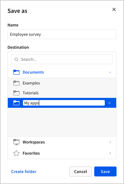
In the Save as modal, name the workbook and choose where to save it:
-
In the Name field, enter
Employee survey. -
In the Destination section, keep the Documents folder selected (default).
-
In the modal footer, click Create folder to add a subfolder to Documents, then enter
My appsas the subfolder name.Maintaining a designated folder for apps can improve document management and make it easier for you to search for and locate the workbook.
-
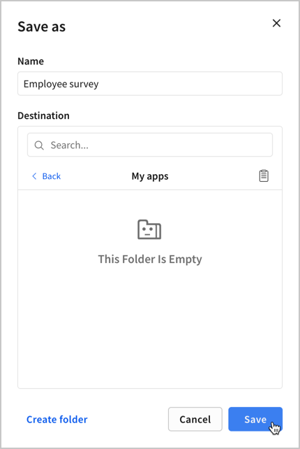
Select the new My apps subfolder.
-
Click Save.
-
Task 2: Build an input table
You're now ready to build your app. Begin by creating an input table to record data from the form submissions.
Starting with the input table allows you to establish the table schema based on the data you want to collect. Defining the table columns, data types, and relationships gives you a clear direction to efficiently build the rest of your app.
2.1 Create an input table element
The input table records form submissions as new data points that are written to your data platform.
-
In the Add element bar, select Input > Empty.

-
In the Select source modal, select the Sigma Sample Database connection, then click Create.
This is the connection that Sigma will use to write data to your data platform.

-
The workbook now displays a new input table element with a default text column. Double-click the default title ("New input table") to enable editing, then enter
Form submissionsto rename it.
2.2 Add columns to the input table
Each column corresponds to a data point collected through the form submissions.
Building the input table with clear structure and relevant data types ensures efficient mapping of columns to form fields when you configure the app interactivity.
-
Add a column to record employee satisfaction levels:
-
Double-click the default text column's header and enter
Sentimentto rename it.This column will record text values defined in a future task (Very satisfied, Somewhat satisfied, Neither satisfied nor dissatisfied, Somewhat dissatisfied, and Very dissatisfied).
-
-
Add a column to record NPS ratings (the likelihood employees will recommend the company):
-
In the table header, click the plus (+) icon and select Number from the menu.
-
Double-click the new column's header and enter
NPS ratingto rename it.This column will record number values from 0 to 10.
-
-
Add a column to record employee workplace preference:
-
In the table header, click the plus (+) icon and select Text from the menu.
-
Double-click the new column's header and enter
Workplace preferenceto rename it.This column will record one of three text values defined in a future task (Remote, Hybrid, and In-office).
-
-
Add a column to record employee feedback about leadership:
-
In the table header, click the plus (+) icon and select Text from the menu.
-
Double-click the new column's header and enter
Feedbackto rename it.This column will record open-ended text input.
-
-
Add a column to record the date and time of each form submission:
-
In the table header, click the plus (+) icon and select Date from the menu.
-
Double-click the new column's header and enter
Date receivedto rename it.This column will record a system-generated timestamp.
-
Your input table should now look like the screenshot below. If you don't intend to pre-populate data directly in the input table prior to collecting form submissions, delete the default empty rows.

Task 3: Build the form
Next, you'll build the form by configuring UI and control elements to present the survey questions and form fields.
When configuring control elements, it's important to implement a clear, consistent naming convention. Doing so can make it easier to identify individual controls and prevent referential issues. The naming convention in this tutorial follows this format:
form-<topic>, where topic is a single word that describes the information collected through the control.
3.1 Create the employee sentiment field
The employee sentiment field uses a collapsed List value control element that prompts employees to select one of five options from a dropdown. The employee's selection is then displayed in the collapsed field.
Using a collapsed list allows you to offer several options while taking up minimal space in the form.
-
Add a Text element to display the survey question:
-
In the Add element bar, select UI > Text.

-
In the new element, enter the following question:
Overall, how satisfied or dissatisfied are you with your current role and responsibilities?
-
-
Add and configure a List value control element as the response field:
-
In the Add element bar, select Controls > List value.

-
With the new element selected, open the Properties tab in the side panel and configure the value settings:
-
Keep the default value source (manual list) and type (text).

-
In the Values section, toggle the Set display values switch to the off position, then add the following values (in the order listed) in the Add text value fields. When you add a value, another Add text value field appears below it.
- Very satisfied
- Somewhat satisfied
- Neither satisfied nor dissatisfied
- Somewhat dissatisfied
- Very dissatisfied

-
To ensure employees select one of the five satisfaction levels, clear the Allow multiple selection and Show null option checkboxes (both enabled by default). The only selected option should be the Show clear button checkbox (also enabled by default), which allows the employee to clear the control after a value is selected.

-
In the Control ID field, clear the default ID and replace it with
form-sentimentto align with the established naming convention, then press Enter on your keyboard to save the change.You'll use this ID when referencing the control value in a later step.

-
-
In the side panel, open the Format tab and edit the element style and label:
-
Click the Element style header to expand the settings.
-
In the Placeholder field, clear the default text and enter
Select an optionto display this text when a value has not been selected.Customizing the placeholder text provides employees with relevant guidance on the type of response expected.

-
Click the Label header to expand the element settings.
-
Clear the Show label checkbox to hide the label.

-
The sentiment form field should now look like the screenshot below when the dropdown is expanded:

-
3.2 Create the NPS rating field
The NPS rating field uses a Slider control element that allows employees to set their rating by sliding a handle along a track or by clicking a specific position on the track.
Using a Slider control element saves space and enables single-click input with intuitive visual feedback.
-
Add a Text element to display the survey question:
-
In the Add element bar, select UI > Text.

-
In the new element, enter the following question:
How likely are you to recommend this company as a great place to work? (0 being not at all likely and 10 being extremely likely)
-
-
Add and configure a Slider control element as the response field:
-
In the Add element bar, select Controls > Slider.

-
With the new element selected, open the Properties tab in the side panel and configure the slider settings:
-
Set the Max value to 10, and leave the default settings for Min (0), Step (1), and Format (Automatic).
The resulting slider has a range of 0 to 10 and allows employees to move the slider handle left and right at intervals of 1.

-
In the Filter setting select = from the dropdown.
The slider control element isn't applied as a filter, but the setting affects how the slider is reset. When the "equal to" (=) option is selected, the slider resets to 0, which is the preferred behavior for the form.

-
In the Control ID field, clear the default ID and enter
form-npsto align with the established naming convention, then press Enter on your keyboard to save the change.You'll use this ID when referencing the control value in a later step.

-
-
In the side panel, open the Format tab and edit the element label:
-
Click the Label header to expand the label settings.
-
Clear the Show label checkbox to hide the label.

-
The NPS rating form field should now look like the screenshot below:

-
3.3 Create the workplace preference field
The workplace preference field uses a Segmented control element that allows employees to select one of three displayed options.
While you can use a List value control element for this field, a Segmented control element provides clear, scannable options in a compact display while enabling single-click input with intuitive visual feedback.
-
Add a Text element to display the survey question:
-
In the Add element bar, select UI > Text.

-
In the new element, enter the following question:
What work environment do you prefer?
-
-
Add and configure a Segmented control as the response field:
-
In the Add element bar, select Controls > Segmented.

-
With the new element selected, open the Properties tab in the side panel and configure the value settings:
-
Keep the default value source (manual list) and type (text).

-
In the Values section, toggle the Set display values switch to the off position, then add the following values (in the order listed) in the Add text value fields. When you add a value, another Add text value field appears below it.
- Remote
- Hybrid
- In-office

-
In the Control ID field, clear the default ID and enter
form-preferenceto align with the established naming convention, then press Enter on your keyboard to save the change.You'll use this ID when referencing the control value in a later step.

-
-
In the side panel, open the Format tab and edit the element label:
-
Click the Label header to expand the label settings.
-
Clear the Show label checkbox to hide the label.

-
The workplace preference form field should now look like the screenshot below:

-
3.4 Create the feedback field
The feedback field uses a Text area control element that allows employees to enter open-ended comments.
While you can use a Text input control element for this field, a Text area control is more suitable for lengthier open-ended input that can be easily viewed in a larger field with customizable height and width. When the text extends beyond the text area, the employee can scroll to view additional lines of text.
-
Add a Text element to display the survey question:
-
In the Add element bar, select UI > Text.

-
In the new element, enter the following question:
What can leadership do to make your work experience more positive?
-
-
Add and configure a Text area control as the response field:
-
In the Add element bar, select Controls > Text area.

-
With the new element selected, open the Properties tab in the side panel to edit the control ID.
-
In the Control ID field, clear the default ID and enter
form-feedbackto align with the established naming convention, then press Enter on your keyboard to save the change.You'll use this ID when referencing the control value in a later step

-
In the side panel, open the Format tab and edit the element style and label:
-
Click the Element style header to expand the style settings.
-
In the Placeholder field, enter
Share feedback to help us improveto display this text when employee input has not been added.Customizing the placeholder text provides employees with additional context and guidance on the type of response expected.

-
Click the Label header to expand the label settings.
-
Clear the Show label checkbox to hide the label.

-
The feedback form field should now look like the screenshot below. You can select and drag the handles of the Text area control to resize the response field:

-
3.5 Create the form buttons
The form will include two buttons (Submit and Clear) on which you'll configure interactivity. The Submit button will enable employees to send their form entries, which are recorded in the input table. The Clear button will provide an easy way to reset the form fields.
-
Create the Submit button:
-
In the Add element bar, select UI > Button.

-
With the new element selected, open the Properties tab in the side panel to edit the button text.
-
In the Text field, clear the default text and enter
Submit, then press Enter on your keyboard to save the change.
-
In the Alignment section, set the Horizontal setting to
 Stretch.
Stretching the horizontal alignment of both buttons allows you to make them the same width.

-
-
Create the Clear button:
-
In the Add element bar, select UI > Button.

-
With the new element selected, open the Properties tab in the side panel to edit the button text.
-
In the Appearance field, select Outline from the dropdown.
The outline appearance indicates that the Clear button is secondary to the Submit button. This is UI/UX best practice that creates a visual hierarchy and cleaner design.

-
In the Text field, clear the default text and enter
Clear, then press Enter on your keyboard to save the change.
-
In the Alignment section, set the Horizontal setting to
Stretch.
-
-
Select and drag the button elements to arrange them side-by-side below the form fields.

3.6 Create a container
The container will enclose the essential components of the form.
While containers and other layout elements are utilized primarily to customize the app design, enclosing all of the form items in a container can also simplify the process of configuring interactivity for this app. When actions need to apply to the entire form, you'll be able to configure a single action that references all elements in the container rather than configuring a separate action for each control element.
-
Click and drag to multi-select all UI and control elements created in the previous subtasks. Do not include the input table element.
-
In the element toolbar, select
 Create container to enclose the elements in a single container.
-
With the container selected, you'll see the default container name (Container 1) in the side panel header. Double-click the header to enable editing, then enter
Form fieldsto rename it.
The feedback form field should now look like the screenshot below:

Task 4: Configure interactivity
With the form fields set up, you can now configure action sequences on the Submit and Clear buttons.
When configuring actions, it can be beneficial to rename individual actions and sequences. Applying more specific and descriptive names can provide clarity about the actions at first glance.
4.1 Configure actions on the Submit button
When an employee clicks the Submit button, the app will first insert a new input table row based on the form entries, then it will clear the form fields to reset them to their initial states.
-
Select the Submit button element.
-
In the side panel, open the Actions tab.
-
In the default empty action sequence, click + Add action.

-
In the Action modal, configure the first action that will insert a new row in the input table:
-
In the Action field, select Insert row from the dropdown.
-
In the Into field, select the Form Submissions input table you previously created.
-
The With values section lists all columns from the input table and requires you to specify the source of each column's value for the inserted row.
Controls can only be mapped to columns when they're compatible with the column type. For example, a List value control cannot be set as the source for a number column.
If you're unable to select the required control when configuring the action, check and update the column type or control type as needed.
Configure the sources for each column as follows:
-
For the Sentiment column, select Control from the first dropdown, then select the Form Sentiment (form-sentiment) control from the second dropdown.
If the column type (text) and control type (List value) are correctly applied and you're still unable to select the form-sentiment control, go to the control's properties and ensure the Allow multiple selection checkbox is cleared.
-
For the NPS rating column, select Control from the first dropdown, then select the Form Nps (form-nps) control from the second dropdown.
-
For the Workplace preference column, select Control from the first dropdown, then select the Form Preference (form-preference) control from the second dropdown.
-
For the Feedback column, select Control from the first dropdown, then select the Form Feedback (form-feedback) control from the second dropdown.
-
For the Date received column, select Formula from the first dropdown, then click the secondary field to open the formula bar. Enter the Now() function, then click the checkmark or press Enter on your keyboard to save the formula.
This formula produces a system-generated timestamp at the time the employee clicks the button to submit the form.

-
-
-
In the action sequence, double-click the action, then enter
Record form submissionto rename it.
-
In the same action sequence, click + Add action to add a second action.

-
In the Action modal, configure the second action that will clear all the controls configured as form fields:
-
In the Action field, select Clear control from the dropdown.
-
In the Apply to field, select Container from the dropdown.
-
In the Container field, select the Form fields container from the dropdown.

-
-
In the action sequence, double-click the second action, then enter
Reset formto rename it.
4.1 Configure actions on the Clear button
When an employee clicks the Clear button, the app will clear the form fields.
-
Select the Clear button element.
-
In the side panel, open the Actions tab.
-
In the default empty action sequence, click + Add action.

-
In the Action modal, configure the action that will clear all the controls configured as form fields:
-
In the Action field, select Clear control from the dropdown.
-
In the Apply to field, select Container from the dropdown.
-
In the Container field, select the Form fields container from the dropdown.

-
-
In the action sequence, double-click the second action, then enter
Reset formto rename it.
The form should now be interactive! Test your app by completing the form fields and ensuring the entries and submission timestamp are accurately recorded in the input table.
Next steps
- Customize the design: Before deploying your app, customize styles and add UI components to refine the presentation and comply with company brand guidelines. See Design layout, UI elements and Workbook formatting.
- Organize elements on pages: Create separate pages for the form and input table, then hide the page containing the input table to ensure it's not visible to employees granted access to the workbook. This also enables you to only display the form when embedding it outside of the workbook. See Manage workbook page visibility.
- Edit data entry permission: Update the input table to only allow edits in the published version. This enables the input table to record form submissions from a view of the published workbook or in an embed. See Set data entry permission.
- Create a secure embed: Embed the form in another application to present it to employees outside of the workbook. See Create a secure embed.
Updated 27 days ago