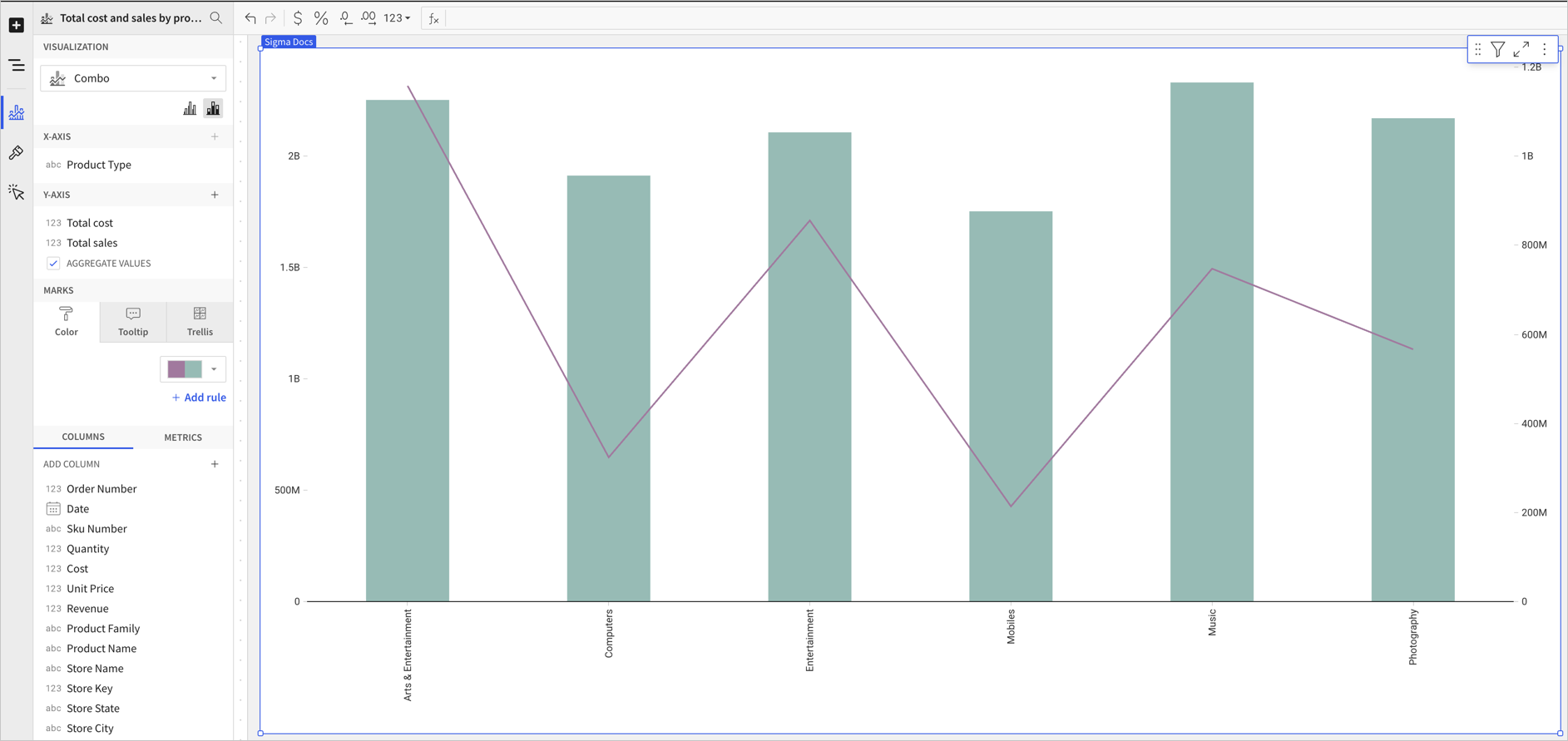
Combo charts
Combo charts are a type of chart that uses a mixture of chart types. Sigma combo charts support bars, lines, areas, and scatter plots.
Requirements
- You must be assigned an account type with the Edit Workbook and/or Explore Workbook permission enabled.
- You must be the workbook owner or be granted Can explore or Can edit workbook permission.
If you’re granted Can explore access to the workbook, you can create and modify visualization properties and formatting in Explore mode, but you cannot publish your changes.
Plot a combo chart
To plot a combo chart, configure the following properties in the ![]() Element properties tab:
Element properties tab:
The chart is empty until all properties are configured.
Add a combo chart to a workbook
- Open a workbook in Explore or Edit mode and add a new chart element.
- In the Chart property, click the dropdown field and select Combo from the list.
Define the x-axis categories
Configure a source column to define the x-axis categories.
-
In the X-axis property, click
 Add column and select an option from the menu:
-
To generate categories based on distinct values in an existing column, search or scroll the Select column list and select the preferred column name.
-
To generate categories based on a custom formula, select New column and enter the formula in the toolbar.
You can also select or replace an existing column by dragging and dropping a column name from the Columns list to the X-axis property.
-
-
[optional] Control how the source column data is categorized and displayed in the chart:
-
Hover over the source column name, then click the caret (
 ) to open the column menu.
 -
Hover over any of the following items, then select the preferred option:
Availability of column menu items and corresponding options varies depending on the column’s data value type (for example, Truncate date is available for date values only).
-
Define the y-axis variable
Configure a source column to define the y-axis variable. Sigma automatically aggregates values associated with the same x-axis category, and the aggregation type depends on the data type of the column.
By default, the first column placed on the y-axis is displayed as a bar chart and all additional columns are plotted as lines.
-
In the Y-axis property, click
 Add calculation and select an option from the menu:
-
To aggregate values of an existing column, search or scroll the Aggregate column list and select the preferred column name.
-
To calculate values based on a custom formula, select New column and enter the formula in the toolbar.
-
To count the number of rows associated with each category, select Row count.
You can also select an existing column by dragging and dropping a column name from the Columns list to the Y-axis property.
-
-
[optional] Control how the source column data is calculated and displayed in the chart:
-
Hover over the source column name, then click the caret (
) to open the column menu. -
Hover over any of the following items, then select the preferred option:
To plot the source column data without aggregating values, clear the Aggregate values checkbox in the Y-axis property. If this results in an incomplete chart that exceeds the 25,000 data point limit, reaggregate the values or apply data filters to reduce the number of data points.
You can also use the toolbar to change the aggregation method (using the formula) and data label format.
-
-
[optional] Repeat the previous steps to configure multiple y-axis source columns. Sigma plots each further column as a separate line series on the chart, but you can change the shape of any plotted column from the column menu. See Change the chart type for a plotted column).
-
[optional] Sigma auto-generates source column names and chart titles to reflect the visualized data, but you can customize these fields as needed:
-
To rename a source column, double-click the column name in the X-axis or Y-axis property, then enter a new name. Changes are reflected in the default chart title.
-
To edit the chart title, double-click the title in the chart, then enter a new title.
Sigma auto-generates the default chart title. After the title is customized, it no longer reflects changes to source columns and their names.
-
Combo chart properties
You can configure the following properties for combo charts:
Configure a chart color by category
If your combo chart includes bars, you can set a column to use as a category and split the bar colors by category.
Configure combo chart colors in the ![]() Element properties > Marks > Color tab.
Element properties > Marks > Color tab.
You can use color to differentiate data, highlight specific column values, and split the chart bars by category.
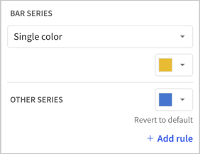
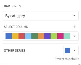
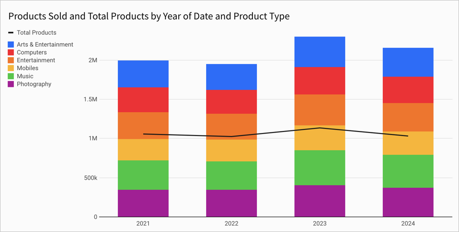
Multiple variables in the y-axis result in a stacked or clustered bar series in which each data series represents a measure of a different variable. The By category color setting can also generate bar stacks or clusters, but the resulting series represent sub-categories within the configured chart categories that measure the same variable.
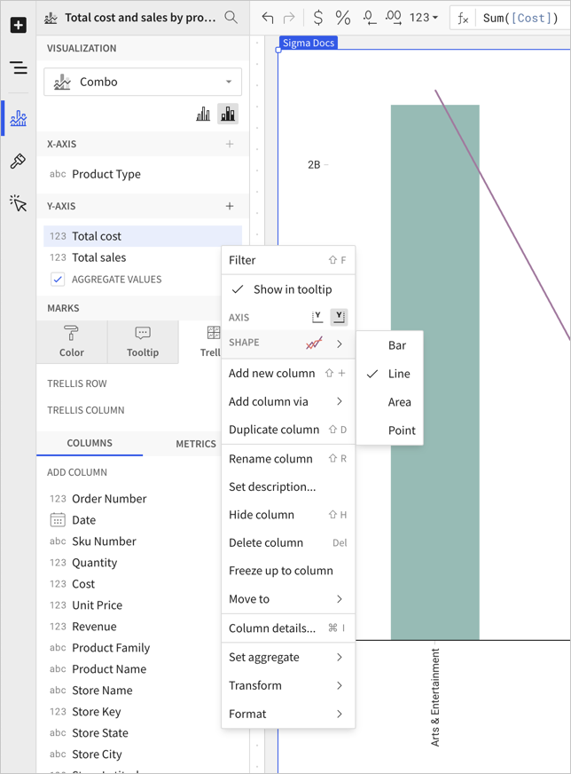
Change the chart type for a plotted column
The chart type for a column plotted on a combo chart can be one of four options: bar, line, area, or scatter.
Before you start: This action uses the editor panel. If you have not done so already, open the editor panel from either Explore or Edit mode. See Workbook modes.
To change the chart type, do the following:
- In the editor panel, hover over the column and click the caret .
The column menu opens. - In the Shape submenu, choose Bar, Line, Area, or Point.
Format options
To begin editing a chart’s format options:
Before you start: This action uses the editor panel. If you have not done so already, open the editor panel from either Explore or Edit mode; see Workbook modes.
- Select
 Element format in the side navigation.
 - Select a format option to view and edit its settings.
Format categories
The following format categories are available for combo charts:
-
X-axis
-
Y-axis
- You can add a secondary y-axis for a column on the left or right side of the chart. See Format chart axis position.
-
Gaps
-
Area/line style