SparklineAgg
This function isn’t compatible with all data platform connections. To check if your connection supports it, see Supported data platforms and feature compatibility.
The SparklineAgg function generates sparkline charts by aggregating values over time. If you want to create sparklines for JSON data, see the Sparkline function.
Sparklines can also be created from a column containing pre-formatted data. See Create sparklines from a table.
Syntax
Function arguments
Notes
- To create meaningful sparklines, add a grouping to your table. Groupings ensure multiple values are available for use in the sparkline. For more information on groupings, see Group columns in a table.
- SparklineAgg charts the values provided in the category column and returns variant data that renders as a sparkline chart in the table. You cannot copy from the chart canvas.
- To format the chart output of SparklineAgg (color, chart type, interpolation, etc), see Format sparklines in Create sparklines in a table.
Example
A table, PLUGS_ELECTRONICS_HANDS_ON_LAB_DATA, contains information an electronic retailer’s sales, including columns such as:
- Product Name: Name of electronic product sold
- Date: Date and time of sale transaction
- Quantity: Number of a specific product sold during the transaction
To see how the sales of each product have changed month to month, you can use SparklineAgg:
- Group the table by product name. Select + Add grouping, then search for and select Product Name.
- Select + Add calculation. In the formula bar, enter:
Entering DateTrunc("month", [Date]) as the category argument uses the DateTrunc function to truncate the value in the Date column to months. These month values form the x-axis of the sparkline. Entering Sum([Quantity]) as the aggregate argument ensures the y-axis reflects the total quantity of products sold in each month.
Your table might look something like:
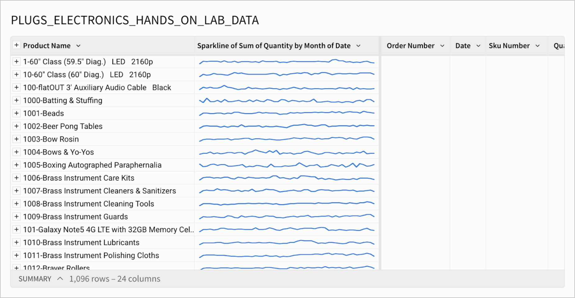
The sparklines here represent changes in the quantity of each product sold by month.
If you want to change the format (e.g. chart type, color, interpolation) of your sparklines, see Format sparklines in Create sparklines in a table.