Lesson three: Grouped tables and pivot tables
Lesson three: Grouped tables and pivot tables
Welcome to lesson three: Grouped tables and pivot tables.
In the last lesson, we manipulated and transformed a table at the column level, preparing fields so that they use the correct data type and format for later use in our calculations.
Now, we’ll work with grouped tables to explore our data, as well as pivot tables to present organized data to users. By the end of this lesson, we’ll have our raw data sectioned off from what will eventually be our dashboard.
This lesson covers the following Sigma features:
- Grouped tables
- Calculations in groupings
- Hierarchical groupings
- Duplicate elements
- Pivot tables
- Parent-child relationships
Grouped tables
With our data organized and transformed, let’s turn our attention to exploration.
As an FAA analyst, we’ve been tasked with understanding trends in flight delay times and their potential sources. One way to investigate how delay time changes with other variables is to create groupings.
The transformations we did in the previous section were all done at the individual record level. This can be contrasted with groupings, which allow us to perform calculations for sets of records that share some set of characteristics. This allows us to compare groups of flights, to see if any of those characteristics impact delay times.
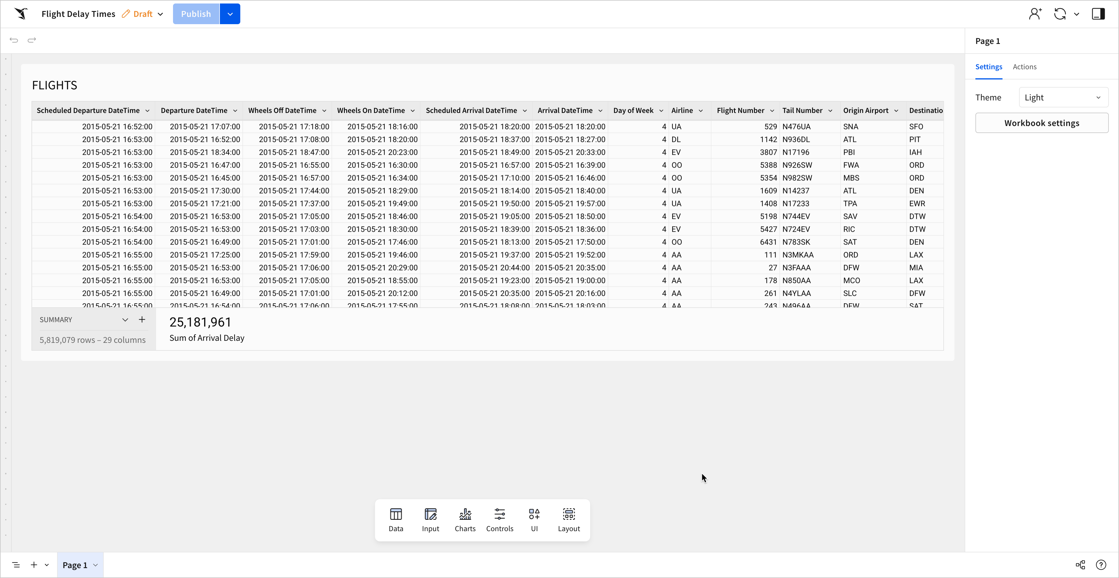
Groupings in Sigma can be created directly on tables. Let’s make a duplicate table to experiment with!
- Open the Flight Delay Times workbook for editing.
-
At the bottom of your workbook, double click on the tab that says
Page 1. This will allow you to edit the title of the page. Change it toRaw Dataand press enter to finish renaming the page. -
Next to your Raw Data page, select
 Add page to add a new page.
 -
Rename this page
Grouped Data
You now have two pages in your workbook to place elements on. Let’s add a table element to our Grouped Data page so we can start experimenting.
- Back on the Raw Data page, select the FLIGHTS table element, and open the element menu. Select Duplicate.
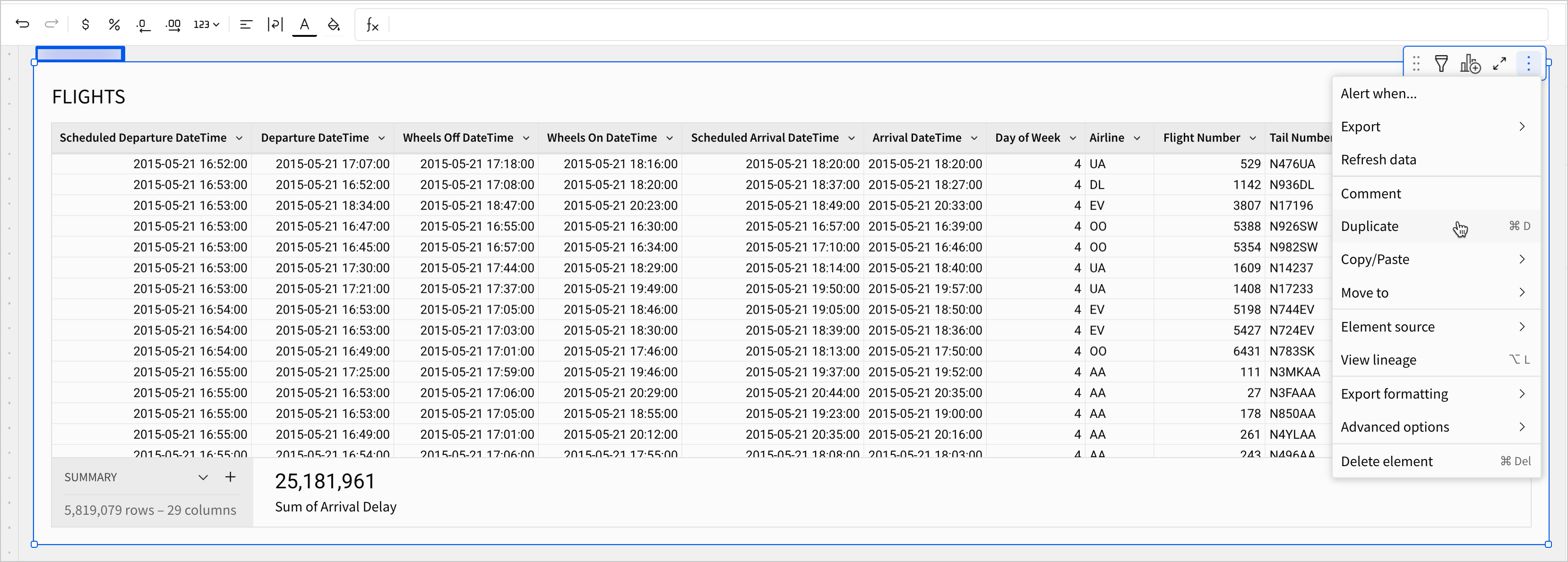
You now have two identical table elements on your Raw Data page.
Notice that this table element is a true duplicate of our first table. It has all the changes we made in the previous lesson. After the duplicate is created, though, changes made to the original don’t appear in the copy. It’s important to note the difference between duplicates and child elements, which is discussed in more detail later in this lesson.
- Select the duplicate FLIGHTS table, click
 to open the element menu, and select Move to > Grouped Data.
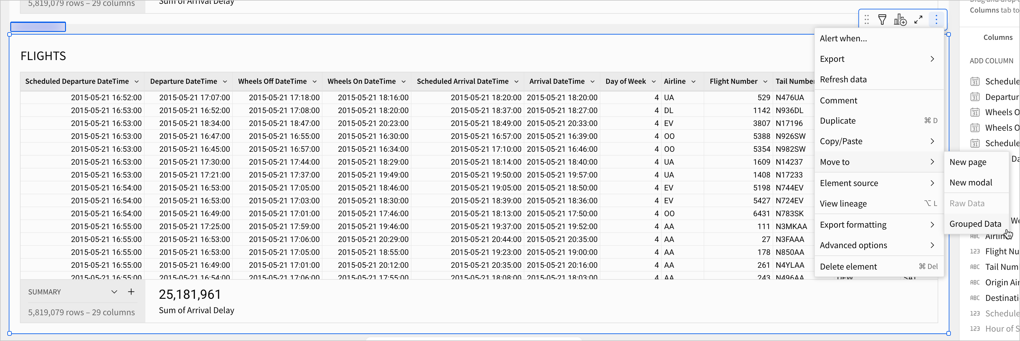
This immediately moves the element to the Grouped Data page. Notice as well that Sigma automatically navigates us to that page.
- Rename the table so that we can identify it more easily. Double click the title and rename it
FLIGHTS - GROUPEDso that your Grouped Data page looks like this:
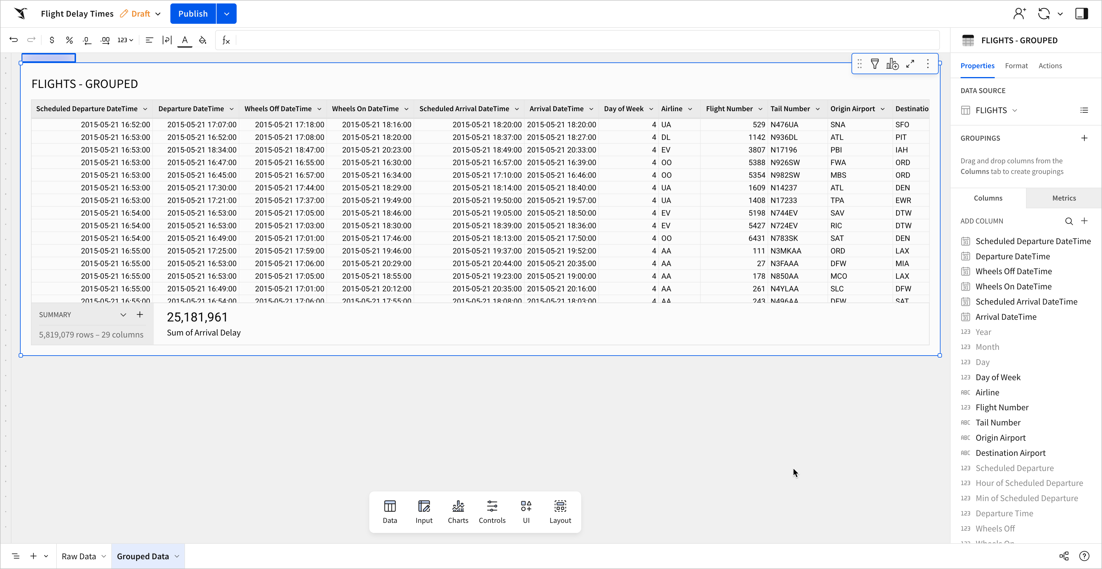
Now we can begin grouping.
-
Select the FLIGHTS - GROUPED table.
-
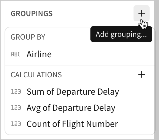
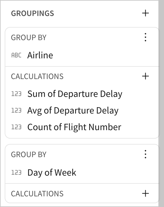
In the editor panel, under the Groupings section, click
Add grouping…

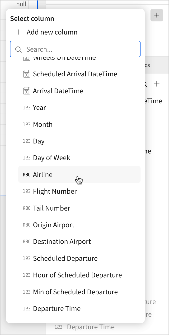
- From this menu, select
Airline.
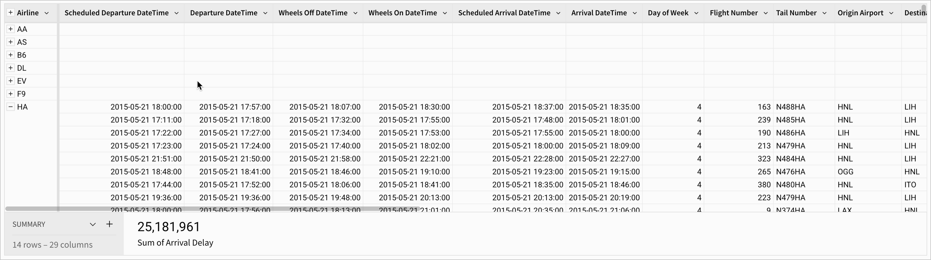
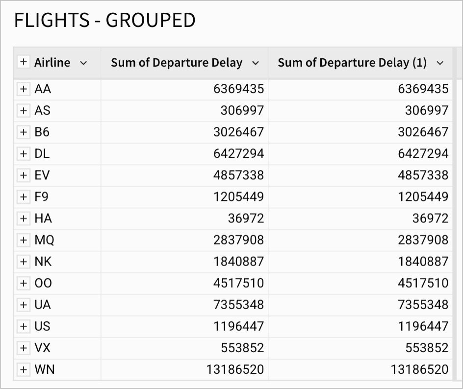
Our table now shows a new section on the left-hand side, titled Airline. It’s separated from the rest of the table by a vertical gray bar. This is a grouping, and the vertical gray is the visual indication that separates groupings.
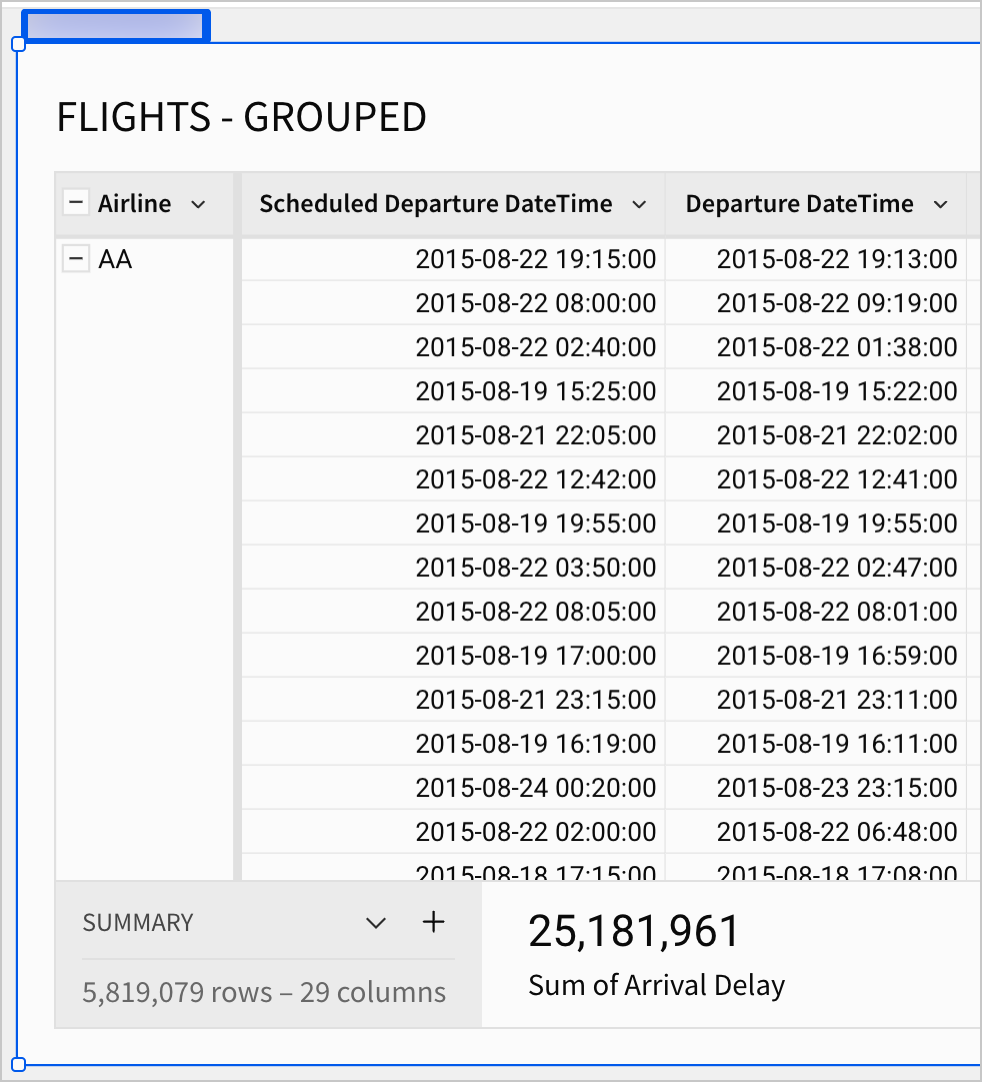
- Click the minus icon next to
Airlineto collapse the grouping. The table now shows only the groupings, rather than individual records.
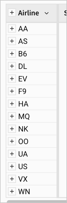
Every record has been organized according to its value in the Airline field. There are 14 groups, and each of our 5.8 million records belongs to one of them. We can expand individual groups with the ![]() for that airline, or expand all groups again with the
for that airline, or expand all groups again with the ![]() at the top of the field.
at the top of the field.
When our groupings are collapsed, the rest of our fields are blank. This is because the rest of our fields are not grouped - they contain record-level information. Because no single record could represent the entire group, they remain blank unless the group is expanded and all records are made visible again. In the screenshot below, the expanded grouping for the Airline HA shows record-level information for that group.
Now, let’s add information at the grouping level with a calculation.
- In the Groupings section of the editor panel, under Group By Airline, click the Add calculation… to add a calculation.
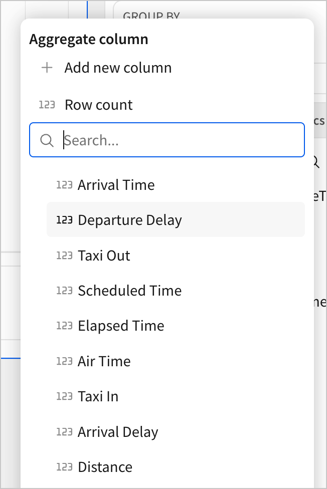
The Aggregate column menu opens.
- Select
Departure Delay.
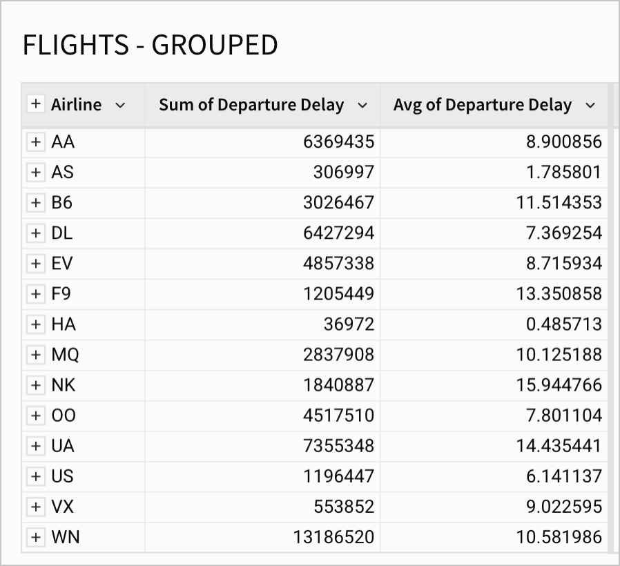
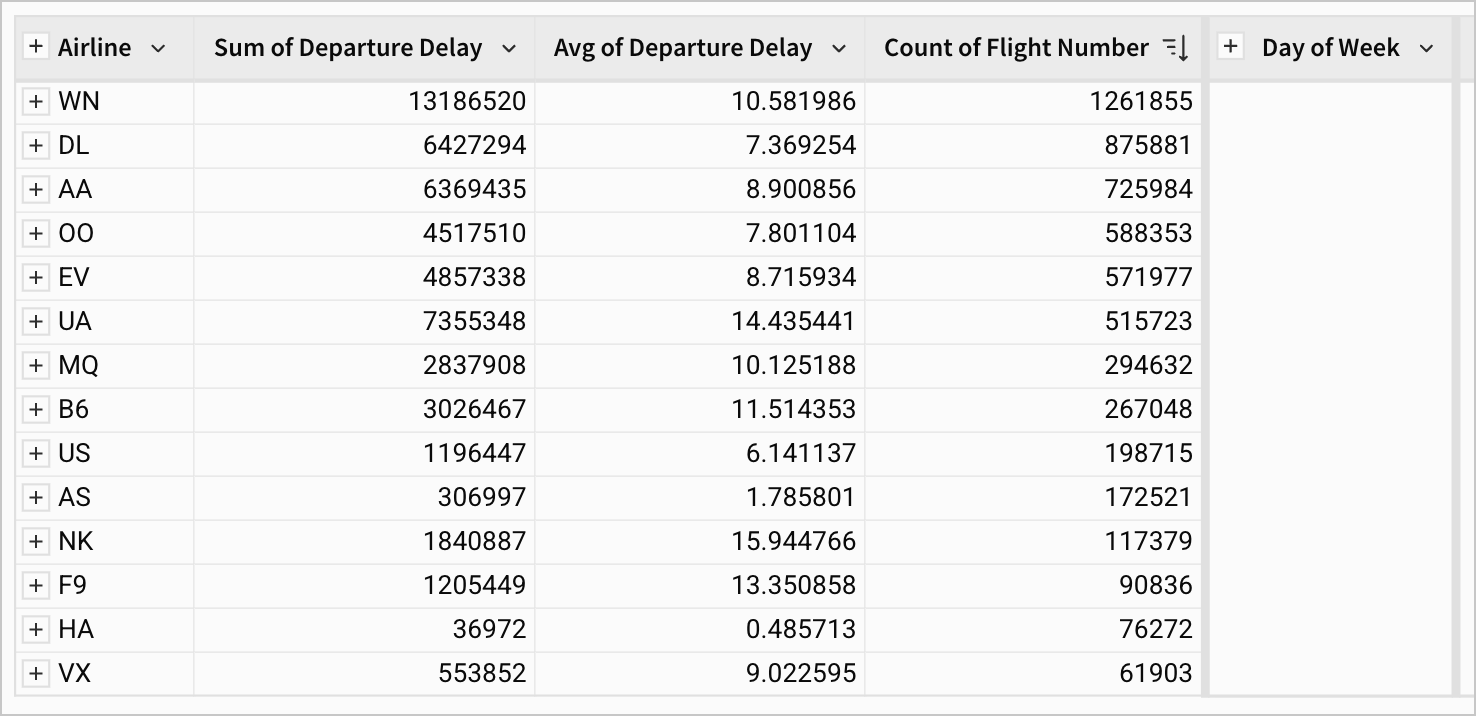
This action adds a calculation for the Sum of Departure Delay, like the screenshot below.
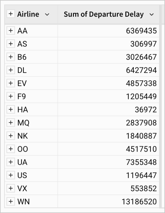
We can now see the total minutes of departure delay for each airline.
Notice that the aggregate is treated like a new column, rather than a transformation of Departure Delay. Our table now has 30 columns instead of 29 listed under the summary, and the Departure Delay column still appears in our column list and table independently.
This is great, but single calculations like this don’t make for excellent data exploration. For example, airline WN has the greatest total departure delay, but that doesn’t tell us that they’re necessarily the most delayed airline. Perhaps they have ten times as many flights as any other airline, and their delay per flight is actually quite low. Currently, we can’t tell if that’s the case. Let’s add on another calculation to resolve this ambiguity.
-
Click
Add calculation… to add another calculation. -
Select
Departure Delayagain.
This adds a second Sum of Departure Delay column to our grouping, like the below.
- Open the column menu for
Sum of Departure Delay (1), navigate to Set aggregate and select Avg.
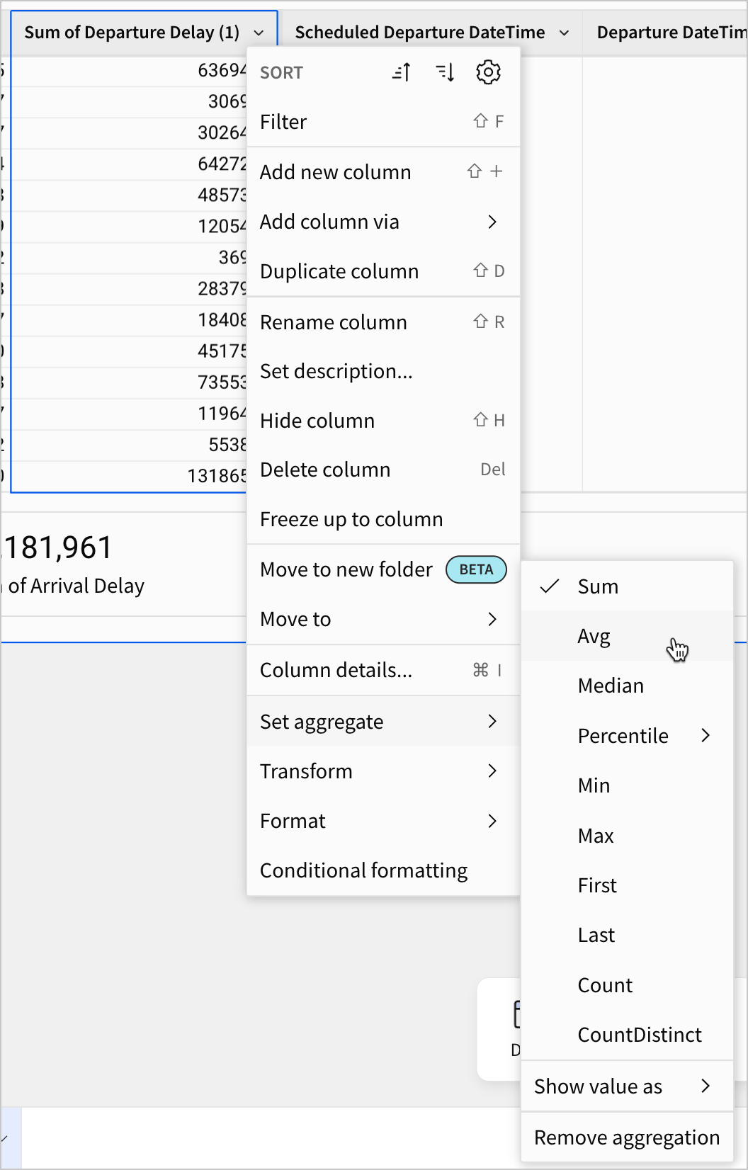
Now, the grouping shows two calculations - Sum of Departure Delay and Avg of Departure Delay for each airline. We can see now that the airline NK has the highest average departure delay.
Customizing calculations
You’ve used two of the default aggregates available for columns with number data - sum and avg. But, what if you want to customize your calculations? For greater control, consider combining calculations with filters or writing custom formulas.
Filters can be used to perform calculations on a subset of records. For example, if you wanted to see the sum and avg of departure delay for only flights that were delayed, you could set a filter on our table for flights where departure delay is greater than zero. This would filter out flights that left on time before performing any calculations.
Formulas allow you to perform custom calculations. For example, if you want to see the avg departure delay expressed in seconds rather than minutes, you could edit the formula for the Avg([Departure Delay]) calculation in the formula bar. Changing the formula to Avg([Departure Delay]) * 60 would return the departure delay in seconds.
Multiple Groupings
Our exploration of the differences between airlines is getting interesting. Based on these two calculations, there seems to be serious variation in departure delay based on the airline. HA and AS are almost always on time, while NK and UA are delayed about 15 minutes on average.
At a glance, we might suspect this has something to do with the total volume of flights each airline serves. Perhaps smaller airlines like HA can keep flights on time because they have fewer flights to coordinate. Let’s add more groupings to investigate this hypothesis more closely.
- Add a calculation to the
Airlinegrouping using the columnFlight Numberand Set aggregate to Count.
This adds a third calculation column for the number of flights each airline conducted in 2015.
- Sort the new
Count of Flight Numbercolumn in descending order.
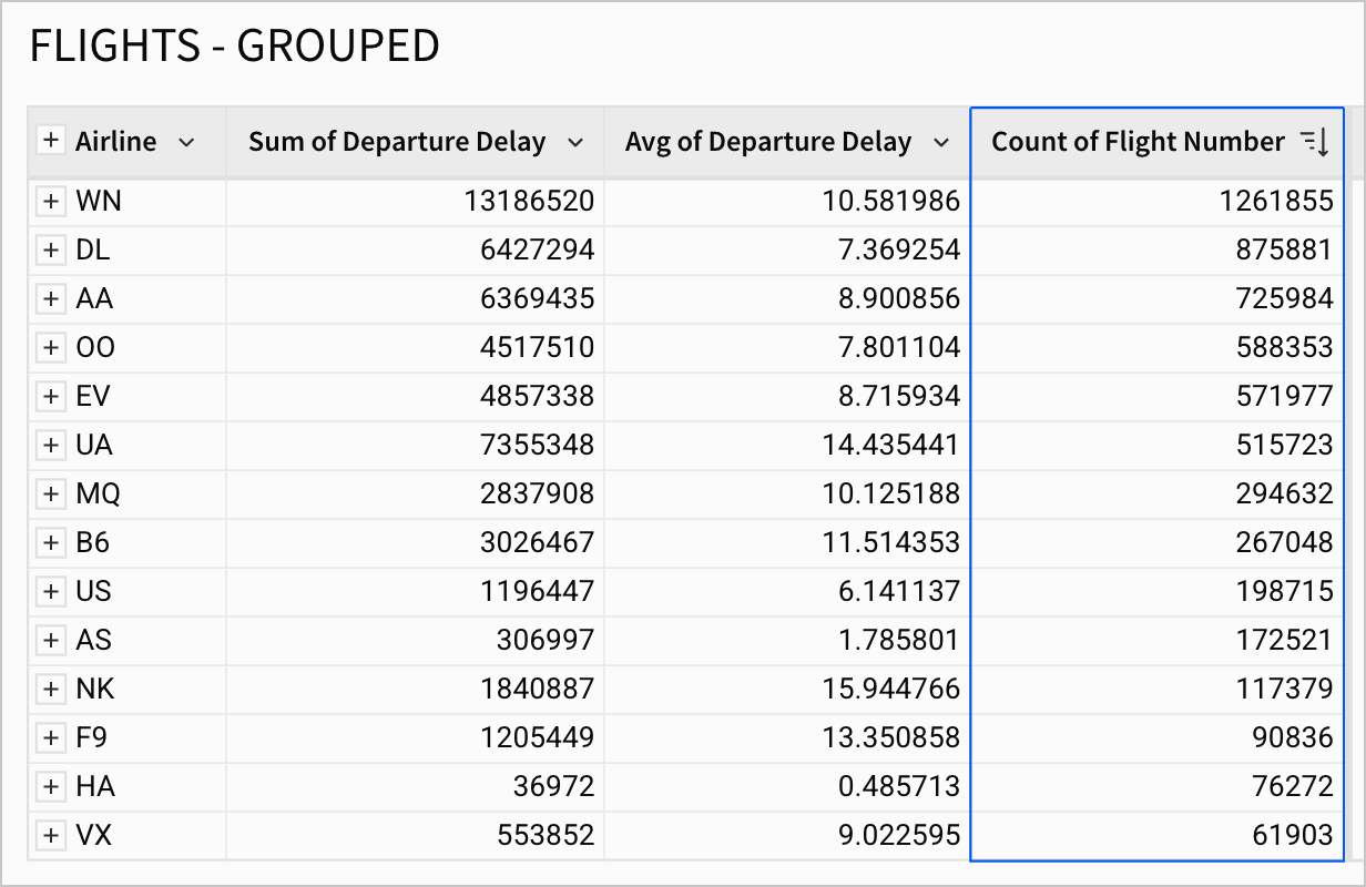
With our groupings organized this way, it doesn’t seem that there’s a strong relationship between flight volume and delay time. Some smaller airlines like NK and F9 have long delays, and some of the larger airlines like DL and OO have relatively average delays.
Keep this in mind for when we make our dashboard later. We need tools for a more robust exploration of factors that contribute to the variance between airlines.
Imagine now that one of your managers offers you a lead based on their industry knowledge. They suggest you view the variation by day of the week for each airline as well, since they know anecdotally that flight delay times vary depending on the day of the week.
In other words, they’re suggesting you place a grouping for the day of the week within the Airline grouping.
- Add another grouping by clicking Add grouping… in the editor panel.
- Select
Day of Weekas the column.
The editor panel now shows two groupings.
The table also shows two groupings, separated by an additional set of gray bars.
- In the
Day of Weekgrouping, add a calculation for theAvg of Departure Delay.
Because there is already a column titled Avg of Departure Delay in our first grouping, Sigma titles this one Avg of Departure Delay (1).
-
Rename
Avg of Departure Delay (1)toAvg of Departure Delay by Day of Week. -
Then, expand the groupings for
Airline. Your table might look like the screenshot below.
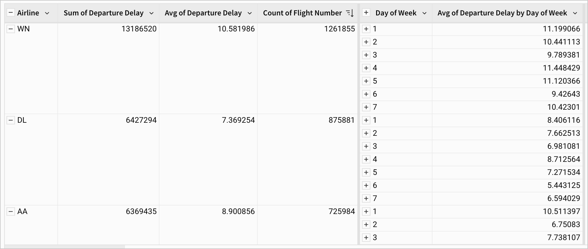
In this dataset, 1 indicates Monday and 7 indicates Sunday.
With our highest grouping level (Airline) expanded, we can see the calculation values for each entry in our second grouping level (Day of Week). If we scroll down through the table, we can see that there’s more consistent variation by the Day of Week than there was for Airline.
Does it make sense to transform Day of Week?
Reading a Day of Week value as a number can be unintuitive for end users. Does that mean we should transform it now? We could certainly create a calculated column and write an If statement in the formula bar that converts each value to the corresponding day as text data - 1 as Mon, 2 as Tues, etc.
Though transforming this data might make it more legible, it might also make it harder to work with. For example, if we want to make a chart with Day of Week on the x-axis, number data allows us to easily sort the days in order from 1 to 7, which is more difficult with text data.
- Remove the Sort descending from
Count of Flight Numberand apply a Sort descending toAvg of Departure Delay by Day of Week. This sorts theDay of Weekvalues by this calculation within eachAirline.

- Scroll through the sorted grouping, and notice that Monday (1) ranks consistently among the days with the most delay, regardless of
Airline.
Having done this simple exploration, we can begin to make some plans for our future dashboard:
- Airline - We know that the delay time changes by Airline, but we don’t quite yet understand why. Let’s plan to make a chart for our Airline delay data, and allow users to change various filters to see how they impact delays for each airline.
- Day of Week - We’ve observed a trend with Day of Week, where Monday has the greatest delay. Perhaps there’s more to learn here about how time impacts delays.
- Click Publish to save your work to the published version.
Pivot Tables
In the last section, we saw that there’s a relationship between flight delay time and day of the week that may need more exploration. In our imagined role as an analyst, we might realize that the variation among days of the week isn’t likely to change based on the airline, but it might change depending on the time of year. For example, a Monday like Labor Day might be even more delayed than other Mondays.
In this section, let’s place a pivot table onto the workbook to explore this two-dimensional relationship visually.
-
Add a new page to your workbook and call it
Dashboard. -
Back on the Raw Data page, select the FLIGHTS table, and select
 Create a child element.
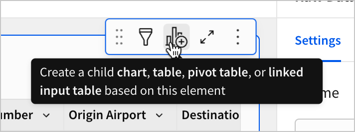
- Select Pivot table.
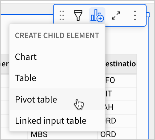
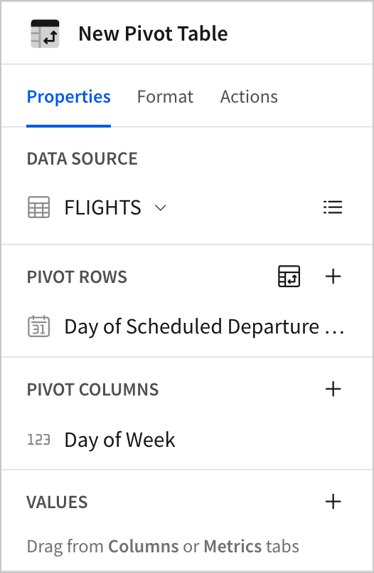
This creates a pivot table titled New Pivot Table.
- Select New Pivot Table, and then select More. Select Move to and then Dashboard.
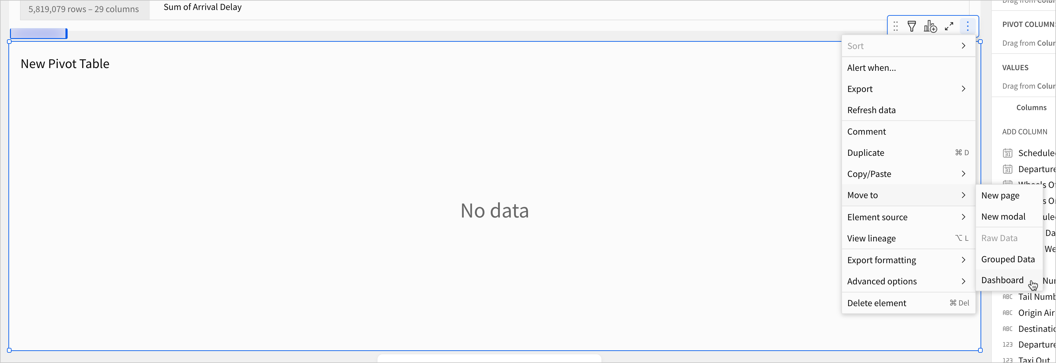
This adds the pivot table to the Dashboard page.
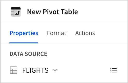
Notice that the editor panel shows the FLIGHTS table as its data source. This is because New Pivot Table is a child element of the FLIGHTS table.
Child elements are distinct from duplicate elements and have some unique features that we can cover in a moment. First, let’s configure our pivot table to show delay time averages for each day of the week over the course of the year.
- In the editor panel, drag
Day of Weekto the Pivot columns section, andScheduled Departure DateTimeto the Pivot Rows section.
By default, Scheduled Departure DateTime is truncated to the Day. Scroll through the pivot table to see that there is one row for each day of the year.
We want this pivot table to give a high-level overview, so this view is too detailed. To fix this, let’s change the date truncation.
- Open the column menu for
Day of Scheduled Departure DateTime, select Truncate date, and select Month.
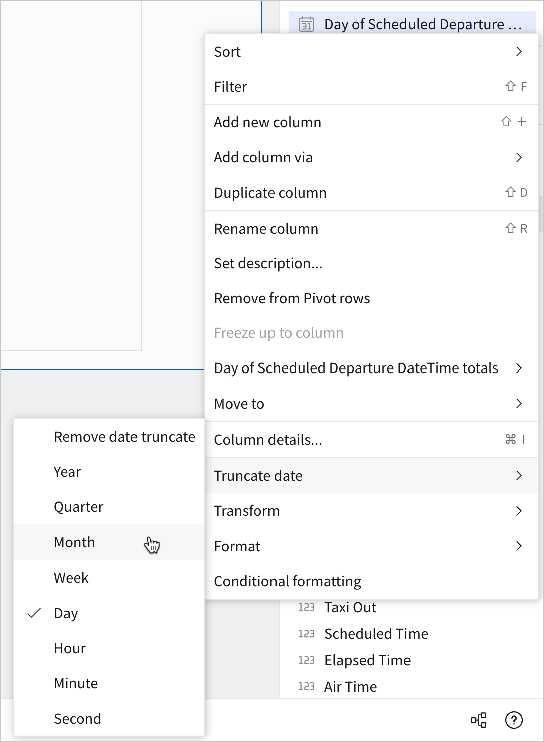
The pivot table rows now show a row for each month.
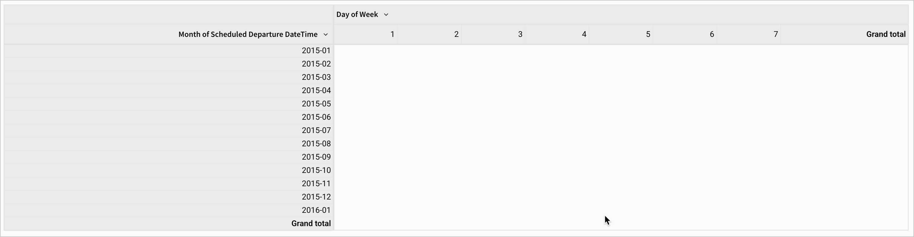
Before we populate the pivot with values for each cell, notice that there is a row for 2016-01, meaning that some number of records in our original table are actually from January of 2016. Our goal is to make a dashboard for 2015, so we don’t want to see these records in our dashboard. To address this, we’ll leverage the parent-child element relationship in Sigma to remove these records from all our future dashboard elements.
-
Navigate to the Raw Data page, and select the FLIGHTS table.
-
Open the Filters & controls menu and select
Add filter…
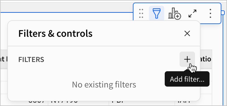
- Select the
Scheduled Departure DateTimecolumn. Set a date range filter for the datesBetweenJan 1, 2015andDec 31, 2015.
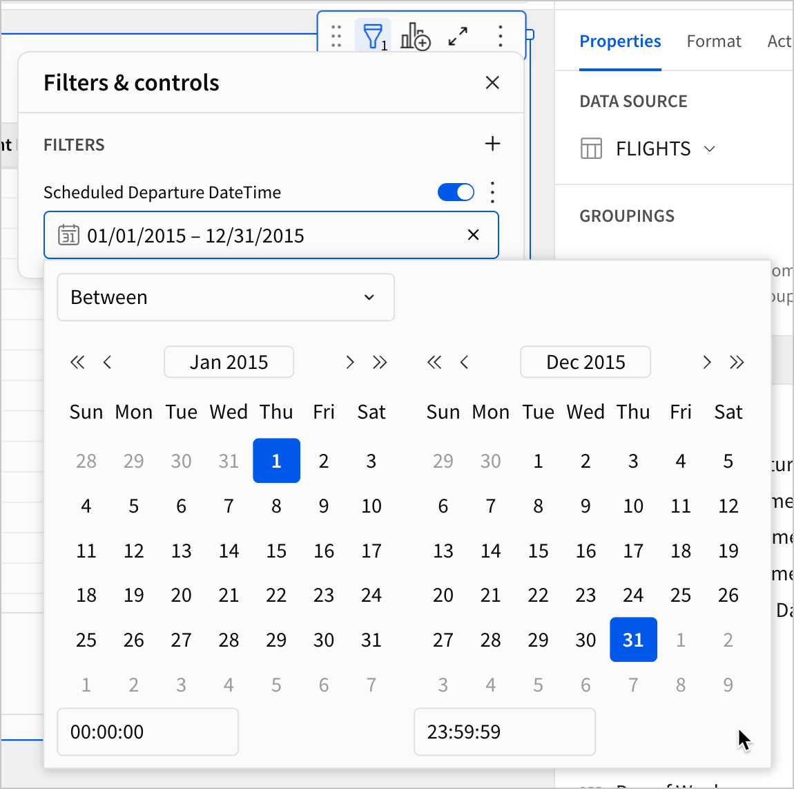
- Navigate back to the Dashboard page. When the pivot table refreshes, there is no longer a row for
2016-01.
Here, we’ve demonstrated a foundational use case for tying child elements to a parent element in Sigma. A change made by a filter on our parent table (FLIGHTS) is reflected in the child element (New Pivot Table). This is different from a duplicate element, which does not inherit new changes after it’s created.
Parent tables and global filters
Filtering a parent table applies the filter to all its child elements. For this reason, Sigma recommends building dashboard elements off of a parent table, so that you can apply global filters from a single location.
For the rest of this course, create charts and other elements as children of this FLIGHTS table so that you can apply global filters and other changes as needed.
With the 2016 records filtered out, let’s finish configuring our pivot table.
-
On the Dashboard page, select the New Pivot Table element.
-
In the editor panel, drag the
Departure Delaycolumn to the Values section. -
Change the aggregate from
Sum of Departure DelaytoAvg of Departure Delay.
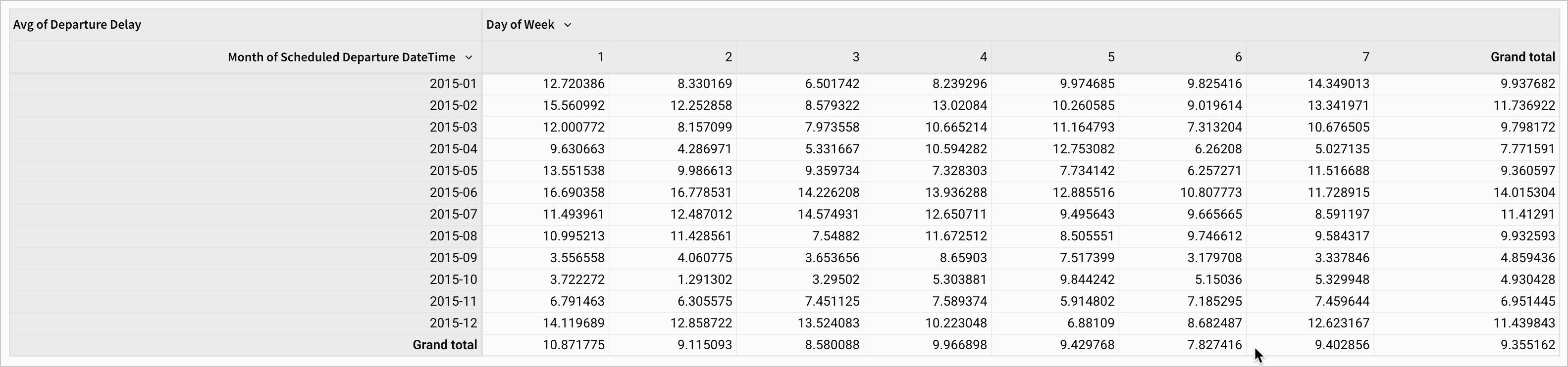
Our pivot values now populate correctly. Each cell shows the average number of minutes a flight was delayed in the corresponding month and day of the week. But, the trends aren’t as obvious as they could be. Let’s use some formatting to make the changes more visually obvious to ourselves and future users.
-
Rename the pivot table to Departure Delay by Month and Day of the Week.
-
In the editor panel, select Format > Conditional Formatting.
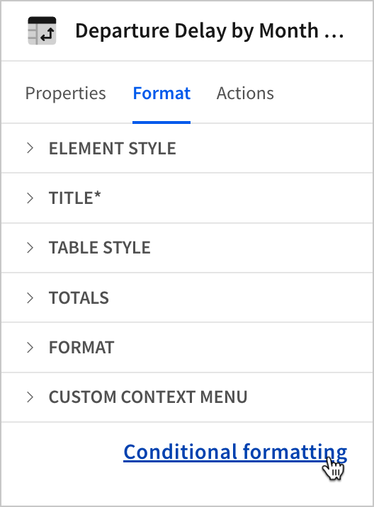
-
Under Apply to, select Avg of Departure Delay.
-
Select Color Scale.

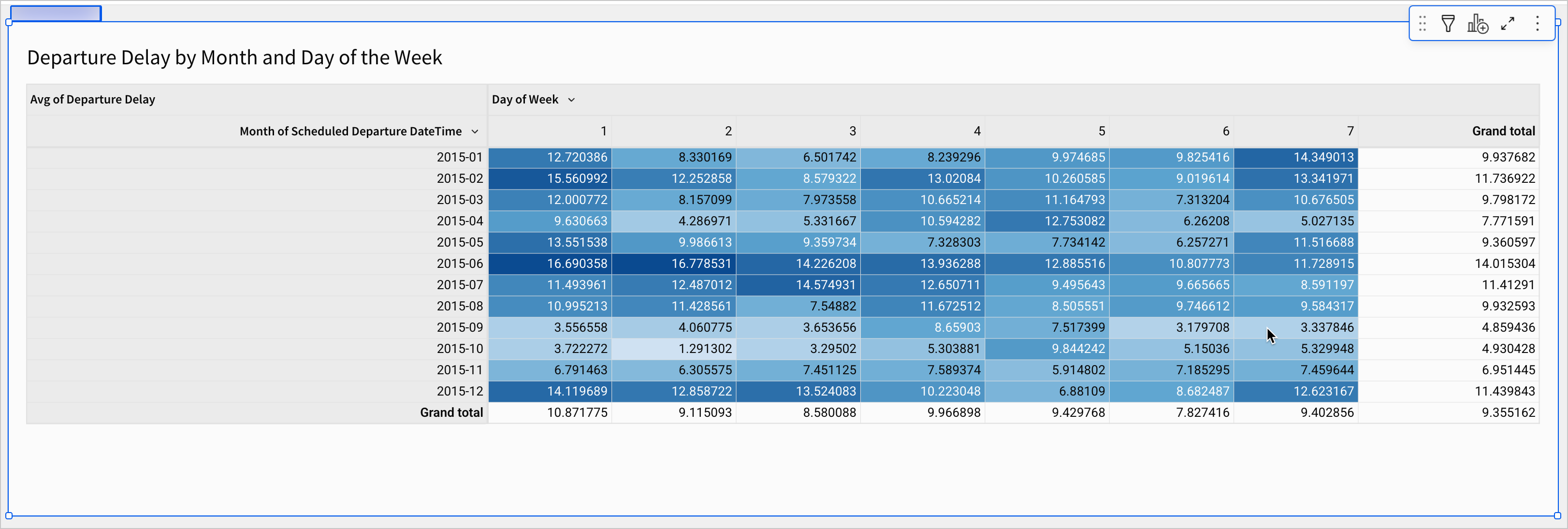
Our pivot table now works as a basic heatmap, using darker colors to indicate higher delay times and lighter colors to indicate lower delay times. It’s now even easier to see that delay times are worst in the beginning of the week, and in the summer months of June and July.
- Click Publish to save your work to the published version.
Conclusion
At the end of lesson three, we’ve started to explore our data for trends. We’ve placed our first element on our dashboard page, and used it to demonstrate one of our findings visually. To do that, we learned about the following:
- Grouped tables
- Calculations in groupings
- Hierarchical groupings
- Duplicate elements
- Pivot tables
- Parent-child relationships