Lesson four: Charts and visualizations
Lesson four: Charts and visualizations
Welcome to lesson four: Charts and visualizations.
In the last lesson, we familiarized ourselves with our data by using groupings. Then, we added the first element to our dashboard: a formatted pivot table that functions like a heatmap. Additionally, we learned the difference between duplicate elements and child elements, and began leveraging the parent-child relationship to simplify our development process.
Now, we’ll expand our dashboard with additional charts and visualizations. By the end of this lesson, we’ll have a draft dashboard with several visualizations. We’ll also learn more strategies for leveraging the parent-child relationship by discussing lineage.
This lesson covers the following Sigma features:
- Bar charts
- Line charts
- KPI elements
- Donut hole charts
- Workbook lineage
- Hiding workbook pages
Basic chart elements
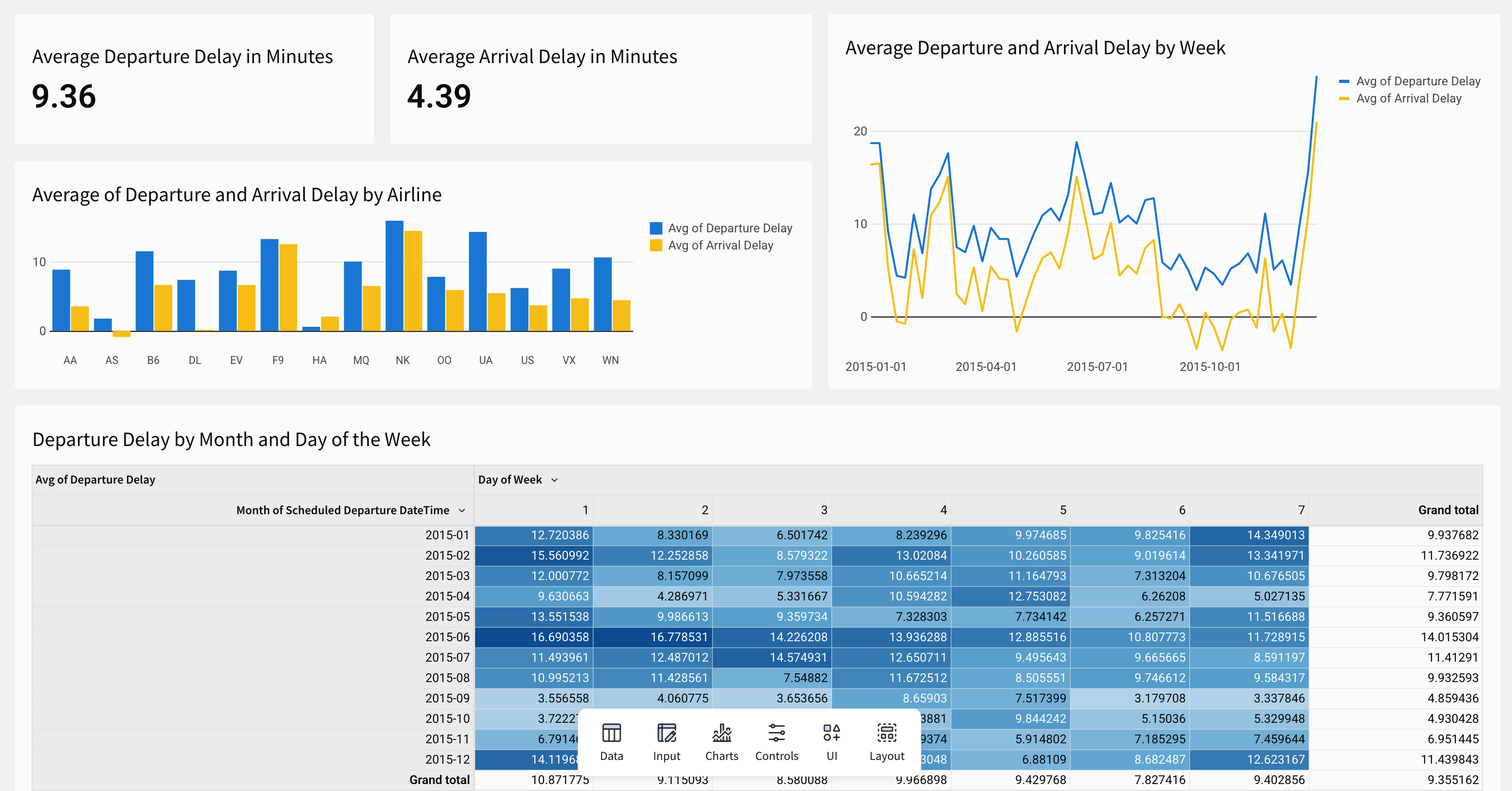
With our parent table transformed and separated onto its own page, let’s begin building charts by adding a bar chart, a line chart, and a pair of KPIs. Our manager has asked us to expand our analysis to include arrival delay as well as departure delay, so we’ll be charting both of them on this page as we go.
-
Navigate to the Raw Data page.
-
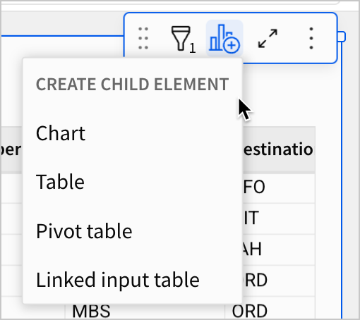
Select the FLIGHTS table, and select
 Create child element > Chart.
By default, Sigma creates a bar chart element on the current page. Let’s bring it to the Dashboard page.
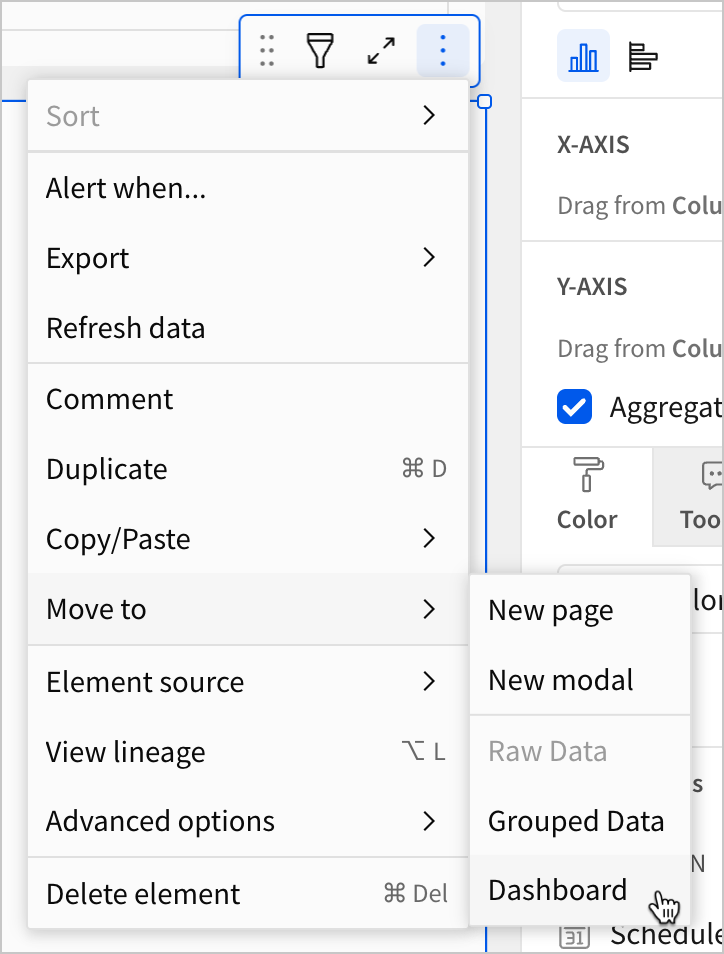
- Select the new bar chart and click
 More. Select Move to > Dashboard.
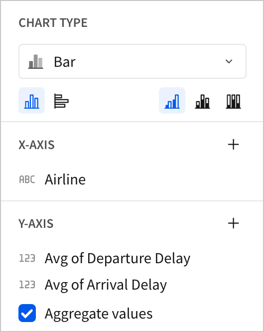
Over on the Dashboard page, notice that the editor panel for our chart has new options. We can configure a Data source, Chart type, orientation, axes, and more.
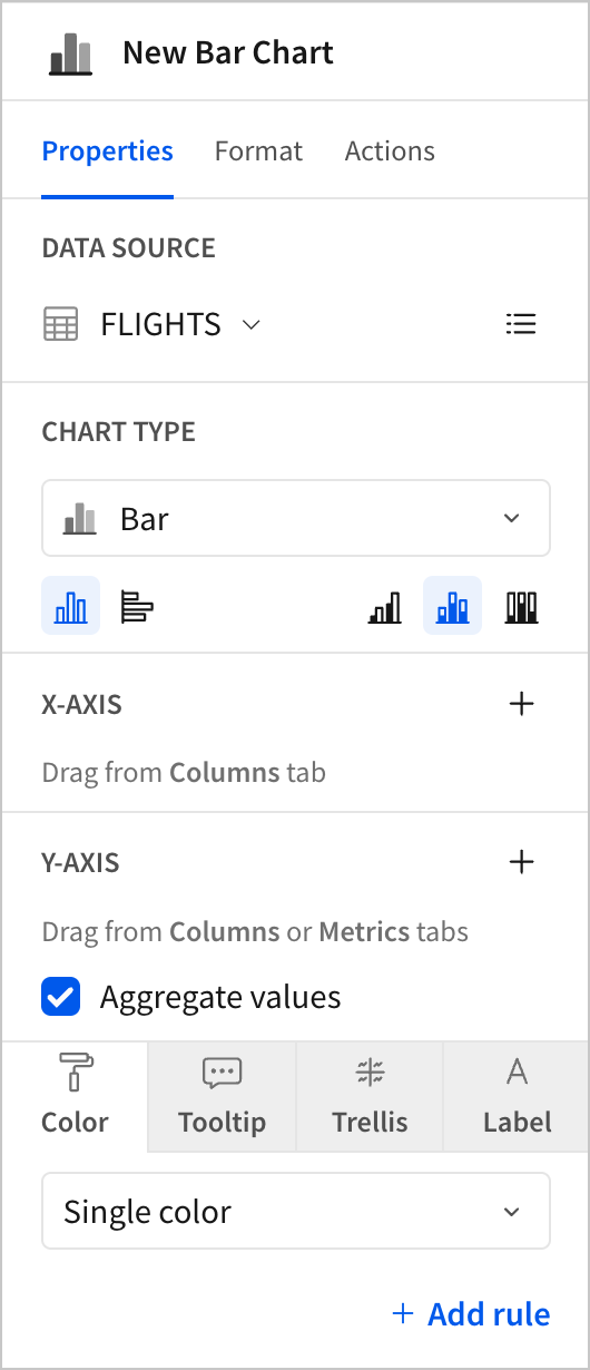
Bar charts are excellent for making comparisons between categories, so let’s configure this one to show differences between departure delay and arrival delay by airline. Because we want to easily compare categories across these two columns, we’ll create a bar chart with no stacking, and set our aggregates to the average of each delay. Removing stacking will make the comparisons between airlines visually clear, and setting our aggregate to average helps us make a consistent comparison across airlines with different flight volumes.
When should I use one chart type instead of another?
Choosing an appropriate chart type is critical for creating legible, accessible dashboards. Some chart types make a specific type of comparison easier to see than other chart types do.
For example, if you want to quickly compare five sales regions to see which had the most sales, a bar chart is a great option. To identify the region with the highest sales, you just have to find the tallest bar.
By contrast, if you want to understand changes in sales by region over time, a line chart may be a better option. With time on the x-axis, you can plot a line for each region. At any particular point in time, you can then easily see which region had the most sales and how it changed.
Let’s configure the bar chart.
- Drag the
Airlinecolumn to the X-axis section, and then dragDeparture DelayandArrival Delayto the Y-axis section.
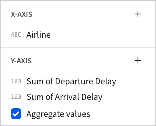
This creates a stacked bar chart with the sums of Departure Delay and Arrival Delay
-
Change the aggregate for
Departure DelayandArrival Delayto Avg. -
In the Chart type section, select the icon for No Stacking.
- Double click the name of the chart to rename it. Enter
Average of Departure and Arrival Delay by Airline.
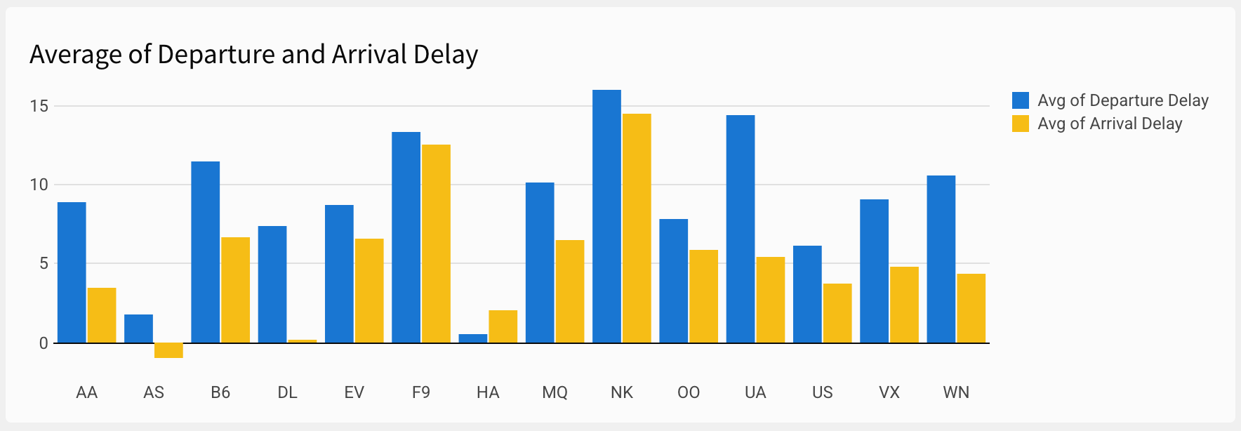
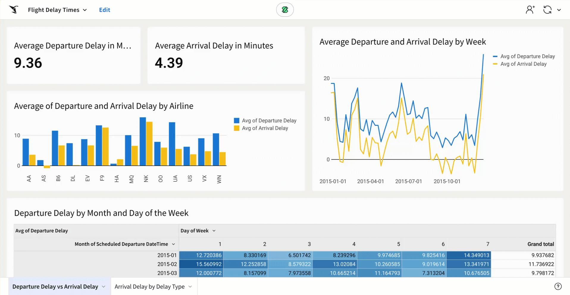
We now have a bar chart that can be used to quickly compare delays for each airline. We can quickly see that AS, DL, and HA have the least arrival delay, and that NK has the most. We can see that DL starts with a relatively average departure delay, but makes it up by arrival time. We can also see that arrival delay is generally lower than departure delay.
Having completed our first chart, we’re asked to make another chart comparing the two delay types over the course of the year. A line chart is suitable for the use case.
-
Return to the Raw Data page, and create another child chart element. Move it to the Dashboard page.
-
Change the Chart type to Line chart.
-
Drag the
Departure DelayandArrival Delaycolumns to the Y-axis section. Set both of their aggregates to Avg. -
Drag
Scheduled Departure DateTimeto the X-axis section. By default, the date is truncated toDay of Scheduled Departure DateTime, creating a highly detailed line chart.
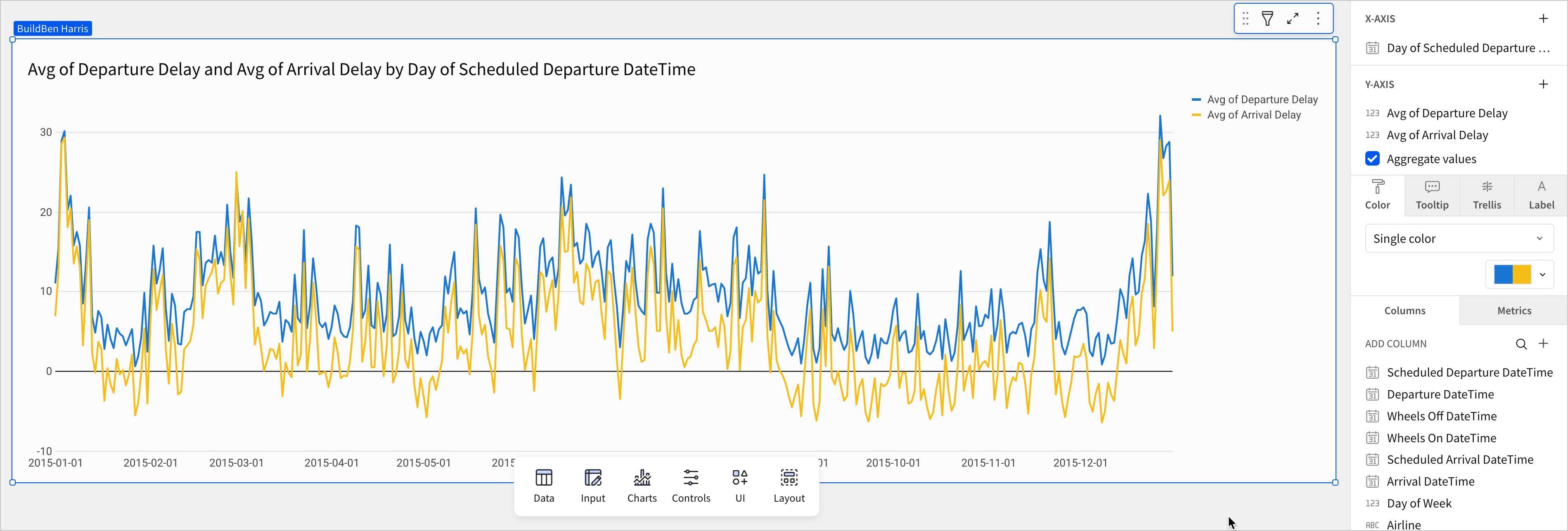
This is a more detailed chart than we need. Our goal is to understand trends over the course of the year, and by charting the x-axis down to individual days, we introduce a significant amount of noise. The chart is spiky and erratic, reflecting the variation based on day of the week we observed in the previous lesson.
Thankfully, our work in lesson two preparing our datetime data can help solve the problem. Recall that we spent a significant amount of time in that lesson combining year, month, day, and time data into one column with the date data type. This transformation to date data gave us access to the default functionality for dates, like charting it along the x-axis as a time dimension.
Let’s adjust the chart to make the yearly trend easier to analyze.
- In the X-axis section, open the menu for the
Day of Scheduled Departure DateTimecolumn. Select Truncate Date > Week.
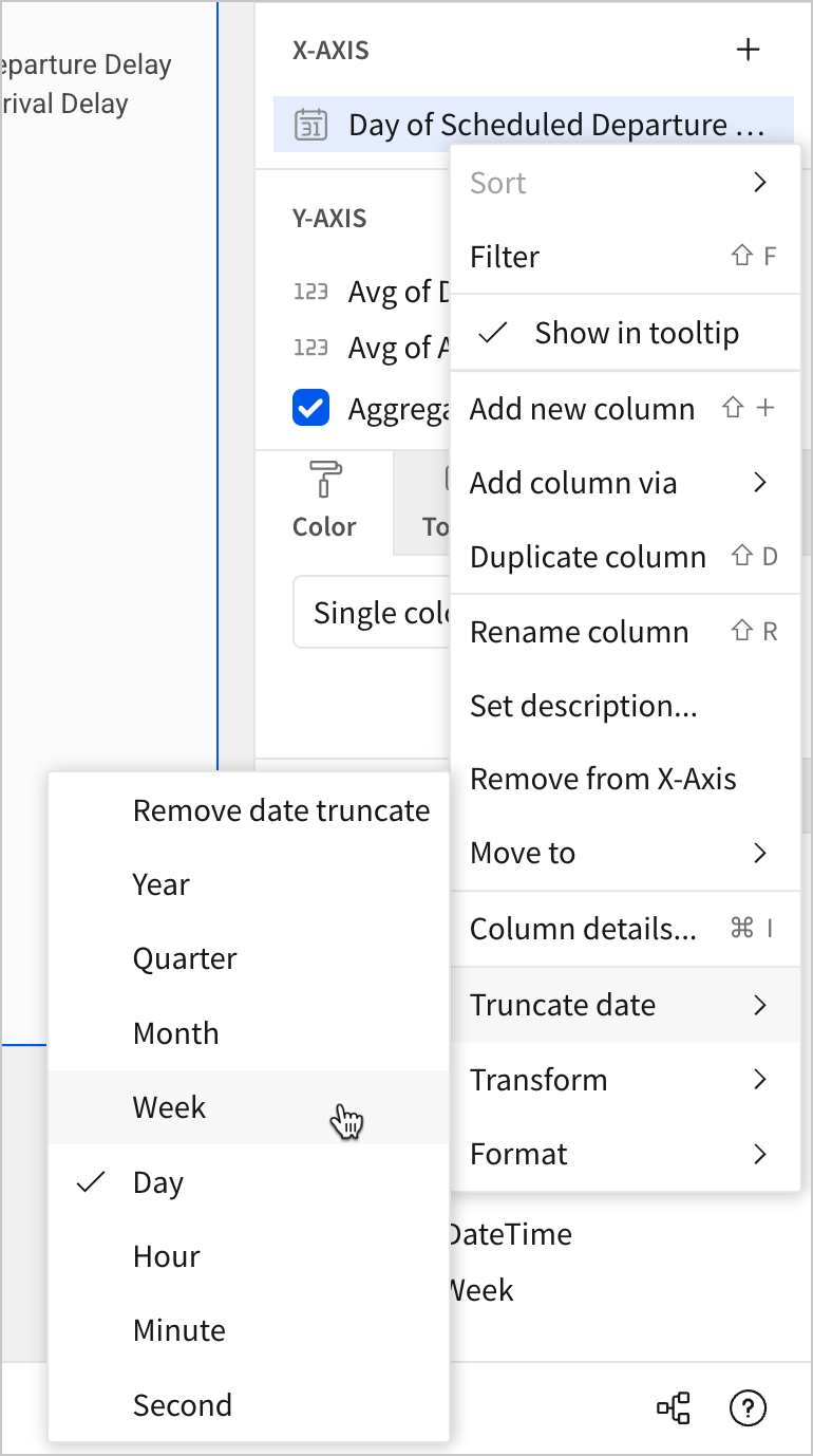
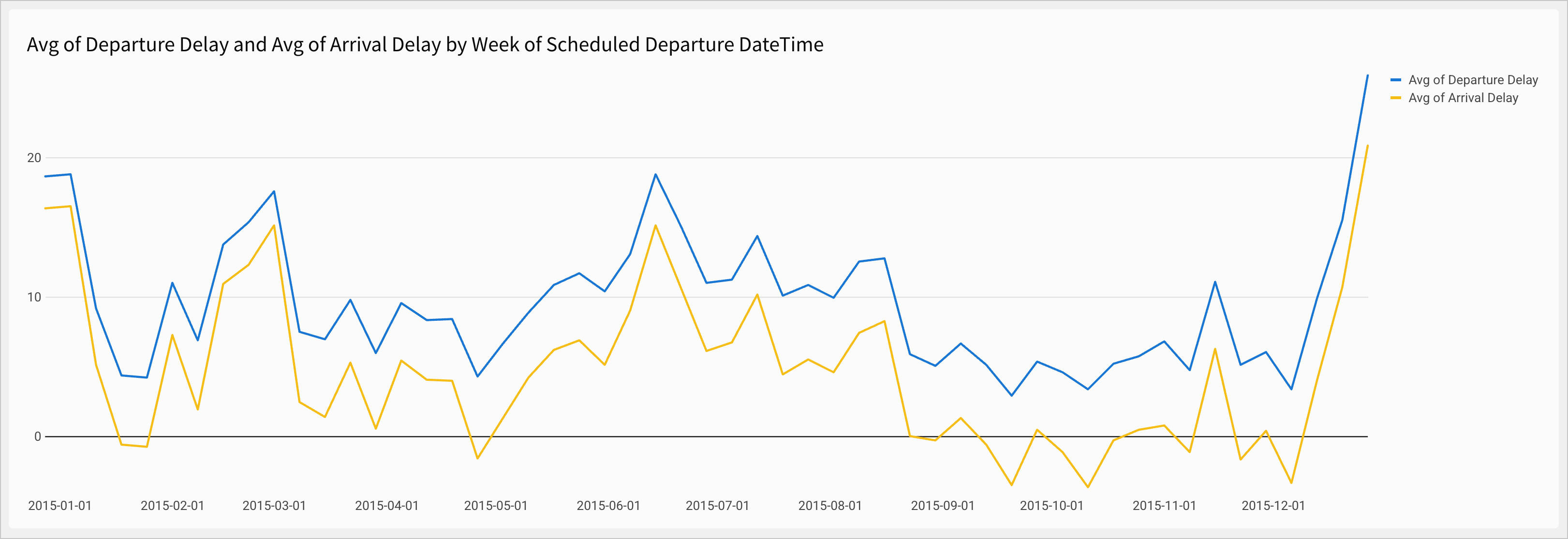
Sigma automatically adjusts the line to plot points by week instead of by day.
- Rename the chart
Average Departure and Arrival Delay by Week.
We can now see a couple of trends more clearly.
- First, we can see that time of year impacts delay times. Delay times spike around holidays at the end of the calendar year, and they are also elevated for the entire summer.
- Additionally, we can see that arrival delay remains lower than departure delay for the entire year, which might be of interest to us later.
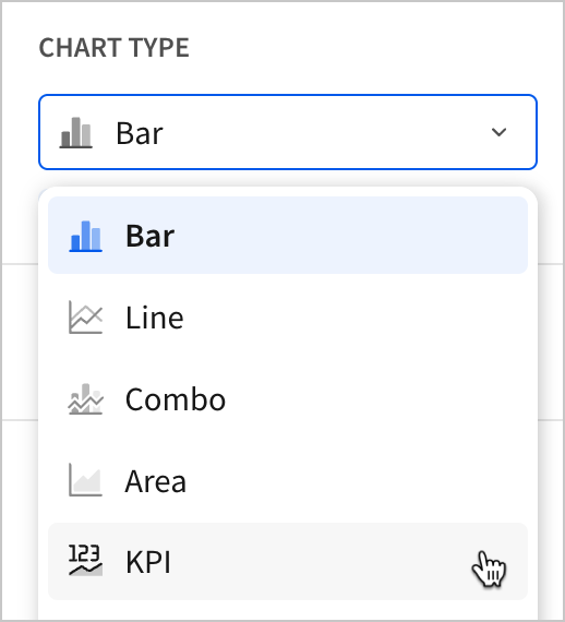
To round out this section, let’s use a pair of KPI elements to make this fact clear to users as soon as they open the dashboard.
-
Return to the Raw Data page.
-
Create two new child chart elements from the FLIGHTS table, and move them both to the Dashboard page.
-
Change the Chart type for both of these new elements to KPI.
-
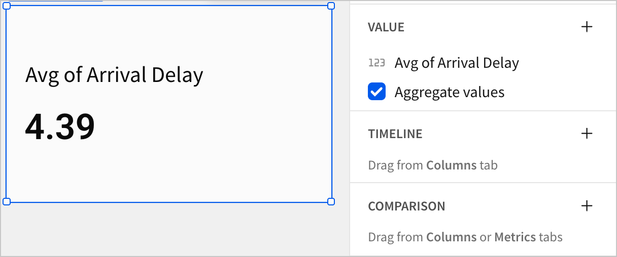
For one, drag
Departure Delayto the Value section and change the aggregate to Avg. -
For the other, drag
Arrival Delayto the Value section and change the aggregate to Avg.
-
Rename them
Average Departure Delay in MinutesandAverage Arrival Delay in Minutesrespectively. -
Spend a few moments reorganizing the dashboard page by resizing and rearranging elements.
- Click Publish to save your work to the published version.
Review chart sources in workbook lineage
So far, all of our dashboard elements have shared one source. They have all been created directly from a single parent element: the FLIGHTS table. To confirm this, and see it represented visually, we can use Sigma’s lineage feature.
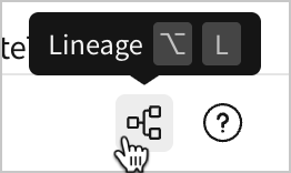
- Click the
 Lineage in the bottom-right corner of the workbook.
This opens the workbook lineage, where element relationships are displayed in a directed acyclic graph (DAG).
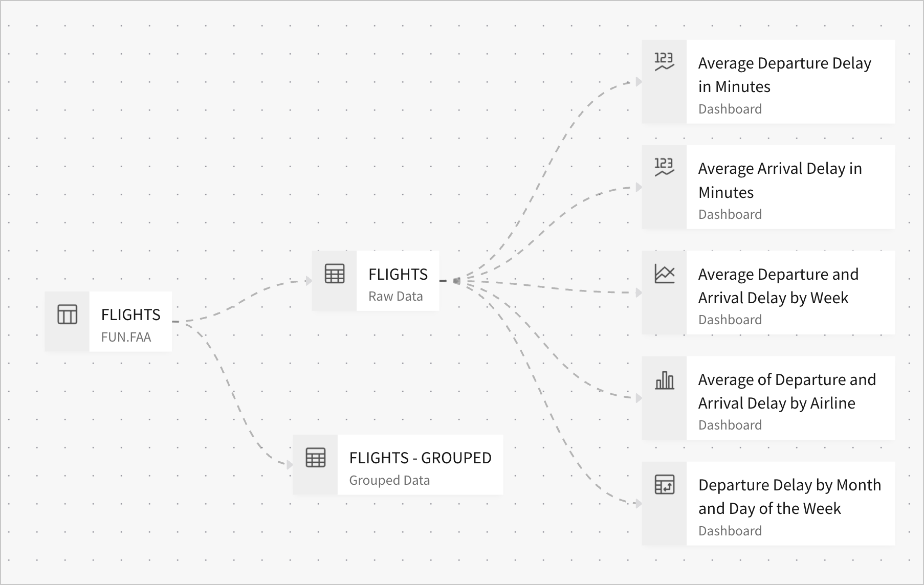
The chart is read from left to right. Sources, like the FLIGHTS table in the Sigma Sample Database Snowflake connection, appear on the left-most edge of the chart. Dotted lines flow downstream (to the right) to elements that inherit data.
As an example, we can trace that the lineage for the line chart Average Departure and Arrival Delay by Week starts at the Sigma Sample Database FLIGHTS table, then moves downstream to the FLIGHTS table element on the Raw Data page, and terminates at the line chart Average Departure and Arrival Delay by Week.
In this section, let’s add another layer to this lineage, and use this chart to verify that we’ve configured our elements correctly.
- Return to the Dashboard page.
So far, all of our dashboard elements are focused on departure delay and arrival delay across all flights in 2015. It’s appropriate for them to share the same parent dataset, since they all visualize trends within that dataset.
Imagine we’ve been asked, however, to deepen our analysis of arrival delay by analyzing its root causes. Let’s return to our parent table to learn about some information we could use for this analysis.
-
Navigate to the Raw Data page, and create a child element table.
-
Rename it FLIGHTS - Delay Breakdown.
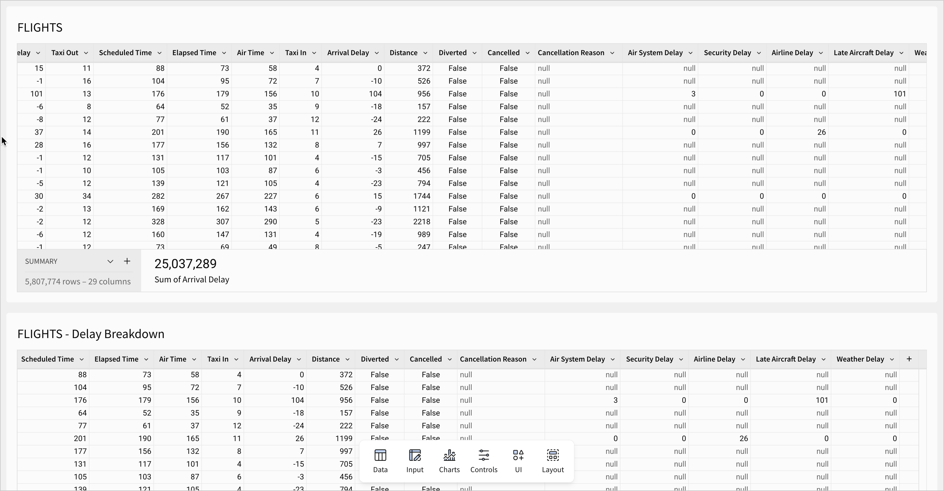
- Scroll over to the last handful of columns in the new FLIGHTS - Delay Breakdown child table.
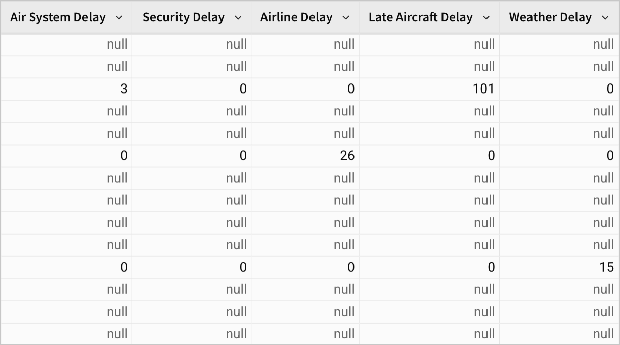
These five columns - Air System Delay, Security Delay, Airline Delay, Late Aircraft Delay, and Weather Delay - are the component parts of Arrival Delay for flights that arrived 15 minutes late or more.
For example, a flight with an Arrival Delay value of 15 minutes might have the following values for these five columns:
Air System Delay-7Security Delay-2Airline Delay-3Late Aircraft Delay-3Weather Delay-0
These all add to the total Arrival Delay value of 15. In other words, they can tell us why a flight was delayed.
Note the following:
- Any flight with less than 15 minutes of Arrival Delay has null values for all five of these columns.
- Cancelled flights have null values for all five of these columns.
- Diverted flights have null values for all five of these columns.
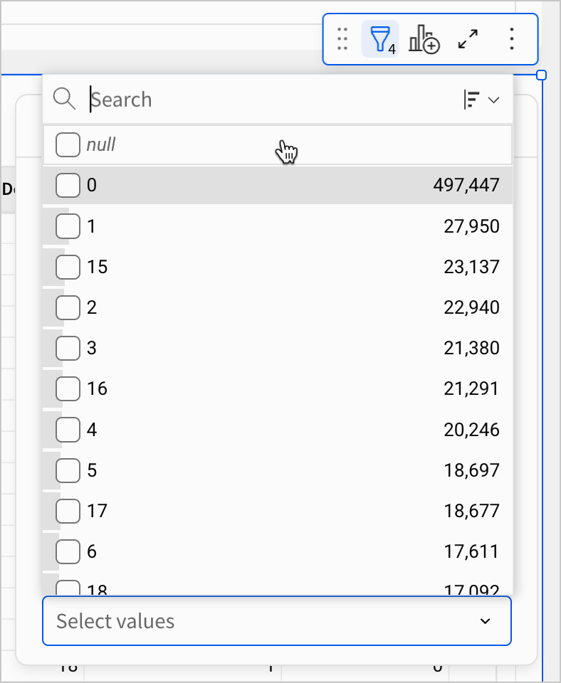
If you were doing discovery on this dataset independently, then you might want to verify which records have null values, and under what circumstances. You could confirm this by configuring filters on the FLIGHTS - Delay Breakdown table.
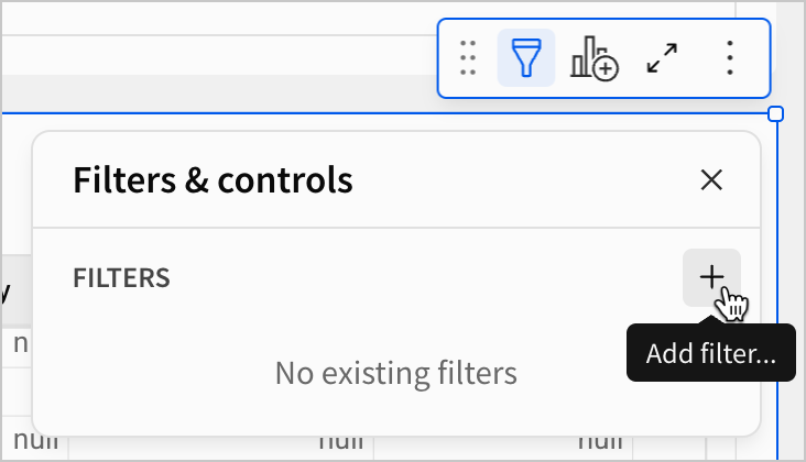
-
Using the Add filter… option, create filters for
Arrival Delay,Cancelled,Diverted, andAir System Delay. Alternatively, create them from the column menu for each field. -
Change the Filter type for
Air System Delayto List.
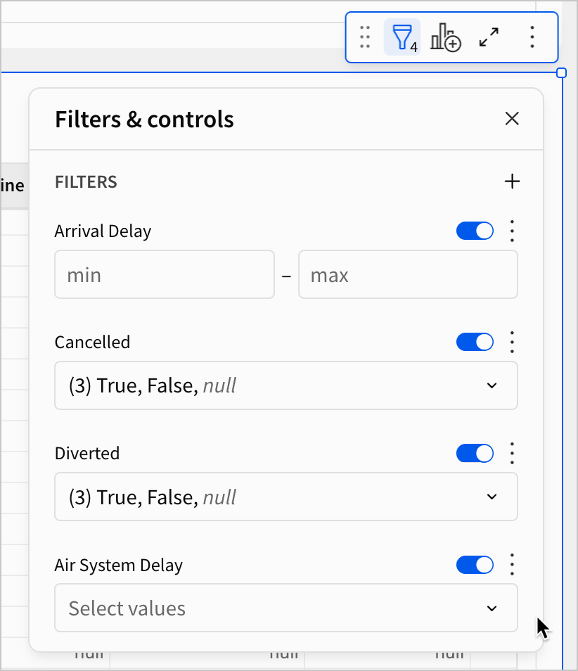
-
In the Arrival Delay filter, set the min value to
15. -
In the Cancelled filter, select
Falseonly. -
In the Diverted filter, select
Falseonly.
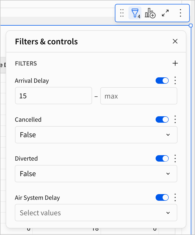
- Open the Air System Delay list filter, and confirm that there are no records with a null value.
Using these filters, we’ve now limited our results to 1,060,551 flights that arrived 15 minutes late or more. Each record in this table has a breakdown of that delay as well. Using this table, we can make a new chart that visualizes this information.
-
Create a child chart element from the FLIGHTS - Delay Breakdown table.
-
Move the new chart element to the Dashboard page.
-
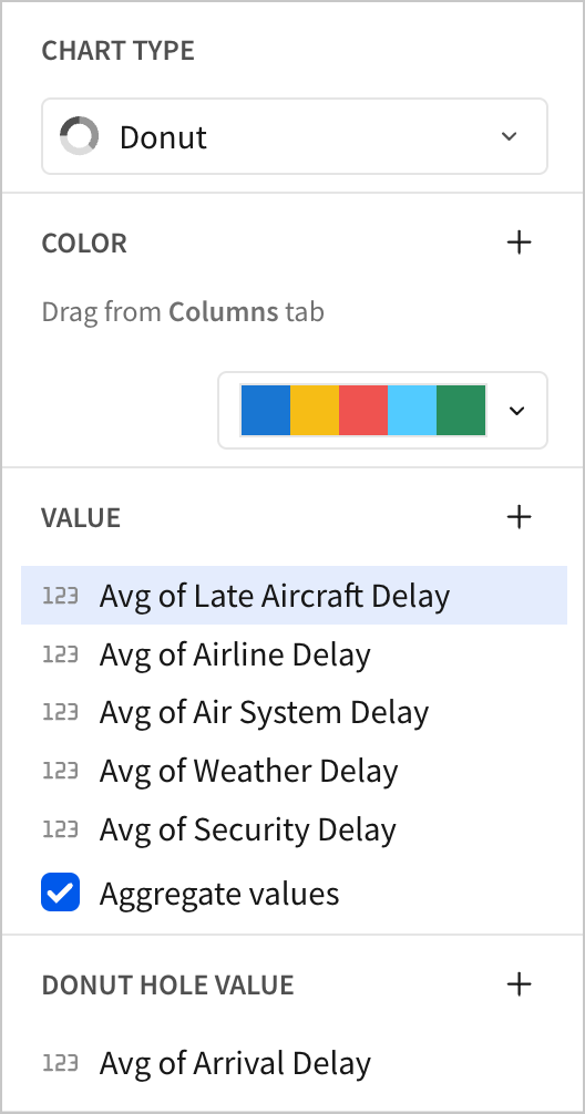
Set the chart type to Donut.
-
In the Value section, add an average calculation for each of the five sources of delay. In the Donut Hole Value section, add a calculation for the average of Arrival Delay.
- Rename the chart
Average Arrival Delay by Delay Type.
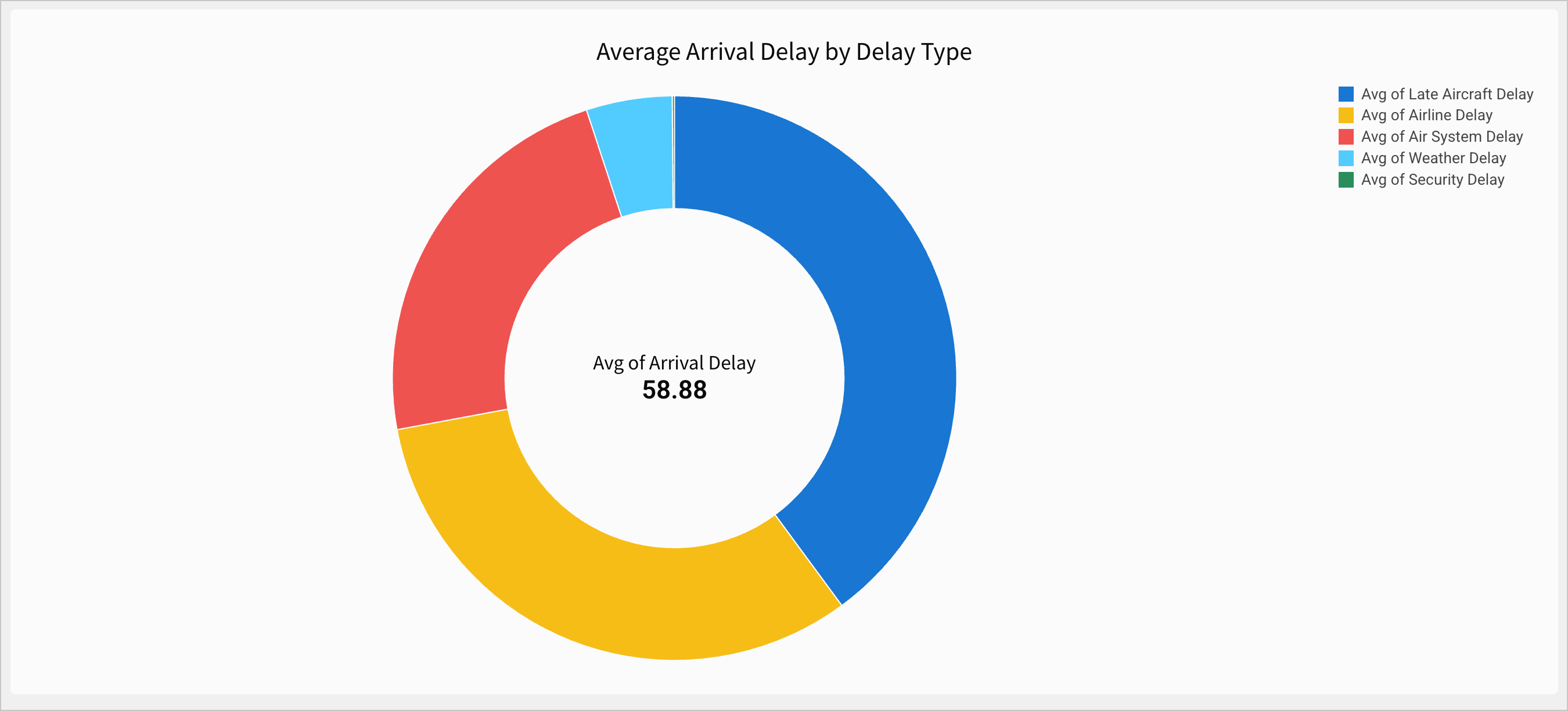
We can now see that the average arrival delay for these flights is 58.88 minutes - almost an hour - and that the majority of that delay comes from Late Aircraft Delay and Airline Delay.
- Open the Lineage again.
Our newest chart appears on the far right of the lineage, as the furthest downstream element. It is a child element of the FLIGHTS - Delay Breakdown table, which is a child element of the FLIGHTS table that the rest of our charts are built from.
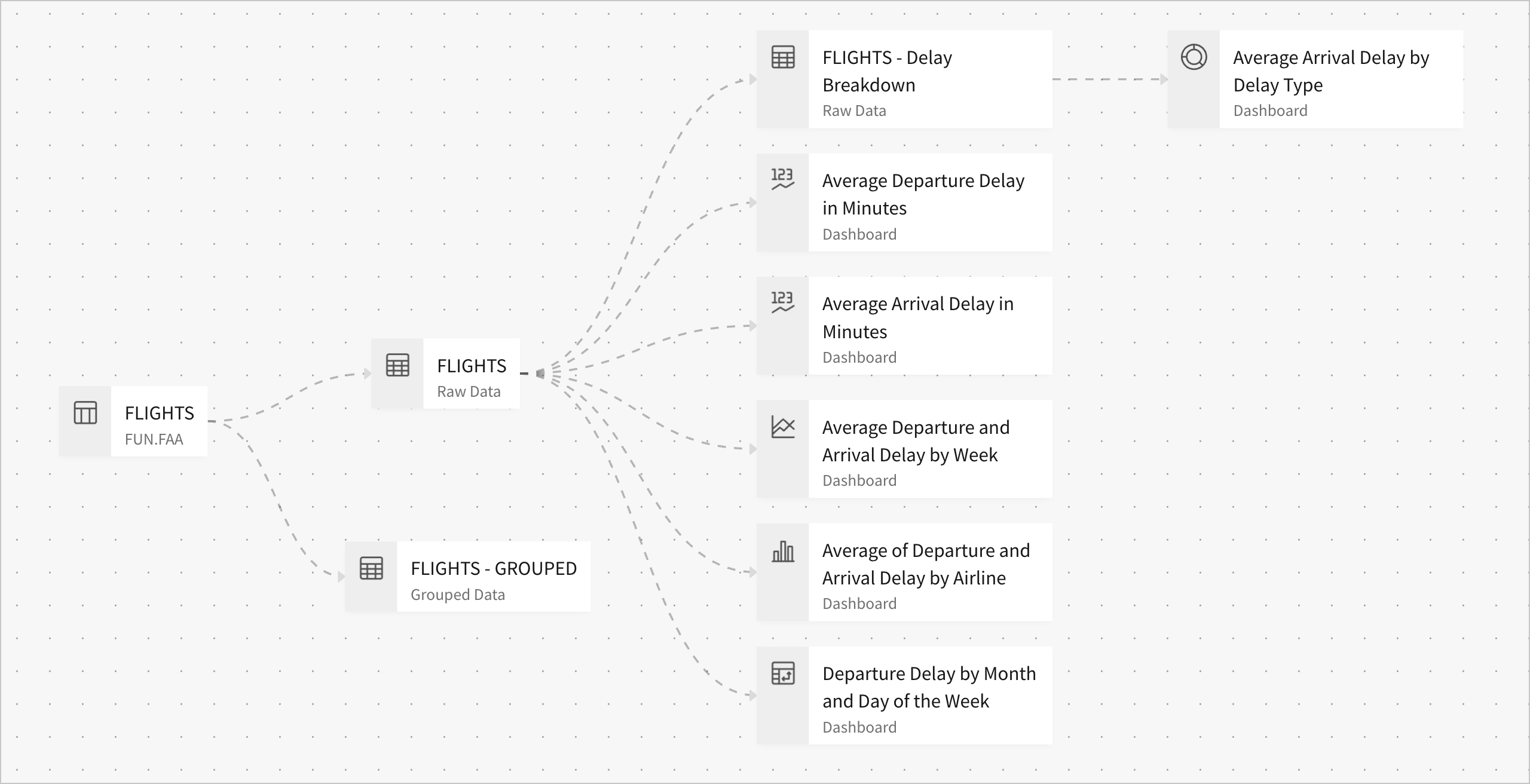
Because the FLIGHTS table is still upstream of all charts, any changes we make to it - like new filters - are still universal. Changes we make to FLIGHTS are reflected in the child table FLIGHTS - Delay Breakdown, which are in turn be reflected in its child elements like the Average Delay by Delay Type donut chart.
However, we don’t have to apply filters to every element. When we want to filter only from flights that were delayed 15 minutes or more, we can now filter FLIGHTS - Delay Breakdown.
When should I split the workbook lineage like this?
When deciding on data sources for the elements in a workbook, less is more. If you can achieve the same functionality with fewer data sources, the workbook is easier to manage than one with more data sources.
For example, if you were constructing a sales dashboard with one page on profit, one page on order volume, and one page on revenue by region, you could use the same data source for all of them. This is because you don’t need to filter the data source differently for each of these pages. They can all be derived from the same set of records.
One key advantage of this is that, as you add more elements and interactions, you don’t have to track or maintain the various filters that should apply to them. They can all be added to the parent data source.
Only split the lineage when there’s a significant group of elements that must reference a logically separate set of records.
- Click Publish save your work to the published version.
Organization
Before concluding this lesson, let’s briefly organize our workbook pages by topic, and hide our raw data from end users to make the workbook more legible. In a future lesson, we’ll take a closer look at organization and style.
-
Rename the Dashboard page to
Departure Delay vs Arrival Delay. -
Add a new page, and name it
Arrival Delay by Delay Type. -
Open the page menu for Raw Data and select Hide page.
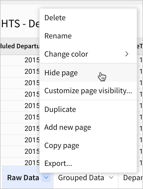
- Hide the Grouped Data page as well, so that you have two hidden pages, and two named dashboard pages.
Hidden pages aren’t seen by the end users of the workbook. They’re useful for omitting unnecessary details for users that you still need as an editor. For more information on hidden pages, see Manage workbook page visibility.

- Move the donut chart Average Arrival Delay by Delay Type to the new Arrival Delay by Delay Type page.
- Click Publish to save your work to the published version.
Now, let’s view the published version of the workbook to see what our changes did for our users.
- Open the workbook menu and select Go to published version.
You can now see what an end user would see: two published pages, one for each distinct set of records we’ve built chart elements from. Our data tables are hidden from the end user, directing their attention to the charts and visuals we’ve prepared for them.
Conclusion
At the end of lesson four, we’ve made significant progress developing our dashboard by adding and configuring several chart elements built on appropriate parent data tables. To do that, we learned about the following:
- Bar charts
- Line charts
- KPI elements
- Donut hole charts
- Workbook lineage
- Hiding workbook pages