Create sparklines in a table
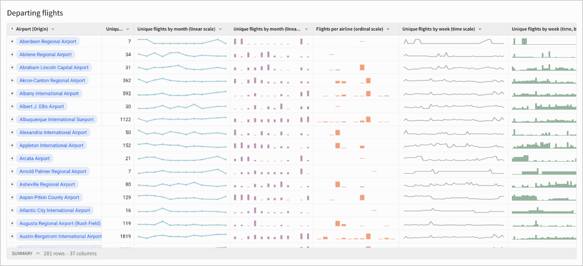
Sigma supports creating sparklines, which are small charts within a single cell. These charts can help show data trends at a glance, and can be valuable for creating overviews of data. They may remove the need for many individual charts and can help save visual space in a workbook. For example, you may want to generate sparklines to show trends in sales performance or website traffic over time. The following table shows trends in departing flights from various airports:
This document covers how to add, format, investigate the data in, and export sparklines. It also covers an example use case for creating sparklines.
User requirements
- To create sparklines, you must have Can Edit or Can Explore access to an individual workbook.
- The workbook must be in either Edit mode or Explore mode. See Workbook modes overview.
Add sparklines
Currently, Sigma only supports creating sparklines in tables and pivot tables. To create a sparkline for an input table, create a child table from your input table element.
How to add sparklines depends on how your data is formatted:
-
If your data is JSON data in an
x,yformat (e.g.{"x":"2025", "y":"123456"}), add a new column in your desired table and use the Sparkline function. See Sparkline for more information.The key-value pairs must be labelled as
xandy. Other labels are not compatible with the Sparkline function. -
If your data is not JSON or not in an
x,yformat, there are two methods you can use to add sparklines:- Create a new column in your desired table and use the SparklineAgg function. See SparklineAgg for more information.
- Add sparklines from a table in a workbook.
To add sparklines from a table:
-
Add a grouping to your table. Under Groupings, select + Add grouping…, then select the column you want to group by.
Groupings are necessary for sparklines as multiple values are needed to create a meaningful sparkline. For more information on groupings, see Group columns in a table. -
From the column you wish you create a sparkline for, select the caret (
 ). Hover over Add column via, then select Sparkline.
 -
Configure your sparkline in the modal that appears:
- Select an X-Axis column from the dropdown. This is usually a time-based column, but can also be another numeric or text column.
- Select a Y-Axis column from the dropdown.
- Select an aggregation method from the Aggregate dropdown. The available options vary based on the data types you select for your axes.
- Select Done.
For sparklines in pivot tables, all cells within a pivot table column will share the same axes for easier comparison.
Format sparklines
You can change sparkline chart type, color, interpolation method, stroke and point style/width, and more. To format sparklines:
-
Select the table with the sparklines you want to format.
-
In the editor panel, select Format, then select Sparkline.
-
From the dropdown, select which sparklines you want to apply formatting changes to:
- Select Apply to all sparklines to apply your formatting changes to every sparkline in that table.
- Select the name of a specific column to apply formatting changes to only that column.
-
Select your desired sparkline chart type (Auto, Line or Bar):
- Auto: (Available if you selected Apply to all sparklines) This automatically assigns chart type based on the x-axis of your chart (line charts are used for time-based and numeric axes and bar charts for categorical x-axes).
- Line: Formats sparklines as line charts.
- Bar: Formats sparklines as bar charts.
-
For line charts, configure your desired formatting options:
-
Color: Select a color for your sparklines using the color picker, color wheel, or from the provided color palette.
-
Interpolation: Select how you want the lines between your data to be interpolated.
-
Stroke style: Select a Solid, Dashed, or Dotted stroke style.
-
Stroke width: Select your desired stroke pixel width.
-
Null data: Select if you want null data to be interpolated, hidden, or represented by zeroes.
-
Turn the Show points toggle on or off. If you choose to show points, configure the available options:
- Point shape: Select Circle, Square, Cross, Diamond or Triangle.
- Point size: Select your desired point pixel width.
-
Turn the Show endpoints labels toggle on or off. Endpoint labels display the first and last
x, yvalue pairs for each sparkline. If you choose to show endpoint labels, you can also select a color for the labels with the color picker, color wheel, or from the provided color palette.If your endpoint labels are not appearing as expected, try changing the selected font size.
To clear previously selected options, select Revert to default.
-
-
Tooltips are shown by default for sparklines. To hide them, turn the Show tooltip toggle off. These tooltips will show the
xandyof the point that your cursor is nearest to.
Investigate sparkline data
You can see a more detailed view of the data in each sparkline:
- Double-click the cell with the sparkline, or right-click the cell and select Show value.
- Select your preferred view:
- Tree view: Select the caret by a specific index to view its
x,yvalues. - Raw text: See an expanded list of all
x,yvalues for that sparkline.
- Tree view: Select the caret by a specific index to view its
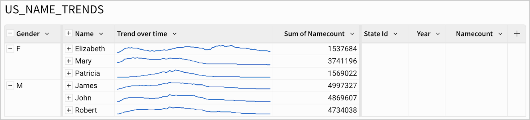
Example: Showcasing popular US baby name trends and distributions over time
A table, US_Name_Trends, contains information about historical U.S. baby name trends, including columns such as:
- State ID: The abbreviated name of a U.S. state
- Year
- Name: A specific baby name
- Namecount: The number of babies born in a specific state, in a specific year, with that specific baby name
- Gender: Baby names classified into either F or M
To get a table with sparklines showcasing the top three most popular baby names for each gender and how they changed from year to year:
- Group the table by Gender. Select + Add grouping, then search for and select Gender.
- Group the table by Name. Select + Add grouping, then search for and select Name.
- From the Name column, select the caret () in the column header, then hover over Add column via, then select Sparkline
- In the sparkline modal, configure the following:
- X-axis: Year
- Y-axis: Namecount
- Aggregate: Sum
Select Done.
- Double-click on the name of the sparkline column and rename it as Trend over time.
- From the Name column, select the caret (), then select Add new column. In the formula bar, enter:
Sum([Namecount]). - From the Sum of Namecount column, select the caret, then select Filter.
- Select More ⋮, then Change filter type, then Top N.
- Next to Top N, enter
3. - Select - in the Name column to collapse the rows. Your table should look something like:
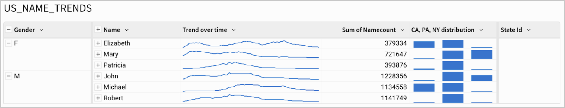
To get a view of the distribution of these 3 most popular names per gender over the states of California (CA), New York (NY) and Pennsylvania (PA):
- Select + in the Name column to expand the rows.
- From the Name column, select the caret in the column header, then hover over Add column via, then select Sparkline.
- In the sparkline modal, configure the following:
- X-axis: State Id
- Y-axis: Namecount
- Aggregate: Sum
- Select Done.
- From the State Id column, select Filter. Search for and select CA, NY and PA. Your table should look something like:
Export tables with sparklines
To export or download tables with sparklines, see Send or schedule workbook exports.