Use repeated containers to generate layouts from data
Use repeated containers to define a layout that repeats for each row in a data source. Repeated containers display several cards in a grid or list, with a unique card for each row of the data source. While the layout of each card is identical, the cards can be customized with dynamic content from that row of the data source. You can customize the layout, content, and style of the cards, and configure actions that trigger when selecting a card.
Repeated containers are a layout element, allowing you to guide users and create focused interfaces as you build AI apps in Sigma.
Use a repeated container when you want to:
- Create several identical layouts automatically.
- Dynamically update items in a layout based on changes to a data source.
- Create a layout for a data source with a varying number of rows.
User requirements
The ability to create and modify repeated containers requires the following:
- You must have Can edit or Can explore access to the individual workbook.
- You must be in Edit or Explore mode for the workbook. See workbook modes overview.
Limitations
- Creating a repeated container requires a connected data source.
- The following elements cannot be used in a repeated container card:
- All data elements
- All input elements
- All chart elements
- All control elements
- Repeated container
- Tabbed container
About repeated containers
Using the repeated container, you can define a layout one time, and have it repeat with dynamic content for each row in a data source. Each row in the data source generates one card. For example, a table with 10 rows generates 10 cards. Adding a row adds a card, and deleting a row deletes a card.
Because each repeated container card is associated with one row in the data source, you can customize each card with information from that row. For example, if you have a table of employee data, you can create a repeated container where each card displays an employee’s name, department, and picture.
Repeated containers allow you to automatically configure layouts from data, without having to manually create or update each layout when the data changes. To walk through an end-to-end example, see Example: Create an interactive employee directory.
Add a repeated container to a workbook
You can add a repeated container from the Add element bar or directly from an existing data element.
Add a repeated container from the Add element bar
- In the Add element bar, select Layout, then select Repeated container.
- In the Select source modal, select a data source for the repeated container.
A repeated container element appears on the canvas.
Add a repeated container from an existing element
- Navigate to the element you want to use as the data source for the repeated container.
- Select
 Create child element > Repeated container.
A repeated container element appears on the canvas.
Add elements to a repeated container card
To add an element to a repeated container:
- Select the repeated container element.
- In the Add element bar, select the element you want to add. For a list of elements that aren’t supported in the repeated container, see Limitations.
- (Optional) For elements outside of the repeated container, drag and drop the element into a repeated container card.
The element appears in all repeated container cards. Adding an element to one repeated container card adds that element to all cards in the repeated container. Changes made to the element in one card affect all cards.
Create an action sequence with an On select card trigger
You can execute actions when a user clicks on a card in the repeated container by configuring an action sequence with an On select card trigger. Action sequences with an On select card trigger can use the selected card as context for the action sequence.
- Select the repeated container element.
- In the editor panel, select Actions.
- Click
 Add action sequence to create a new sequence.
An action sequence with an On select card trigger appears.
Example: Update a control when a user selects a card in a repeated container
You can use an action sequence with an On select card trigger to update a control with data from the selected card.
In a workbook with a repeated container and a text input control:
- In the editor panel, select Actions.
- If you do not have an action sequence with an On select card trigger, click
 Add action sequence to create one.
 - In the action sequence, click Add action to add an action to the sequence.
- In the action configuration modal, select Set control value from the Action dropdown.
- In the Update control dropdown, select the text input control.
- In the Set value as dropdown, select Column.
- In the Column dropdown, select the column to provide as the control value.
When a user clicks on the card, the text input control updates with the value for the selected column from the selected card.
Change the data source of a repeated container
To change the data source of a repeated container:
- Select the repeated container.
- In the editor panel, select Properties.
- Under Source column, select
 > Change source….
 - In the Change source modal, select a new data source.
The repeated container updates to use the new data source. Any elements connected to the repeated container that reference columns from the previous data source update to display the value for the column with the same name from the new data source.
When you change the data source of a repeated container, connected elements that reference columns from the previous data source display an error if there is no column with the same name in the new data source.
For example, if a value list displays information from a column in one data source, and you change the data source of the repeated container to a data source that does not have a column of that name, the value list displays an error.
The same error appears if you delete a column from the data source of a repeated container.
Customize a repeated container
To customize the location, size, and style of a repeated container, see the following sections:
- Move a repeated container
- Resize a repeated container
- Change the layout of a repeated container
- Set the grouping level used by a repeated container
- Style a repeated container
Move a repeated container
To change the location of a repeated container, select it, then drag it to the new location.
Resize a repeated container
To resize a repeated container, click and drag the edges of the element.
When resizing a repeated container, consider the following:
- Resizing a repeated container does not directly resize its cards. To resize repeated container cards, see Resize repeated container cards.
- When resizing a repeated container with a grid layout, the number of cards displayed changes in response to the dimensions. For example, if you resize a repeated container to be narrower, it displays fewer cards in each row. If you resize a repeated container to be taller, it displays more cards in each column.
- If you resize a repeated container to a dimension smaller than its cards, card contents are obscured. For example, if you resize a repeated container to be shorter than an individual card, the card is cut off, and not displayed in its entirety.
Change the layout of a repeated container
By default, repeated containers display cards in a grid, with multiple cards displayed in each row and column. You can change the display to a list view, where only one card is shown in each row.
- Select the repeated container element.
- In the editor panel, select Properties.
- Select List.
To return to the grid view, select Grid.
Set the grouping level used by a repeated container
If the data source of the repeated container includes groupings, you can select which grouping level the repeated container uses:
- Select the repeated container element.
- In the editor panel, select Properties.
- In the Source grouping dropdown, select a grouping level.
The repeated container updates to use the selected grouping level. The number of cards displayed changes to match the number of rows in the selected grouping level. For example, in a table grouped by State, selecting the State grouping level displays one card for each state.
Style a repeated container
In the editor panel, select Format. In the Element style section, configure the following to style your repeated container:
Customize repeated container cards
To customize the location, size, and style of repeated container cards, see the following sections:
- Resize repeated container cards
- Sort repeated container cards
- Filter repeated container cards
- Style repeated container cards
Resize repeated container cards
To change the Card size of all cards in a repeated container:
- Select the repeated container element.
- In the editor panel, select Format.
- Open the Card style section.
- In the Card size dropdown, select Small, Medium, or Large.
The card size applies to all cards in the repeated container.
When resizing repeated container cards, consider the following:
- Resizing cards does not directly resize the repeated container. To resize the repeated container, see Resize a repeated container.
- You can resize cards vertically with the drag handle at the bottom of any card.
- Size changes applied to one card apply to all cards.
Sort repeated container cards
You can sort repeated container cards in ascending or descending order by any column in the data source.
-
Select the repeated container.
-
Select
 More to open the element menu, and select Sort by.
 -
In the Sort modal, configure the following fields for each column used to sort:
-
(Optional) Select + Add column to configure a second column to sort by.
To change the sort column and order, or to delete the sort, select Sort by in the element menu and make changes in the Sort modal.
Filter repeated container cards
You can filter repeated container cards independently of the data source.
- Select the repeated container.
- Select
 Filters.
 - In the Filters modal, click Add filter.
- Select a column for the filter.
- Make a selection for the filter.
The filter criteria apply to the repeated container cards.
Style repeated container cards
In the editor panel, select Format. In the Card style section, configure the following to style your repeated container cards:
Example: Create an interactive employee directory
You can follow along with the step-by-step instructions in this example to create an interactive employee directory using the repeated container element. Each card contains the employee’s name and image. Clicking on a card displays additional information about the employee.
Add a data source for employee
This example uses a table from the Sigma Sample Database. Your organization might have disabled access to the Sigma sample connection. If so, you can contact an admin to enable it, or use a table from another connection to follow along with this example.
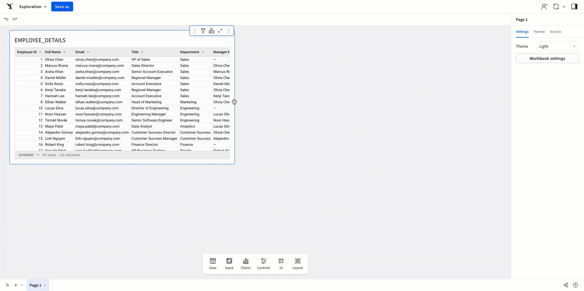
To start, add the “EMPLOYEE_DETAILS” table to the workbook:
- In a new workbook, select Data > Table > Data sources > Connections.
- Open the Sigma Sample Database.
- Select the
FINANCE.HEADCOUNT_ANALYSIS.EMPLOYEE_DETAILStable.
The table appears on the workbook canvas.
Create a repeated container from the data source
After adding the data source, create a repeated container as a child element:
- Select the input table.
- Select Create child element > Repeated container.
A repeated container element appears on the page.
Move the repeated container to a new page and hide the page with the data source:
- Select the repeated container.
- Select More > Move to > New page.
- Rename the new page “Employee Directory”
- In the page tab menu for the “EMPLOYEE_DETAILS” page, select , then select Hide page.
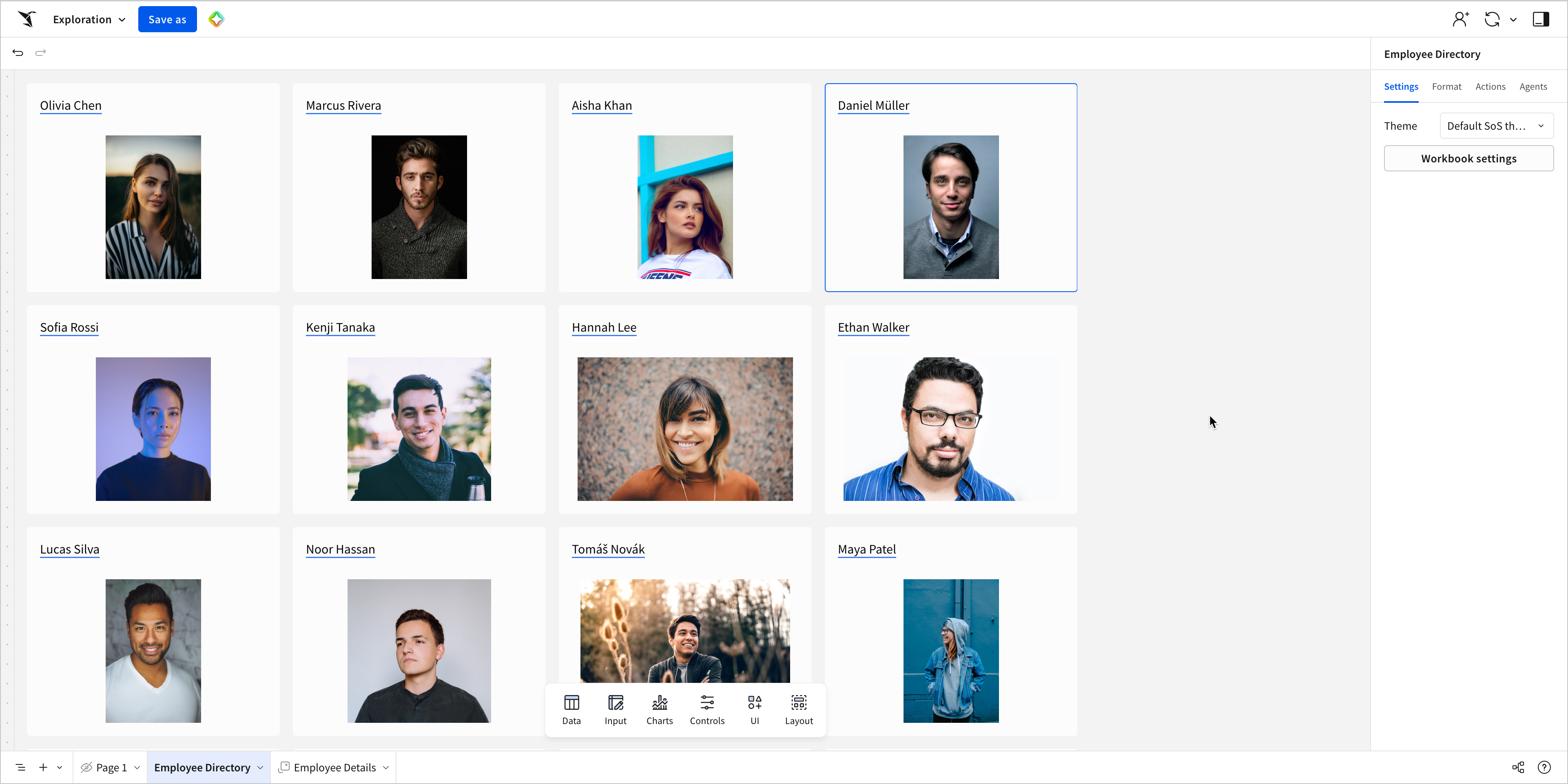
Configure the repeated container cards
Add elements to the repeated container cards:
- In the Add element bar, select UI > Text.
- Drag the text element into any repeated container card.
- In the Add element bar, select UI > Image.
- Drag the image element into any repeated container card.
The elements appear in all cards.
Configure the text element:
- Select the text element.
- In the Text field, press
=on your keyboard to open the formula bar. - In the formula bar, set the Input type to Source column, and select the Full Name column from the input table.
Each card now displays the name of the employee associated with that row.
Configure the image element:
- Select the image element.
- In the editor panel, select Properties.
- Set the image source to Data.
- In the Image column dropdown, select Profile Image URL.
Each card now displays an image of the employee associated with that row.
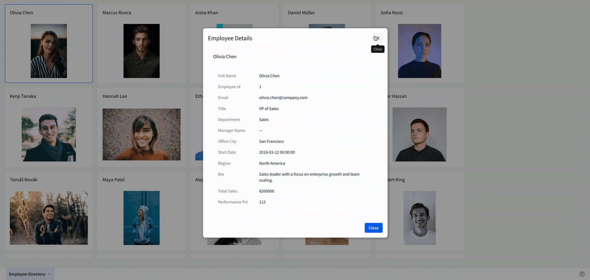
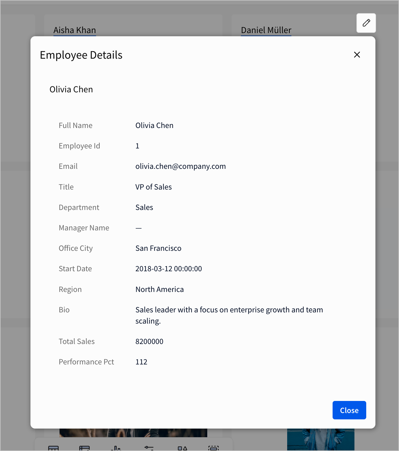
Configure a modal with a single row container to display employee details
Add and configure a modal for additional details:
- In the workbook footer, select More options > Add modal.
- Rename the modal “Employee Details”.
- In the editor panel, select Format and open the Footer section.
- Rename the Primary button to “Close”.
- Turn off the Show secondary button toggle.
- In the editor panel, select Actions.
- In the action sequence with an On click - primary trigger, click Add action.
- Set the action to Close modal.
Add and configure a single row container in the modal to display information about each employee:
- In the Add element bar, select Layout > Single row container.
- In the Select source modal, select the “EMPLOYEE_DETAILS” table as the source for the single row container.
- In the Single row container modal, select the Employee Id column as the unique identifier.
- Click Create.
- Add and configure a text element in the single row container to display the name of the selected employee:
- In the Add element bar, select UI > Text.
- Drag the text element into the single row container.
- In the Text field, press
=on your keyboard to open the formula bar. - In the formula bar, set the Input type to Source column, and select the Full Name column from the input table.
- Add and configure a value list in the single row container to display details of the selected employee:
- In the Add element bar, select UI > Value list.
- Drag the value list element into the single row container.
- In the editor panel, select Properties.
- Select Add field.
- Repeat the previous step to add the remaining fields from the data source, except for Profile Image URL.
When a value is selected in the single row container, the elements display the details of the selected employee.
Configure an action sequence to display additional information
Configure an action sequence to update and open the modal:
- Navigate to the Employee Directory page.
- Select the “EMPLOYEE_DETAILS” repeated container.
- In the editor panel, select Actions.
- In the action sequence with an On select trigger, click Add action.
- In the modal, configure the required fields to define the response:
- In the action sequence with an On select trigger, click Add action.
- Set the action to Open modal.
- In the Select modal dropdown, select Employee Details.
When you click on a repeated container card, the action sequence opens the modal, and displays information about the employee from the selected card.