
Build a line chart
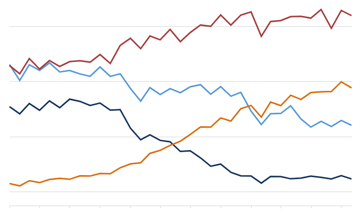
Line charts are typically used to assess how values change over time. Create basic single-line charts to spot trends and identify anomalies in your dataset. You can also build advanced multi-line charts to analyze and compare multiple variables over the same period of time.
This document details basic line chart requirements and introduces key properties and format options to help you enhance your workbook charts.
Example use cases:
Consumer packaged goods (CPG) analytics: Compare monthly profit margins by product category to understand profit trends and gain insight into overall business profitability.
Manufacturing analytics: Track machine uptime percentage by the hour to identify productivity lapses and reliability issues.
Air travel analytics: Assess monthly percentage of on-time flight departures by airline to understand seasonal patterns and compare operational efficiency across companies.
User requirements
The ability to create line charts and other charts requires the following:
-
You must be assigned an account type with the Edit Workbook and/or Explore Workbook permission enabled.
-
You must be the workbook owner or be granted Can explore or Can edit workbook permission.
If you're granted Can explore access to the workbook, you can create and modify chart properties and formatting in Explore mode, but you cannot publish your changes.
Workbook prerequisite
Before you can build a line chart, you must add a new chart element and select a data source.
At the core of every chart is an underlying data table (derived from the data source) that supplies the information visualized by the chart. As you build a line chart, Sigma automatically groups, aggregates, and calculates the underlying data to create source columns for various chart properties. You can view the underlying data table while configuring the chart to see how the data is applied.
Line charts support up to 25,000 data points. If the configurations result in a data set that exceeds this limit, the chart displays the first 25,000 data points, and a warning message indicates that the chart is incomplete. To reduce the number of data points, aggregate the values or apply data filters to the chart or source element.
Basic line chart requirements
To plot a line chart, configure the following properties in the ![]() Element properties panel:
Element properties panel:
| Chart | Chart type displayed in the workbook |
| X-axis | Source column that defines the x-axis (horizontal axis) categories |
| Y-axis | Source column that defines the y-axis (vertical axis) variable |
In a line chart, the x-axis typically represents time-based categories (like dates, months, years) that correspond with individual data points. The y-axis represents a variable that measures a value (like sales, leads, expenses) for each category and determines the vertical placement of each data point.
Select the chart type
After you add a new chart to a workbook, select the chart type:
-
In the Chart property, click the dropdown field and select Line from the list.
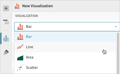 You can also use this dropdown field to convert an existing chart to a different type. Sigma retains all property and format configurations shared by the initial and new type. Unshared properties and formatting are not saved or restored if you further convert the chart.
Define the x-axis categories
Configure a source column to define the x-axis categories.
-
In the X-axis property, click
 Add column and select an option from the menu:
-
To generate categories based on distinct values in an existing column, search or scroll the Select column list and select the preferred column name.
-
To generate categories based on a custom formula, select New column and enter the formula in the toolbar.
You can also select or replace an existing column by dragging and dropping a column name from the Columns list to the X-axis property.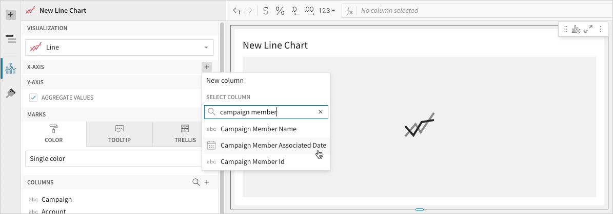
-
-
[optional] Control how the source column data is categorized and displayed in the chart:
-
Hover over the source column name, then click the caret (
 ) to open the column menu.
 -
Hover over any of the following items, then select the preferred option:
Truncate date Categorize date values by the selected interval or unit of measure. Transform Convert the column to the selected data value type. Format Display axis and data labels in the selected format.
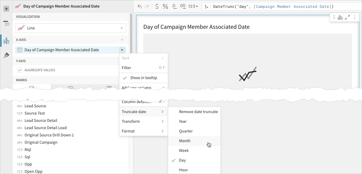 Availability of column menu items and corresponding options varies depending on the column’s data value type (for example, Truncate date is available for date values only).
 -
Define the y-axis variable
Configure a source column to define the y-axis variable. Sigma automatically aggregates values associated with the same x-axis category.
-
In the Y-axis property, click
 Add calculation and select an option from the menu:
-
To aggregate values of an existing column, search or scroll the Aggregate column list and select the preferred column name.
-
To calculate values based on a custom formula, select New column and enter the formula in the toolbar.
-
To count the number of rows associated with each category, select Row count.
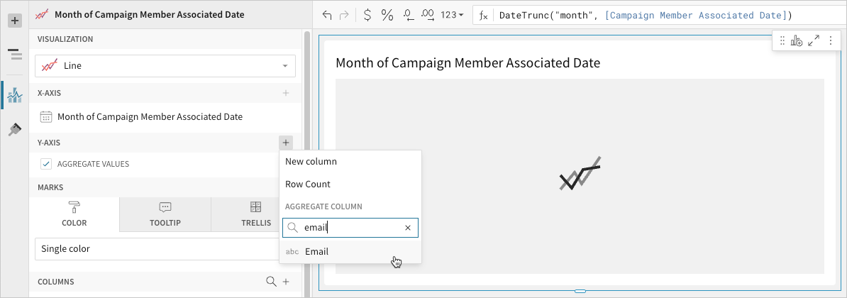 You can also select an existing column by dragging and dropping a column name from the Columns list to the Y-axis property.
 -
-
[optional] Control how the source column data is calculated and displayed in the chart:
-
Hover over the source column name, then click the caret (
) to open the column menu. -
Hover over any of the following items, then select the preferred option:
Set aggregate Calculate values based on the selected aggregation method. Transform Convert the column to the selected data value type. Format Display axis and data labels in the selected format.
To plot the source column data without aggregating values, clear the Aggregate values checkbox in the Y-axis property. If this results in an incomplete chart that exceeds the 25,000 data point limit, reaggregate the values or apply data filters to reduce the number of data points.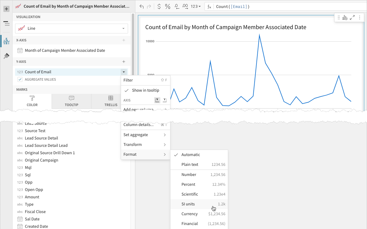 You can also use the toolbar to change the aggregation method (using the formula) and data label format.
 -
-
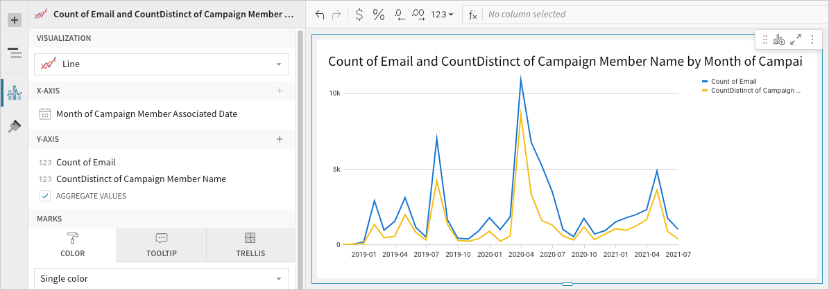
[optional] Repeat the previous steps to configure multiple y-axis source columns. Sigma plots each as a separate line series on the chart.
-
[optional] Sigma auto-generates source column names and chart titles to reflect the visualized data, but you can customize these fields as needed:
-
To rename a source column, double-click the column name in the X-axis or Y-axis property, then enter a new name. Changes are reflected in the default chart title.
-
To edit the chart title, double-click the title in the chart, then enter a new title.
Sigma auto-generates the default chart title only. Once the title is customized, it no longer reflects changes to source columns and their names.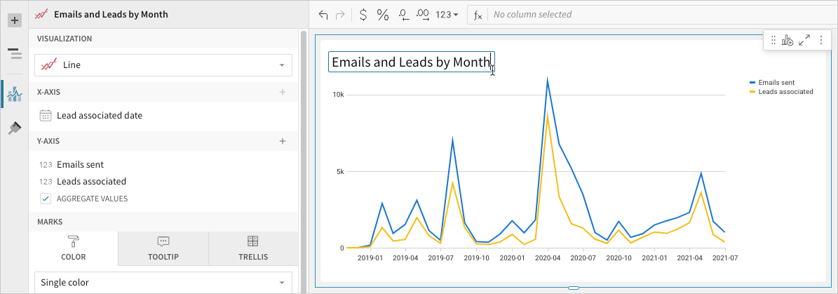
-
Advanced line chart properties
Sigma features various properties and format options that give you the flexibility to build advanced line charts and variations, including multi-line, step-line, and dual-axis line charts.
The following sections introduce configurations that can enhance your line charts and help you deliver specific insights with meaningful and actionable information.
Configure mark colors
Configure line mark colors in the ![]() Element properties > Marks > Color tab to differentiate data, highlight associations, or split your chart colors by category.
Element properties > Marks > Color tab to differentiate data, highlight associations, or split your chart colors by category.
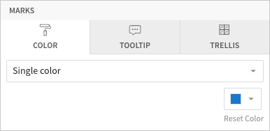
| Mark color | ||
|---|---|---|
Single color |
For each data series, enter a hex code or select an option from the color palette or color picker. |
|
By category |
Select a source column to define color categories, then select or customize a color palette for the resulting multi-line series. |
|


Multiple variables in the y-axis result in a multi-line chart in which each data series represents a measure of a different variable. The By category color setting can also generate a multi-line chart, but the resulting series represent sub-categories (within the x-axis categories) that measure the same variable.
Customize line style
Customize line styles in the ![]() Element format > Line Style section. When the line chart contains multiple y-axis variables, you can modify the different data series individually or together.
Element format > Line Style section. When the line chart contains multiple y-axis variables, you can modify the different data series individually or together.
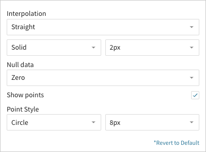
In addition to customizing the line pattern (solid, dashed, or dotted) and weight (1-5px), you can choose the type of interpolation path:
| Interpolation | ||
|---|---|---|
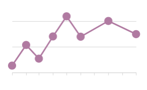
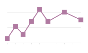
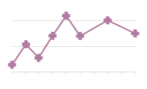
| Straight | Create straight lines between data points. |  |
| Smooth | Create a curved line that runs through data points. |  |
| Step | Create a step up or down between data points, with the vertical line occurring at the midpoint. |  |
| Step (Before) | Create a step up or down between data points, with the vertical change occurring before the horizontal line. |  |
| Step (After) | Create a step up or down between data points, with the vertical change occurring after the horizontal line. |  |
Step-line charts can be useful when visualizing changes that occur at irregular intervals, such as pricing, interest rates, or inventory.
You can also show or hide individual data points and control how the line chart handles null values:
| Null data | ||
|---|---|---|
| Zero | Plot null values as zero-value data points. | 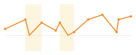 |
| Interpolate | Disregard null values and continue the line path between non-null data points. | 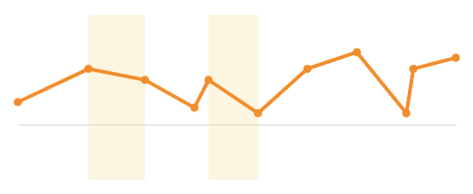 |
| Hide | Omit line paths through null data points. | 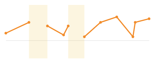 |
By default, line charts hide distinct data points between line connections. If you select the Show points checkbox, you can display the points and customize their size (2-15px) and shape:
| Point style | ||||
|---|---|---|---|---|
| Circle | Square | Cross | Diamond | Triangle |
 |  |  | 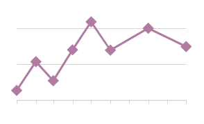 | 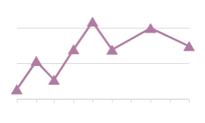 |
Show a single series or multiple series in a tooltip
You can configure a tooltip to display data from a single series or from all series in your chart. By default, line charts show all series values in the tooltip.
- On the workbook page, select the line chart you want to modify.
- In the editor panel, click Format, then select Tooltip to expand the section.
- Turn off the Show multiple series toggle to show only the value for the series the cursor is over. Turn on the Show multiple series toggle again to show all series in the tooltip.
The option to choose between displaying a single series or multiple series in the tooltip is available only for bar, line, and area charts.
All line chart format options
Updated 13 days ago