
Design workbook layouts
The workbook starting state is a blank canvas to which you can add and arrange elements, containers, manage theme and color settings, and more.
There are multiple ways you can customize workbook layouts, such as:
- Grouping your analyses by concept by adding pages
- Add data, interactivity and filtering by adding elements
- Matching your company branding by changing workbook settings like theme and font
- Creating a cleaner workbook by resizing and arranging elements on a page
- Design optimal layouts with best practices in mind, such as removing unneeded space or adding padding
You might also want to add containers to group elements (see Organize workbook layouts with containers) or add modals to create an app-like experience (see Add a modal to a workbook).
User requirements
You need Can edit workbook access to an individual workbook to change its layout.
Add pages to a workbook
Workbooks can contain multiple pages. These pages can be used to group your analyses into different concepts or cohorts, or can act as “dashboards”. To add a page, ensure you are editing a workbook, then select  Add page.
Add elements to a workbook page
Use elements to add data, UI features or controls to your workbook pages. For more information about adding and configuring various elements, see Create a data element, Create and manage a control element, or Create a UI element.
Once you have added your first element to a workbook, a snap-to grid appears that allows you to arrange elements to your liking.
Previewing and editing different device layouts
Workbooks support both mobile and desktop layouts. To switch the device view of your workbook, select the Publish menu while editing, then select either Switch to desktop view or Switch to mobile view. Sigma workbooks are built on a responsive framework, so your workbook layout is automatically adapted to a mobile-friendly layout when viewing on smaller screens.
If you would prefer to manually configure the mobile layout instead of relying on the workbook's responsiveness, you can do so in the workbook settings:
- Select the workbook page.
- In the editor panel, select Workbook settings, then Layout settings.
- Select the Custom mobile layout checkbox. By default, Custom mobile layout is not enabled.
The Custom mobile layout option allows you to arrange workbook elements for mobile view. While this creates two separate layouts for mobile and desktop views, all other changes, such as edits to data, element formatting and color, or deleting elements, are applied to both desktop and mobile views.
Arrange elements on a workbook page
There are multiple ways to resize and rearrange elements on a workbook page:
- Resize an element: Click an element and pull the drag handle to resize.
- Move an element: Select and drag an element to move it.
- Select multiple elements at once: Select multiple elements with
⌘ Command+Click(Mac) orCtrl+Click(Windows), or by clicking and dragging your cursor over the elements you want to select. You can then move the elements as a group. - Swap element location and size: Drag and drop an element over another element to swap their locations and sizes.
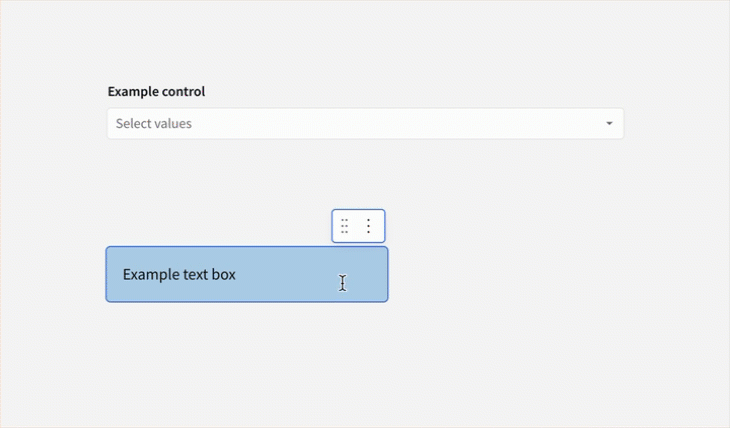
- Insert an element between elements: Drag and drop an element in between two other elements.
Editing whitespace and padding on a workbook page
You can design more optimal layouts by removing unneeded space, moving elements closer together, or adding additional padding.
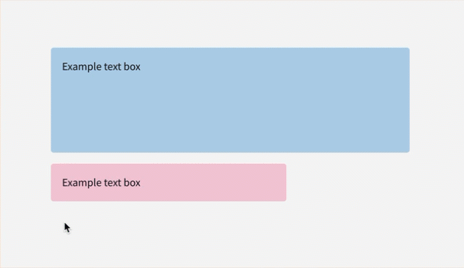
To add, remove or split whitespace on a workbook page for a cleaner workbook:
- Add or remove vertical space between elements: Hover over the left edge of the workbook until a resizer handle appears. Drag the handle up or down to increase or decrease the vertical space between two elements.
- Remove empty space: Hover over the empty space between two elements until the Trim space button appears. Select it to remove the space in between.
- Split space between elements: You can share or split the space used by an element by dragging and dropping another element onto it. The space taken up by the underlying element must be large enough to accommodate both elements.
You may also want to add padding to an element to increase whitespace on a page. See Add padding to an element in Customize element background and styles.
Change workbook settings
Manage global workbook settings such as theme, color and font. While editing, click anywhere in the background of a workbook to open the Settings tab of the editor panel. Then, select Workbook settings. For more information, see Workbook settings overview.
Updated about 2 months ago