

Use stacks to make responsive layouts
Using the Stack layout type, you can configure containers that change their layouts responsively as you add new elements. Similar to the CSS Flexible Box Layout Model, a stack arranges all elements automatically based on a specified layout direction, distribution, and alignment, rather than requiring you to manually place each element in a grid.
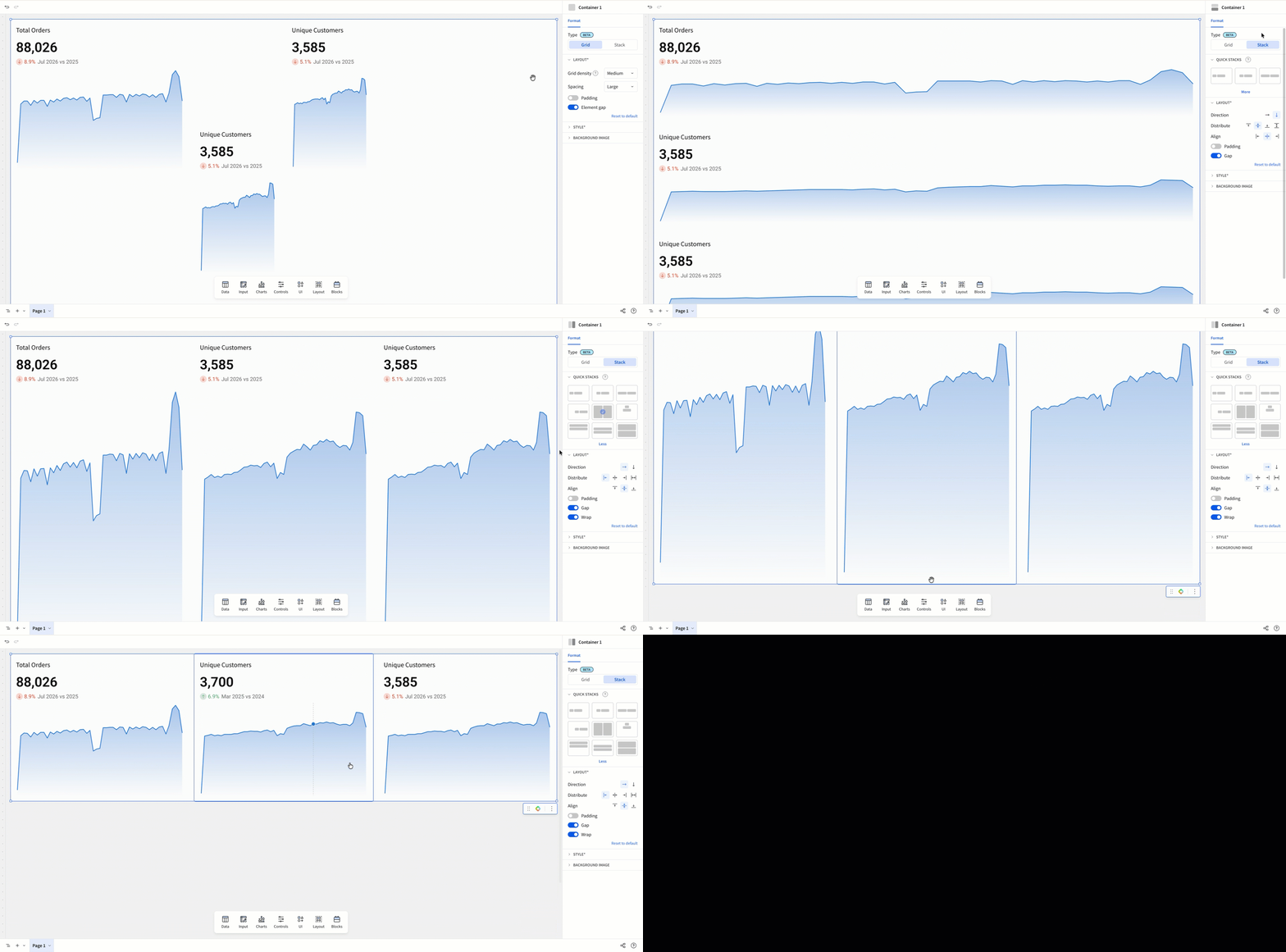
Use a stack when you want to:
- Arrange and size elements dynamically across a container
- Iterate quickly on designs that might change
This document covers how to configure and customize containers with the Stack layout type, as well as their elements.
User requirements
The ability to create and customize a stack requires the following:
- You must be assigned an account type with the Create, edit, and publish workbooks permission enabled.
- You must be the workbook owner or be granted Can edit access to the workbook.
Limitations
- The Wrap option is only available when Direction is set to Row.
Add a stack to your workbook
You can create a stack by converting a container to use the Stack layout type, or by grouping existing elements into a new stack.
Convert a container to a stack
- In the Add element bar, select Layout then Container.
- Select the container, then in the editor panel, open the Format section.
- Set the Type to Stack.
The container updates to use the default stack layout.
Group elements into a stack
- On the canvas, select multiple elements.
- In the selection crumb menu, select Create horizontal stack or Create vertical stack.
The selected elements appear in a new stack using the direction you chose.
Customize the layout of elements in a stack
The Stack layout type changes how all elements in a container are arranged. Instead of placing and sizing each element at a specific position in a grid, elements are arranged automatically based on the layout configuration of the stack, and change size in response to other elements.
By default, a stack arranges all elements in a single column, with each element sized to fill the width of the container.
To customize a stack, you can do the following:
Set the layout for a stack
You can change the orientation, spacing, and arrangement of elements in a stack:
-
Select the container.
-
In the editor panel, under Format, open the Layout section.
-
For Direction, select the axis to arrange elements in the container on:
Option Details  Row
RowDistribute elements across the container left-to-right. Optionally, turn on the Wrap toggle to arrange elements across multiple rows based on sizing.  Column
Distribute elements down the container’s length. -
For Distribute, select how elements are arranged along the selected Direction:
-
For Align, select how elements are arranged along the axis perpendicular to the selected Direction:
-
Configure spacing settings for the elements:
Customize sizing for elements in a stack
You can configure elements in a stack with unique sizing options that aren’t available in the Grid layout type, allowing you to size elements responsively based on their own contents or other elements in the container.
After placing an element in a stack:
-
Select the element.
-
In the editor panel, select Properties.
-
In the Size section, select an option for the Width and Height settings:
The available sizing options depend on the element type. For example, viz and image elements can’t use Fit content, and some elements have no configurable Height.
Apply a Quick stack preset
You can configure common layouts in a single click by selecting a preset from the Quick stacks menu.
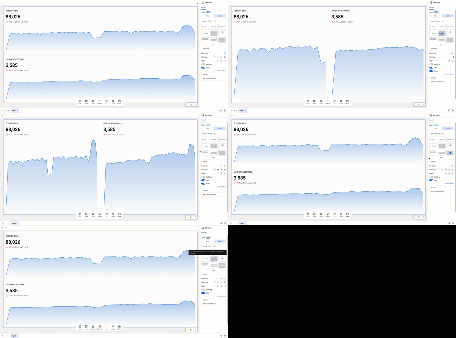
To use Quick stacks:
- Add elements to the stack.
- Select the container.
- In the editor panel, under Format, open the Quick stacks section.
- Select a preset to arrange and size the elements in the stack. To see all available presets, select More.
Each preset sets the direction, distribution, and element sizing for the stack in a single step. Applying a preset overwrites the current layout settings.
The following presets set Direction to Row, arranging elements horizontally:
| Preset | Result |
|---|---|
 | Elements arranged horizontally, aligned to the left, each sized to fit its content. |
 | Elements arranged horizontally, centered, each sized to fit its content. |
 | Elements arranged horizontally, aligned to the right, each sized to fit its content. |
 | Elements arranged horizontally, each filling the available width. |
 | Elements arranged horizontally, each filling the available width and height. |
The following presets set Direction to Column, arranging elements vertically:
| Preset | Result |
|---|---|
 | Elements stacked vertically at the top center, each sized to fit its content. |
 | Elements stacked vertically at the top, each filling the available width. |
 | Elements stacked vertically and centered, each filling the available width. |
 | Elements stacked vertically and centered, each filling the available width and height. |