

Build a treemap (Beta)
This documentation describes one or more public beta features that are in development. Beta features are subject to quick, iterative changes; therefore the current user experience in the Sigma service can differ from the information provided in this page.
This page should not be considered official published documentation until Sigma removes this notice and the beta flag on the corresponding feature(s) in the Sigma service. For the full beta feature disclaimer, see Beta features.
Treemaps display values as nested boxes sized in proportion to other values within the same category. Create treemaps to easily compare values within different product categories, regions, fiscal periods, and more.
This document describes how to add a treemap chart to a workbook or report and introduces key properties and format options to help you enhance your charts.
User requirements
The ability to create treemaps requires the following:
- To create a chart in a workbook, you must be assigned an account type with the Full explore or Create, edit, and publish workbooks permission enabled.
- To create a chart in a report, you must be assigned an account type with the Create, edit, and publish reports permission enabled.
- You must be the workbook or report owner or be granted Can explore or Can edit access to the document.
Create a treemap
Add a treemap to a workbook or report, and configure the required properties:
-
Open a draft, custom view, or saved view of a workbook or report.
-
In the Add element bar, select Chart and then Treemap. The Select source modal opens.
-
Select a data source to use for the treemap.
You can also use the Chart type dropdown field to convert an existing chart to a treemap. Sigma retains all property and format configurations shared by the initial and new type. Unshared properties and formatting are not saved or restored if you further convert the chart.
-
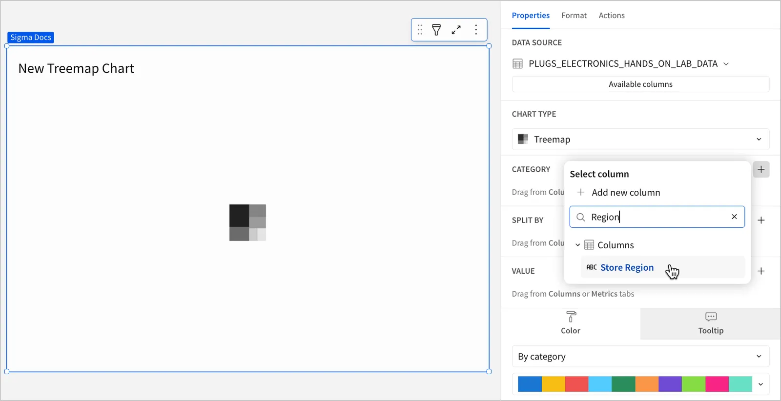
In the Properties tab of the editor panel, select + Add column next to Category and choose an option from the Select column popover to define how the data is grouped into different color categories:
-
To use a column that exists in the data source, search or scroll through the Columns list and select the column you want to use.
-
To use a custom formula, click + Add new column and, in the formula bar, enter the formula you want to use.
-
-
(Optional) Change the truncation, data type, or format of the Category column by clicking the down arrow (
 ) to open the column menu and then choosing the desired option.
Column menu items vary depending on the data type of the column. For example, Truncate date is only available for date columns.
-
(Optional) For Split by, select + Add column and choose an option from the Select column popover to define subcategories within the main color categories. Then, configure the column’s truncation, data type, and format.
If you add a column to the Split by property but do not add a column to the Category property, the column used for Split by is used to define the primary categories.
-
For Value, select + Add column and choose an option from the Aggregate column popover to define the measurable value:
- To aggregate the values of an existing column in the data source, search or scroll through the Columns list and select the column you want to use.
- To calculate the value with a custom formula, click + Add new column and, in the formula bar, enter the formula you want to use.
- To count the number of rows associated with each category, select Row count.
-
(Optional) Change the aggregation, data type, or format of the Value column by clicking the down arrow (
) to open the column menu and then choosing the desired option.This visualization supports up to 25,000 data points. If the configurations result in a data set that exceeds this limit, the visualization displays the first 25,000 data points, and a warning message indicates that the chart is incomplete. To reduce the number of data points, aggregate the values or apply data filters to the visualization or source element.
-
(Optional) Add additional columns or calculations to the Value property and configure their aggregation, data type, and format to compare additional values within your defined categories and subcategories.
Customize a treemap
You can also customize a treemap’s appearance by changing its colors, layout, and spacing, in addition to using many of the formatting options available for charts. See Additional formatting options for treemaps for a list of the general chart formatting options available for treemaps.
Configure colors for a treemap
You can change the colors used to distinguish the categories defined by the Category property of your treemap. By default, treemaps use the default categorical colors configured for the theme of your workbook or report.
You can also configure a custom color scale for your treemap. For more information, see Add a custom color scale.
-
Select the treemap you want to modify.
-
In the editor panel, select the Properties tab, and then click Color.
-
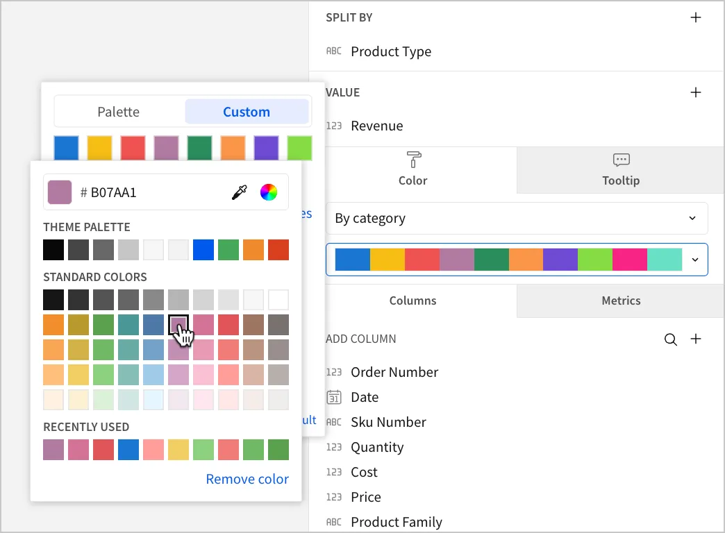
Select the color palette dropdown to open the popover. You can choose a default color palette or configure a custom one:
- To use a default color palette, select Palette and then select one of the configured palettes for your workbook or report’s theme.
- To configure a custom color palette, select Custom and then click the color swatch for the individual color you want to customize or click Add color to add a new color to the palette. Use the color picker, enter a hex code, or choose from one of your theme’s standard colors.
Change the layout of a treemap
You can modify how the dimensions of rectangles in a treemap are calculated by changing the layout method. By default, treemaps use the Squarify method.
-
Select the treemap you want to modify.
-
In the Format tab of the editor panel, select Layout to expand the section.
-
For Method, choose the desired layout method from the dropdown:
Customize spacing for a treemap
You can change the spacing between categories as well as individual rectangles in a treemap to modify how categories and subcategories are separated visually.
-
Select the treemap you want to modify.
-
In the Format tab of the editor panel, select Layout to expand the section.
-
Configure the spacing of the treemap:
-
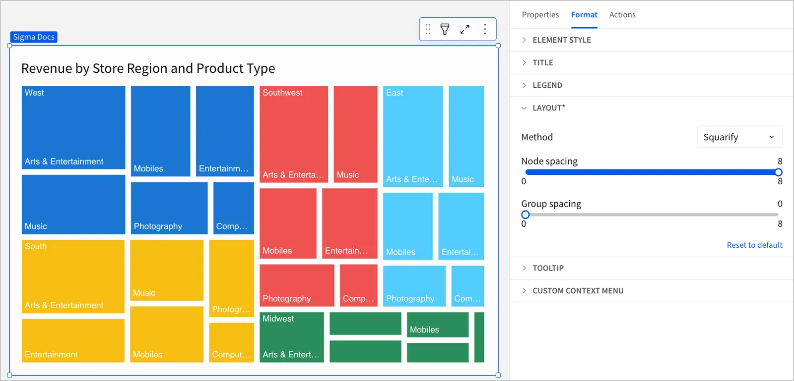
To customize the spacing between each individual rectangle, adjust the Node spacing slider.
-
To customize the spacing between color categories, adjust the Group spacing slider.
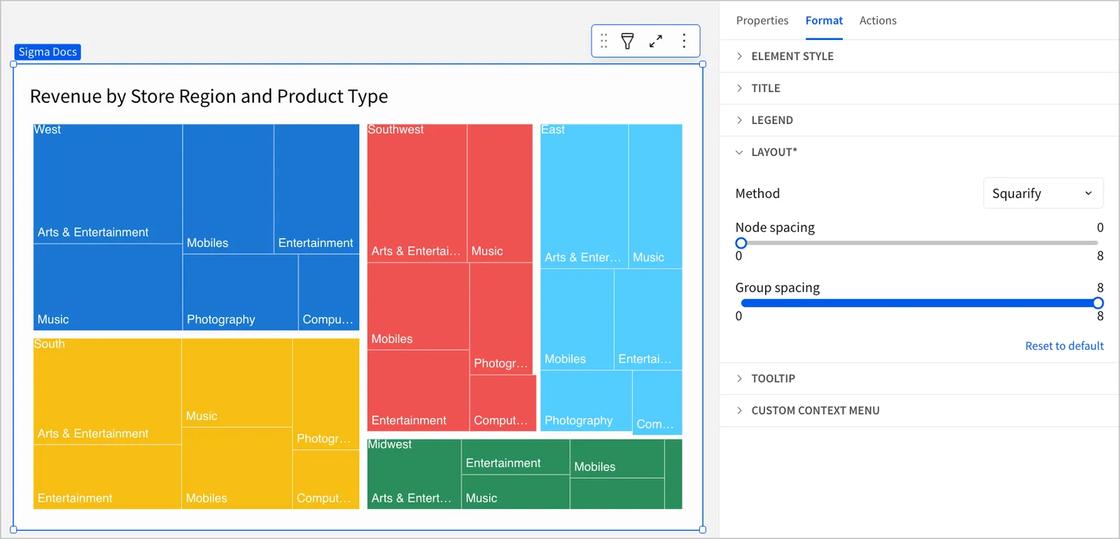
If you do not have columns configured for both Category and Split by, the Group spacing slider is not available.
-
Additional formatting options for treemaps
Treemaps also support the following chart formatting and customization options: