
Build a KPI chart
Sigma's KPI chart element has replaced the Single Value visualization (SVV) option. For information about the SVV deprecation and benefits of KPI charts, see the Sigma Community post.
Key performance indicator (KPI) charts highlight single metric values typically used to measure performance or progress toward goals. Create a KPI chart to summarize the total value of a metric for a specific period, or include additional data to compare the metric’s value over time and measure it against a benchmark or target value.

Example use cases:
Marketing analytics: Track click-through rates to highlight email campaign performance over time.
Executive dashboards: Measure monthly year-over-year revenue to understand how the current month’s revenue compares to the previous year benchmark.
Manufacturing analytics: Report cycle time to analyze the amount of time it takes a product to complete the manufacturing process.
User requirements
The ability to create KPI charts and other charts requires the following:
- To create a chart in a workbook, you must be assigned an account type with the Full explore or Create, edit, and publish workbooks permission enabled.
- To create a chart in a report, you must be assigned an account type with the Create, edit, and publish reports permission enabled.
- You must be the workbook or report owner or be granted Can explore or Can edit access to the document.
KPI chart variations
Sigma’s KPI charts allow you to track and display metrics in various ways depending on how you configure the element properties.
Static variations
 | Summary valueSummarize the metric's global value to understand overall performance or magnitude. The KPI chart highlights the global summary, which aggregates the metric values across the entire dataset. Required element properties: |
 | Benchmark summary comparisonSummarize a metric's global value against a benchmark or target value. Assess relative performance and gain insight into patterns, relationships, and correlations. The KPI chart highlights the global summary, which aggregates the metric values across the entire dataset. It also displays a comparison as a percentage, delta, or absolute value. Required element properties:
|
Time series variations
 | Period valueMeasure a metric's period value to analyze performance during a specific time interval (like week, month, or year). The KPI chart highlights the latest period value or global summary, and it can display a trend line that illustrates patterns and changes across sequential time periods. Required element properties: |
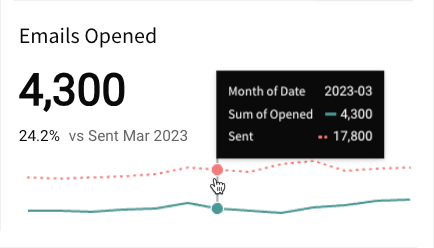
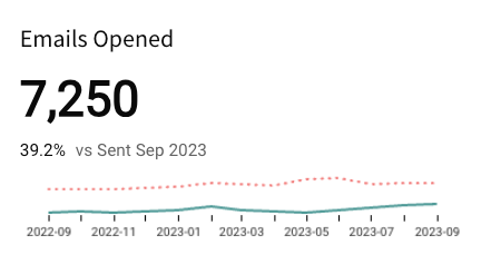
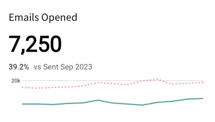
 | Period comparisonMeasure a metric’s value in one period (like week, month, or year) against another to perform a sequential or period-over-period comparison. The KPI chart highlights the latest period value or global summary, and it can display the comparison as a percentage, delta, or absolute value. It can also include a trend line that illustrates patterns and changes over time. Required element properties:
|
 | Benchmark period comparisonCompare a metric's period value against a benchmark or target to assess relative performance and gain insight into patterns, relationships, and correlations. The KPI chart highlights the latest period value or global summary, and it can display a comparison as a percentage, delta, or absolute value. It can also include a trend line for both values to illustrate patterns and changes over time. Required element properties:
|
Basic KPI chart configurations
To build a KPI chart, configure the following properties in the editor panel:
| Value | Calculation that determines the metric value |
| Timeline | (Optional) Date data that defines the reporting period |
| Comparison | (Optional) Period or calculation that defines the comparison value |
At the core of every chart is an underlying data table (derived from the data source) that supplies the information visualized by the chart. As you build a KPI chart, Sigma automatically calculates and structures the data to map the element properties to source columns in the underlying data table. For information about how to view the underlying data while you configure the chart, see Maximize or minimize a data element.
Add a KPI chart
Add a KPI chart element to a workbook or report and specify a data source:
-
Open a document for editing or customizing.
-
From the Add element bar, select Charts, then select KPI.
-
In the Select source modal, select a data source for the chart.
You can also create a new KPI chart directly from a summary value in a table element by clicking the down arrow (
) on the summary value and selecting Create KPI element.
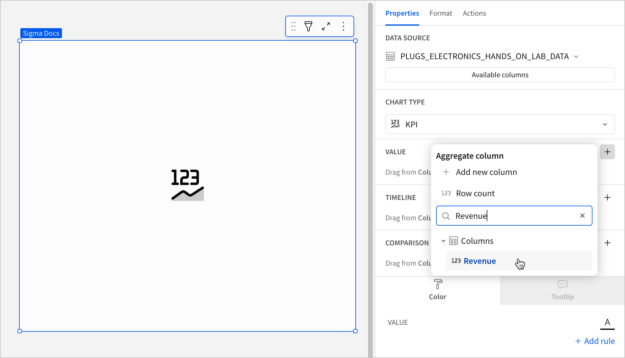
Calculate the metric
Configure the Value property to calculate the metric. Configuring the Value property is required to build any KPI chart variation.
-
In the Value property, click + Add calculation, then use one of the following methods to calculate the metric:
-
To aggregate the values of an existing column, search or scroll the Columns list and select the desired column.
-
To add a custom calculation or value, select + Add new column, then enter the calculation or value in the formula bar.
-
To count the number of rows in the underlying dataset, select Row count.
-
When you add a calculation to the Value property, the values are automatically aggregated and the Aggregate values checkbox is selected by default. If you deselect the Aggregate values checkbox and the Timeline property is not configured, one value from the column is selected and displayed instead of a global summary.
-
(Optional) If you want to control how the metric is measured and formatted, leave the Aggregate values checkbox selected and adjust the aggregate, data type, or format of the metric:
-
In the Value property, hover over the column name, then click the down arrow (
) to open the column menu. -
Hover over any of the following items and select the desired option:
Set aggregate Measure the metric based on the selected aggregation method. Transform Convert the column to the selected data value type. Format Display the metric value in the selected format.
Column menu items vary depending on the data type of the column. For example, Truncate date is only available for date columns.
-
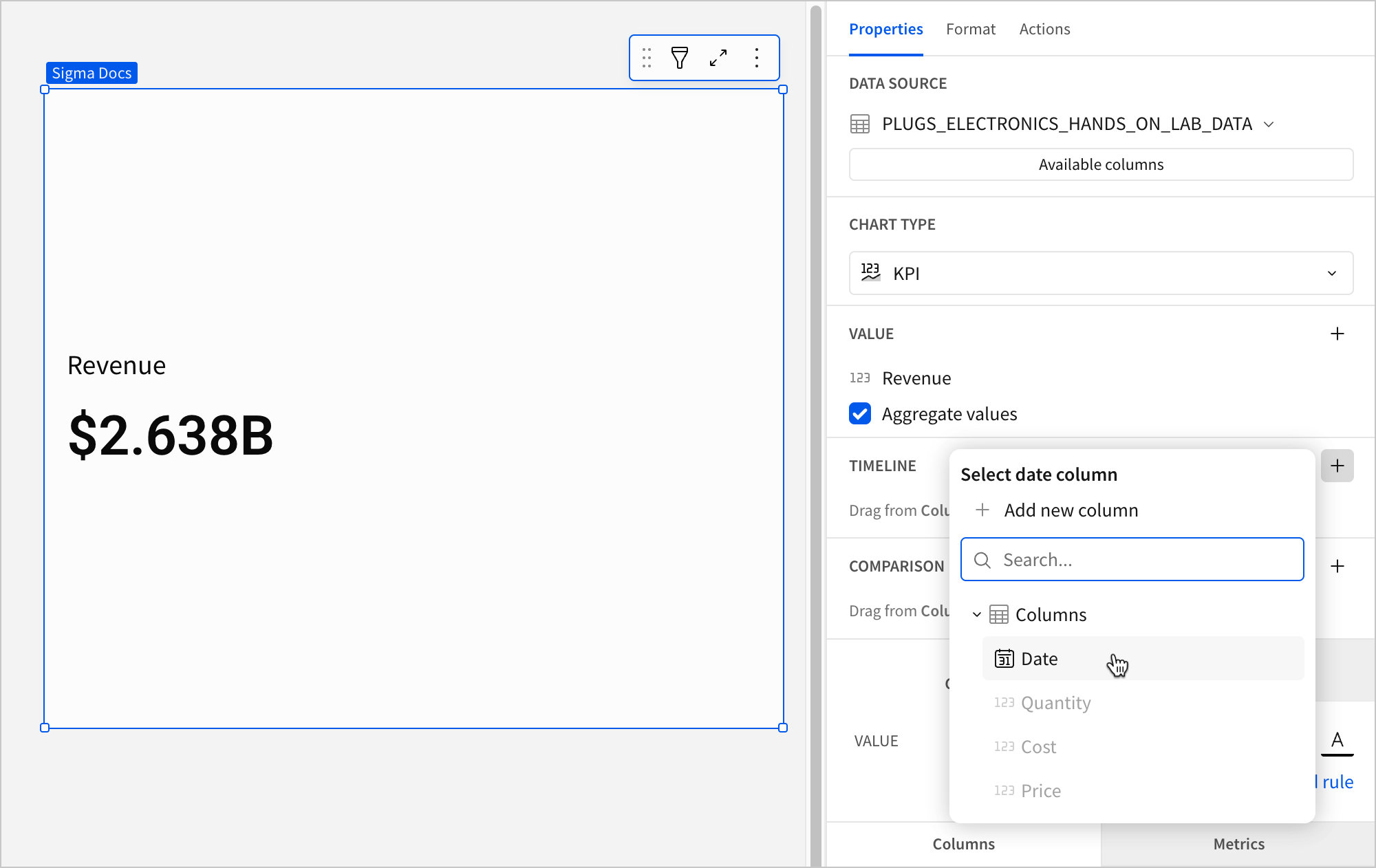
Define the reporting period
Configure the Timeline property to define the reporting period for the time series. Configuring the Timeline property is required to build a period value, period comparison, or benchmark period comparison KPI chart.
-
In the Timeline property, click + Add column, then use one of the following methods to define the reporting period:
-
To derive the period from an existing date column, search or scroll the Select date column list and select the desired column.
-
To create a period based on a new date column, select Add new column, then enter a date function or value in the formula bar.
The Timeline property supports date columns only. You cannot select or create a column that does not contain date data.
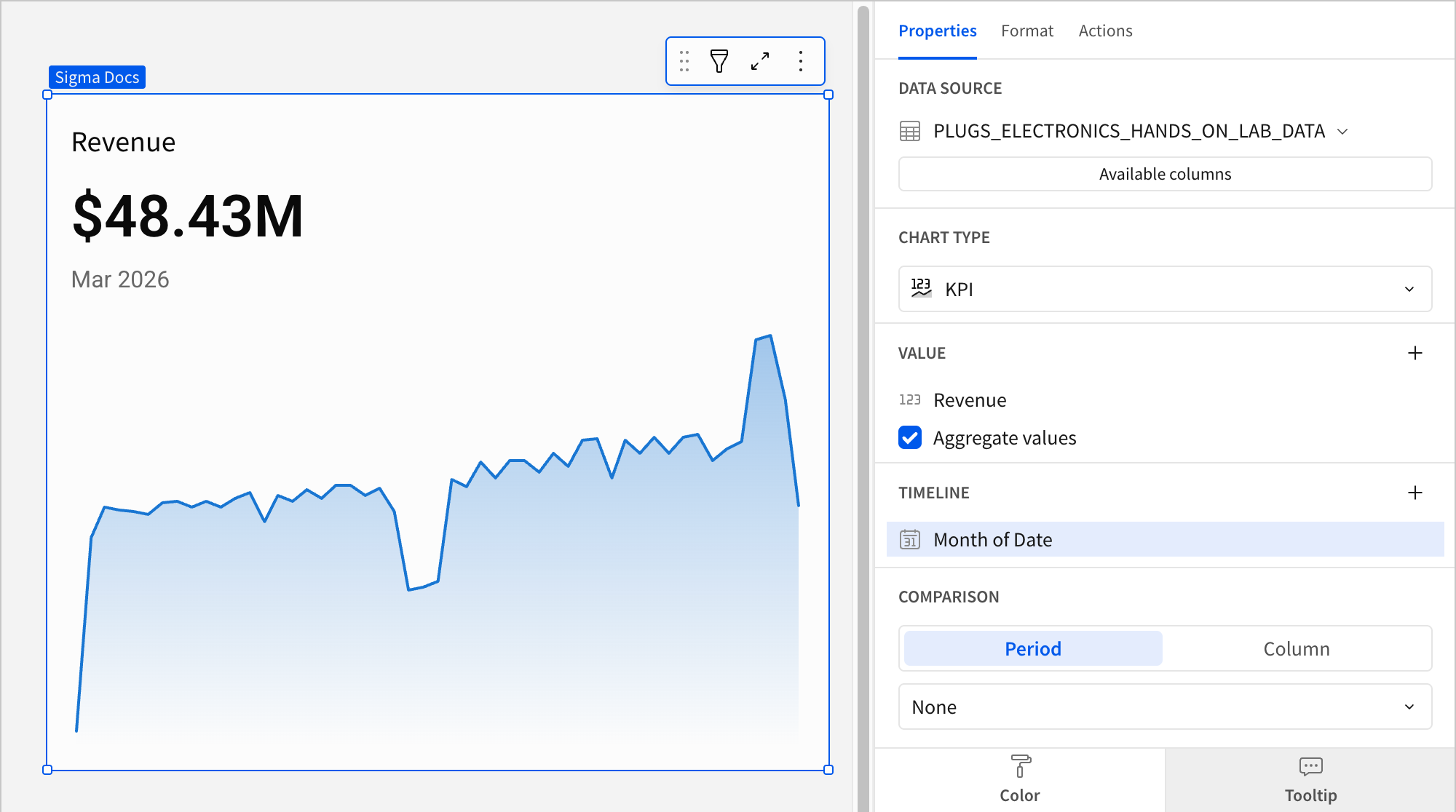
When a source column is added to the Timeline property, two changes occur in the chart:
-
The chart now displays the metric's latest period value, which aggregates the Value property source column data for the most recent period. To change the default display value to the global summary, proceed to the next step.
-
If the element layout size allows, the chart displays a trend line, which you can hover over to view previous period values. For information about how to hide the trend line, see Customize the trend line in this document.
This visualization supports up to 25,000 data points. If the configurations result in a data set that exceeds this limit, the visualization displays the first 25,000 data points, and a warning message indicates that the chart is incomplete. To reduce the number of data points, aggregate the values or apply data filters to the visualization or source element.
-
-
(Optional) To change the default value displayed in the KPI when a user is not interacting with the trend line:
-
In the Value property, hover over the source column name, then click the down arrow (
) to open the column menu. -
Hover over Default display type and select an option:
Latest period Display the aggregate value for the most recent period in the time series. Global summary Display the aggregate value for all periods in the time series.
-
-
(Optional) Control how the period is measured and formatted:
-
In the Timeline property, hover over the column name, then click the down arrow (
) to open the column menu. -
Hover over any of the following items and select the desired option:
Truncate date Measure the metric value based on the selected period. Format Display the period date in the selected format.
-
Configuring a column in the Timeline property automatically turns on the Comparison property. To build a KPI chart that highlights the period value of a metric without displaying a comparison, ensure the dropdown is set to None.
Select a comparison period
Configure the Comparison > Period property to measure a sequential or period-over-period comparison for the metric. Configuring the Period property is required to build a period comparison KPI chart.
When the benchmark or target value is null, such as for the first week in a sequential week-over-week analysis, the comparison value and label are hidden.
-
In the Comparison property, enable the Period option. If a source column is configured in the Timeline property, the option is automatically enabled.
-
Select the dropdown and choose a type of period comparison.
By default, a comparison value displays as a percentage. To instead display a delta or absolute value, customize the comparison in the Format tab of the editor panel.
Select a comparison value
To measure the metric against a benchmark or target value, configure the Comparison property with a column. Configuring the a column for the Comparison property is required to build a benchmark summary comparison or benchmark period comparison KPI chart.
-
In the Comparison property, click + Add calculation, then use one of the following methods to calculate the benchmark or target value:
-
To aggregate values in an existing column, search or scroll the Columns list and select the desired column.
-
To add a custom calculation or value, select Add new column, then enter the calculation or value in the formula bar.
-
To count the number of rows in the underlying dataset, select Row count.
-
-
(Optional) Control how the benchmark or goal is measured and formatted:
-
In the Comparison property, hover over the column name, then click the down arrow (
) to open the column menu. -
Hover over any of the following items and select the desired option:
Set aggregate Measure the metric based on the selected aggregation method. Transform Convert the column to the selected data value type.
-
By default, a comparison value displays as a percentage. To instead display a delta or absolute value, customize the comparison in the Format tab of the editor panel.
Advanced KPI chart properties and formatting
You can also build more detailed and advanced KPI charts using the formatting options available.
The following sections introduce configurations that can enhance your charts and help you deliver specific insights with meaningful and actionable information.
Customize the value text
You can customize the metric value’s font weight, color, and size to match the theme of your document or to distinguish a value from others.
- In the Format tab of the editor panel, select Value to expand the section.
- Select an option to customize the appearance of the value text:
- To change the font color, select
 Text color and choose a color by using the color picker, entering a hex code, or choosing from one of the standard colors configured for your workbook or report's theme.
 - To change the font weight, select
 Bold to turn bold formatting on or off.
 - To change the font size, click Auto and select a font size from the dropdown.
- To change the font color, select
The Value format settings only apply to the metric value and don’t affect the element title or comparison font. You can also change the font color in the element’s Color property in the Properties tab.

Add conditional formatting to the value text
You can configure conditional formatting to highlight or emphasize a KPI's value when it meets the specified conditions.
- In the Properties tab of the editor panel, select Color.
- Click + Add rule to open the Format rule popover.
- For Formatting rule, configure a condition to evaluate.
- Click Text color and select a color to apply to the value text when the configured conditions are met.
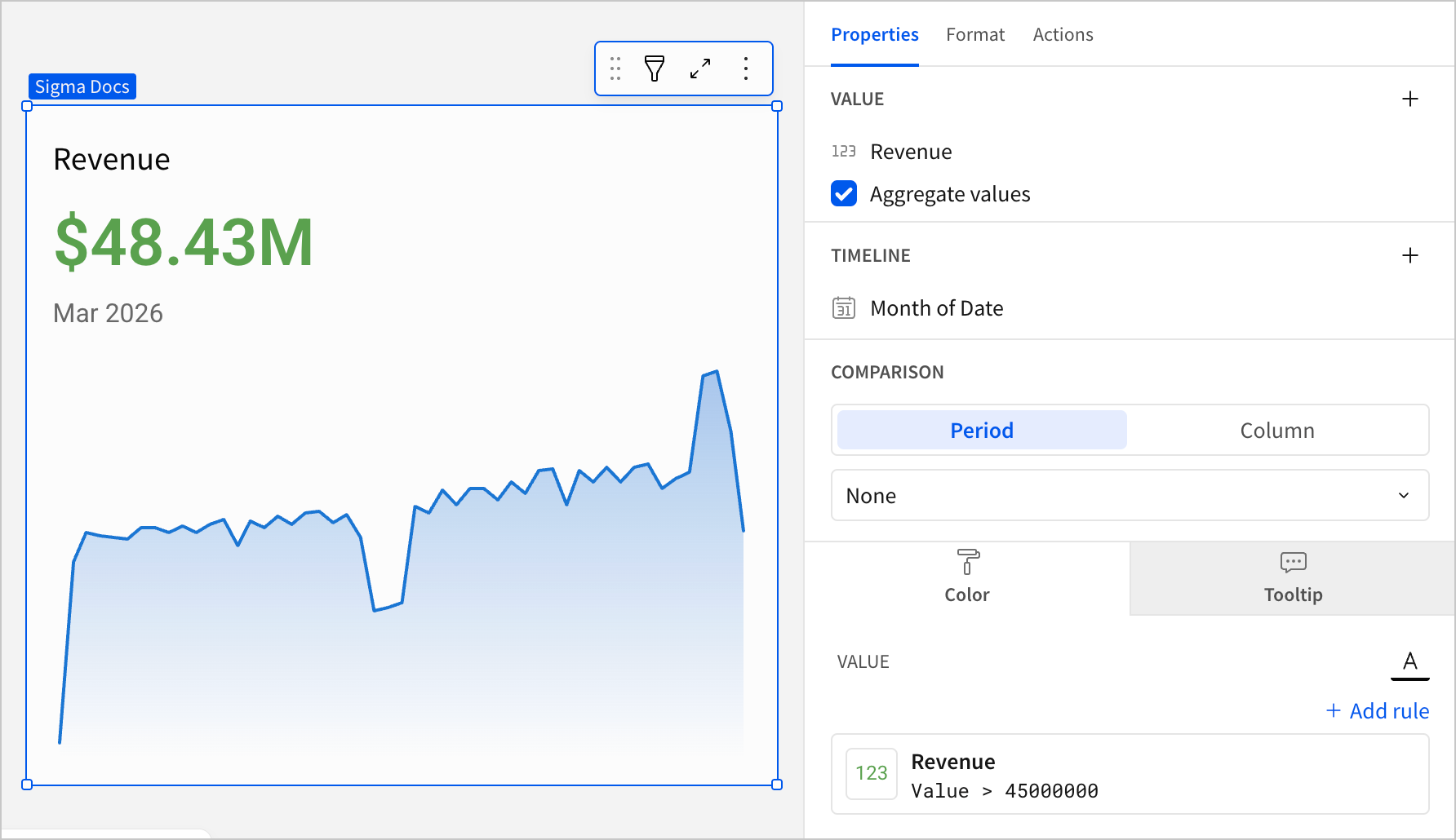
When the conditions of multiple rules are met, Sigma applies the formatting rules in order of precedence, from top to bottom. Drag and drop rule blocks to reorder them as needed.
Customize the comparison display
You can customize the comparison display by selecting the Format tab in the editor panel and clicking Comparison to expand the section. In addition to modifying the color indicators, you can change the font size of the comparison value, show or hide the label, and customize the label content.
You can modify the Display setting to select the type of comparison that is displayed.
| Display | ||
|---|---|---|
| % difference from | Display the percent of increase or decrease relative to the comparison value. |  |
| Difference from | Display the numerical increase or decrease relative to the comparison value. |  |
| % of | Display the percent of the comparison value. |  |
| Absolute | Display the absolute value of the comparison period or column. |  |
You can also specify the favorable direction of the comparison by changing the Direction setting and defining when the Good color, Neutral color, and Bad color indicators apply to the comparison value.
| Direction | ||
|---|---|---|
| Higher is better | Apply the Good color selection to increased comparative values and the Bad color selection to decreased comparative values. |  |
| Lower is better | Apply the Good color selection to decreased comparative values and the Bad color selection to increased comparative values. |  |
| None | Apply no color indicator to the comparative value. |  |
Customize the trend line
You can customize the trend line by selecting the Format tab in the editor panel and clicking Trend to expand the section. In addition to showing and hiding the trend line, you can select the trend line shape (line or area) and customize its colors.
| Shape | |
|---|---|
| Line | Area |
 |  |
You can also enable tooltips on hover, display the x-axis with timeline tick marks and labels, and display the y-axis with grid lines and labels.
| Display options | ||
|---|---|---|
| Show tooltip | Show timeline axis | Show y-axis |
 |  |  |
Customize empty state text when KPI has no data
You can customize the empty state text that appears as "No data" or "Invalid date" in KPI charts when trends and comparisons are configured but no data is returned.
These options are only available in KPI charts. To customize the message that is displayed for other data elements when no data is returned, see Customize no data text.
To customize the "No data" message in a KPI with a trend line configured:
- Select the KPI chart you want to customize on the workbook canvas.
- In the Format tab of the editor panel, click Trend to expand the section.
- In the Display label for no data field, enter the message you want to display when the column used for the trend returns no data.
To customize the "Invalid date" message in a KPI with a comparison configured:
- Select the KPI chart you want to customize on the workbook canvas.
- In the Format tab of the editor panel, click Comparison to expand the section.
- In the Display label for invalid date field, enter the message you want to display when the comparison uses an invalid date value.
Customize the chart layout
You can customize the chart layout by selecting the Format tab in the editor panel and clicking Layout to expand the section.
Change the alignment of the text components and select the location of the title and comparison value.
| Alignment | ||
|---|---|---|
| Left | Center | Right |
 |  |  |
| Title | |
|---|---|
| Top | Bottom |
 |  |
| Comparison value | |
|---|---|
| Right | Below |
 |  |
All KPI chart format options
Updated 5 days ago