Box and whisker charts
Box and whisker charts display the distribution of a set of values along an axis. They are also commonly known as box plots.
Requirements
- To create a data element, you must have Can Edit access to the individual workbook and be in Edit mode.
- Many exploratory actions are also supported when customizing a view, see Workbook modes.
Anatomy of a box and whisker chart
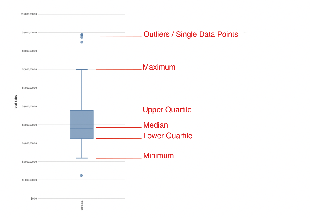
Box and whisker charts break data into quartiles. The upper quartile, median, and lower quartile make up what we refer to as box. The entire spread from whisker minimum to whisker maximum, including the box, accounts for the statistically central range of data. This is called the interquartile range (IQR) and is calculated as Q3 - Q1. Data points that fall out of the IQR are called outliers.
Maximum: The data point with the highest value below Q3 + 1.5*IQR
Upper Quartile: Values contained in the upper 25% of data.
Median: The data range's midpoint.
Lower Quartile: Values contained in the lower 25% of data.
Minimum: The data point with the lowest value above Q1 - 1.5*IQR
Outliers: Values that fall above or below the IQR. Outliers are calculated as is > Q3 + 1.5*IQR and is < Q1 - 1.5*IQR
Plot a box and whisker chart
You can create a chart from the Add element section of your workbook's editor panel or directly from an existing data element.
Visualized data will not display on the page canvas until all required plot fields are defined.
Add columns to open fields using either the field's + menu or dragging and dropping the column.
Fields
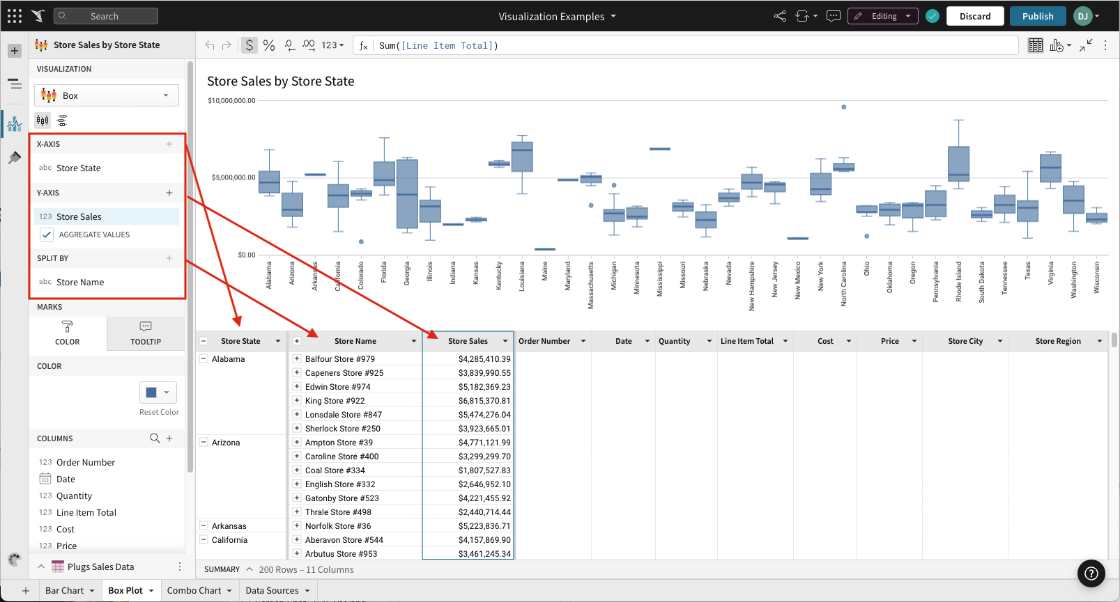
- X-AXIS (1 column)
Categorical data is first grouped by the column on the X-axis. - Y-AXIS (1+ columns)
Columns added to the chart's Y-axis are aggregated by default. Aggregation type (e.g. Sum vs Count) is dependent on the original column’s value type.
In some cases, you might want to uncheck the AGGREGATE VALUES option. Aggregating the value on the Y-AXIS value gives you an option to SPLIT BY. - SPLIT BY (1 column - optional)
Creates a second grouping under the first grouping (defined on the X-AXIS).
Example: In the screenshot below, the X-AXIS is set to [Store State], grouping the rows of data into states. The column on the Y-AXIS, [Store Sales] defines the numerical range of the plotted data. The column added to SPLIT BY, [Store Name], acts as a grouping below [Store State]. In other words, data is grouped by state and then each state's data is grouped by (aka "split by") individual stores' names. Points on the y-axis represent the aggregate [Store Sales] values listed under the second, "split by", grouping.
Marks
- COLOR
- TOOLTIP (1+ columns)
Display orientation (horizontal vs vertical)
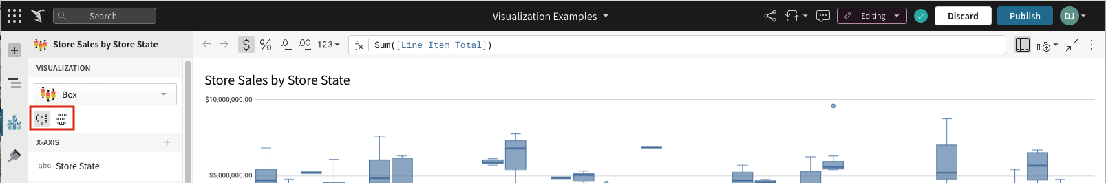
Box and whisker charts can be displayed both vertically and horizontally.
To select your chart’s orientation, select either the display vertical ( viz-box-vertical.svg ) or display horizontal ( viz-box-horizontal.svg ) icon button in the chart’s editor panel view.
Format options
Before you start: This action uses the editor panel. If you have not done so already, open the editor panel from either Explore or Edit mode.
To begin editing an chart's format options:
-
Select
 Element format in the side navigation.
 -
Select a format option to view and edit its settings.
The following format categories are available for box and whisker charts:
Customize point display options
Before you start: This action uses the editor panel. If you have not done so already, open the editor panel from either Explore or Edit mode.
- Select Element format in the side navigation.
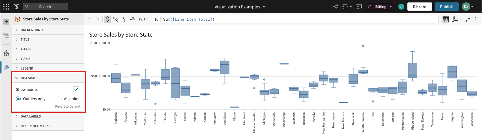
- Click BOX SHAPE.
- Select BOX SHAPE formatting from the options presented:
- The Show points checkbox is checked by default. Uncheck to hide all points.
- If Show points is selected, you can choose:
- Outliers only – Shows only the points that fall outside the box.
- All points – Shows all points, regardless of position.