
Customize chart mark tooltip fields
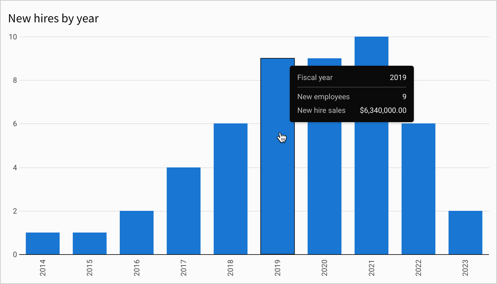
Chart mark tooltips appear when you hover over individual data points in a visualization. Sigma auto-selects default tooltip fields, but you can customize them to display the metrics and data attributes most relevant to your use case.
Tooltips are featured in all visualization types but are not customizable in gauge charts and Sankey diagrams.
This document explains how to manage default and custom tooltip fields.
User requirements
The ability to customize chart mark tooltip fields requires the following:
- To use this feature, you must have Can edit or Can explore access to the individual workbook.
- You must be customizing or editing the workbook.
Show or hide default tooltip fields
By default, tooltips display fields corresponding to source columns configured in the chart properties. For example, the columns defining axes, values, stages, and mark colors. You can show or hide these fields as needed.
-
On the workbook page, select the chart element you want to modify.
-
In the editor panel, hover over the relevant column in the X-axis or Y-axis field, then click the down arrow (
 ) to open the column menu.
 -
Select Show in tooltip to change the tooltip visibility.
- If the menu item displays a checkmark (✓), the corresponding tooltip field is currently shown. Click to hide the tooltip field.
- If the menu item displays no checkmark, the corresponding tooltip field is currently hidden. Click to show the tooltip field.
The change to the tooltip takes effect immediately. Hover over individual data points in the chart to view your changes.
When you apply stacking in bar charts, you can also customize tooltips in the editor panel's Format > Tooltip section to display the variable value as a percentage of the cumulative stack. See Customize tooltip fields and values in Build a bar chart.
Show or hide column names in a tooltip
You can hide column names to make tooltips simpler to read, or show them again to provide additional context. By default, chart tooltips display column names for each field.
If hiding column names makes the tooltip unclear or difficult to read, column names are not hidden.
- On the workbook page, select the chart element you want to modify.
- In the editor panel, click Format, then select Tooltip to expand the section.
- Turn the Show all column names toggle on or off to show or hide column names in the tooltip.
Display additional tooltip fields
To enhance your chart tooltips with additional fields, add new or existing columns to the Tooltip property.
-
On the workbook page, select the chart element you want to modify.
-
In the editor panel, click Tooltip.
-
In the Select column field, click
 Add calculation... and configure a source column for the new tooltip field:
- To reference or aggregate data from an existing column, search or scroll the Select column or Aggregate column list and select a column name. You can change or remove the aggregation if needed.
- To create a new column based on a custom formula, select Add new column, then enter the formula or value in the toolbar.
- To create a new column based on the number of aggregated rows, select Row count.
The new tooltip field is displayed when you hover over individual data points in the chart.
Remove custom tooltip fields
To remove fields added to tooltips, remove columns configured in the Tooltip property.
-
On the workbook page, select the chart element you want to modify.
-
In the editor panel, click Tooltip.
-
In the Tooltip property, hover over the column you want to remove, then click the down arrow (
) to open the column menu. -
To delete the column, select Delete column or remove it from the Tooltip property by clicking and dragging it back to the Add column list.
The change to the tooltip takes effect immediately. Hover over individual data points in the chart to view your changes.
Updated 14 days ago