
Build a bar chart
Bar charts are typically used to compare values across categories or groups of data. Create basic single-series bar charts, or build advanced charts to compare multiple variables, measure values against reference marks, evaluate parts of a whole, and more.
This document details basic bar chart requirements and introduces key properties and format options to help you enhance your charts.

Example use cases:
Store analytics: Measure total sales by product category to identify top and bottom performing categories.
Marketing analytics: Track unique website page views by ad referral site (such as LinkedIn and GoogleAds) to understand ad performance trends and referral site effectiveness.
Accounting analytics: Monitor travel expenses by spend category to understand travel spend and identify categories that exceed expectations.
Education analytics (histogram): Count student exam results by score range to analyze frequency distribution and understand performance variability.
User requirements
The ability to create bar charts and other charts requires the following:
-
To create a chart in a workbook, you must be assigned an account type with the Full explore or Create, edit, and publish workbooks permission enabled.
-
To create a chart in a report, you must be assigned an account type with the Create, edit, and publish reports permission enabled.
-
You must be the workbook or report owner or be granted Can explore or Can edit access to the document.
Basic bar chart requirements
To plot a bar chart, configure the following settings in the Properties tab of the editor panel:
| X-axis | Source column that defines the x-axis (horizontal axis) categories or variable |
| Y-axis | Source column that defines the y-axis (vertical axis) categories or variable |
In a bar chart, one axis typically represents ordinal or nominal categories (like stages, regions, departments) presented as vertical or horizontal bars. The other axis represents a variable that measures a value (like sales, leads, expenses) for each category and determines the height or length of the corresponding bar. The type of data affiliated with each axis depends on the chart orientation, which you can modify at any time.
At the core of every chart is an underlying data table (derived from the data source) that supplies the information visualized by the chart. As you build a bar chart, Sigma automatically calculates and structures the data to map the element properties to source columns in the underlying data table. For information about how to view the underlying data while you configure the chart, see Maximize or minimize a data element.
Add a bar chart
Add a bar chart element to a workbook or report and specify a data source:
- Open a document for editing or customizing.
- From the Add element bar, select Charts, then select Bar.
- In the Select source modal, select a data source for the chart.
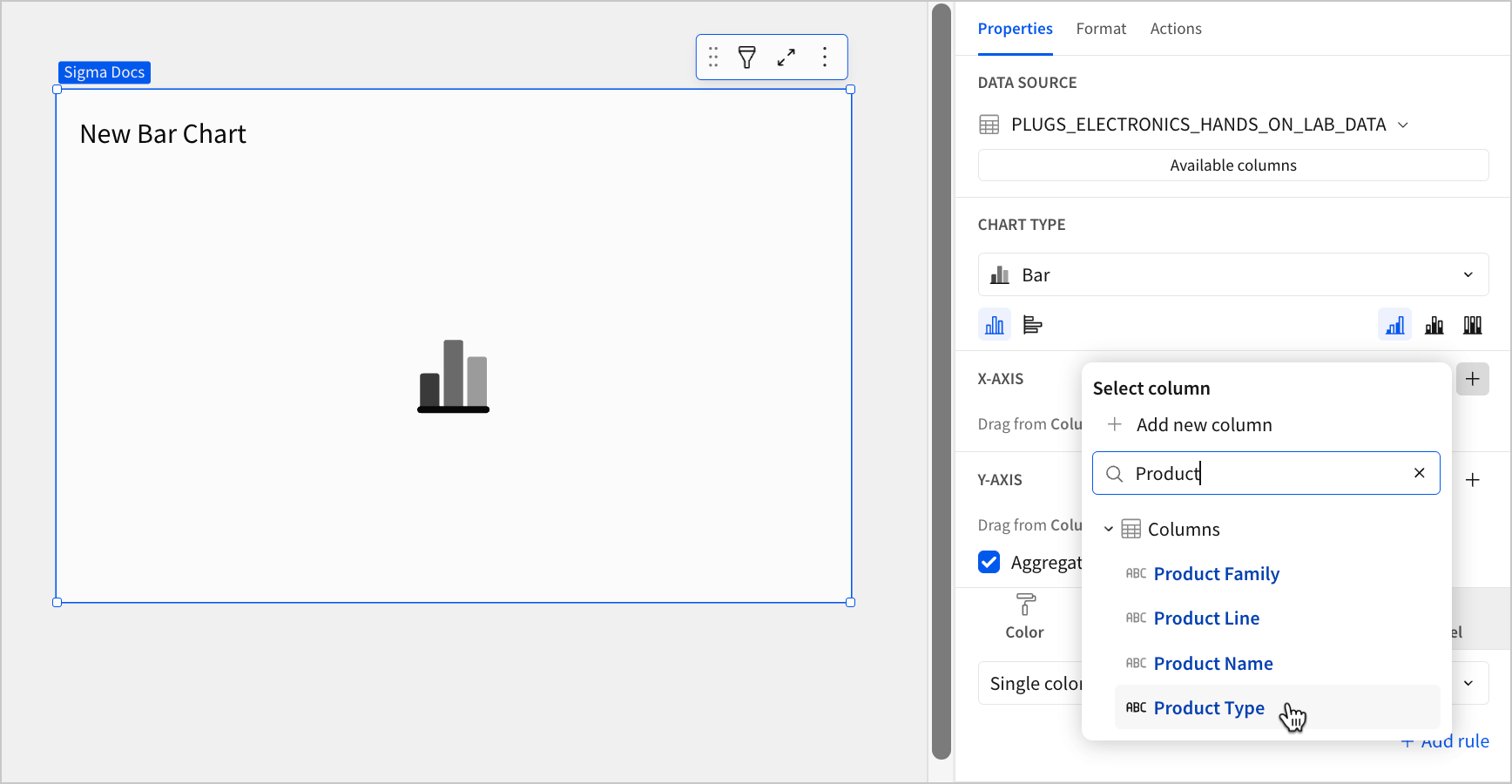
Define the categories
Configure a source column to define the chart categories.
When building a vertical bar chart (default orientation), apply the following steps to the X-axis property. When building a horizontal bar chart, apply the steps to the Y-axis property. For information about chart orientation and how it affects chart axes, see Change orientation and stacking in this document.
-
In the applicable axis property, click + Add column and select an option from the menu:
-
To generate categories based on distinct values in an existing column, search or scroll the Select column list and select the desired column name.
-
To generate categories based on a custom formula, select + Add new column and enter the formula in the toolbar. For example, when building a histogram, create a custom formula using the BinRange or BinFixed function to generate categories based on value ranges.
-
You can also select or replace an existing column by dragging and dropping a column name from the Columns list to the applicable axis property.
-
(Optional) Control how the source column data is categorized and displayed in the chart:
-
Hover over the source column name, then click the down arrow (
 ) to open the column menu.
 -
Hover over any of the following items, then select the preferred option:
Truncate date Categorize date values by the selected interval or unit of measure. Transform Convert the column to the selected data type . Format Display axis and data labels in the selected format.
Column menu items vary depending on the data type of the column. For example, Truncate date is only available for date columns.
-
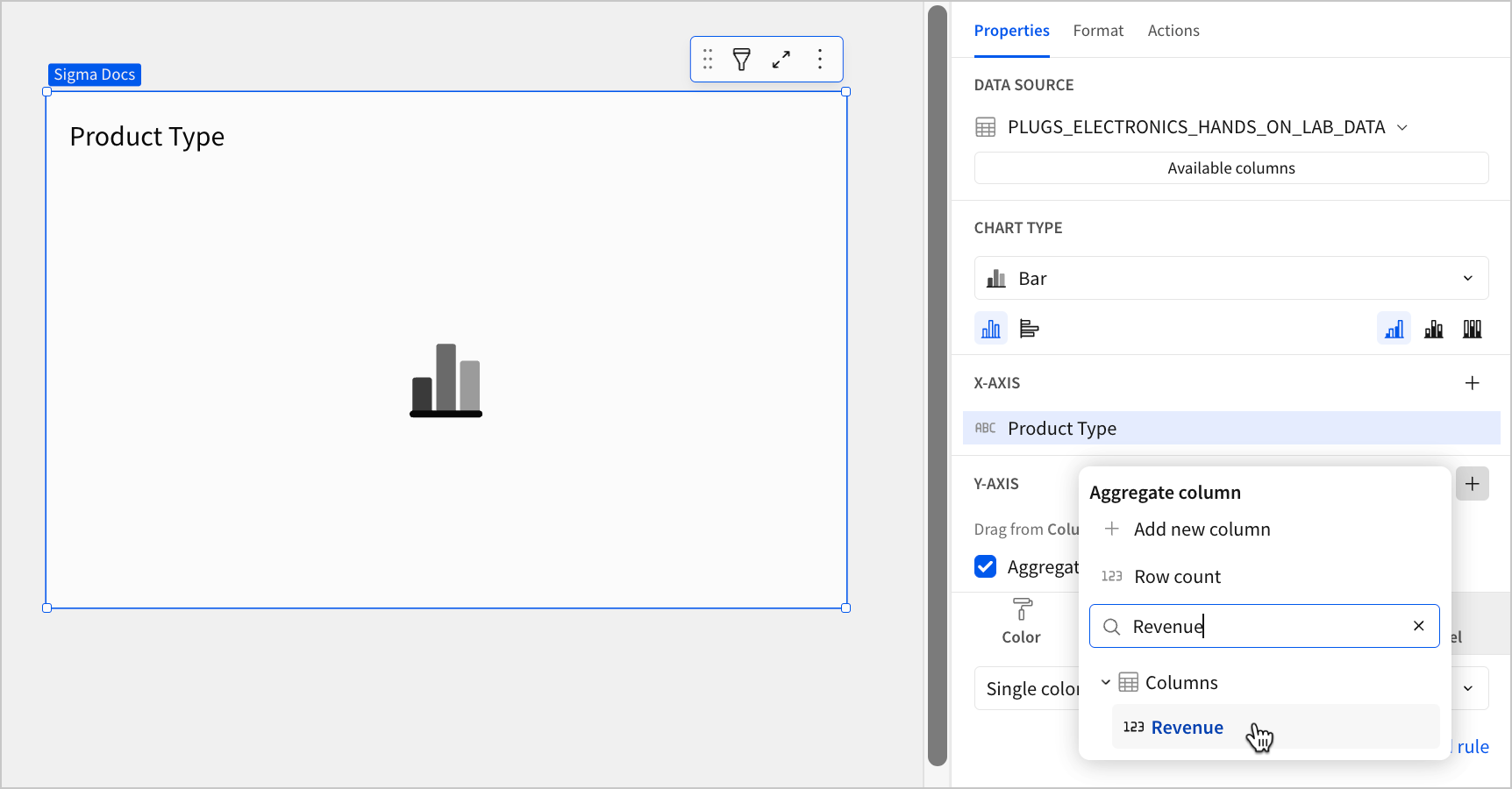
Define the variable
Configure a source column to define the chart variable. Sigma automatically aggregates values associated with the same chart category.
Apply the following steps to the Y-axis property when building a vertical bar chart (default orientation) or the X-axis property when building a horizontal bar chart. For information about chart orientation and how it affects chart axes, see Change orientation and stacking in this document.
-
In the applicable axis property, click + Add calculation and select an option from the menu:
-
To aggregate values of an existing column, search or scroll the Columns list and select the desired column name.
-
To calculate values based on a custom formula, select + Add new column and enter the formula in the toolbar.
-
To count the number of rows associated with each category, select Row count.
-
This visualization supports up to 25,000 data points. If the configurations result in a data set that exceeds this limit, the visualization displays the first 25,000 data points, and a warning message indicates that the chart is incomplete. To reduce the number of data points, aggregate the values or apply data filters to the visualization or source element.
-
(Optional) Control how the source column data is calculated and displayed in the chart:
-
Hover over the source column name, then click the down arrow (
) to open the column menu. -
Hover over any of the following items, then select the preferred option:
Set aggregate Calculate values based on the selected aggregation method. Transform Convert the column to the selected data type. Format Display axis and data labels in the selected format.
-
To plot the source column data without aggregating values, clear the Aggregate values checkbox in the Y-axis property. If this results in an incomplete chart that exceeds the 25,000 data point limit, you must aggregate the values or apply data filters to reduce the number of data points.
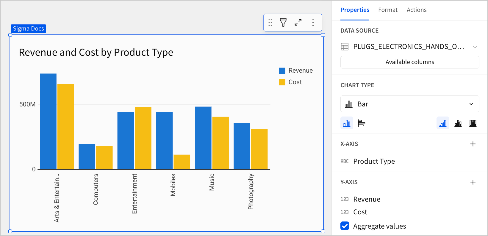
- (Optional) Repeat the previous steps to add multiple y-axis source columns. Sigma plots the columns as stacked or clustered series.
-
(Optional) Sigma auto-generates source column names and chart titles to reflect the visualized data, but you can customize these fields as needed:
-
To rename a source column, double-click the column name in the X-axis or Y-axis property, then enter a new name. Changes are reflected in the default chart title.
-
To edit the chart title, double-click the title in the chart, then enter a new title.
-
Sigma generates a default chart title. If you customize the title, changes to the source columns or column names are not automatically reflected in the title.
Advanced bar chart properties and formatting
You can build advanced variations of bar charts, including stacked, percent stacked, clustered (grouped), and dual-axis bar charts.
The following sections introduce configurations that can enhance your bar charts and help you deliver specific insights with meaningful and actionable information.
Change orientation and stacking
Change bar chart orientation and stacking in the Chart type section of the Properties tab to optimize the way you compare data across and within categories.
| Orientation | ||
|---|---|---|
|
Categorize data on the x-axis and measure values on the y-axis to create vertical bar marks. |
|
|
Categorize data on the y-axis and measure values on the x-axis to create horizontal bar marks. |
|


| Stacking | ||
|---|---|---|
|
Plot multiple data series as separate bars within categories. Compare values across and within categories in the resulting clustered bar chart. |
|
|
Plot multiple data series as cumulative bar segments. Compare subcategory contributions to each category’s total sum value in the resulting stacked bar chart. |
|
|
Plot multiple data series as stacked bars totaling 100% of each category’s total sum value. Compare subcategory distribution in the resulting percent stacked bar chart. |
|


Configure mark colors
You can configure the colors of the bars in a chart from the Properties tab of the editor panel by selecting Color. Configuring custom colors for your chart allows you to differentiate data, highlight specific values, use color to split bar values by category, or apply a color scale.
| Mark color | ||
|---|---|---|
Single color |
For each data series, enter a hex code or select an option from the color palette or color picker. For information about adding formatting rules, see Add conditional formatting in this document. |
|
By category |
Select a source column to define color categories, then select or customize a color palette for the resulting stacks or clusters. |
|
By scale |
Select a source column to define the color scale, then select a color range to apply to the marks. |
|


Multiple variables in the y-axis (in a vertical bar chart) or x-axis (in a horizontal bar chart) result in a stacked or clustered bar chart in which each data series represents a measure of a different variable. The By category color setting can also generate bar stacks or clusters, but the resulting series represent sub-categories (within the configured chart categories) that measure the same variable.
Add conditional formatting
You can highlight certain bars on a bar chart by configuring formatting rules that apply different colors to bars that meet specific conditions.
- In the Properties tab of the editor panel, select Color.
- Select Single color from the dropdown.
- Click + Add rule to open the Format rule popover.
- For Apply to, select the column you want the rule to evaluate.
- For Formatting rule, configure the condition you want to evaluate.
- Click
 Background color and select a color to apply to the bar marks when the configured conditions are met.
 |  |
If the conditions of multiple rules are met, Sigma applies the formatting rules in order of precedence, from top to bottom. Drag and drop rule blocks to reorder them as needed.
Customize tooltip fields and values
You can customize your bar chart's tooltip fields from the Properties tab of the editor panel by clicking Tooltip and then + Add column to display additional, relevant metrics and data attributes for your chart.
You can also customize the formatting and appearance of your chart's tooltip from the Format tab of the editor panel, by clicking Tooltip to expand the section. When you apply chart stacking, you can also customize tooltips to display the variable value as a percentage of the cumulative stack. For more information, see Customize chart mark tooltip fields.
| Tooltip value display | |
|---|---|
| Default | Percent |
 |  |
Show a single series or multiple series in a tooltip
You can configure a tooltip to display data from a single series or from all series in your chart. By default, bar charts show only the value for the series that you hover over with your cursor.
- On the document page, select the bar chart you want to modify.
- In the editor panel, click Format, then select Tooltip to expand the section.
- Turn on the Show multiple series toggle to show all series in the tooltip. To show the value for only the series the user's cursor is hovering over, turn off the Show multiple series toggle again.
The option to choose between displaying a single series or multiple series in the tooltip is available only for bar, line, and area charts.
Resize gap width
You can resize the gaps between bars on your bar chart from the Format tab of the editor panel by clicking Gaps to expand the section. By default, gap widths are sized automatically to optimize readability, but you can override this with one of these bar chart spacing configurations:
| Gap width | ||
|---|---|---|
| Small | Medium | Large |
 |  |  |