What's new in Sigma
Admin
OAuth write access
OAuth with write access is now generally available (GA). No changes were made since the Beta release in May.
Configure an OAuth connection with write access to leverage the benefits of OAuth permission management with Sigma’s write-access features, including input tables, warehouse views, workbook materializations, and CSV uploads.
For more information, see Configure OAuth with write access.
API
Connection sync endpoint
Sync the connection to a specific database, schema, or table to update the data in Sigma.
For more information, see POST /v2/connections/{connectionId}/sync.
Embeds
Additional language support for workbook localization
You can now localize workbook text into Simplified Chinese, Korean, and Swedish.
For more information, see Manage workbook localization.
Workbook elements
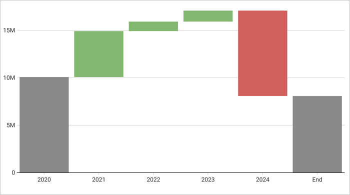
Waterfall chart (Beta)
Build a waterfall chart to show changes in data over a period of time. Waterfall charts are perfect for financial analytics use cases where you track revenue and spend for a project, department, or an entire organization, and other use cases. You can format the shape, start, and end values of a waterfall chart as well.

For more information, see Build a waterfall chart.
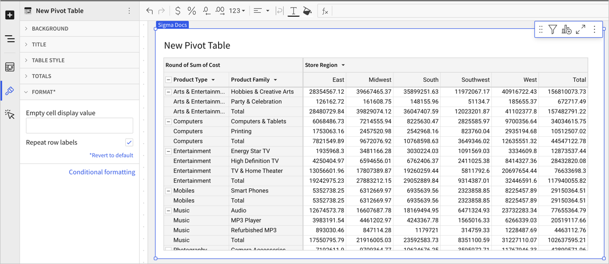
Repeat row labels in pivot tables
In pivot tables with multiple pivot rows, you can format your table to repeat row labels.

For more information, see Working with pivot tables.
Text area control element
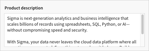
Use the Text area control element to enable multi-line text input.
With customizable input field height and vertical scrolling to view text overflow, the Text area control element is ideal for forms and more effectively supports larger amounts of text than the Text input control element.

Checkbox control element
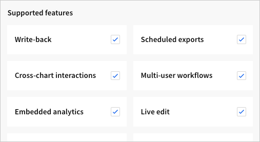
Use the Checkbox control element to allow users to select or deselect a single option.
Like the Switch control element, the Checkbox control represents a binary state (true/false, on/off, etc.), but it offers a more suitable UI for presenting a list of multiple form options that users can select or deselect.

The screenshot demonstrates the use of multiple elements to create a multi-checkbox selection form. Each element supports a single checkbox field that can be selected independently of the others.
