 **Add new field**.
4. In the **New field** popover, select a field type.
Field types limit the data type of user input. For example, a **Short text** field only accepts text data, and a **Number** field only accepts number data. For more information on data types, see [Data types and formats](/docs/data-types-and-formats).
The field is added to the form element.
To manually configure the destination of a form field:
1. Select the form element.
2. In the editor panel, select **Actions**.
3. In the action sequence with an **On click - Primary** trigger, click **Add action**.
4. Configure an action to set the destination of the form field. For example, you can configure an **Insert row** action to add a row to an input table based on the current form field values. For more information, see [Configure form actions](#configure-form-actions).
### Create a form from an existing data source
After selecting **Select source** in step 2 of [Add a form to a workbook](#add-a-form-to-a-workbook), the **Select form fields from source** modal opens. Creating a form this way allows you to quickly configure fields and actions based on the columns in an existing data source. You can customize the form fields and actions as needed after the form is created.
1. In the **Select form fields from source** modal, select a **Source type** and **Source** to use for the form's fields.
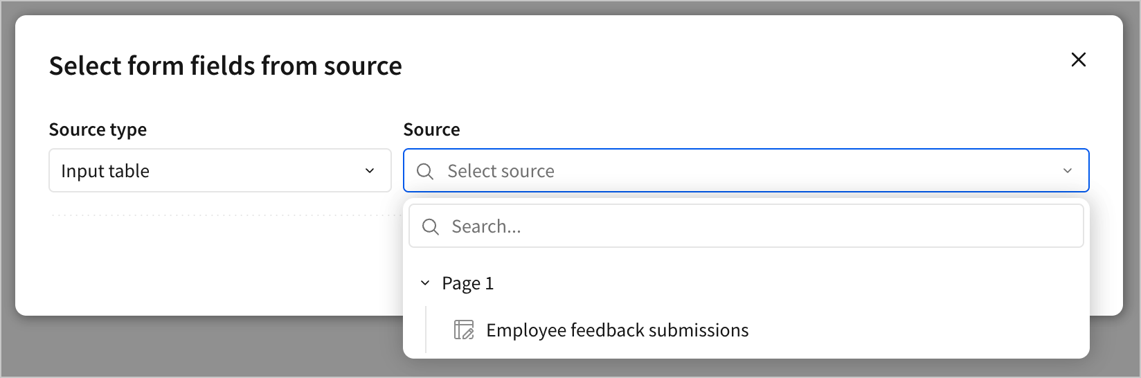
You can create a form from an input table or stored procedure.
2. Select the fields to include in the form. For each column in an input table, or for each argument in a stored procedure, you can set a form field name, and select a form field type from a list of compatible options for the column or argument's data type.
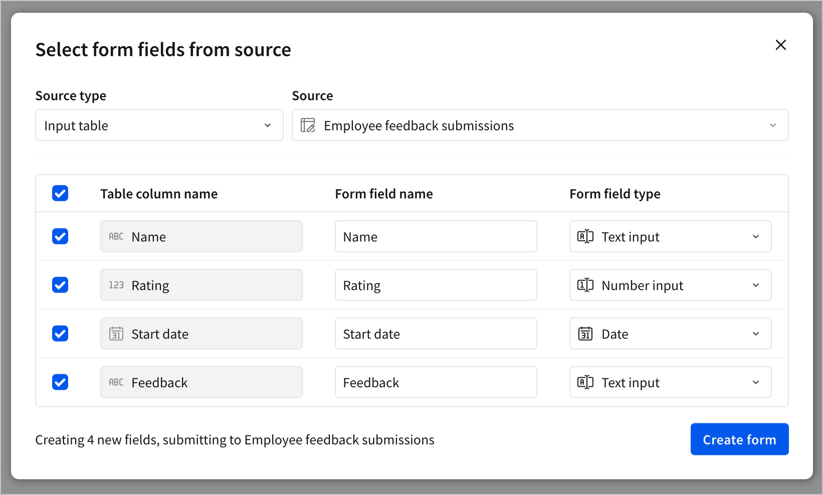
3. Click **Create form**.
The form element is added to the canvas with the selected fields. By default, the form includes an action sequence with an **On click - Primary** trigger that submits the data to the selected data source and then clears the form fields.
### Create a form as a child element of an input table
To quickly configure a form with an input table as its data source, you can create the form as a child element:
1. Navigate to the element you want to use as the data source for the form.
2. Select
**Add new field**.
4. In the **New field** popover, select a field type.
Field types limit the data type of user input. For example, a **Short text** field only accepts text data, and a **Number** field only accepts number data. For more information on data types, see [Data types and formats](/docs/data-types-and-formats).
The field is added to the form element.
To manually configure the destination of a form field:
1. Select the form element.
2. In the editor panel, select **Actions**.
3. In the action sequence with an **On click - Primary** trigger, click **Add action**.
4. Configure an action to set the destination of the form field. For example, you can configure an **Insert row** action to add a row to an input table based on the current form field values. For more information, see [Configure form actions](#configure-form-actions).
### Create a form from an existing data source
After selecting **Select source** in step 2 of [Add a form to a workbook](#add-a-form-to-a-workbook), the **Select form fields from source** modal opens. Creating a form this way allows you to quickly configure fields and actions based on the columns in an existing data source. You can customize the form fields and actions as needed after the form is created.
1. In the **Select form fields from source** modal, select a **Source type** and **Source** to use for the form's fields.

You can create a form from an input table or stored procedure.
2. Select the fields to include in the form. For each column in an input table, or for each argument in a stored procedure, you can set a form field name, and select a form field type from a list of compatible options for the column or argument's data type.

3. Click **Create form**.
The form element is added to the canvas with the selected fields. By default, the form includes an action sequence with an **On click - Primary** trigger that submits the data to the selected data source and then clears the form fields.
### Create a form as a child element of an input table
To quickly configure a form with an input table as its data source, you can create the form as a child element:
1. Navigate to the element you want to use as the data source for the form.
2. Select  **Create child element** > **Form**.
The form element is added to the canvas with a form field for each column in the input table, as well as an action sequence with an **On click - Primary** trigger that inserts a row into the input table and then clears the form fields. The form fields are configured with the same name and data type as the corresponding column in the input table.
## Import form fields from a data source
If you want to add fields from a data source to an existing form, you can import them directly from the data source:
1. Select the form element.
2. In the editor panel, select **Properties**.
3. In the **Form fields** section, click **Add new field**.
4. Select **Import fields from...**.
5. In the **Select form fields from source** modal, select a **Source type** and **Source** to import fields from.
6. Select the fields to import.
7. Click **Add new form fields**.
The selected fields are added to the form element, along with an action sequence with an **On click - Primary** trigger that submits the form data to the data source and then clears the form fields.
## Create an input table from a form
To quickly configure an input table to collect form submissions, you can create a new input table from the form:
1. Select the form element.
2. In the editor panel, select **Properties**.
3. In the notice to create an input table, click **Create**.
4. In the **Create input table from form** modal, select a connection for the input table data, and click **Create**.
The input table is created with a column for each form field, and an action sequence with an **On click - Primary** trigger that inserts a row into the input table and then clears the form fields.
## Customize a form
To customize the fields, actions, and style of a form, see the following sections:
* [Configure form fields](#configure-form-fields)
* [Configure form actions](#configure-form-actions)
* [Style a form](#style-a-form)
### Configure form fields
In the editor panel, select **Properties**. Depending on the **Field type**, configure the following options for each field:
**Create child element** > **Form**.
The form element is added to the canvas with a form field for each column in the input table, as well as an action sequence with an **On click - Primary** trigger that inserts a row into the input table and then clears the form fields. The form fields are configured with the same name and data type as the corresponding column in the input table.
## Import form fields from a data source
If you want to add fields from a data source to an existing form, you can import them directly from the data source:
1. Select the form element.
2. In the editor panel, select **Properties**.
3. In the **Form fields** section, click **Add new field**.
4. Select **Import fields from...**.
5. In the **Select form fields from source** modal, select a **Source type** and **Source** to import fields from.
6. Select the fields to import.
7. Click **Add new form fields**.
The selected fields are added to the form element, along with an action sequence with an **On click - Primary** trigger that submits the form data to the data source and then clears the form fields.
## Create an input table from a form
To quickly configure an input table to collect form submissions, you can create a new input table from the form:
1. Select the form element.
2. In the editor panel, select **Properties**.
3. In the notice to create an input table, click **Create**.
4. In the **Create input table from form** modal, select a connection for the input table data, and click **Create**.
The input table is created with a column for each form field, and an action sequence with an **On click - Primary** trigger that inserts a row into the input table and then clears the form fields.
## Customize a form
To customize the fields, actions, and style of a form, see the following sections:
* [Configure form fields](#configure-form-fields)
* [Configure form actions](#configure-form-actions)
* [Style a form](#style-a-form)
### Configure form fields
In the editor panel, select **Properties**. Depending on the **Field type**, configure the following options for each field:
| Options | Details |
|---|---|
| Label | Enter a name for the field. When the form is created from a data source, the Label inherits the name of the connected column. |
| Placeholder | Enter text to appear when the field is empty. |
| Default value | Enter a default value for the field from either a Static value or a Custom formula . |
| Read-only | Turn on the toggle to disable editing while leaving the field visible. If the field has a default value, it can be submitted via an action. Off by default. |
| Required input | Turn on the toggle to make the field required. Required fields must be populated before the user can submit. Required fields are marked with an asterisk next to the Label . Off by default. |
| Validation | Configure a validation rule for the field, including a Comparison operator and Text match pattern . Turn on the Case sensitive toggle to make the validation case sensitive. |
| Hint text | Select Auto to use automatically generated hint text, Custom to enter your own, or None to hide hint text. Hint text provides succinct guidance to users filling out the field. |
| Field ID | Enter a unique identifier for the field. |
| Options | Details |
|---|---|
| Label | Enter a name for the field. When the form is created from a data source, the Label inherits the name of the connected column. |
| Placeholder | Enter text to appear when the field is empty. |
| Default value | Enter a default value for the field from either a Static value or a Custom formula . |
| Read-only | Turn on the toggle to disable editing while leaving the field visible. If the field has a default value, it can be submitted via an action. Off by default. |
| Required input | Turn on the toggle to make the field required. Required fields must be populated before the user can submit. Required fields are marked with an asterisk next to the Label . Off by default. |
| Validation | Configure a validation rule for the field, including a Comparison operator and Text match pattern . Turn on the Case sensitive toggle to make the validation case sensitive. |
| Hint text | Select Auto to use automatically generated hint text, Custom to enter your own, or None to hide hint text. Hint text provides succinct guidance to users filling out the field. |
| Field ID | Enter a unique identifier for the field. |
| Options | Details |
|---|---|
| Label | Enter a name for the field. When the form is created from a data source, the Label inherits the name of the connected column. |
| Format | Select a format for the number, such as currency or percentage. |
| Placeholder | Enter text to appear when the field is empty. |
| Default value | Enter a default value for the field from either a Static value or a Custom formula . |
| Read-only | Turn on the toggle to disable editing while leaving the field visible. If the field has a default value, it can be submitted via an action. Off by default. |
| Required input | Turn on the toggle to make the field required. Required fields must be populated before the user can submit. Required fields are marked with an asterisk next to the Label . Off by default. |
| Validation | Enter a range of valid values for the field. |
| Hint text | Select Auto to use automatically generated hint text, Custom to enter your own, or None to hide hint text. Hint text provides succinct guidance to users filling out the field. |
| Field ID | Enter a unique identifier for the field. |
| Options | Details |
|---|---|
| Label | Enter a name for the field. When the form is created from a data source, the Label inherits the name of the connected column. |
| Placeholder | Enter text to appear when the field is empty. |
| Default value | Enter a default value for the field from either a Static value or a Custom formula . |
| Read-only | Turn on the toggle to disable editing while leaving the field visible. If the field has a default value, it can be submitted via an action. Off by default. |
| Required input | Turn on the toggle to make the field required. Required fields must be populated before the user can submit. Required fields are marked with an asterisk next to the Label . Off by default. |
| Validation | Enter a range of valid values for the field. |
| Hint text | Select Auto to use automatically generated hint text, Custom to enter your own, or None to hide hint text. Hint text provides succinct guidance to users filling out the field. |
| Field ID | Enter a unique identifier for the field. |
| Options | Details |
|---|---|
| Label | Enter a name for the field. When the form is created from a data source, the Label inherits the name of the connected column. |
| Default value | Enter a default value for the field from either a Static value or a Custom formula . |
| Read-only | Turn on the toggle to disable editing while leaving the field visible. If the field has a default value, it can be submitted via an action. Off by default. |
| Required input | Turn on the toggle to make the field required. Required fields must be populated before the user can submit. Required fields are marked with an asterisk next to the Label . Off by default. |
| Hint text | Select Auto to use automatically generated hint text, Custom to enter your own, or None to hide hint text. Hint text provides succinct guidance to users filling out the field. |
| Field ID | Enter a unique identifier for the field. |
| Options | Details |
|---|---|
| Label | Enter a name for the field. When the form is created from a data source, the Label inherits the name of the connected column. |
| Default value | Upload a default file for the field, or select a file using a Custom formula . |
| Required input | Turn on the toggle to make the field required. Required fields must be populated before the user can submit. Required fields are marked with an asterisk next to the Label . Off by default. |
| Allow multiple files | Turn off the toggle to allow only one file to be uploaded. On by default. |
| Restrict number of files | Turn on the toggle to restrict the number of files that can be uploaded. When turned on, set a Max number . Off by default. |
| Accepted file types | Select one or more file types to accept. |
| Max size | Enter a maximum file size for the upload. Default 200 MB. |
| Hint text | Select Auto to use automatically generated hint text, Custom to enter your own, or None to hide hint text. Hint text provides succinct guidance to users filling out the field. |
| Field ID | Enter a unique identifier for the field. |
| Details | |
|---|---|
| Enter a name for the field. When the form is created from a data source, the Label inherits the name of the connected column. | |
| Select a source for the list of values. Either enter a Manual list or select a column from an existing Data source . | |
| Value type | Select the data type for the values in the list. For Number and Date , you can also select a Format . |
| Values | Enter values to include in the list. Optionally, enter a display value to show in the list instead of the raw data value. |
| Set display values | Turn on the toggle to add the option to set display values for the list. Off by default. |
| Default value | Enter a default value for the field from either a Static value or a Custom formula . |
| Source column | Select a column from the data source to use as the list of values. |
| Set display column | Select a mapping column to use as the display values for the list. For example, you might select a column with product names as the display values and a column with product IDs as the source values. |
| Default value | Enter a default value for the field from either a Static value or a Custom formula . |
| Turn on the toggle to disable editing while leaving the field visible. If the field has a default value, it can be submitted via an action. Off by default. | |
| Turn on the toggle to make the field required. Required fields must be populated before the user can submit. Required fields are marked with an asterisk next to the Label . Off by default. | |
| Select Custom to enter hint text or None to hide it. Hint text provides succinct guidance to users filling out the field. | |
| Enter a unique identifier for the field. |
| Details | |
|---|---|
| Enter a name for the field. When the form is created from a data source, the Label inherits the name of the connected column. | |
| Select a source for the list of values. Either enter a Manual list or select a column from an existing Data source . | |
| Value type | Select the data type for the values in the list. For Number and Date , you can also select a Format . |
| Values | Enter values to include in the list. Optionally, enter a display value to show in the list instead of the raw data value. |
| Set display values | Turn on the toggle to add the option to set display values for the list. Off by default. |
| Default value | Enter a default value for the field from either a Static value or a Custom formula . |
| Source column | Select a column from the data source to use as the list of values. |
| Set display column | Select a mapping column to use as the display values for the list. For example, you might select a column with product names as the display values and a column with product IDs as the source values. |
| Default value | Enter a default value for the field from either a Static value or a Custom formula . |
| Turn on the toggle to disable editing while leaving the field visible. If the field has a default value, it can be submitted via an action. Off by default. | |
| Turn on the toggle to make the field required. Required fields must be populated before the user can submit. Required fields are marked with an asterisk next to the Label . Off by default. | |
| Select Custom to enter hint text or None to hide it. Hint text provides succinct guidance to users filling out the field. | |
| Enter a unique identifier for the field. |
| Details | |
|---|---|
| Enter a name for the field. When the form is created from a data source, the Label inherits the name of the connected column. | |
| Select a source for the list of values. Either enter a Manual list or select a column from an existing Data source . | |
| Turn off the toggle to limit the user to selecting a single value. | |
| Value type | Select the data type for the values in the list. For Number and Date , you can also select a Format . |
| Values | Enter values to include in the list. Optionally, enter a display value to show in the list instead of the raw data value. |
| Set display values | Turn on the toggle to add the option to set display values for the list. Off by default. |
| Placeholder | Enter text to appear when the field is empty. |
| Default value | Enter a default value for the field from either a Static value or a Custom formula . |
| Source column | Select a column from the data source to use as the list of values. |
| Set display column | Select a mapping column to use as the display values for the list. For example, you might select a column with product names as the display values and a column with product IDs as the source values. |
| Placeholder | Enter text to appear when the field is empty. |
| Default value | Enter a default value for the field from either a Static value or a Custom formula . |
| Turn on the toggle to disable editing while leaving the field visible. If the field has a default value, it can be submitted via an action. Off by default. | |
| Turn on the toggle to make the field required. Required fields must be populated before the user can submit. Required fields are marked with an asterisk next to the Label . Off by default. | |
| Select Custom to enter hint text or None to hide it. Hint text provides succinct guidance to users filling out the field. | |
| Enter a unique identifier for the field. |
| Details | |
|---|---|
| Enter a name for the field. When the form is created from a data source, the Label inherits the name of the connected column. | |
| Select a source for the list of values. Either enter a Manual list or select a column from an existing Data source . | |
| Turn off the toggle to limit the user to selecting a single value. On by default. | |
| Value type | Select the data type for the values in the list. For Number and Date , you can also select a Format . |
| Values | Enter values to include in the list. Optionally, enter a display value to show in the list instead of the raw data value. |
| Set display values | Turn on the toggle to add the option to set display values for the list. Off by default. |
| Default value | Enter a default value for the field from either a Static value or a Custom formula . |
| Source column | Select a column from the data source to use as the list of values. |
| Set display column | Select a mapping column to use as the display values for the list. For example, you might select a column with product names as the display values and a column with product IDs as the source values. |
| Default value | Enter a default value for the field from either a Static value or a Custom formula . |
| Turn on the toggle to disable editing while leaving the field visible. If the field has a default value, it can be submitted via an action. Off by default. | |
| Turn on the toggle to make the field required. Required fields must be populated before the user can submit. Required fields are marked with an asterisk next to the Label . Off by default. | |
| Select Custom to enter hint text or None to hide it. Hint text provides succinct guidance to users filling out the field. | |
| Enter a unique identifier for the field. |
**Add action**.
4. Configure an action to define the behavior when the primary button is clicked.
For several action types, including **Insert row**, **Update row(s)**, **Set control value**, and **Set single row container**, you can use a form field as the source for a value. For example, you can configure an **Insert row** action to add a row to an input table, submitting the form fields to corresponding columns in an input table.
To configure the action sequence with an **On click - Secondary** trigger:
1. Select the form element.
2. In the editor panel, select **Actions**.
3. In the action sequence with an **On click - Secondary** trigger, click **Add action**.
4. Configure an action to define the behavior when the secondary button is clicked.
To configure an action sequence with an **On click - Tertiary** trigger:
1. Select the form element.
2. In the editor panel, select **Actions**.
3. Select **Add action sequence**.
4. Configure the action sequence with an **On click - Tertiary** trigger.
5. Select **Add action**.
6. Configure an action to define the behavior when the tertiary button is clicked.
### Style a form
In the editor panel, select **Format** to set the style options in each section.
In the **Form style** section, set the following options:
| Style | Details |
| -------------------- | ------------------------------------------------------------------------------------------------------------------------------------------------------ |
| **Spacing** | Specify the amount of space to include between fields in the form. If padding is turned on, the spacing setting also determines the amount of padding. |
| **Padding** | Adds padding to the form. Turn the toggle off to remove padding between fields and the edges of the form. On by default. |
| **Background color** | Select a background color for the form. |
| **Border** | Specify a border for the form. Defaults to None, and can be set to 1, 2, or 3 pixels. You can also choose a color for the border. |
| **Corner** | Choose a corner shape for the form. Choose between square, round, and pill. Defaults to round. |
| **Field gap** | Adds padding between elements in the form. Turn the toggle off to remove padding between fields. On by default. |
In the **Header** section, set the following options:
| Style | Details |
| :------------------------- | :--------------------------------------------------------------------------------------------------------------------------------------------------------------------------------- |
| **Show title** | Shows the title. On by default. Turn the toggle off to hide the title. |
| **Title formatting** | Enter a title and use the formatting options to set text weight, color, size, and alignment. Press `=` on the keyboard to include a dynamic value defined by a formula expression. |
| **Show description** | Shows the description. On by default. Turn the toggle off to hide the description. |
| **Description formatting** | Enter a description and use the formatting options to set text weight, color, and size. Press `=` on the keyboard to include a dynamic value defined by a formula expression. |
In the **Form field style** section, set the following options:
| Style | Details |
| :------------------- | :-------------------------------------------------------------------------------------------------- |
| **Label position** | Select the label position for form fields as either **Top** or **Left**. Set to **Top** by default. |
| **Label formatting** | Set a text weight and color. |
In the **Footer** section, set the following options:
| Style | Details |
| :------------------------ | :--------------------------------------------------------------------------------------------------------------------- |
| **Show primary button** | Turn off the toggle to hide the primary button. |
| **Primary label** | Enter a label for the primary button. `Submit` by default. |
| **Show secondary button** | Turn off the toggle to hide the secondary button. |
| **Secondary label** | Enter a label for the secondary button. `Reset form` by default. |
| **Show tertiary button** | Turn on the toggle to show the tertiary button. |
| **Tertiary label** | Enter a label for the tertiary button. `Tertiary` by default. |
| **Alignment** | Select an alignment for the buttons. Choose between **Left align**, **Center align**, **Right align**, or **Stretch**. |