> For clean Markdown of any page, append .md to the page URL.
> For a complete documentation index, see https://help.sigmacomputing.com/llms.txt.
> For AI client integration (Claude Code, Cursor, etc.), connect to the MCP server at https://help.sigmacomputing.com/_mcp/server.
# Create and configure a segmented control
A segmented control has between one and seven sections that a user can select to filter data in target elements. The segments in the control are single-select, so each segment acts like a radio button, selecting the matches and excluding other data.
You might choose to use a segmented control as an alternative to a list control to present a small set of relevant values to choose from. You can also use a segmented control like a toggle switch, to change between different views of related content. For example, if you segment your webinar registrations by customer type, you can build one workbook with all relevant data and use a segmented control to switch between relevant customer groups: new, prospect, existing, all.
## User requirements
* You must have **Can edit** [access](/docs/folder-and-document-permissions) to the document, or **Can explore** access to the workbook to make changes in a custom or saved view.
## Create a segmented control
To create a segmented control, do the following:
1. Open the document for editing.
2. Add a control element from either the **Add element** bar or from a column:
* **Column**: Right-click the name of your desired column, then select **Add control**.
* **Add element** bar: On the **Add element** bar, select **Controls**, then select **Segmented control**.
The new control appears on the canvas.
3. Select the control element, then in the **Properties** tab of the editor panel, configure the control. See [Configure the control](#configure-the-control).
4. (Optional) Select **Targets** to specify which elements to filter or modify when the user interacts with the control. See [Specify the target of the control](#specify-the-target-of-the-control).
## Configure the control
To configure the control behavior, select the **Settings** tab, then choose the attributes of the segmented control.
A segmented control can contain a maximum of 7 values. You can populate the values used by a segmented control in different ways:
* Create a [manual list](#use-a-manual-list). For your control to work, the list must correspond in some way with the data in the target data elements.
* Create a [list from a preset](#use-a-list-from-a-preset) defined by Sigma.
* Use a [column in your data](#use-a-column-from-a-data-element-or-data-source). The control uses the first 7 values in the column. You can change the sort order to modify which column values are used.
After the control values are populated, you can perform additional configuration steps:
1. (Optional) To allow users of the control to reset the control so nothing is selected, select the checkbox to **Show clear option**. By default, the label for this option is **None**, but you can enter a different label in the text box to change it.
2. (Optional) To make sure that targeted data elements only load after a user makes a selection on the control, select the checkbox for **Required**.
3. (Optional) Decide whether to update the default **Control ID**. See [About control IDs](/docs/intro-to-control-elements#about-control-ids).
### Use a manual list
You can create a manual list to select custom values. You still reference a data table or a data element, but you can directly name the data segments you want to use, regardless of their relative frequency in the data.
1. In the **Properties** tab for the control, select the **Settings** tab.
2. For **Value source**, select **Create manual list**.
3. For **Value type**, specify the data type of the values that you add manually. The data type must match the data type of the columns targeted by the control. Choose between [Text](/docs/data-types-and-formats#text) (default), [Number](/docs/data-types-and-formats#number), [Date](/docs/data-types-and-formats#date), and [Boolean](/docs/data-types-and-formats#logical).
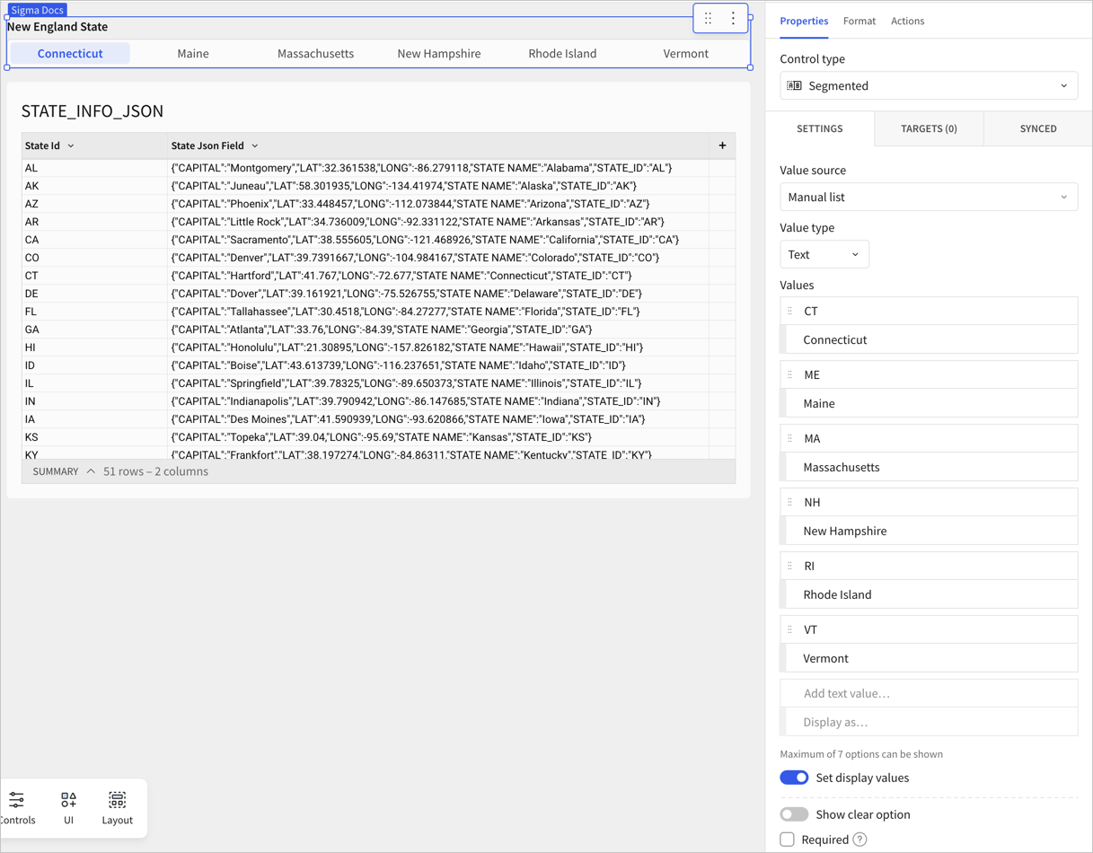
4. For **Values**, enter a custom list of values to use for the control. Press enter or return to add new values. You can optionally specify a display value to show in the control instead of the raw data value.
For example, you can create a manual list of text values that correspond to the states in the New England region of the United States: Connecticut, Maine, Massachusetts, New Hampshire, Rhode Island, and Vermont.
You can specify the display values as the full state names, but use the state abbreviations as the data values to correspond with a column in the targeted data element.
### Use a list from a preset
This option lets you choose from a common set of presets: Month names, Weekday names, and Date parts. After you select one of these options, your control is a manual list. You can change it, remove values, and add new values.
1. In the **Properties** tab for the control, select the **Settings** tab.
2. For **Value source**, select **Create list from preset** and choose one of the preset options:
* Month names
* Weekday names
* Date parts
3. After selecting a preset list, the **Value type** and **Values** automatically update. The **Value source** changes to **Create manual list** to reflect that a preset list is a pre-populated manual list.
4. Modify the preset list as desired, removing unneeded values and changing display values. To delete a value, hover over the value and select **x**.
### Use a column from a data element or data source
1. In the **Properties** tab for the control, select the **Settings** tab.
2. For **Value source**, select a data source or data element in use on the workbook.
3. For **Source column**, the first column of the data source is shown. Select the column to open a drop-down menu and choose the column that you want to use to populate the control.
By default, the control uses the top 7 most frequent values in that column. Select **Sort** ( ) to change the sort order from the default of **Descending by count** to **Ascending by count**, **Ascending by alphanumeric**, or **Descending by alphanumeric**. Custom sort orders are not supported.
4. (Optional) To use a different related column as the display values for the data, turn on the toggle switch to **Set display column** and choose a display column from the same data source. For example, you might use an ID column as the data source, but a name column as the display value.
5. (Optional) To allow users of the control to reset the control so nothing is selected, select the checkbox to **Show clear option**. By default, the label for this option is **None**, but you can change it.
6. (Optional) To make sure that targeted data elements only load after a user makes a selection on the control, select the checkbox for **Required**.
7. (Optional) Decide whether to update the default **Control ID**. See [About control IDs](/docs/intro-to-control-elements#about-control-ids).
## Specify the target of the control
Add targets to a control to specify which data elements and data sources to filter:
1. Select the control, then in **Properties**, click **Targets**.
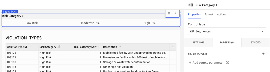
2. Click **+** (**Add filter target**).
3. Select one or more elements in your workbook that you want to be changed by the control.
In this example, the data element table `VIOLATION_TYPES` is selected. The table is on the same page of the workbook as the control.
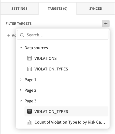
The table appears under **Targets**, and the count of targets for the control increases to 1. As you add other targets to this control, the count increases.
4. Update the column targeted by the control. By default, the control targets the first column of the table. To change the target column, click the current column and choose the new target column. In this example, the target column **Risk Category** is correct for the control.
As you change the target column, the default name of the control updates to match the selected column. In this example, the name of the filter control was **New Control**, then it changed to **Risk Category** when the table was added as a target.
## Format and design a segmented control
You can format and design the segmented control to match the styling of your workbook. To review and update the formatting options, select the **Format** tab.
### Responsive appearance
When the values for a segmented control are too long to fully display in a document, the control appears as a drop-down menu instead of truncating the text in the control.
For example:
| Display | Appearance |
| :-------------------------------- | :------------------------------------------------------------------------------------------------------------------------------------------------------------------------------------------------------------------------------------------------------------------------------------------------------- |
| Segmented control with all values |  |
| Segmented control dropdown | 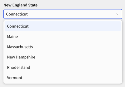 |
### Update the element style
You can customize the style of the element, such as the background. See [Customize element background and styles](/docs/customize-element-background-and-styles).
### Update the control label
| Option | Description |
| :------------------------- | :---------------------------------------------------------------------------------------------------------------------------------------------------------------------------------------------------- |
| **Show label** | Select the checkbox to show a label on the control. A label is shown by default, either "New Control" or a label that matches the column name used to populate the control. You can update the label. |
| **Bold** | Bold the label text. |
| **Text color** | Update the color of the label text. |
| **Label position** | Choose whether to position the label at the **Top** of the control, or to the **Left**. |
| **Show description** | Select the checkbox to show a description on the control. You can provide up to 200 characters of text as a description. |
| **Description formatting** | If a description is shown, you can bold the description text and update the text color. |
| **Description display** | If a description is shown, you can choose whether to display the description as a **Subtitle** or **Tooltip**, or use the **Auto** setting, which defaults to a tooltip. |
### Update the alignment of the control
You can align a segmented control within the element boundaries on the workbook canvas.
Choose from the following horizontal alignment options:
| Alignment setting | Example |
| ------------------------------------------------------------------------------------------------------------------------------ | ------------------------------------------------------------------------------------------------------------------------------------------------------------------------------------------------------------------------------------------------------------- |
| **Left align** (
) to change the sort order from the default of **Descending by count** to **Ascending by count**, **Ascending by alphanumeric**, or **Descending by alphanumeric**. Custom sort orders are not supported.
4. (Optional) To use a different related column as the display values for the data, turn on the toggle switch to **Set display column** and choose a display column from the same data source. For example, you might use an ID column as the data source, but a name column as the display value.
5. (Optional) To allow users of the control to reset the control so nothing is selected, select the checkbox to **Show clear option**. By default, the label for this option is **None**, but you can change it.
6. (Optional) To make sure that targeted data elements only load after a user makes a selection on the control, select the checkbox for **Required**.
7. (Optional) Decide whether to update the default **Control ID**. See [About control IDs](/docs/intro-to-control-elements#about-control-ids).
## Specify the target of the control
Add targets to a control to specify which data elements and data sources to filter:
1. Select the control, then in **Properties**, click **Targets**.

2. Click **+** (**Add filter target**).
3. Select one or more elements in your workbook that you want to be changed by the control.
In this example, the data element table `VIOLATION_TYPES` is selected. The table is on the same page of the workbook as the control.

The table appears under **Targets**, and the count of targets for the control increases to 1. As you add other targets to this control, the count increases.
4. Update the column targeted by the control. By default, the control targets the first column of the table. To change the target column, click the current column and choose the new target column. In this example, the target column **Risk Category** is correct for the control.
As you change the target column, the default name of the control updates to match the selected column. In this example, the name of the filter control was **New Control**, then it changed to **Risk Category** when the table was added as a target.
## Format and design a segmented control
You can format and design the segmented control to match the styling of your workbook. To review and update the formatting options, select the **Format** tab.
### Responsive appearance
When the values for a segmented control are too long to fully display in a document, the control appears as a drop-down menu instead of truncating the text in the control.
For example:
| Display | Appearance |
| :-------------------------------- | :------------------------------------------------------------------------------------------------------------------------------------------------------------------------------------------------------------------------------------------------------------------------------------------------------- |
| Segmented control with all values |  |
| Segmented control dropdown |  |
### Update the element style
You can customize the style of the element, such as the background. See [Customize element background and styles](/docs/customize-element-background-and-styles).
### Update the control label
| Option | Description |
| :------------------------- | :---------------------------------------------------------------------------------------------------------------------------------------------------------------------------------------------------- |
| **Show label** | Select the checkbox to show a label on the control. A label is shown by default, either "New Control" or a label that matches the column name used to populate the control. You can update the label. |
| **Bold** | Bold the label text. |
| **Text color** | Update the color of the label text. |
| **Label position** | Choose whether to position the label at the **Top** of the control, or to the **Left**. |
| **Show description** | Select the checkbox to show a description on the control. You can provide up to 200 characters of text as a description. |
| **Description formatting** | If a description is shown, you can bold the description text and update the text color. |
| **Description display** | If a description is shown, you can choose whether to display the description as a **Subtitle** or **Tooltip**, or use the **Auto** setting, which defaults to a tooltip. |
### Update the alignment of the control
You can align a segmented control within the element boundaries on the workbook canvas.
Choose from the following horizontal alignment options:
| Alignment setting | Example |
| ------------------------------------------------------------------------------------------------------------------------------ | ------------------------------------------------------------------------------------------------------------------------------------------------------------------------------------------------------------------------------------------------------------- |
| **Left align** ( ) (default) | 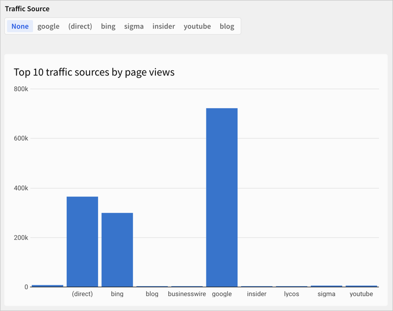 |
| **Right align** (
) (default) |  |
| **Right align** ( ) | 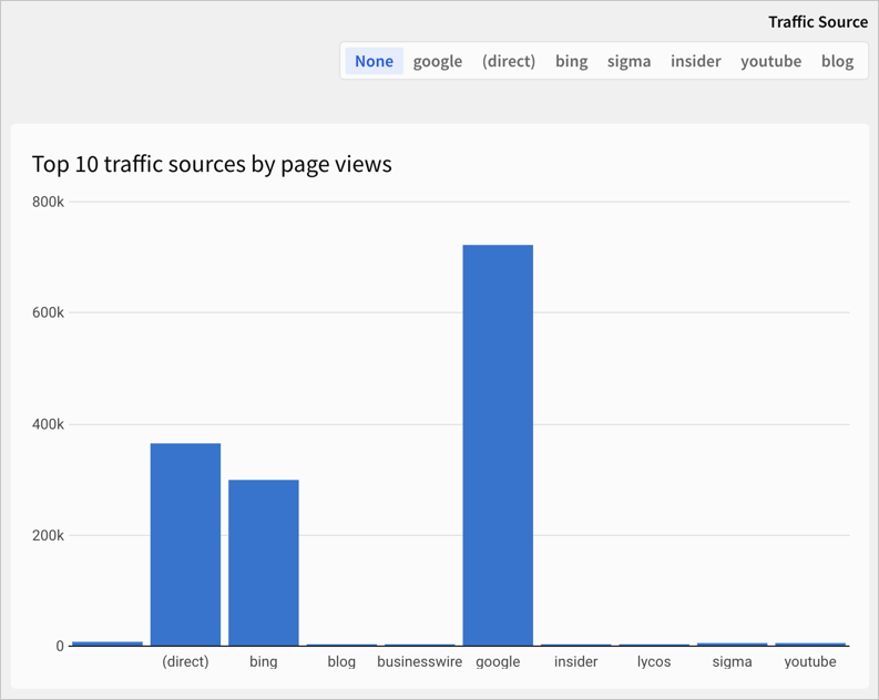 |
| **Stretch** (
) |  |
| **Stretch** ( ) | 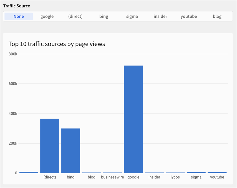 |
You can also change the vertical alignment of the control within the element boundaries. Choose one of:
* **Top align**
* **Center align**
* **Bottom align**
## Related resources
* [Intro to control elements](/docs/intro-to-control-elements)
* [Create and manage a control element](/docs/create-and-manage-a-control-element)
* [Reference control values as parameters](/docs/parameters-in-workbooks)
) |  |
You can also change the vertical alignment of the control within the element boundaries. Choose one of:
* **Top align**
* **Center align**
* **Bottom align**
## Related resources
* [Intro to control elements](/docs/intro-to-control-elements)
* [Create and manage a control element](/docs/create-and-manage-a-control-element)
* [Reference control values as parameters](/docs/parameters-in-workbooks)