> For clean Markdown of any page, append .md to the page URL.
> For a complete documentation index, see https://help.sigmacomputing.com/llms.txt.
> For AI client integration (Claude Code, Cursor, etc.), connect to the MCP server at https://help.sigmacomputing.com/_mcp/server.
# Format and customize a table
You can customize the appearance of tabular data in Sigma, allowing you to adhere to brand guidelines, apply conditional formatting, or highlight interactive data for users.
You can format and customize tables, pivot tables, and input tables, and apply the formatting at different levels of workbook development:
* Admins can define a default table style in an organization-wide workbook theme. See [Create and manage workbook themes](/docs/create-and-manage-workbook-themes).
* Specify table styles for all tables, including pivot tables and input tables, in a workbook. See [Table style settings in Workbook settings overview](/docs/workbook-settings-overview#table-style-settings).
* Apply table styles to one table element. See [Customize the table style for an individual element](#customize-the-table-style-for-an-individual-element) on this page.
* Format data in a given column or totals row or column. See [Format column and totals data](#format-column-and-totals-data) on this page.
* Format data in columns based on a condition. See [Apply conditional formatting](#apply-conditional-formatting-to-table-columns-and-cells) on this page.
* Format cells in columns that trigger actions. See [Format action button columns](#format-action-button-columns).
## User requirements
**Before you start:** This action uses the editor panel. If you have not done so already, open the editor panel from either **Explore** or **Edit** mode; see [Workbook modes](/docs/workbook-modes-overview).
* You must be assigned an [account type](/docs/account-type-and-license-overview) with the **Full explore** or **Create, edit, and publish workbooks** permission enabled.
* You must be the workbook owner or be granted **Can explore** or **Can edit** [workbook permission](/docs/folder-and-document-permissions).
## Customize the table style for an individual element
Apply a custom table style to an individual table, pivot table, or input table element. Any custom table styles override styles [set on the workbook level](/docs/workbook-settings-overview#table-style-settings).
1. Start customizing a workbook or open it for editing.
2. Select the table, pivot table, or input table element that you want to modify.
3. In the side panel, select **Format**, then click the **Table style** header to expand the section.
4. Select a table style preset, or customize the table style components as needed.
See [Customizable table style options](#customizable-table-style-options) for more.
## Available table style presets
Sigma includes two presets that automatically configure all table style options for a workbook. You can use a preset as a one-click solution or as the starting point for a custom table design.
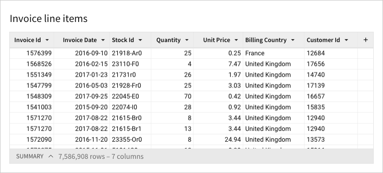
### Spreadsheet
The **Spreadsheet** preset (default) is designed for ongoing analysis and collaboration. It’s ideal for ensuring readability and including additional context, like tooltips and images.
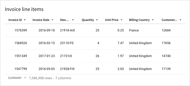
### Presentation
The **Presentation** preset is designed for table viewing. It’s ideal for aligning with company branding and adding visual appeal to your workbook.
## Customizable table style options
You can customize any of the following table style components to meet branding and aesthetic requirements with table, pivot table, and input table elements:
* [Cell spacing](#cell-spacing)
* [Grid lines](#grid-lines)
* [Dividers](#dividers)
* [Banding](#banding)
* [Header format](#header-format)
* [Subheader format](#subheader-format-pivot-tables-only)
* [Cell format](#cell-format)
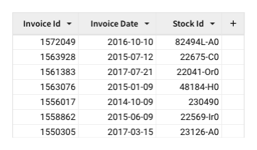
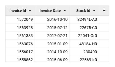
### Cell spacing
The **Cell spacing** setting allows you to adjust the padding around text within table cells. You can select one of four options: **Extra small**, **Small**, **Medium**, and **Large**.
| Extra small | Small |
| :------------------------------------------------------------------------------------------------------------------------------------ | :---------------------------------------------------------------------------------------------------------------------------------------- |
|  |  |
| Medium | Large |
| 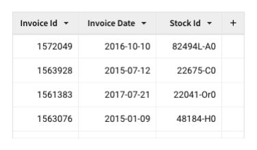 | 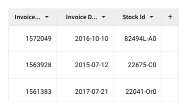 |
### Grid lines
The **Grid lines** setting lets you manage the display of cell borders. You can select one of four options: **No grid**, **Vertical grid**, **Horizontal grid**, and **All grid**.
| No grid | Vertical grid |
| :------------------------------------------------------------------------------------------------------------------ | :----------------------------------------------------------------------------------------------------------------------------- |
| 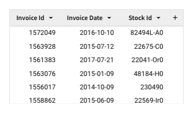 | 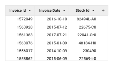 |
| Horizontal grid | All grid |
| 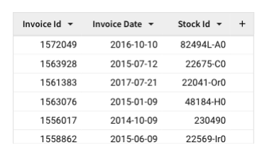 | 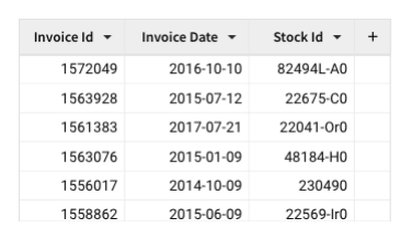 |
### Dividers (pivot tables only)
You can enable heavier, more visually apparent dividers for better readability across groups.
#### Vertical dividers
For pivot tables with at least two fixed pivot columns, you can enable heavier vertical dividers. Under **Heavier group dividers**, select the **Vertical** checkbox.
| No heavier vertical dividers | Heavier vertical dividers enabled |
| :--------------------------------------------------------------------------------------------------------------------------------------------- | :--------------------------------------------------------------------------------------------------------------------------------------------------------------------------------------- |
| 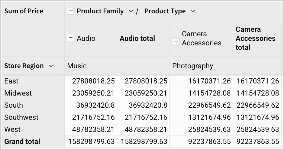 | 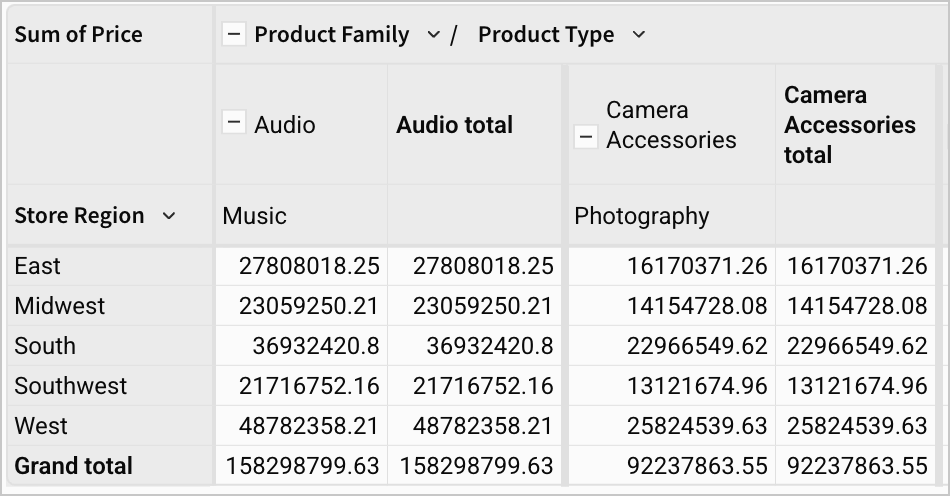 |
#### Horizontal dividers
For pivot tables with at least two fixed pivot rows, you can enable heavier horizontal dividers. Under **Heavier group dividers**, select the **Horizontal** checkbox.
| No heavier horizontal dividers | Heavier horizontal dividers enabled |
| :------------------------------------------------------------------------------------------------------------------------------------------------------------------- | :------------------------------------------------------------------------------------------------------------------------------------------------------------------------------------------------- |
| 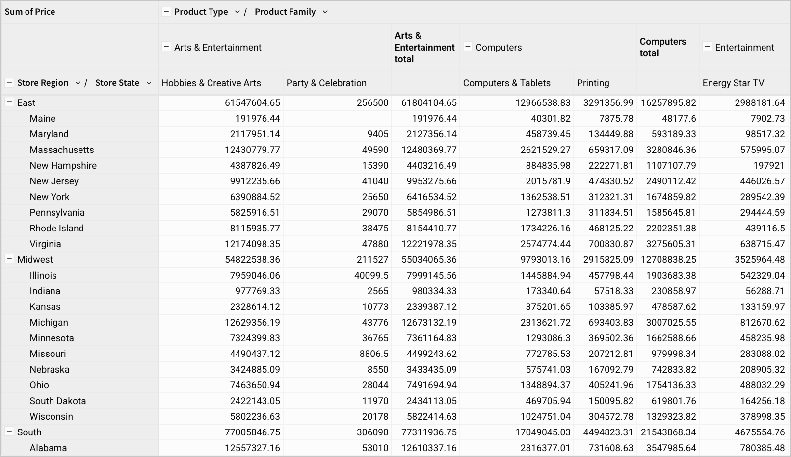 | 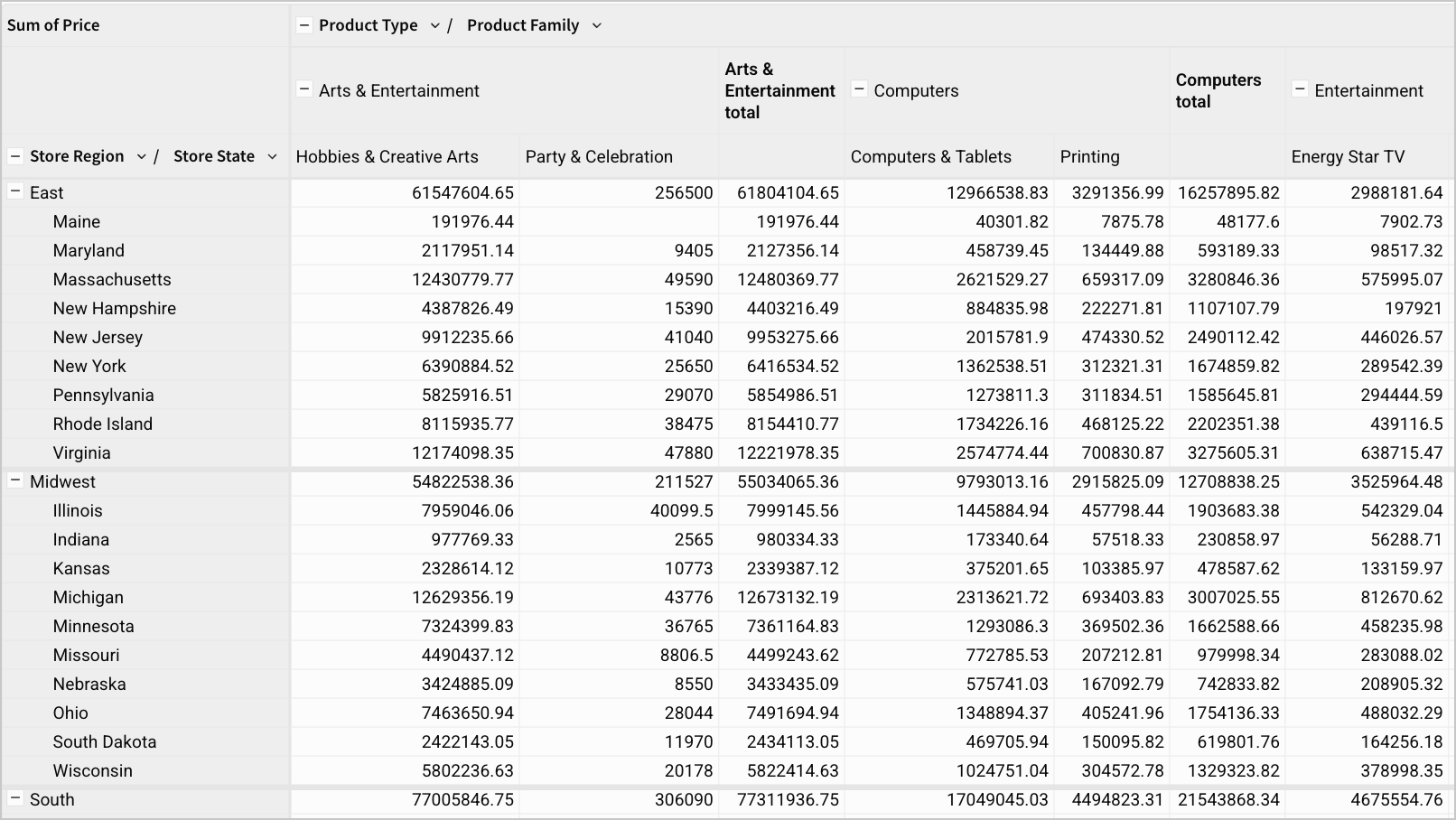 |
### Banding
You can alternate the background color of the data rows. For **Banding color**, select a color. Choose **None** to remove banding from your table.
| Banding color set to None | Banding color set to #EBEBEB |
| :-------------------------------------------------------------------------------------------------------------------------------------- | :----------------------------------------------------------------------------------------------------------------------------------------------- |
| 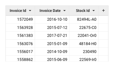 | 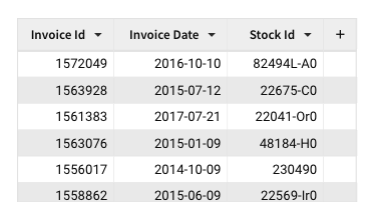 |
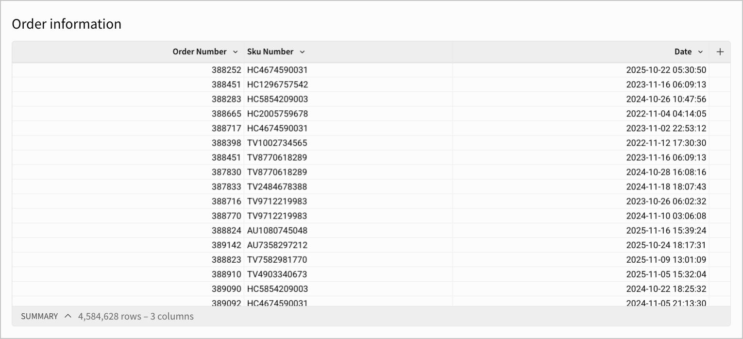
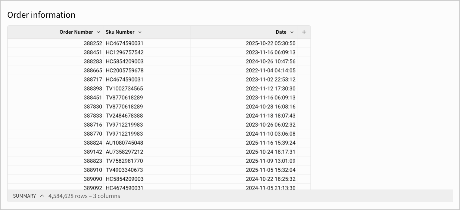
### Autofit columns
You can configure columns to automatically scale to the size of your table element by using the **Autofit columns** option. This provides a more consistent experience between different screen resolutions and reduces unnecessary white space.
The **Autofit columns** option is enabled by default, and can be disabled by unselecting the **Autofit columns** checkbox. Autofit columns is not supported for pivot tables.
| Autofit columns enabled | Autofit columns disabled |
| :------------------------------------------------------------------------------------------------------------------------------------------------------------------------------------ | :-------------------------------------------------------------------------------------------------------------------------------------------------------------------------------------------------------------------- |
|  |  |
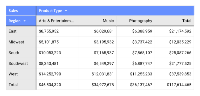
### Header format
The **Header** tab contains settings and tools that let you format table headers. You can customize the font type, size, weight, and color, as well as text wrap, text alignment, background color, and divider color settings.
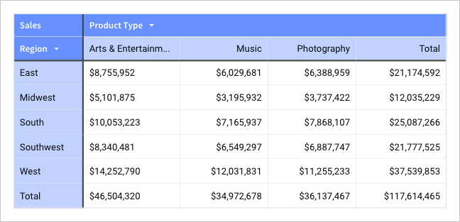
### Subheader format *(pivot tables only)*
The **Subheader** tab contains settings and tools that let you format subheader rows and columns. You can customize the font type, size, weight, and color, as well as text wrap, text alignment, and background color settings for both row or column headers.
### Cell format
The **Cell** tab contains settings and tools that let you format data cells. You can customize the font type, size, weight, and color, as well as text wrap, text alignment, and background color settings.
For pivot tables, cell styles apply to both value and total cells by default. To apply different styles to pivot table total cells, see [Format column and totals data](#format-column-and-totals-data) and [Format pivot table totals](/docs/format-pivot-table-totals).
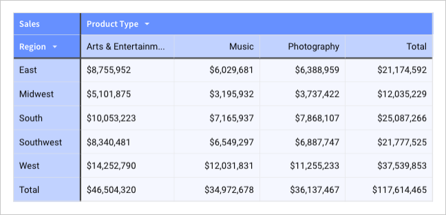
## Format column location in a table
To manage visibility and interactions with the columns in a table, you can format the location of columns in a table or pivot table.
Right-click a column, or select the down arrow ( ) to customize a column:
* Choose **Freeze up to column** to freeze the position of that column and all columns to the left of the selected column. When scrolling to the right, the frozen columns remain visible. To remove a column from the frozen position, choose **Unfreeze columns**.
* Choose **Hide column** to hide the column when the table is viewed. You can reference hidden columns in formulas. Child elements created from a table with hidden columns do not include the hidden columns, but the columns can be added.
Pivot tables support freezing values columns, including totals columns, but not pivot row columns or columns set as pivot columns.
You cannot change the location of the totals row in a grouped table.
## Hide and show table components
To manage whether various table components are shown in a table, you can format the table components:
1. Start customizing a workbook or open it for editing.
2. Select the table or input table element you want to modify.
3. In the side panel, select **Format**.
4. Click the **Table components** header to expand the section and adjust the settings:
| Option | Details |
| ---------------------- | ----------------------------------------------------------------------------------------------------------------------------------------------------------------------------------------------------------------------------------------------------------------- |
| Show table | Whether to show the table columns and rows in the element. Turn off to show only the summary bar and title, if shown. |
| Show collapsed columns | For a table, whether to show ungrouped columns when a grouping is collapsed. Tables without groupings are unaffected by this option. For tables with multiple groupings, see [Manage groups in a table](/docs/create-and-manage-tables#manage-groups-in-a-table). |
| Show summary bar | Whether to show the summary bar in a table or input table. |
## Format column and totals data
Columns are formatted automatically according to the [data type](/docs/data-types-and-formats) of the column. You can change the formatting to display the column data in a different way.
If your grouped table or pivot table includes totals, you can use the toolbar to format the totals row or totals column separately from the table columns. If you apply formatting to both a totals row and a totals column, the row formatting takes precedence. For more options formatting totals in a pivot table, see [Format pivot table totals](/docs/format-pivot-table-totals).
### Change number formatting
Select a column or totals cell, then choose an option in the toolbar to change the number formatting:
* Format as currency
* Format as percent
* Decrease or increase decimal places
* Display numeric data in a different format. See [Supported data types and formats](/docs/data-types-and-formats) for more details.
## Change column data appearance
You can change the appearance of data in a specific column using the formatting toolbar. To change the appearance of all data in a table, set the [Cell format](#cell-format). These formatting options do not affect the column headers.
After selecting a column or totals cell, choose an option in the toolbar to change the appearance of the data:
* Choose the alignment of data.
* Choose the text color.
* Choose the background color. Select the column or totals cell, then in the toolbar, click
) to customize a column:
* Choose **Freeze up to column** to freeze the position of that column and all columns to the left of the selected column. When scrolling to the right, the frozen columns remain visible. To remove a column from the frozen position, choose **Unfreeze columns**.
* Choose **Hide column** to hide the column when the table is viewed. You can reference hidden columns in formulas. Child elements created from a table with hidden columns do not include the hidden columns, but the columns can be added.
Pivot tables support freezing values columns, including totals columns, but not pivot row columns or columns set as pivot columns.
You cannot change the location of the totals row in a grouped table.
## Hide and show table components
To manage whether various table components are shown in a table, you can format the table components:
1. Start customizing a workbook or open it for editing.
2. Select the table or input table element you want to modify.
3. In the side panel, select **Format**.
4. Click the **Table components** header to expand the section and adjust the settings:
| Option | Details |
| ---------------------- | ----------------------------------------------------------------------------------------------------------------------------------------------------------------------------------------------------------------------------------------------------------------- |
| Show table | Whether to show the table columns and rows in the element. Turn off to show only the summary bar and title, if shown. |
| Show collapsed columns | For a table, whether to show ungrouped columns when a grouping is collapsed. Tables without groupings are unaffected by this option. For tables with multiple groupings, see [Manage groups in a table](/docs/create-and-manage-tables#manage-groups-in-a-table). |
| Show summary bar | Whether to show the summary bar in a table or input table. |
## Format column and totals data
Columns are formatted automatically according to the [data type](/docs/data-types-and-formats) of the column. You can change the formatting to display the column data in a different way.
If your grouped table or pivot table includes totals, you can use the toolbar to format the totals row or totals column separately from the table columns. If you apply formatting to both a totals row and a totals column, the row formatting takes precedence. For more options formatting totals in a pivot table, see [Format pivot table totals](/docs/format-pivot-table-totals).
### Change number formatting
Select a column or totals cell, then choose an option in the toolbar to change the number formatting:
* Format as currency
* Format as percent
* Decrease or increase decimal places
* Display numeric data in a different format. See [Supported data types and formats](/docs/data-types-and-formats) for more details.
## Change column data appearance
You can change the appearance of data in a specific column using the formatting toolbar. To change the appearance of all data in a table, set the [Cell format](#cell-format). These formatting options do not affect the column headers.
After selecting a column or totals cell, choose an option in the toolbar to change the appearance of the data:
* Choose the alignment of data.
* Choose the text color.
* Choose the background color. Select the column or totals cell, then in the toolbar, click  **Background color**.
* (
**Background color**.
* ( ) **Wrap text** in the column.
[Conditional formatting](#apply-conditional-formatting-to-table-columns-and-cells) takes precedence over formatting applied from the toolbar.
## Apply conditional formatting to table columns and cells
To format table columns and cells based on a rule, or condition, apply conditional formatting.
Conditional formatting takes precedence over [toolbar column formatting options](#format-column-and-totals-data).
With conditional formatting, you can apply a specific format to one or more columns based on a formatting rule. Choose from a default formatting rule, or specify a custom formula to use, such as with a [logical function](/docs/logical-functions) or [text function](/docs/text-functions).
* Apply text formatting, such as italics, bold, underline, and text color.
* Set a background color.
* Format number or date values.
* Apply a color scale to the background color or the text color.
* Display data bars over data values, or hide the data values to show data bars only.
To apply formatting to the entire table, see [Customizable table style options](#customizable-table-style-options).
1. Click to select the table.
2. In the column menu for a column, or from the **Format** section of the side panel, select **Conditional formatting**.
3. If you open conditional formatting from the column menu, the **Conditional formatting** panel contains a default rule for the column. Otherwise, click **+ Add rule**.
4. (Optional) For **Apply to**, choose the columns to apply the conditional formatting to. You can also choose **All columns**.
5. Choose between **Single color**, **Color scale**, and **Data bars** options for the formatting.
6. For **Formatting rule**, define the conditional formatting rule. Choose a prebuilt rule, or define a custom formula.\
As you create the rule and define the formatting, the formatting is applied to the relevant columns and cells.
7. (Optional) Add more conditional formatting rules by clicking **+ Add rule**.
If your table contains totals, you can apply conditional formatting only to subtotal rows and columns or grand total rows and columns.
## Format action button columns
To make it clear that selecting a column is the trigger for an action sequence, apply button formatting to the cells in that column.
Action button formatting cannot be applied to the following column types: single-select, multi-select, sparkline, and checkbox.
For a table with one or more action sequences with an **On select** trigger configured:
1. Select the table.
2. In the editor panel, select **Format**.
3. Open the **Action button** section.
4. Select a column to apply the formatting to, or select **Apply to all action columns** to apply the formatting to all columns that trigger an action sequence.
5. Configure the selected columns with the following fields:
| Option | Details |
| -------------- | ------------------------------------------------------------------------------------------------------------------------------------------------------------------------------------------------------------ |
| **Appearance** | Select one of **Filled**, **Outline**, or **Text**. The default depends on the table style preset: the **Spreadsheet** preset defaults to **Text**, and the **Presentation** preset defaults to **Outline**. |
| **Style** | Select whether or not the text is **Bold**, as well as a **Text color**. |
| **Horizontal** | Select one of **Left align**, **Center align**, **Right align**, or **Stretch**. |
To use the **Filled** or **Outline** options for **Appearance**, you must set [**Cell spacing**](#cell-spacing) to **Small** or larger.
) **Wrap text** in the column.
[Conditional formatting](#apply-conditional-formatting-to-table-columns-and-cells) takes precedence over formatting applied from the toolbar.
## Apply conditional formatting to table columns and cells
To format table columns and cells based on a rule, or condition, apply conditional formatting.
Conditional formatting takes precedence over [toolbar column formatting options](#format-column-and-totals-data).
With conditional formatting, you can apply a specific format to one or more columns based on a formatting rule. Choose from a default formatting rule, or specify a custom formula to use, such as with a [logical function](/docs/logical-functions) or [text function](/docs/text-functions).
* Apply text formatting, such as italics, bold, underline, and text color.
* Set a background color.
* Format number or date values.
* Apply a color scale to the background color or the text color.
* Display data bars over data values, or hide the data values to show data bars only.
To apply formatting to the entire table, see [Customizable table style options](#customizable-table-style-options).
1. Click to select the table.
2. In the column menu for a column, or from the **Format** section of the side panel, select **Conditional formatting**.
3. If you open conditional formatting from the column menu, the **Conditional formatting** panel contains a default rule for the column. Otherwise, click **+ Add rule**.
4. (Optional) For **Apply to**, choose the columns to apply the conditional formatting to. You can also choose **All columns**.
5. Choose between **Single color**, **Color scale**, and **Data bars** options for the formatting.
6. For **Formatting rule**, define the conditional formatting rule. Choose a prebuilt rule, or define a custom formula.\
As you create the rule and define the formatting, the formatting is applied to the relevant columns and cells.
7. (Optional) Add more conditional formatting rules by clicking **+ Add rule**.
If your table contains totals, you can apply conditional formatting only to subtotal rows and columns or grand total rows and columns.
## Format action button columns
To make it clear that selecting a column is the trigger for an action sequence, apply button formatting to the cells in that column.
Action button formatting cannot be applied to the following column types: single-select, multi-select, sparkline, and checkbox.
For a table with one or more action sequences with an **On select** trigger configured:
1. Select the table.
2. In the editor panel, select **Format**.
3. Open the **Action button** section.
4. Select a column to apply the formatting to, or select **Apply to all action columns** to apply the formatting to all columns that trigger an action sequence.
5. Configure the selected columns with the following fields:
| Option | Details |
| -------------- | ------------------------------------------------------------------------------------------------------------------------------------------------------------------------------------------------------------ |
| **Appearance** | Select one of **Filled**, **Outline**, or **Text**. The default depends on the table style preset: the **Spreadsheet** preset defaults to **Text**, and the **Presentation** preset defaults to **Outline**. |
| **Style** | Select whether or not the text is **Bold**, as well as a **Text color**. |
| **Horizontal** | Select one of **Left align**, **Center align**, **Right align**, or **Stretch**. |
To use the **Filled** or **Outline** options for **Appearance**, you must set [**Cell spacing**](#cell-spacing) to **Small** or larger.