Reference line
Create vertical and horizontal lines to divide the chart into four segments.

Reference band
Create vertical and horizontal bands to differentiate segments by color.

 Example use cases:
* **Education analytics**: Assess college grades and post-college income to determine a possible correlation between academic performance and job earnings.
* **Environmental health analytics**: Compare metro health index scores by neighborhood air pollution amount to analyze patterns and identify areas needing intervention.
* **Retail analytics**: Track price changes and sales amounts by profit to understand consumer response to price changes and identify where pricing did not affect profit.
## User requirements
The ability to create scatter plots and other charts requires the following:
* To create a chart in a workbook, you must be assigned an [account type](/docs/account-type-and-license-overview) with the **Full explore** or **Create, edit, and publish workbooks** permission enabled.
* To create a chart in a report, you must be assigned an [account type](/docs/account-type-and-license-overview) with the **Create, edit, and publish reports** permission enabled.
* You must be the workbook or report owner or be granted **Can explore** or **Can edit** [access to the document](/docs/folder-and-document-permissions).
## Basic scatter plot requirements
To display a scatter plot, configure the following in the **Properties** tab of the editor panel:
| | |
| :--------- | :--------------------------------------------------------------- |
| **X-axis** | Source column that defines the X-axis (horizontal axis) variable |
| **Y-axis** | Source column that defines the Y-axis (vertical axis) variable |
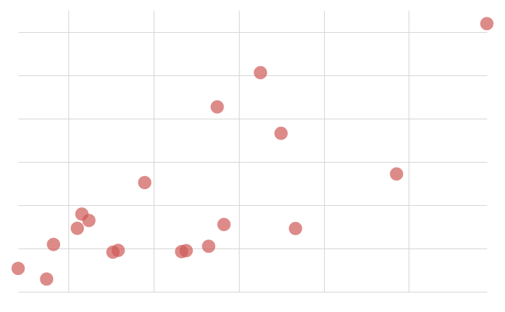
In a scatter plot, data points express the intersection of different variables on the X- and Y-axis, such as revenue and COGS, temperature and precipitation, or page views and clicks.
At the core of every chart is an underlying data table (derived from the data source) that supplies the information visualized by the chart. As you build a scatter plot, Sigma automatically groups, aggregates, and calculates the underlying data to create source columns for various chart properties. You can [view the underlying data table](/docs/view-underlying-data) while configuring the chart to see how the data is applied.
### Add a scatter plot chart
Add a scatter plot chart element to a workbook or report and specify a data source:
1. Open a document for editing or customizing.
2. From the **Add element** bar, select **Charts**, then select **Scatter**.
3. In the **Select source** modal, select a data source for the chart.
### Define the x-axis variable
Configure a source column to define the x-axis variable.
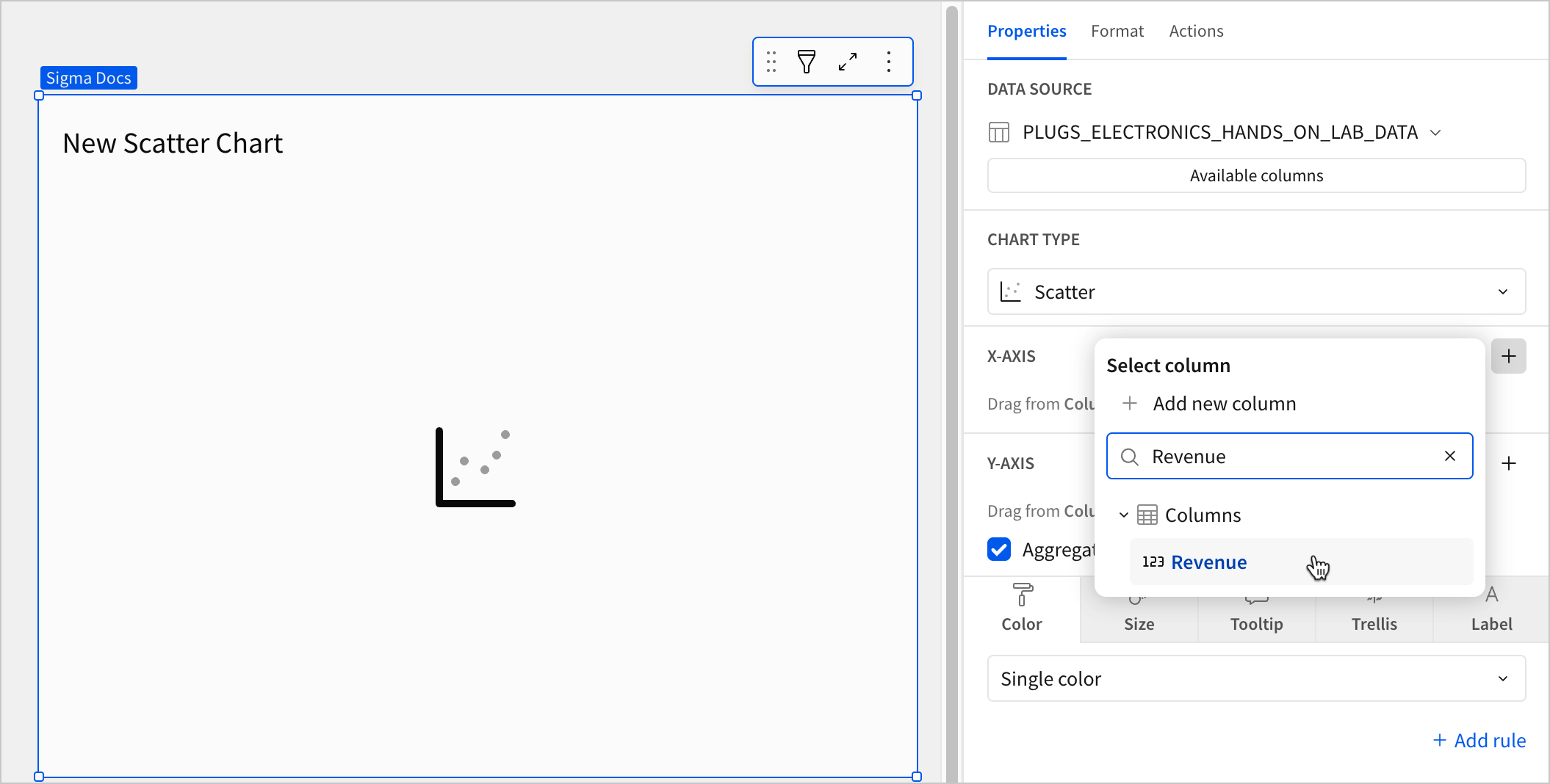
1. In the **X-axis** property, click **+ Add column** and select an option from the menu:
* To plot values from an existing column, search or scroll the **Select column** list and select the desired column name.
* To plot values based on a custom formula, select **+ Add new column** and enter a formula in the toolbar.
You can also select or replace an existing column by dragging and dropping a column name from the **Columns** list to the **X-axis** property.
2. (Optional) Control how the source column data is grouped and displayed in the chart:
1. Hover over the source column name, then click the down arrow (
Example use cases:
* **Education analytics**: Assess college grades and post-college income to determine a possible correlation between academic performance and job earnings.
* **Environmental health analytics**: Compare metro health index scores by neighborhood air pollution amount to analyze patterns and identify areas needing intervention.
* **Retail analytics**: Track price changes and sales amounts by profit to understand consumer response to price changes and identify where pricing did not affect profit.
## User requirements
The ability to create scatter plots and other charts requires the following:
* To create a chart in a workbook, you must be assigned an [account type](/docs/account-type-and-license-overview) with the **Full explore** or **Create, edit, and publish workbooks** permission enabled.
* To create a chart in a report, you must be assigned an [account type](/docs/account-type-and-license-overview) with the **Create, edit, and publish reports** permission enabled.
* You must be the workbook or report owner or be granted **Can explore** or **Can edit** [access to the document](/docs/folder-and-document-permissions).
## Basic scatter plot requirements
To display a scatter plot, configure the following in the **Properties** tab of the editor panel:
| | |
| :--------- | :--------------------------------------------------------------- |
| **X-axis** | Source column that defines the X-axis (horizontal axis) variable |
| **Y-axis** | Source column that defines the Y-axis (vertical axis) variable |
In a scatter plot, data points express the intersection of different variables on the X- and Y-axis, such as revenue and COGS, temperature and precipitation, or page views and clicks.
At the core of every chart is an underlying data table (derived from the data source) that supplies the information visualized by the chart. As you build a scatter plot, Sigma automatically groups, aggregates, and calculates the underlying data to create source columns for various chart properties. You can [view the underlying data table](/docs/view-underlying-data) while configuring the chart to see how the data is applied.
### Add a scatter plot chart
Add a scatter plot chart element to a workbook or report and specify a data source:
1. Open a document for editing or customizing.
2. From the **Add element** bar, select **Charts**, then select **Scatter**.
3. In the **Select source** modal, select a data source for the chart.
### Define the x-axis variable
Configure a source column to define the x-axis variable.
1. In the **X-axis** property, click **+ Add column** and select an option from the menu:
* To plot values from an existing column, search or scroll the **Select column** list and select the desired column name.
* To plot values based on a custom formula, select **+ Add new column** and enter a formula in the toolbar.
You can also select or replace an existing column by dragging and dropping a column name from the **Columns** list to the **X-axis** property.

2. (Optional) Control how the source column data is grouped and displayed in the chart:
1. Hover over the source column name, then click the down arrow ( ) to open the column menu.
2. Hover over any of the following items, then select the desired option:
| | |
| :---------------- | :------------------------------------------------------------------ |
| **Truncate date** | Categorize date values by the selected interval or unit of measure. |
| **Transform** | Convert the column to the selected data value type. |
| **Format** | Display axis and data labels in the selected format. |
Column menu items vary depending on the data type of the column. For example, **Truncate date** is only available for date columns.
### Define the y-axis variable
Configure a source column to define the y-axis variable. Sigma aggregates y-axis values that correlate with the same x-axis value.
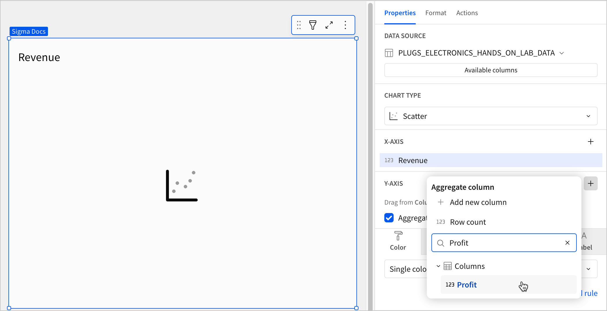
1. In the **Y-axis** property, click **+ Add calculation** and select an option from the menu:
* To aggregate values of an existing column, search or scroll the **Columns** list and select the desired column name.
* To calculate values based on a custom formula, select **+ Add new column** and enter the formula in the toolbar.
* To count the number of rows associated with each category, select **Row count**.
This visualization supports up to 25,000 data points. If the configurations result in a data set that exceeds this limit, the visualization displays the first 25,000 data points, and a warning message indicates that the chart is incomplete. To reduce the number of data points, aggregate the values or apply data filters to the visualization or source element.
2. (Optional) Control how the source column data is calculated and displayed in the chart:
1. Hover over the source column name, then click the down arrow () to open the column menu.
2. Hover over any of the following items, then select the desired option:
| | |
| :---------------- | :--------------------------------------------------------- |
| **Set aggregate** | Calculate values based on the selected aggregation method. |
| **Transform** | Convert the column to the selected data value type. |
| **Format** | Display axis and data labels in the selected format. |
3. (Optional) Repeat the previous steps to add multiple y-axis source columns. Sigma plots each as a separate point series on the chart.
4. (Optional) Customize the chart title and source column names:
* To rename a source column, double-click the column name in the **X-axis** or **Y-axis** property, then enter a new name. Changes are reflected in the default chart title.
* To edit the chart title, double-click the title in the chart, then enter a new title.
Sigma generates a default chart title. If you customize the title, changes to the source columns or column names are not automatically reflected in the title.
## Advanced scatter plot properties and formatting
To build advanced scatter plots and variations, including bubble charts and quadrant charts, you can use the formatting options available for scatter plots.
The following sections introduce configurations that can enhance your scatter plots and help you deliver specific insights with meaningful and actionable information.
### Configure point colors
To configure point colors, select the **Properties** tab in the editor panel, then click **Color**. You can specify the color for all points in the chart, add color categories, or create a color scale.
| Color | | |
| :--------------- | :--------------------------------------------------------------------------------------------------------------------------------------------------------------------------------------------------------------------------- | :----------------------------------------------------------------------------------------------------------------------------------------------------------------------------------------------------------------------------------------------------------------------------------------------------------------------------- |
| **Single color** |
) to open the column menu.
2. Hover over any of the following items, then select the desired option:
| | |
| :---------------- | :------------------------------------------------------------------ |
| **Truncate date** | Categorize date values by the selected interval or unit of measure. |
| **Transform** | Convert the column to the selected data value type. |
| **Format** | Display axis and data labels in the selected format. |
Column menu items vary depending on the data type of the column. For example, **Truncate date** is only available for date columns.
### Define the y-axis variable
Configure a source column to define the y-axis variable. Sigma aggregates y-axis values that correlate with the same x-axis value.
1. In the **Y-axis** property, click **+ Add calculation** and select an option from the menu:
* To aggregate values of an existing column, search or scroll the **Columns** list and select the desired column name.
* To calculate values based on a custom formula, select **+ Add new column** and enter the formula in the toolbar.
* To count the number of rows associated with each category, select **Row count**.

This visualization supports up to 25,000 data points. If the configurations result in a data set that exceeds this limit, the visualization displays the first 25,000 data points, and a warning message indicates that the chart is incomplete. To reduce the number of data points, aggregate the values or apply data filters to the visualization or source element.
2. (Optional) Control how the source column data is calculated and displayed in the chart:
1. Hover over the source column name, then click the down arrow () to open the column menu.
2. Hover over any of the following items, then select the desired option:
| | |
| :---------------- | :--------------------------------------------------------- |
| **Set aggregate** | Calculate values based on the selected aggregation method. |
| **Transform** | Convert the column to the selected data value type. |
| **Format** | Display axis and data labels in the selected format. |
3. (Optional) Repeat the previous steps to add multiple y-axis source columns. Sigma plots each as a separate point series on the chart.
4. (Optional) Customize the chart title and source column names:
* To rename a source column, double-click the column name in the **X-axis** or **Y-axis** property, then enter a new name. Changes are reflected in the default chart title.
* To edit the chart title, double-click the title in the chart, then enter a new title.
Sigma generates a default chart title. If you customize the title, changes to the source columns or column names are not automatically reflected in the title.
## Advanced scatter plot properties and formatting
To build advanced scatter plots and variations, including bubble charts and quadrant charts, you can use the formatting options available for scatter plots.
The following sections introduce configurations that can enhance your scatter plots and help you deliver specific insights with meaningful and actionable information.
### Configure point colors
To configure point colors, select the **Properties** tab in the editor panel, then click **Color**. You can specify the color for all points in the chart, add color categories, or create a color scale.
| Color | | |
| :--------------- | :--------------------------------------------------------------------------------------------------------------------------------------------------------------------------------------------------------------------------- | :----------------------------------------------------------------------------------------------------------------------------------------------------------------------------------------------------------------------------------------------------------------------------------------------------------------------------- |
| **Single color** | For each data series, enter a hex code or select an option from the color palette or color picker.
See [Add conditional formatting](#add-conditional-formatting) for information about adding formatting rules.
|  | | **By category** | Select a source column to define color categories, then select or customize a color palette for the resulting multiple series. |  | | **By scale** | Select a source column to define a color scale, then select a color range to apply to the points. |  | Multiple variables in the y-axis result in a multi-series scatter plot in which each data series represents a measure of a different variable. The **By category** color setting can also generate a multi-series scatter plot, but the resulting series represent sub-categories that measure the same variable. ### Add conditional formatting You can highlight certain points on a scatter plot by configuring formatting rules that apply different colors to points on the chart that meet specific conditions. 1. In the **Properties** tab of the editor panel, select **Color**. 2. Select **Single color** from the dropdown. 3. Click **+ Add rule** to open the **Format rule** popover. 4. For **Apply to**, select the column you want the rule to evaluate. 5. For **Formatting rule**, configure the condition you want to evaluate. 6. Click **Background color** and select a color to apply to the scatter plot points when the configured conditions are met.
| | |
| :----------------------------------------------------------------------------------------------------------------------------------------------------------------------------------------------------------------------------------------------------------------------------------------------------------------------------------------------------------------------------------- | :---------------------------------------------------------------------------------------------------------------------------------------------------------------------------------------------------------------------------------------------------------------------------------------------------------------------------------------------------------------------------------------------------------- |
|  |  |
When the conditions of multiple rules are met, Sigma applies the formatting rules in order of precedence, from top to bottom. Drag and drop rule blocks to reorder them as needed.
### Configure point size
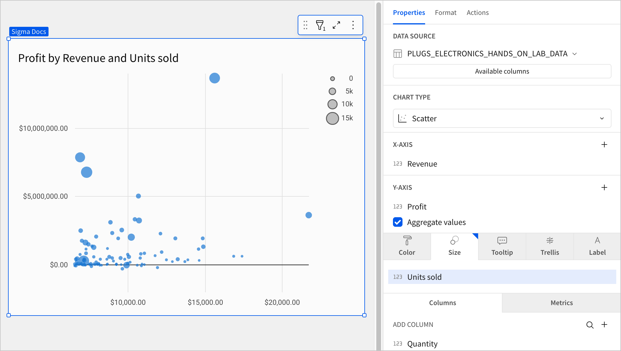
You can configure the size of scatter plot points proportionally based on a column in your data. If you configure a column as a size variable, each point is sized relative to the others in the chart. To set a fixed minimum point size, see [Customize point style](#customize-point-style).
1. In the **Properties** tab of the editor panel, select **Size**.
2. Click **+ Add calculation**.
3. From the **Aggregate column** popover, select one of the following options:
* To aggregate values of an existing column, search or scroll the **Columns** list and select the desired column name.
* To calculate point size based on a custom formula, select **+ Add new column** and enter the formula in the toolbar.
* To calculate point size based on the number of rows associated with each data point, select **Row count**.
### Customize point style
You can customize point styles by selecting the **Format** tab in the editor panel and clicking **Point style** to expand the section. If the scatter plot contains multiple y-axis variables, you can modify the different data series individually or together.
By default, scatter plot points are circular. You can change the point shape to differentiate multiple data series:
| Point shape | | | | |
| :------------------------------------------------------------------------------------------------------------------------------------------------------------------------------------------ | :---------------------------------------------------------------------------------------------------------------------------------------------------------------------------------------- | :--------------------------------------------------------------------------------------------------------------------------------------------------------------------------------------------- | :------------------------------------------------------------------------------------------------------------------------------------------------------------------------------------------------- | :--------------------------------------------------------------------------------------------------------------------------------------------------------------------------------------------------- |
| Circle | Square | Cross | Diamond | Triangle |
|  |  |  |  |  |
If the chart doesn't include a [size variable](#configure-point-size), you can customize the point size in pixels of all points in the chart. If the chart has a size variable configured, you can set the minimum point size:
| Point size | | |
| :---------------------------------------------------------------------------------------------------------------------------------------------------------------------------------------------------------------- | :------------------------------------------------------------------------------------------------------------------------------------------------------------------------------------------------------------------ | :---------------------------------------------------------------------------------------------------------------------------------------------------------------------------------------------------------------- |
| Small | Medium | Large |
|  |  |  |
### Add reference marks
Add reference marks by selecting the **Format** tab in the editor panel and clicking **Reference marks** to expand the section. Use reference marks to define goals, baselines, or other benchmarks. You can also use reference marks to create quadrant charts.
**Background color** and select a color to apply to the scatter plot points when the configured conditions are met.
| | |
| :----------------------------------------------------------------------------------------------------------------------------------------------------------------------------------------------------------------------------------------------------------------------------------------------------------------------------------------------------------------------------------- | :---------------------------------------------------------------------------------------------------------------------------------------------------------------------------------------------------------------------------------------------------------------------------------------------------------------------------------------------------------------------------------------------------------- |
|  |  |
When the conditions of multiple rules are met, Sigma applies the formatting rules in order of precedence, from top to bottom. Drag and drop rule blocks to reorder them as needed.
### Configure point size
You can configure the size of scatter plot points proportionally based on a column in your data. If you configure a column as a size variable, each point is sized relative to the others in the chart. To set a fixed minimum point size, see [Customize point style](#customize-point-style).
1. In the **Properties** tab of the editor panel, select **Size**.
2. Click **+ Add calculation**.
3. From the **Aggregate column** popover, select one of the following options:
* To aggregate values of an existing column, search or scroll the **Columns** list and select the desired column name.
* To calculate point size based on a custom formula, select **+ Add new column** and enter the formula in the toolbar.
* To calculate point size based on the number of rows associated with each data point, select **Row count**.

### Customize point style
You can customize point styles by selecting the **Format** tab in the editor panel and clicking **Point style** to expand the section. If the scatter plot contains multiple y-axis variables, you can modify the different data series individually or together.
By default, scatter plot points are circular. You can change the point shape to differentiate multiple data series:
| Point shape | | | | |
| :------------------------------------------------------------------------------------------------------------------------------------------------------------------------------------------ | :---------------------------------------------------------------------------------------------------------------------------------------------------------------------------------------- | :--------------------------------------------------------------------------------------------------------------------------------------------------------------------------------------------- | :------------------------------------------------------------------------------------------------------------------------------------------------------------------------------------------------- | :--------------------------------------------------------------------------------------------------------------------------------------------------------------------------------------------------- |
| Circle | Square | Cross | Diamond | Triangle |
|  |  |  |  |  |
If the chart doesn't include a [size variable](#configure-point-size), you can customize the point size in pixels of all points in the chart. If the chart has a size variable configured, you can set the minimum point size:
| Point size | | |
| :---------------------------------------------------------------------------------------------------------------------------------------------------------------------------------------------------------------- | :------------------------------------------------------------------------------------------------------------------------------------------------------------------------------------------------------------------ | :---------------------------------------------------------------------------------------------------------------------------------------------------------------------------------------------------------------- |
| Small | Medium | Large |
|  |  |  |
### Add reference marks
Add reference marks by selecting the **Format** tab in the editor panel and clicking **Reference marks** to expand the section. Use reference marks to define goals, baselines, or other benchmarks. You can also use reference marks to create quadrant charts.
| Quadrant chart | ||
|---|---|---|
|
Reference line |
Create vertical and horizontal lines to divide the chart into four segments. |
|
|
Reference band |
Create vertical and horizontal bands to differentiate segments by color. |
|