> For clean Markdown of any page, append .md to the page URL.
> For a complete documentation index, see https://help.sigmacomputing.com/llms.txt.
> For AI client integration (Claude Code, Cursor, etc.), connect to the MCP server at https://help.sigmacomputing.com/_mcp/server.
# Build a Sankey diagram
> Build Sankey diagrams in Sigma to visualize data flow across process stages. Analyze distribution, workflows, and multi-level relationships.
You can build Sankey diagrams to visualize how data flows and changes across stages in a process or system. Create simple Sankey diagrams to demonstrate data distribution, workflows, networks, and more, or build advanced multi-level diagrams to analyze complex data relationships and identify changes in variables across stages, categories, or periods.
This document details basic Sankey diagram requirements and introduces key properties and format options to help you enhance your charts.
Example use cases:
* **Energy analytics**: Measure electricity load and consumption to understand facility performance and gain insight into the origins and transformation of energy.
* **Financial analytics**: Track annual spend by department, division, and expense category to understand the flow of money and analyze budget vs. spend distribution.
* **Marketing analytics**: Follow website visitor activity by parent domain and subsequent page visits to understand user navigation and assess website architecture deficiencies.
## User requirements
The ability to create Sankey diagrams and other charts requires the following:
* To create a chart in a workbook, you must be assigned an [account type](/docs/account-type-and-license-overview) with the **Full explore** or **Create, edit, and publish workbooks** permission enabled.
* To create a chart in a report, you must be assigned an [account type](/docs/account-type-and-license-overview) with the **Create, edit, and publish reports** permission enabled.
* You must be the workbook or report owner or be granted **Can explore** or **Can edit** [access to the document](/docs/folder-and-document-permissions).
## Basic Sankey diagram requirements
To create a Sankey diagram, configure the following properties in the **Properties** tab of the editor panel:
| | |
| :--------- | :-------------------------------------------------------------------------------------------------------------- |
| **Stages** | Source columns that define the stages and categories. At least two columns must be configured for this property |
| **Value** | Source column that defines the data path variable |
In a Sankey diagram, stages consist of categories presented as individual rectangular nodes that represent data flow start and end points. Data paths illustrate the direction and quantity of data (like energy consumption, expense, page visitors) flowing between categories, with path widths proportional to the value of the data path variable.
At the core of every chart is an underlying data table (derived from the data source) that supplies the information visualized by the chart. As you build a Sankey diagram, Sigma automatically groups, aggregates, and calculates the underlying data to create source columns for various chart properties. You can [view the underlying data table](/docs/view-underlying-data) while configuring the chart to see how the data is applied.
### Add a Sankey diagram
Add a Sankey diagram to a workbook or report and specify a data source:
1. Open a document for editing or customizing.
2. From the **Add element** bar, select **Charts**, then select **Sankey**.
3. In the **Select source** modal, select a data source for the chart.
### Define the stages and categories
Configure source columns to define the stages and categories.
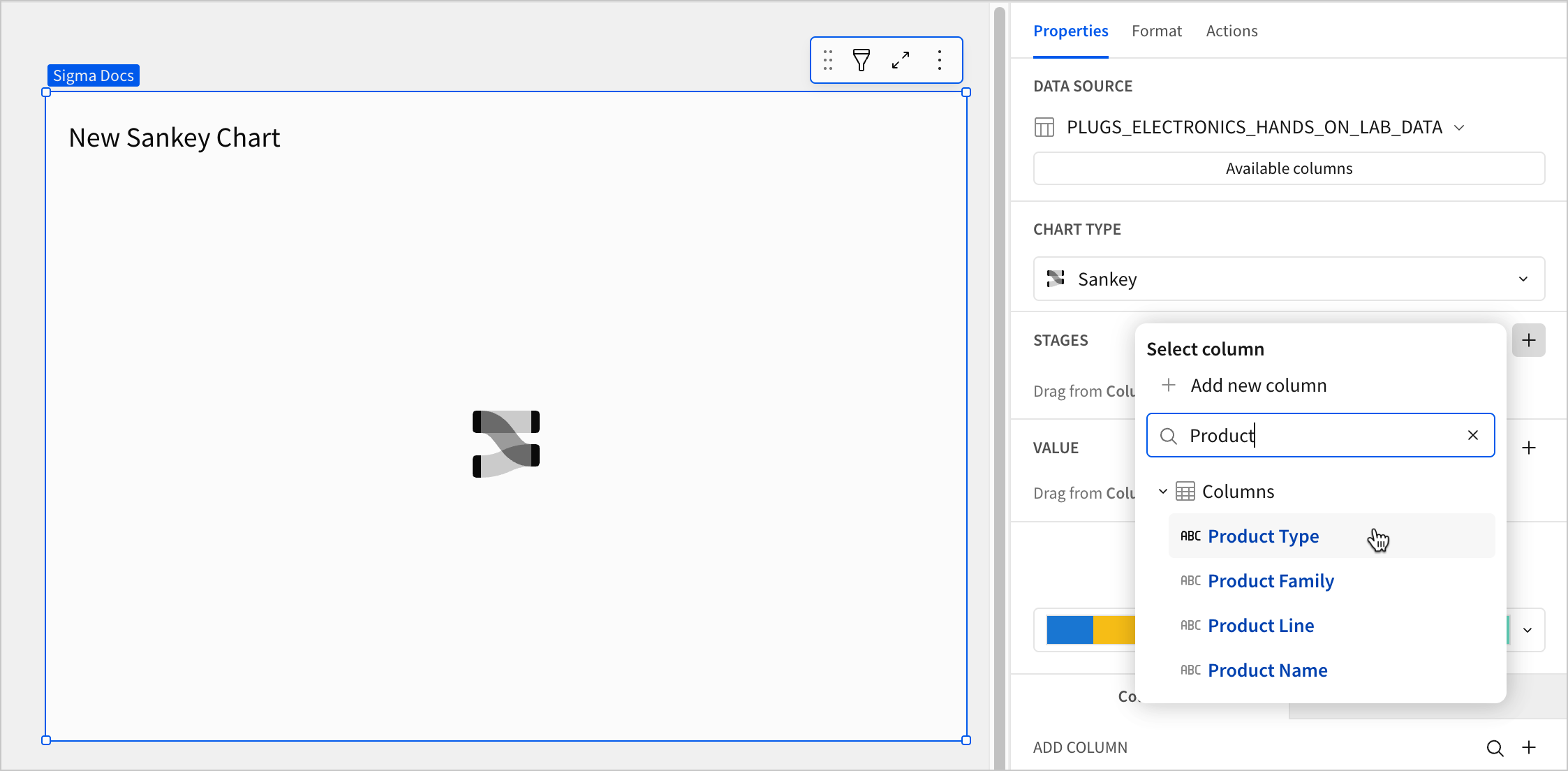
1. For the **Stage** property, click **+ Add column** and select an option from the menu:
* To generate stage categories based on distinct values in an existing column, search or scroll the **Columns** list and select the desired column name.
* To generate stage categories based on a custom formula, select **+ Add new column** and enter the formula in the toolbar.
You can also select or replace an existing column by dragging and dropping a column name from the **Columns** list to the **Stages** property.
2. (Optional) Control how the source column data is categorized and displayed in the chart:
1. Hover over the source column name, then click the down arrow ( ) to open the column menu.
2. Hover over any of the following items, then select the desired option:
| | |
| :---------------- | :------------------------------------------------------------------ |
| **Truncate date** | Categorize date values by the selected interval or unit of measure. |
| **Transform** | Convert the column to the selected data value type. |
| **Format** | Display data labels in the selected format. |
Column menu items vary depending on the data type of the column. For example, **Truncate date** is only available for date columns.
3. Repeat the previous steps to configure additional stages. A minimum of two stages are required to display the chart.
Sigma uses the order of columns in the **Stages** property to determine the flow direction of the chart, where the top column is the starting point and the bottom column is the endpoint. To reorder the columns, drag and drop them to the desired position in the **Stages** property.
### Define the variable
Configure a source column to define the data path variable.
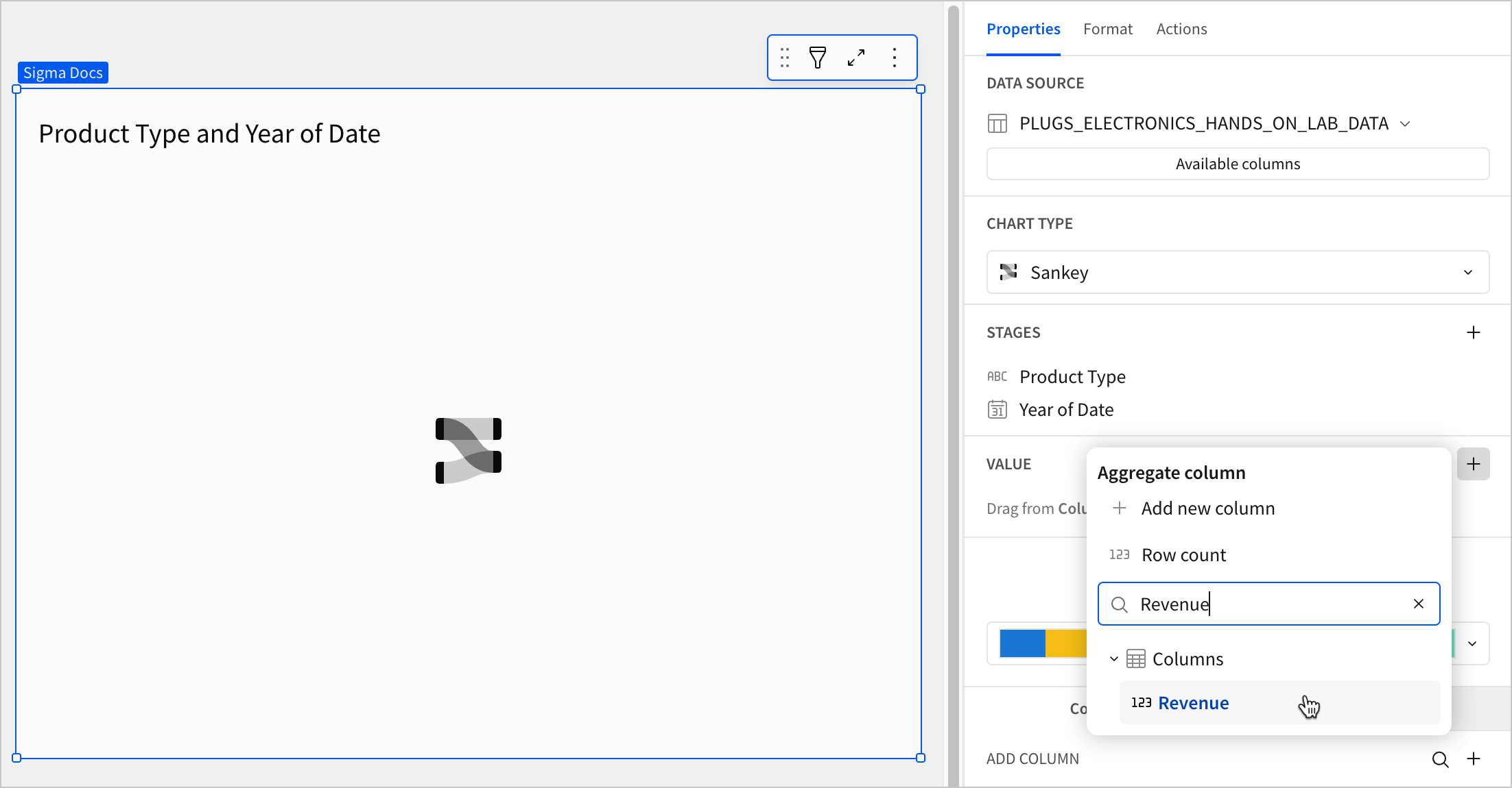
1. In the **Value** property, click **+ Add calculation** and select an option from the menu:
* To aggregate values of an existing column, search or scroll the **Columns** list and select the desired column name.
* To calculate values based on a custom formula, select **+ Add new column** and enter a formula in the toolbar.
* To count the number of rows associated with each stage name, select **Row count**.
This visualization supports up to 25,000 data points. If the configurations result in a data set that exceeds this limit, the visualization displays the first 25,000 data points, and a warning message indicates that the chart is incomplete. To reduce the number of data points, aggregate the values or apply data filters to the visualization or source element.
2. (Optional) Control how the source column data is calculated and displayed in the chart:
1. To open the column menu, click the down arrow () to the right of the source column name.
2. Hover over any of the following items and select the desired option:
| | |
| :---------------- | :---------------------------------------------------------------------------------- |
| **Set aggregate** | Calculate values based on the selected aggregation method. |
| **Transform** | Convert the column to the selected [data value type](/docs/data-types-and-formats). |
| **Format** | Display data labels in the selected format. |
3. (Optional) Sigma auto-generates source column names and chart titles to reflect the visualized data, but you can customize these fields as needed:
* To rename a source column, double-click the column name in the **Stage** or **Value** property, then enter a new name. Changes are reflected in the default chart title.
* To edit the chart title, double-click the title in the chart, then enter a new title.
Sigma generates a default chart title. If you customize the title, changes to the source columns or column names are not automatically reflected in the title.
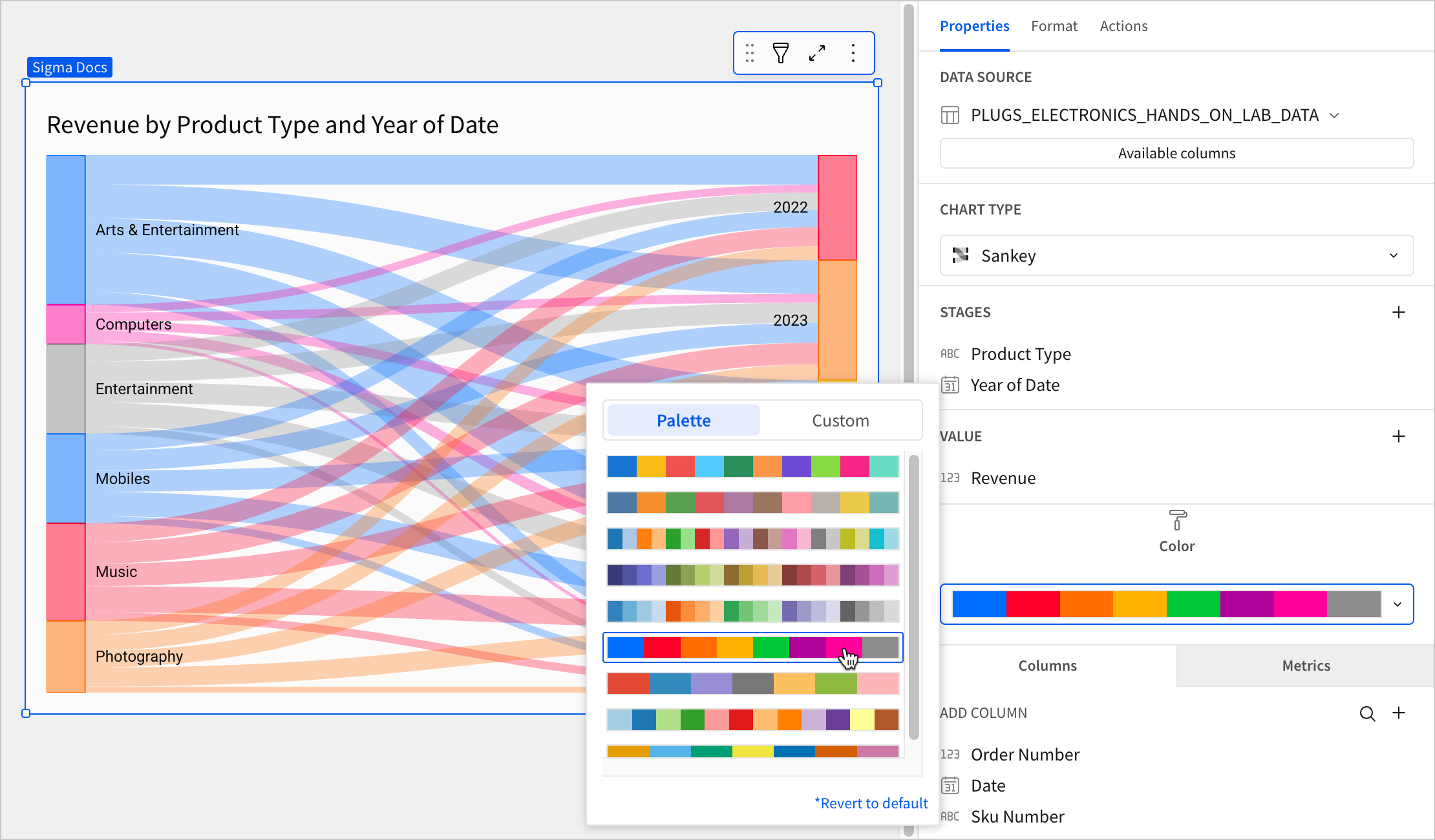
4. (Optional) To configure node and path colors, select the color palette dropdown to open the popover. You can choose a default color palette or configure a custom one:
* To use a default color palette, select **Palette** and then select one of the configured palettes for your workbook or report's theme.
* To configure a custom color palette, select **Custom** and then click the color swatch for the individual color you want to customize or click **Add color** to add a new color to the palette. Use the color picker, enter a hex code, or choose from one of your theme's standard colors.
## All Sankey diagram format options
The following formatting options are available for Sankey diagrams:
* [Element style](/docs/customize-chart-background-and-style)
* [Title](/docs/customize-element-title)
* [Data labels](/docs/display-chart-data-labels)
* [Tooltip](/docs/customize-chart-mark-tooltip-fields)
## Related resources
* [Intro to charts](/docs/intro-to-visualizations)
* [Intro to data elements](/docs/intro-to-data-elements)
) to open the column menu.
2. Hover over any of the following items, then select the desired option:
| | |
| :---------------- | :------------------------------------------------------------------ |
| **Truncate date** | Categorize date values by the selected interval or unit of measure. |
| **Transform** | Convert the column to the selected data value type. |
| **Format** | Display data labels in the selected format. |
Column menu items vary depending on the data type of the column. For example, **Truncate date** is only available for date columns.
3. Repeat the previous steps to configure additional stages. A minimum of two stages are required to display the chart.
Sigma uses the order of columns in the **Stages** property to determine the flow direction of the chart, where the top column is the starting point and the bottom column is the endpoint. To reorder the columns, drag and drop them to the desired position in the **Stages** property.
### Define the variable
Configure a source column to define the data path variable.
1. In the **Value** property, click **+ Add calculation** and select an option from the menu:
* To aggregate values of an existing column, search or scroll the **Columns** list and select the desired column name.
* To calculate values based on a custom formula, select **+ Add new column** and enter a formula in the toolbar.
* To count the number of rows associated with each stage name, select **Row count**.

This visualization supports up to 25,000 data points. If the configurations result in a data set that exceeds this limit, the visualization displays the first 25,000 data points, and a warning message indicates that the chart is incomplete. To reduce the number of data points, aggregate the values or apply data filters to the visualization or source element.
2. (Optional) Control how the source column data is calculated and displayed in the chart:
1. To open the column menu, click the down arrow () to the right of the source column name.
2. Hover over any of the following items and select the desired option:
| | |
| :---------------- | :---------------------------------------------------------------------------------- |
| **Set aggregate** | Calculate values based on the selected aggregation method. |
| **Transform** | Convert the column to the selected [data value type](/docs/data-types-and-formats). |
| **Format** | Display data labels in the selected format. |
3. (Optional) Sigma auto-generates source column names and chart titles to reflect the visualized data, but you can customize these fields as needed:
* To rename a source column, double-click the column name in the **Stage** or **Value** property, then enter a new name. Changes are reflected in the default chart title.
* To edit the chart title, double-click the title in the chart, then enter a new title.
Sigma generates a default chart title. If you customize the title, changes to the source columns or column names are not automatically reflected in the title.
4. (Optional) To configure node and path colors, select the color palette dropdown to open the popover. You can choose a default color palette or configure a custom one:
* To use a default color palette, select **Palette** and then select one of the configured palettes for your workbook or report's theme.
* To configure a custom color palette, select **Custom** and then click the color swatch for the individual color you want to customize or click **Add color** to add a new color to the palette. Use the color picker, enter a hex code, or choose from one of your theme's standard colors.

## All Sankey diagram format options
The following formatting options are available for Sankey diagrams:
* [Element style](/docs/customize-chart-background-and-style)
* [Title](/docs/customize-element-title)
* [Data labels](/docs/display-chart-data-labels)
* [Tooltip](/docs/customize-chart-mark-tooltip-fields)
## Related resources
* [Intro to charts](/docs/intro-to-visualizations)
* [Intro to data elements](/docs/intro-to-data-elements)